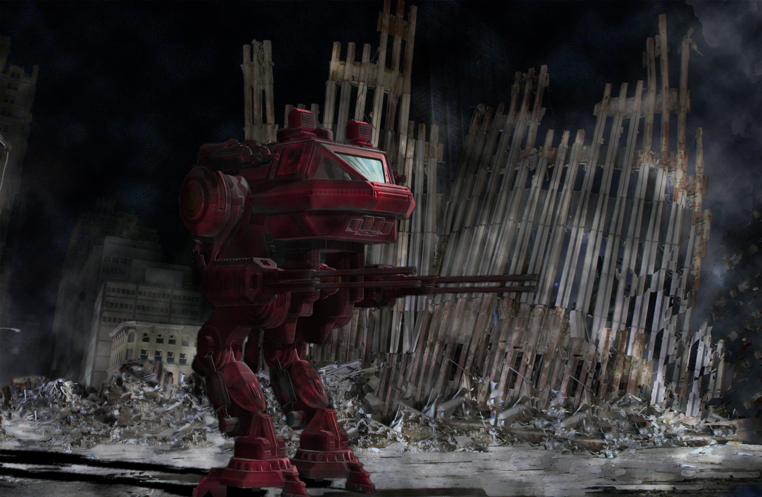
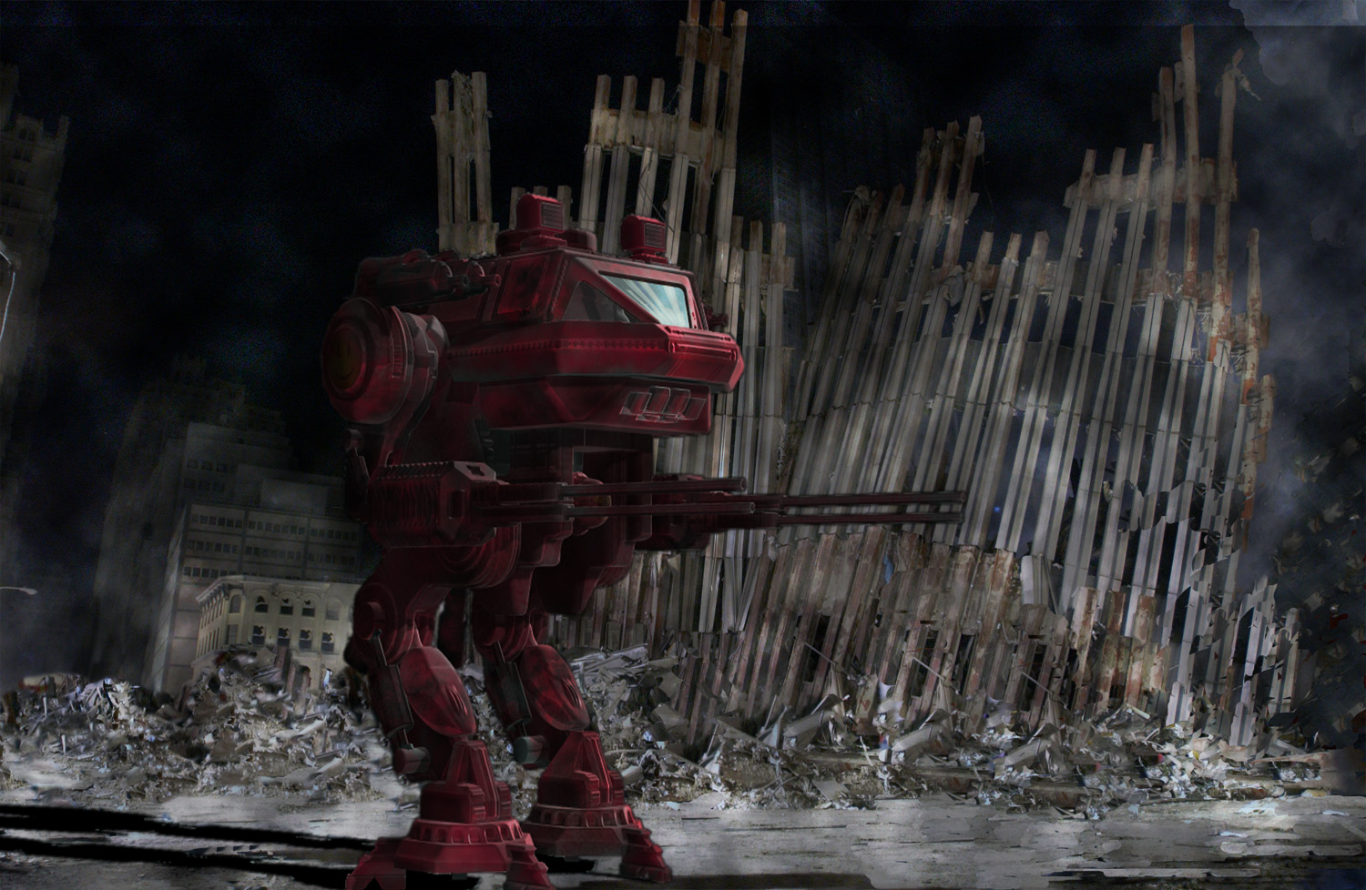
Running with Glen’s idea (sort of). I do need some advice on this one. First and foremost, is the whole concept of using the ruins of the WTC an offensive one? What I mean to say is, almost 3000 people died at this location and even though it’s a heartfelt attempt on my part to convey some meaning, it still feels a little sacrilegious to use an image of that day for the purpose of creating a simple piece of artwork.
Secondly; what do you guys think about the overall composition? I started out with the mech dead center of the image, but it covered up quite a bit of the devastation in the background, and it just didn’t feel right to me. I think it flows pretty well, but my sense of composition is anything but spot-on and I would appreciate any advice concerning this.
Lastly; the details. I did a virtual ton of editing on the image of the WTC to remove construction workers, extraneous lights and such. I also changed the tone, contrast and colors of both images to make them blend together better. But with my partial color-blindness this is probably my weakest area. I also would like to know what you all think about the edit job itself. I used the clone-stamp tool extremely heavily on the rubble and want to know if you think the patterns are too repetitive or if there are areas that just don’t look right. I’m going to add a layer of misty smoke around the mech and between it and the rubble to add some depth and I’ll need to do some additional work around some of the edges of the mech to remove a few leftover pixels from the original background.

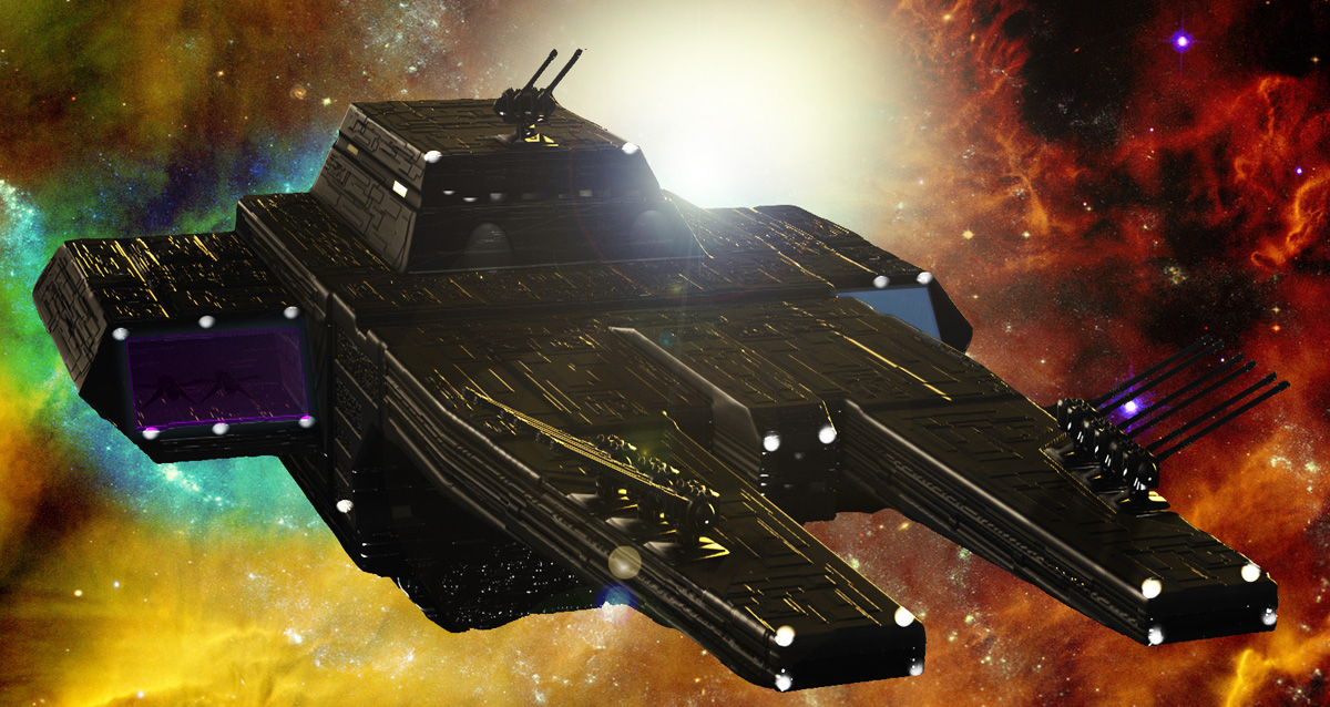


 small_orange_diamond:)…That deeper and richer color on the space ship really makes the image pop now, and also ties it together nicely with the background enviroment…Great job there…