
…
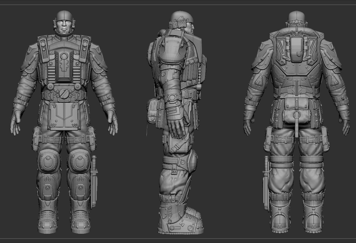
All the detailing looks great!
I would recommend building some asymmetry into your fighter, both through modeling and when you get to texturing/adding damage/dirt.
You have the knife on the one boot maybe remove the thigh pouch on the same side. And are those microphones in his helmet? or air valves? if microphone, he probably doesn’t need two of them.
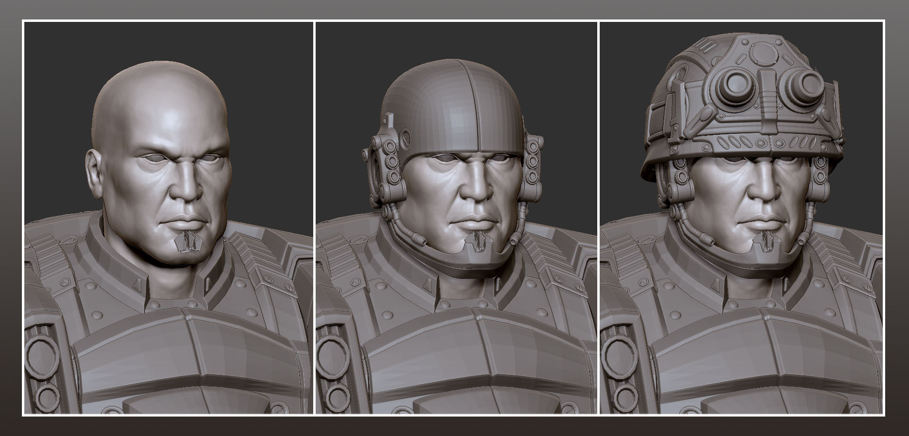
Did you use the new hard surface brushes for most of it?
Nice detailing on the character! I’d agree with Turchik. It’s got alot of potential. What I also would suggest is that you take a look at the characters silhouette. Even though you got lots of nice detail, he feels a bit like a tube if you know what I mean? If you render the character flat shaded in black agains a white background you can get a better look at the overall shape and maybe figure out where to add additional geometry to make him look a bit more interesting.
This might be extreme, but you dont have to look at this picture twice to guess who is who:
http://farm2.static.flickr.com/1151/1357016224_34111739cb.jpg
Looking forward to see more!
Very nice work. What brush did you use to do the grooves on the knife handle and around the chest. Was it Layer or something different? The transitions look clean.
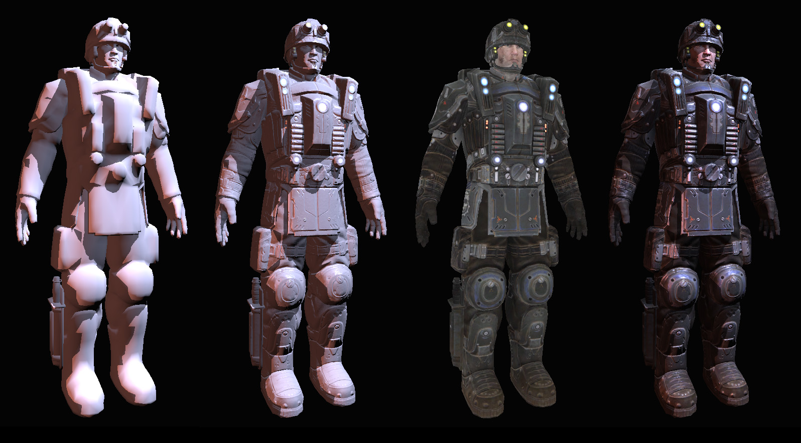
I like gears of war,so I make the fighter.thanks your advice.I will try hard.Thanks!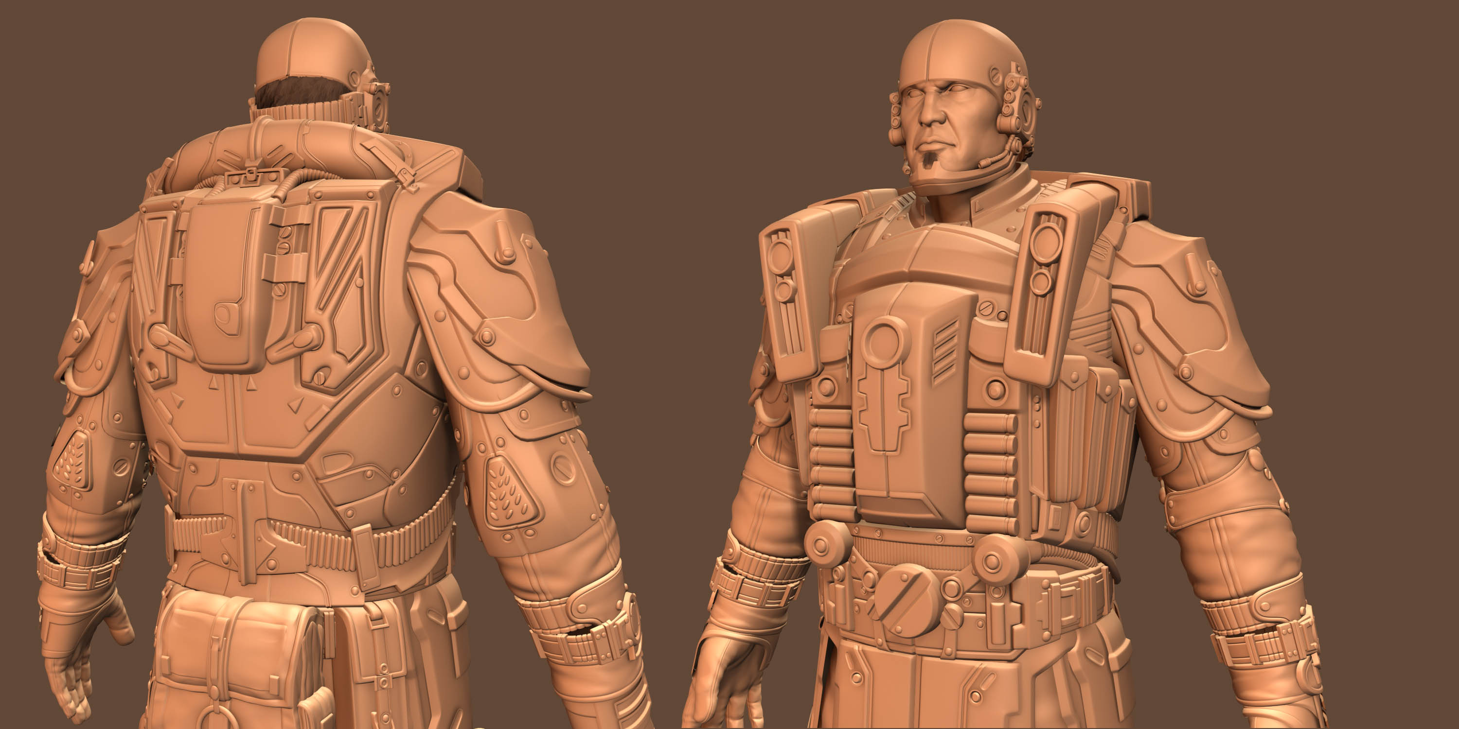
Attachments


Great detailing!!! Congrats! Keep it up!
thanks
aa
Nice pieces over here. I’ll keep my eyes open on this thread. Good work
Very impressive stuff… I especially like the armour and hard surface stuff! Top notch!

awesome man!
looks a bit rigid atm, but its probably just cause hes not posed,
what’d you use to bake out the maps, xnormal??
Very cool made characters you got there. I like the Gears of war style .
I personally would like more herioc proportions but its my pref.
Keep updating
put in the unreal
[attach=166483]ueliehuo01.jpg[/attach]
[attach=166485]ueliehuo02.jpg[/attach]
Attachments
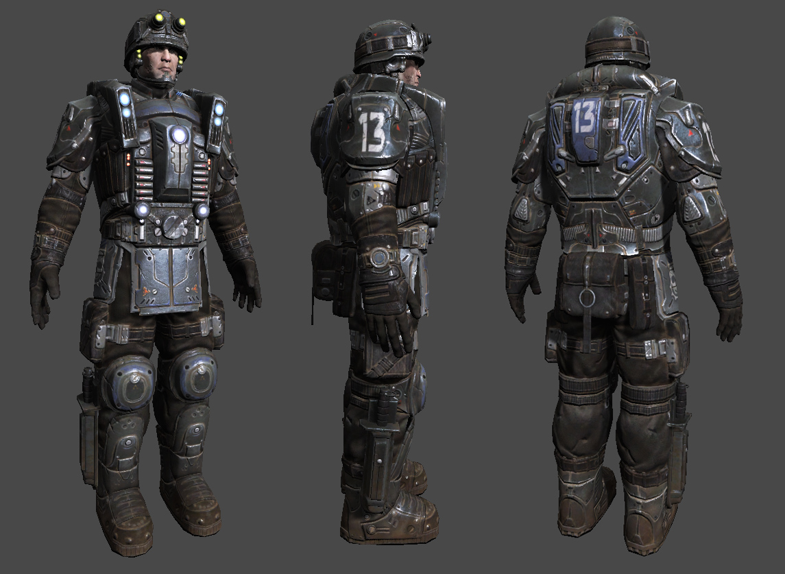
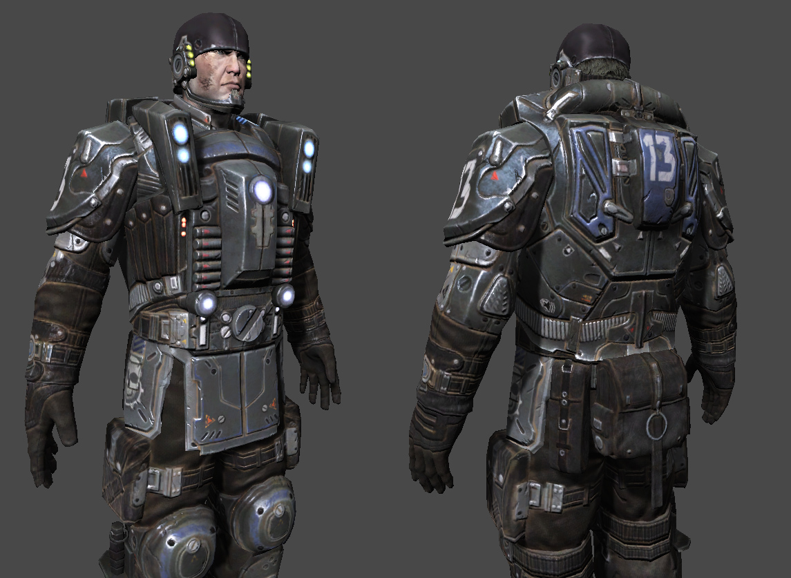
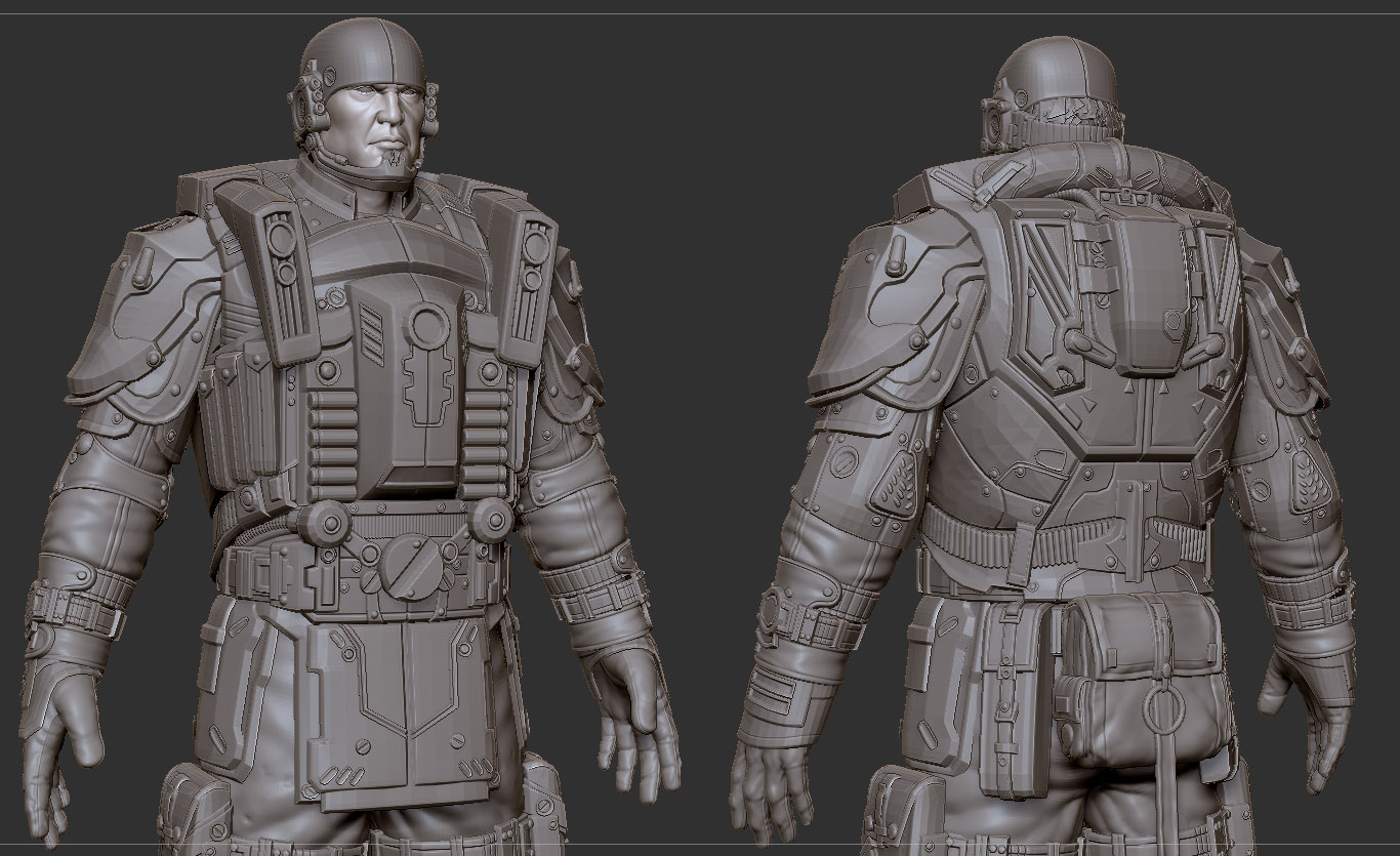
Looks good! My only real crit would be that the front and side ‘apron’ armor looks too flat…like it’s just hanging there and not conforming to the curvature of the body…diggin the textures.
split the armour plate into 2 pieces… so they can atleast have some free movement…Other than that I think hes great.:).
Very thanks your advice,I will hardwork.Thanks everyone
[attach=166830]ueliehuo03.jpg[/attach]
Attachments
Well done, but he look like a cube.