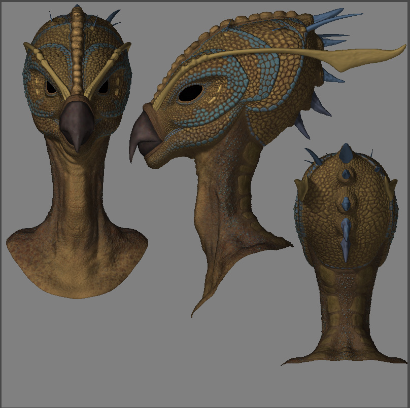
Hey guys, here is an update to a model I posted a little while back. I really need some critique and feedback on the color and overal design so far. Its getting there but I’ve been looking at it so long that I’m losing focus. Any feedback is greatly appreciated![attach=23203]creature.jpg[/attach]
I really love the subtle line of the neck. This type of predator should have its head a little more forward (even though I’m pretty sure this is a base bind pose) in my opinion. The other thing I notice is that the head is kind of ‘bulbous’ but that’s just me being nitpicky. I love the desaturated color scheme you’ve got going on, that’s really nice. I think you should pull the chin back to give him more of a sleeker profile though that may destroy some of the character you have in the design.
So far it’s looking pretty good so it’s kind of hard to crit because it’s mostly opinion. :lol:
Nice modeling
Nice texturing
and very nice character
First of all : You did a concept, and a nice one on top of this. This is very rare here, and I must congrats you for that.
To be more close of your drawing, you could have exagerated the volumes and sculpture a bit more. But, by rigging the neck, you’ll be able to correct this.
Don’t forget to push the colors further as well. It could be my overall critic : You’re not pushing your work as far as you could/can/should. D’ont wait for the lighting to create shadows and highlight, start working on this right now and put some life in those.
Otherwise, good job, I’m looking forward your finished project.
Bye !
Really good. Bravo. I love it.
wow you have done a really great job of getting him to this point!! He looks really good so far!
I don’t have anything to crit. Looks like you have a nice base color laid out. I think you just need to look at him upside down a bit for a new look and go have a few brews, work on something else for a day or so, let him talk to you in the back of your head, so when you go back to him you’ll know what to do!!
Keep going!!
Thanks for the feedback Davlin. Yeah, I could have exaggerated the features a little more. I guess the model is actually closer to the idea I wanted to present, I’m not very skilled at concept work. I think I do need to really push the colors more to make it “pop” more off the screen. Thanks again.
Haha, yeah…Im getting reeeeeeeal tired of lookin at the same model. Thanks for the suggestions…a few beers might actually make him look better! Haha.