ZBrushCentral

Dragon creature

Rory_L - I checked out Toho studios, I see what you mean!:smiley: his personality shares a certain nastiness with those those designs. thanks.

I have definitely struggled with the trans outline, I rendered them seperately and composited them as a stencil in Combustion. otherwise I’d have to render them on every pass, which seemed to take too long with my machine.

In which case you want to be rendering your model against a brick red background, so that in the raw render you can hardly tell where the dragon finishes and the BG begins. Since you have the stencils you can then cut him out and compose him onto the black BG you have here, or any other colour or image of your choice.

R

Rory_L- that sounds promising, I will give it a try

Like the dragon and your design, it is really starting to take form. But I do think that you need to work on the lighting in the scene, just because ever though you textured it very well, it looks like a toy.

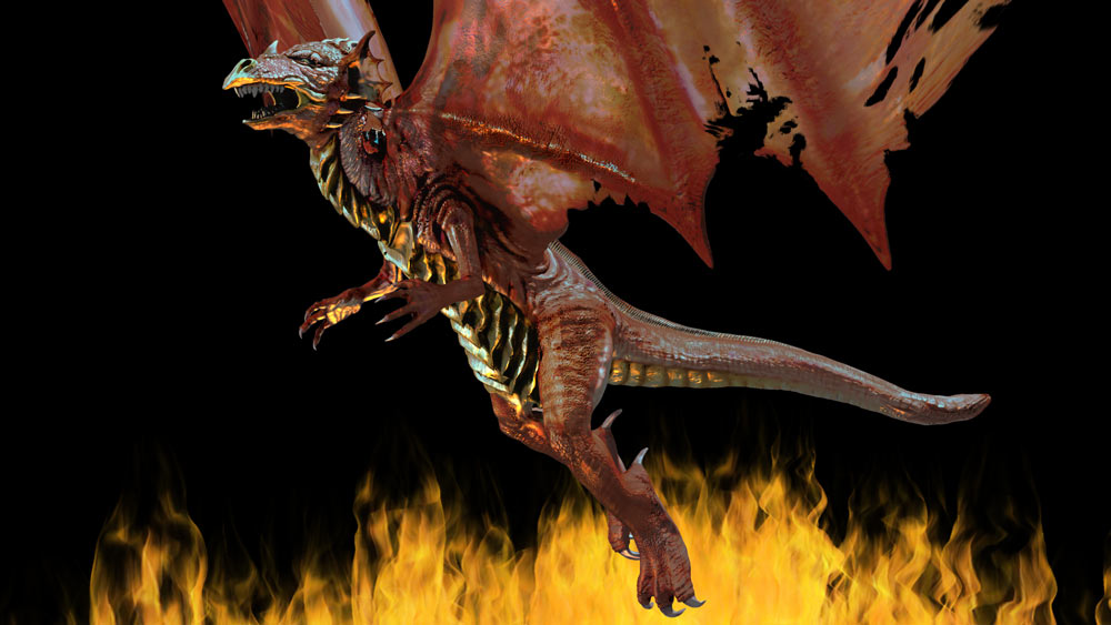
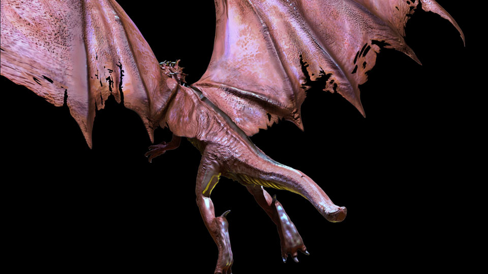
Still playing around with the composite, rendered another specular pass to go with the fire, maybe that will even out the plastic performance, thank you CassandraRoth@Centre for your crit, I agree, but thats a tough thing to get around without SSS:confused:. I tried to increase the ambient occlusion pass to counteract some of the dark shadows, but it kind washes out the scales in the shadow pass, any how I’m trying to find a happy medium.

I did manage to resolve that trans map issue though, thanks Rory_L! I’m still not sure about the color between the last three images. I keep leaning towards the first one at the bottom of page one, looking at the previous one it feels a tad dodged, this one hopefully will be about right, but maybe too saturated, any thoughts, suggestions?

[dragonprofile3.jpg](javascript:zb_insimg(‘43946’,‘dragonprofile3.jpg’,1,0))
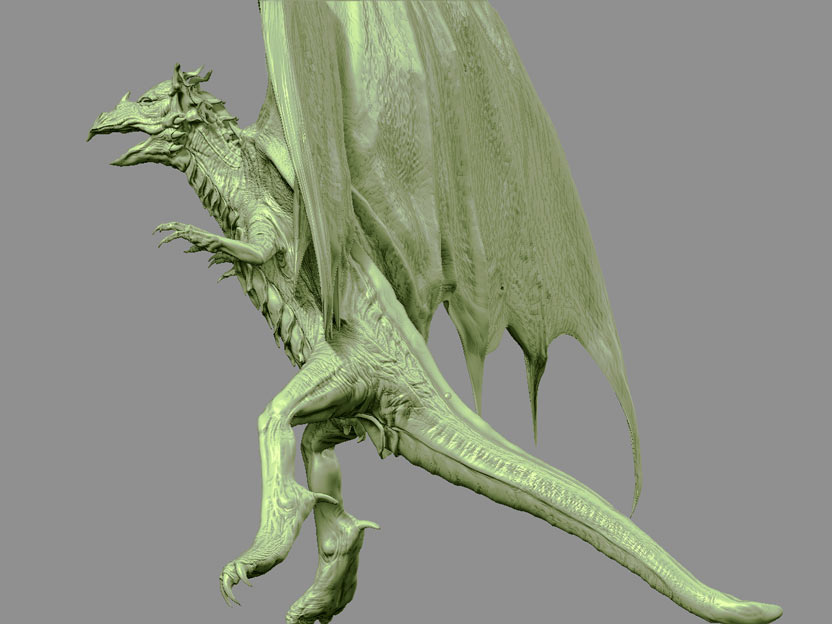
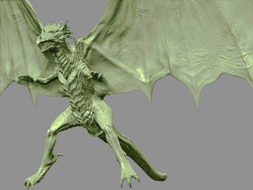
Looking cool. Flames way too soft. It makes them look like they are way in the background and thus wouldn’t affect your colours in anyway other than to backlight the little fella. Not sure of the renderer, missed that, but depending on the control you have, you could just have the light bend beyond the normals, it’s an efficient way to get the look you are after without resorting to the sss process. If your don’t have this ability, composite laters in Shake will do it for you. You should need about 6, for each component and you should have the control easily enough. :wink:

Hahaha, updating the post doesn’t to make me look blind doesn’t help! :wink: A itle better, but the fire is still uniform in luminosity and colour when compared to wht you are bouncing off your character. :wink:

Jason, I’m using Mental Ray in Maya 6.0, I’m a tad confused about your suggestion. Is this accomplished through refraction? GI? I’m currently using final gather, but no GI and I’m afraid I’ve much to learn about Mental Ray. Is there a tutorial on this process, it sounds simple, but I don’t exactly know where to start. I’ll see if I can troubleshoot it, any further help would be awesome!

the reason I originally blurred the flames was because the foot, which is the closest thing to the flames wasn’t recieving much light for some reason. I expect it’s just a specular map issue, easy to fix, but it looks kinda funny being so close to the flames.

My bad, wasn’t trying to make you look blind, just don’t want the thread to be too redundant, this image is slightly larger than previous ones and I’m on a super cool dial up connection :lol:

Hahaha, sorry I’m not fond of MentalRay and since I work in film we do things in layers/passes and composite (not that people don’t get the desired result from MentalRay). To allow the greatest flexibility. You should be able to do something similar, but I’m not going to be much help with MentalRay. :wink:

Quick question, is it pregnant?
krazy.JPG

So I gave everything kind of a once over, except the head. It’s a little thinner (thanks Shmisaac), and I added some wrinkles in certain places to create a sense that the weight is causing stress on the skin, which hopefully will counter the scale issue to some extent. However my next model is definitely going to be something people don’t think of as being so large. Also rendered several different specular passes with different cosine values, lighting setups, and colors thats why it looks kind of purplish now, I’ll post the new fire composite and the rear view a little later. -Dan Bourdet

edit- by scale issue I mean size, to make it look bigger.

[![dragonprofile4.jpg|1000x563](upload://ejUihimCv7lSBIzihDNP8T1eUrN.jpeg)]

Here are a few ZB renders of the sculpt , I’d love to use some of these cavity maps but I’m on a Mac and no Zmapper:mad: I’d do it the the old fashioned way with grabdoc but I decided to try to paint them in with the color maps, not quite as exact but works ok. The ambient occlusion passes also help to fill them in.

by the way I’m aware of the artifacting on the wings, I’m afraid I should have planned the edge flow a litlle better, but the wings don’t really require as much displacement as I sculpted anyways. I’m trying to compensate with bump maps.

[[attach=44882]dragonZB.jpg[/attach]]dragonZB.jpg

[[attach=44883]dragonZB2.jpg[/attach]]dragonZB2.jpg

heres the back, I’m going to have render the trans maps for the spines on the back a different way. The stencil doesn’t seem to affect the center of the model, maybe tomorrow I’ll put some more work into it.

[[attach=44893]dragonback.jpg[/attach]]dragonback.jpg

He could use a less stiff pose. Very nice material update. Also I would push his arm sockets forward a bit as well as his arms. Maybe give him a lumbar region of his spine, an indention where his stomach is.

This is a great dragon, but as mentioned - POSE the sucker!! It’s the pose that defines your character, showing some personality. More than the texture, lighting, background or anythng else. :wink:

Rigging is difinitely my biggest weakness, the scaly breast especially has proved to be a pain to paint weights on, but I will do my best to incorporate some of your suggestions. I also should have put more research into dragon designs before I started this, I wouldn’t be doing so much backtracking. I looked at alot of smaller lizards (photos) where the musculature is not very defined, most lizards have kind of tube legs. I recently found a James Christensen design thats really dynamic, (kind of like your Zsphere dragon Jason) but that ship has sailed I’m afraid. I’ll post some test passes when I get a better pose, so I can get some feedback before I commit.

still working on that new pose, thought I would post this as long as I had it handy.

[firecomp2.jpg](javascript:zb_insimg(‘44942’,‘firecomp2.jpg’,1,0))
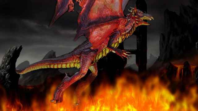
I think it looks pretty cool! I messed with your image a bit while having my morning coffee… sorry, could not resist… Maybe if gives you an idea…
All I did was to install a couple of PS layers.
[attach=44964]firecompo.jpg[/attach]
Cheers
Lemo

Background stolen from: http://kbarts.hu (Fantastic stuff!!!)

Attachments

firecompo.jpg

Lemo, this really works well!:wink: I especially like the pallette, I think I might take a shot at painting my own background with a similar Mordor/wasteland kind of a feel, we’ll see how it goes. This definitely establishes a template for me, thanx a ton -Sub