freaking awesome dude.
 BEAUTIFUL!
Nice! Simply nice to look at. Very pleasing.
You really have a hand for those patterns.
Lemo
awesome… just awesome!..
Beautiful! 
Don’t worry, as you’ll soon find out, the top row doesn’t rotate.

Super Glitcher, thank you!
Lemo, dankescheen!
wethand, thanks + appreciated!
James, thank you! Not sure though
Marcus, thank you;)
Frenchy, lovely fractals
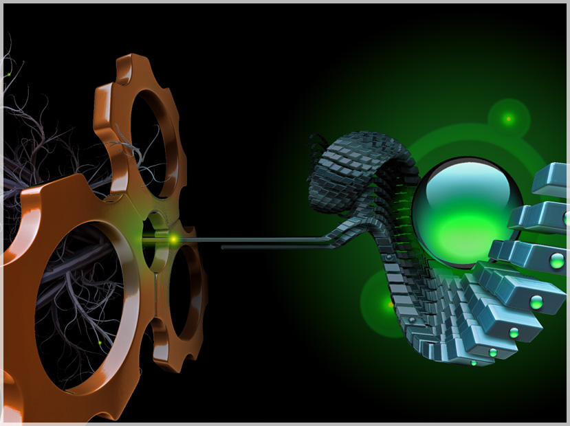
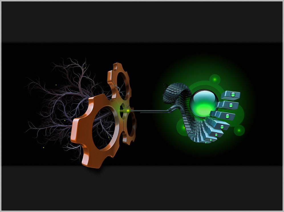
A rather methaphoric interpretation of a neuron:
EDIT; update to final version and closeup attached
Attachments
Keep up the creativity!!!
Nice image…reminds me of a mac trying to talk to a pc.
It’s inspired me to do some shapes myself.
Last one is really nice… Great idea. I feel inspired…
Lemo
OK, seriously, teach us how you do that!
Oh yes, keep this up and this thread will get it’s recognition just because of the unique style rare to zbrush work. You seem to be choppin’ these out pretty quickly! Maybe you should do some crazy elaborate illustration (relatively speaking, these are already). Treat one like a masterpiece and give it your all. Then you’ll probably get top row AND a Grammy! Regardless, awesome stuff.
sick! HI-RES… PLEASE!! 
Jupiter, will do hopefully
pride, thank you! Hope you had fun with your shapes!
Lemo, Dankedanke, freut mich zu hören:D
chwaga, i feel guilty now argh, lets see, ill think about how this could best go into a tutorial.
James, thank you again! Youre right, maybe I should invest more time into the single pieces, but then Lets see, I might be out of ammo soon though, at least timewise
Super Glitcher, i take it as a compliment, have attached a closeup above.
Have updated the main image above as well with the final version.
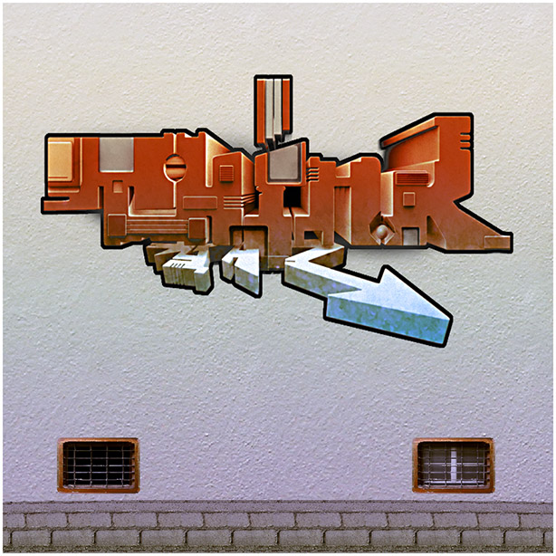
I did a wallpaper version in 1680*1050. It is attached if anyone is interested-
oh man, thats so freakin’ awesome!!!
wethand, thank you, glad its attractive in your eyes
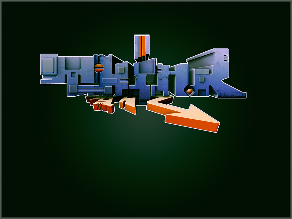
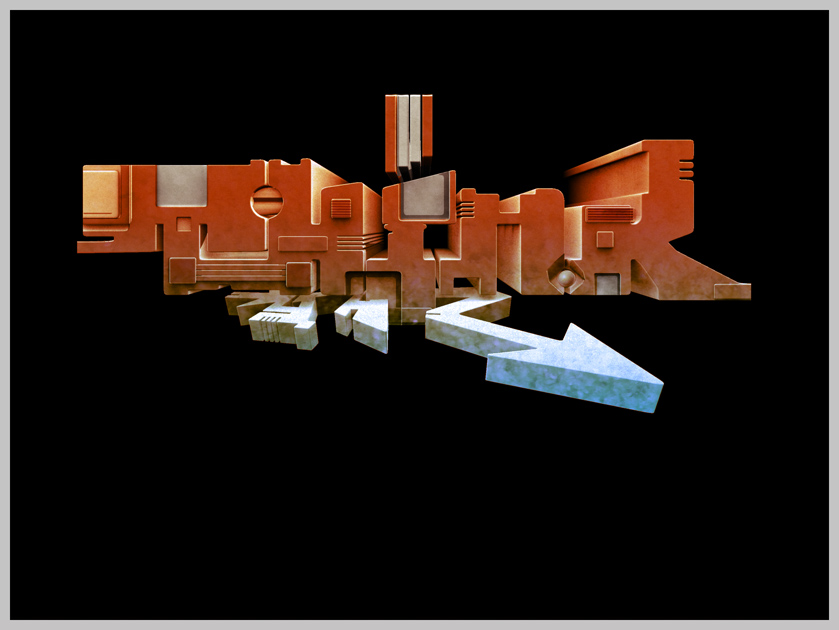
Next one. I have to admit that i horribly failed to build up enough contrast in the forms at the first place. Its barely readable oh well…
EDIT: update to final version
Attachments
Hey Erklaerbar,
Readable or not it’s very cool.
Nice mix of Graffiti & Architectural aesthetics.
groBoto, thank you!