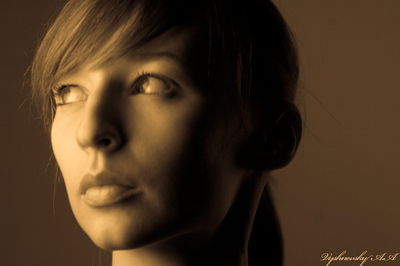
Hi everyone,
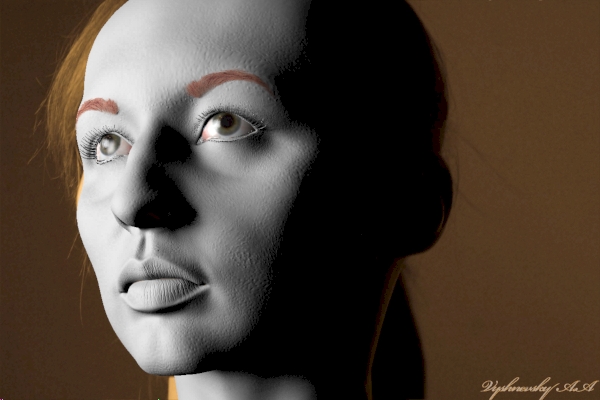
I am exhausted now. She has very specific appearance. I need help.
What is primary areas which do not correspond to the reference?
What changes do I need to make in order to increase the likeness?
Thank you in advance
Attachments
Hi everyone,
I am exhausted now. She has very specific appearance. I need help.
What is primary areas which do not correspond to the reference?
What changes do I need to make in order to increase the likeness?
Thank you in advance
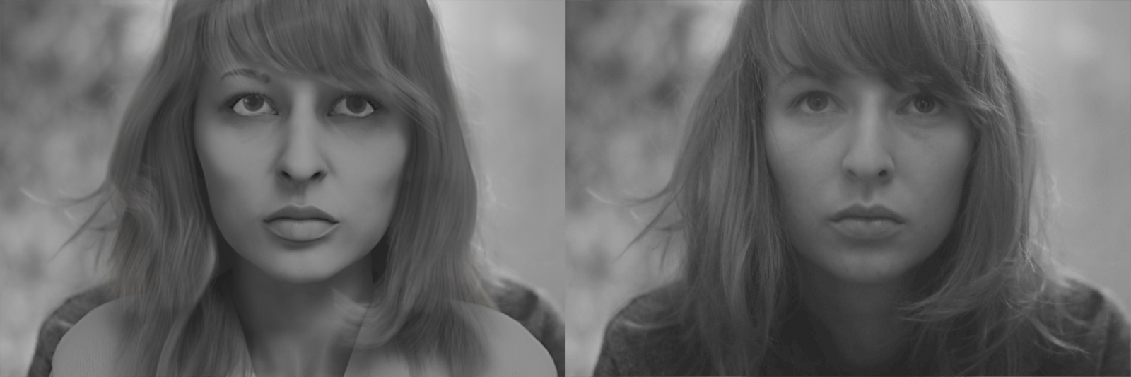
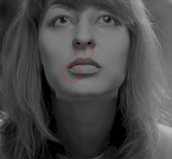
Hopefully someone with more experience with faces will chime in but,
Just did an overlay in photoshop (most seems very subtle changes)
looks like maybe the eyes need to be slightly further apart
the forms on either side of the bottom lip need slightly more volume
and perhaps the jaw line either side of the chin back to the curve
of the back of the jaw needs adjustment.
Bottom of cheek center either side perhaps this will help
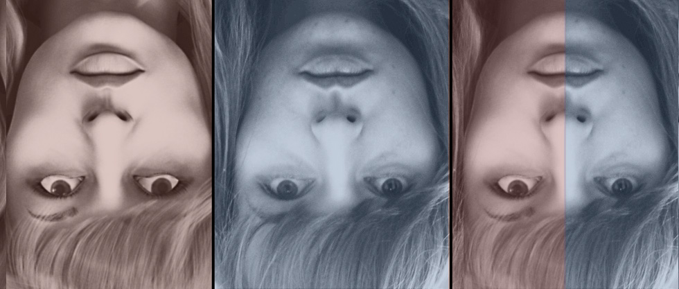
Also, try flipping the images upside down in photoshop should help
you see more. Good look, looks great btw.
[attach=269451]model_B&W_ref2.jpg[/attach]
[attach=269453]model_B&W_ref3.jpg[/attach]
Thank you so much for the greate attention to the details! Absolutely agree about the cheeks and other stuff…
But… Of course I’ve made this model based on many references. And that little disaster:evil: looks different on each of them! At the attached reference it is clearly seen that the large explicit gap is present between her cheek-bone and a jaw, which produces an unwanted shadow on my render. Where did I make a mistake? Maybe light setup?
And another important feature which I want to underline. Look at her upper lip. Looks like a white stroke just above it. How can I recreate it in my geometry? Should I just unsharp the upper edge of that lip?
Thank you again
I am unfamiliar for the model so I am sure you have been staring at her
for some time;) so you know more than us for sure. I think if you follow
your instinct will serve best.
I imagine the “line” on the upper lip is light on a pronounce outline of her
lips, I do not know the anatomical name. It does look exhaggerated
in the photos) t appears very pronounced in that last image on the bottom
lip, almost like a second small bottom lip. I suppose it depends on the light,
geometry and material properties (reflection, SSS, speculars etc.) that would
give that result.
It could be if the tissues there are more compressed than
surrounding skin it may be less “blushed” with blood, like a scar sort of.
But judging from the photos looks like light catcing on a prounouncement.
(combo sss, reflection and so on) total guess.
Hopefully one of those whiz-bang sculpters will jump in here and help
you out.
Also what are you using to render?
What I do if I’m close but missing it is get the position and lihting as close as possible which youve done. The in photoshop have your CG image in a layer above the reference. Then at a time, erase the mouth (to show the real version below), then try the nose, then try the eyes. What you’ll find is that one of them will make the likeness pop out. That way you’ll know what part you need to focus on. Hope that makes sense.
I show it here http://www.foundation3d.com/forums/showpost.php?p=157665&postcount=8
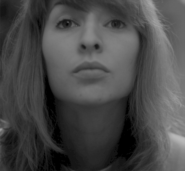
I decided to show you how she looks on other references that I’ve used for this work.
This time I’ve put hair from her photo on top of my render, played with curves and exposure to make render look the same as reference. Forget about the eyes and brows, because on this photo she lifted up her brows while looking down. Concentrate only on the lower part of the face.
The key mismatches I see: “Depressor labii inferioris” muscle is absent (shadows under her lower lip should almost disappear near “oral comissures”), and “Philtrum ridges” must be more expanded and a little thicker.
Thare may be other minor differences, but as for me, this is completely impossible to make the model match entirely perfect on every reference. First of all I don’t know FOVs of cameras used for those photos. And sometimes it’s really hard for me to recreate lighting.
Another one important reference and fortunately in this case lighting is the easiest part.
But as usual, one thing makes me sad. Shadow from the nose should be smaller. Looks like all you have to do, is simply move light source to the left. But it will also move the shadow on her left cheek back, which is definitely not what we want to.
Why is it so? What’s wrong with the geometry?