ZBrushCentral

Demon (need Big helP!!)

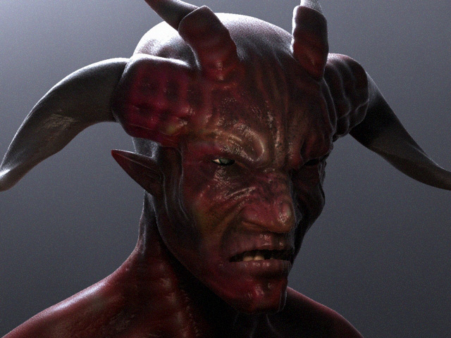
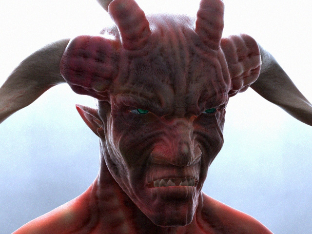
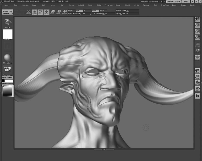
Hi i have have some big problems here,im stuck. I dont know what i lack in ,
cause i just cant seem to get an realistisk result,meaning if it is the model,diffuse,bump or light am doing wrong?

i was hoping someone out there could help me improve myself and tell me what am doing so wrong

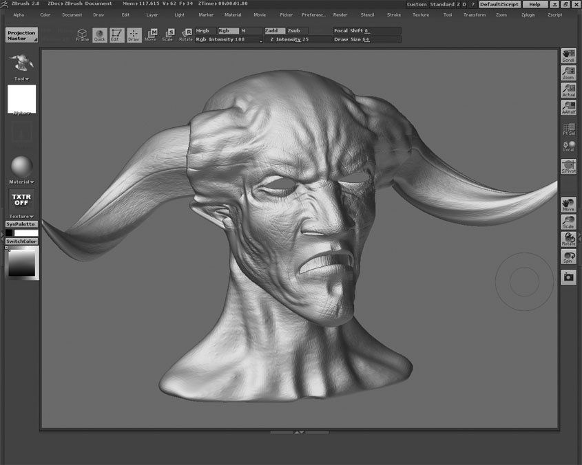
currently am using Max7 Mentalray in the scene i use DOF, GI ,2 lights and SSSskin shader on the model with diffuse,clavity and bump maps
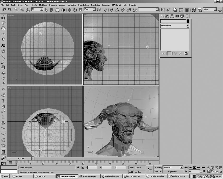
scene.jpg

Attachments

Zbrush.jpg

fdsfsdf.jpg

demonking2.jpg

Your problem is not the maps (except from your specular map which is way too shiny) but it’s the proportions that aren’t right. You should work a little longer on your low poly mesh. The forehead seems to be too short, the jawline too long and in my opinion the neck is to small as are the shoulders.
In the final render are the eyeballs too big.
After all these hints it might seems like you’ve got a bad model over there but that’s not true. It’s a great start. You should just spent some more time at the low poly stadium.

Joost

Thx! ill be back soon with update

OK so now i have done a little nosejob,resized the eyes,the jaw is now smaller, wider shoulders and added horns

is this a valid model:cry: 
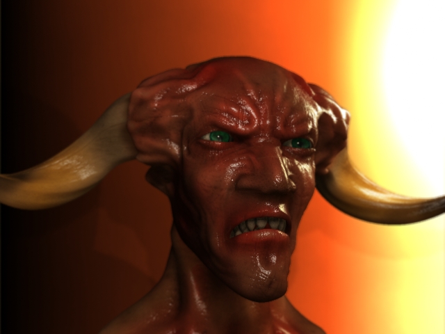
or does it still require some fixxes

New.jpg

It’s definitly better. And if it’s a valid model or not is up to you. But you’re doing a good job. Well done. What I ment about the jawline is this:
In my imagination devils are though guys with a scary look. You’r jawline starts very high and ends very low. Normally this would happen if someone would have his mouth wide open, which is not the case in your model. Such a characteristic won’t make him look evil or though. To achieve that you should give him broad jaws and make the jawline less steep. So raise the chin maybe even make it smaller and lower the jaw itself.
Oh and make the teeth follow the jawline. And get rid off the triangles and use quads only.

Cheers,

Joost

The chin is smaller now and i have detailed him a bit

New.jpg

WOW! You’re realy doing some nice stuff here… The only thing that still looks wierd is his nose. You may wonder if you want to create a human like nose or a animal like. At this time it’s too wide and the nosetrills are too stretched for a human like nose… Al the other stuff looks gorgeous.

Joost

thx! im gonna look in to the nose soon then:Pi was wondering what u use for alpha maps when creating skin in the projection master,i usally use some dots for pores and the line tool to make small kracks,is there a better way for this`?

well whats very important well for me that is is that you use a camera with a lens of 200 mm in max.

why you ask ??? because in Zbrush you ar working in a ortogrhapic vieuw and not in a perspective vieuw.
this means that your head looks the same in max only proportions ar not what you intended them to be because you were sculpting with perspective in mind.

making the camera as ortochrapic as posseble helps you make those features look good ones more.

ortochrapic=? translation pls:D

however i have tested to use a cam and it works great! im really glad of the result, comming soon with update

OK so i have gotten this faar,i think i need to rework my backround,and maybe the lights but i think its faar better now then the first render attempts

lowres though

Low-res.jpg

ssoo what do u think i must rework

Wow You are talented! Orthographic means that it’s without perspective distortion. To put it simple: it doesn’t matter how far an object is away from the camera it will have the same size as it would be close to the camera.

Joost

thx! it feels like i have improved during this thread:D

It has improved quite a bit! Although you lost your eyes now. They were pretty good in the first render. Eyes are important for showing emotion, so I would get them done and you should make a huge difference.

the update looks great. i like the material you had on the horns originally. the smoothness felt like bone. what about keeping that (maybe with just a tad less spec) with the new skin?

OK this is the fina,srry to say that cause it stilldont look good,i have some new ideas on characters that i wanna do so im leaving this one now.though i am very glad for alll the help ive got here i feel like i have improved and im looking forward to do a new creature

Test3.jpg

Attachments

Test2.jpg

I think it looks awesome! Just could use stronger lighting and a tweak to the SSS shader (seemes to be too intense). Look forward to new work from you!

It feels weird given advice to someone who’s more talented than I am. But I think you’re dislikes comes from the the nose which might be too broad and the shape of the mouth is too much of an arc. It’s a mouth shape not many people are able to make (at least not the people I know.) A trick many modellers and animators use to get an expression right is to simply perform that expression in front of a mirror or take a photo of someone who’s perfroming that expression.

Joost