ZBrushCentral

death mask (after bacon)

After Julian_K’s excellent thread about Bacon’s paintings,
http://www.zbrushcentral.com/showthread.php?t=80542
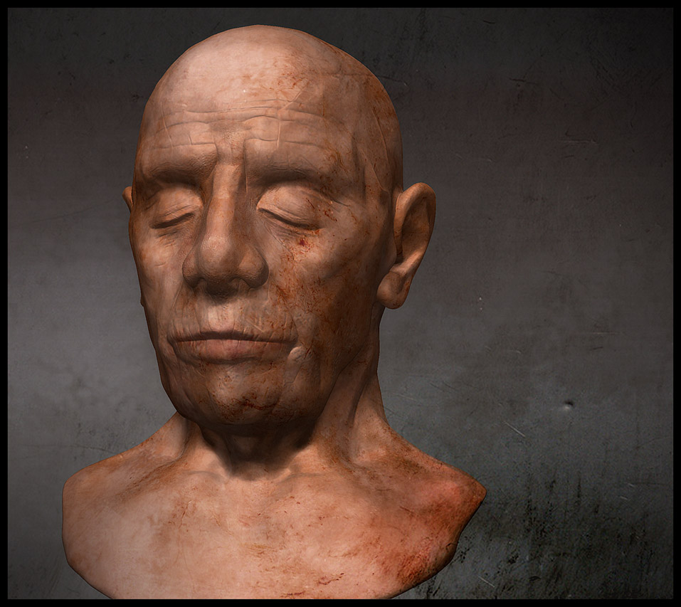
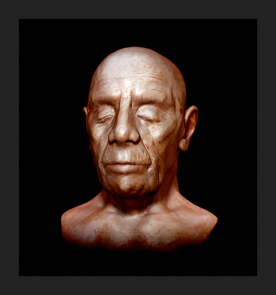
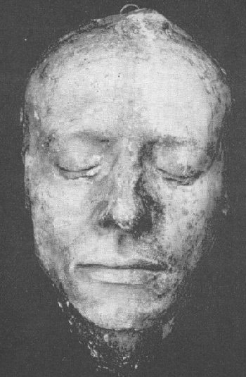
here’s an attempt for a ‘life or death mask’ style portrait of an old friend. I was after a classic oil painting style portrait (not a naturalistic one). Started in 3d coat, zbrush (new UV master is great BTW), rendered in blender internal via nodes (sss).

the ZB version via some PP
DM3.jpg

Attachments

sss14.jpg

some update, less pores more sculpture, zb renders.

2heads1.jpg

I like that there’s a very ‘transient’ feel to this piece.

Do u feel that your eyes are strongly drawn to the centre of the nose - especially in the more face on view?

Would it help the image if u were able to break up/soften the contrast of the shadow running down from the bridge of the nose?

I really like that you’ve got a classical style/approach to sculpting. :+1:

thanks Klephed, you may be right about the nose. Its just this hellenistic-roman 100 BC painting style that always comes to my mind. I’m still trying to fix it, not so easy, because its the whole abstract composition that matters, you know. Thanks again.

:slight_smile: Strong piece…Speaks volumes without saying a word.:+1:
If it is worth saying,… then…What you have to say,… Always trumps how you say it…A million pores or empty words, will never change that fact…:slight_smile:

thanks spiritdreamer, always a pleasure to visit your thread here.
Well, some more modifications on the nose etc. BTW, my problem is that I cant render in a resolution more than 1500x1000 px. (on a macpro 16threads, lot of ram machine), its a major problem, these are preview renders.
2heads2.jpg

This is my final render, more close to what I call “death mask”. Less is more. (sometimes).
About ‘death masks’ have a look here


final_dMask.jpg

You picked yourself a seemingly simple yet great and complex theme here where indeed less is more. Your renders already look promising, but I think you could still take it further. Fore example, while I like the last render best for its rougher texture, I think that a straight frontal render serves the subject better than a 45° angle. Usually the 45 angle is often more interesting, but in this case a centered frontal render underlines the calmness of a death-mask.
That is also the way they are mostly photographed. It is exactly that calm image that is oddly irritating and eerie. because we know and feel it’s not the nice and easy calmness of a meadow on a sunny Sunday afternoon, but the calm silence of death.
I’d also try one picture just in black and white.
I’d really love to see more of it :slight_smile:

oh and here is another nice photo.
http://www.olemiss.edu/courses/engl309/keatsde.jpg

impressive :+1: :+1: :+1: :+1: :+1: