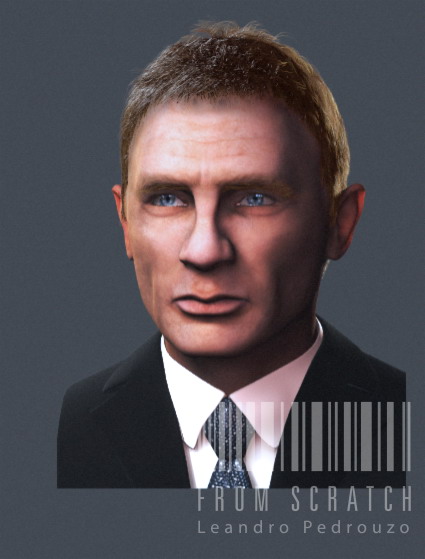
Hello folks. I wanted to share with you my latest project and see if I can get some feedback before releasing a final image.
I like the skin so far, although I’ll continue doing some tests. Lighting could change a bit. Hair is a pain.
Lightwave, Zbrush and AE for final comp. Hair is LW’s sasquatch.
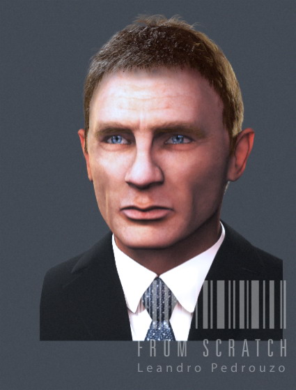
edit: I had problems with Imageshack. Let’s try again. If it is still not working I’ll host it somewhere else. Thanks Luca. Different lighting just to test in the second one.
](http://javascript%3cb%3e%3c/b%3E:zb_insimg(‘74097’,‘Test2.jpg’,1,0))
Hi Leandro,
Can’t see any pics…It’s just my problem?
luca
seems to be working now.
Just a different angle! Please, tell me what you think!
[attach=74104]Test3.jpg[/attach]
Attachments
It’s good! I instantly recognize him. The hair is spot on. There are some flaws in the face it seems. Maybe you can post some of your reference images so we can compare?
here are a couple of reference images.
I think the top of the head (where the hair is), is a little bit different, but since I am still deciding what to do with the hair I posted it anyway.
First thoughts: maybe his eyes could be made a bit smaller? Bring down the eyebrows a little… add some flesh to the ears (the top). Overall the form of the model face is a bit more square and less round then the reff pics. Just my amateur suggestions for some experiments…
You did a great job on the nose, he’s got a real strange one now I look at it.
Looks like you’ve got a good start. His skin should be tanner, and it looks like the wrinkles on his face should be a bit more fleshed out. Especially his smile lines near the corners of his mouth. In the ref pics it looks like he has some deep crows feet wrinkles around the eyes as well. His eyes should be a tad smaller. In the ref pics you can’t really see too much of the whites of his eyes. Also, his chin looks slightly wider than the ref pics.
Overall your rendition definitely looks similar to him, so you’re on the right track. Keep at it.
The eyes and the brow need some work. His brow slopes downward on the corners. The skin tone is too pink, and could use some variation of subdermal color.
I think it looks good though, I could see this character in a bond video game.
Thanks Plakkie, jseverson and JesseGraffam for your comments. I think I will try those changes in Photoshop and i’ll post it here to see how they go. It’s really good to have fresh opinions to help you out, I kept looking at the model but I always saw the same.
edit:here it is! I tried a quick photoshop retouch and I think it improved. I will wait to see if I (or you) can spot some other flaws and then do the modifications.
When you work so hard on a single project you tend to ‘blindstare’ it. Taking some time off and returning with a fresh look helps, but quicker is using ZCentral as a mirror.
good improvements! I think I can spot a few more differences:
- The flesh just under his eyes (don’t know the name) is more puffy in the ref pics.
- He has quite distinct eyelashes, maybe you should try to incorporate them into the model.
- Look closely at the chin on the ref pics… You can see two shapes on the chin, one main shape, and one (more circular) on top of it.
Don’t know if these observations will make a difference, but who knows.
I was really busy for the last few weeks but I resumed this project today and wanted to share with you this render. I tried to follow the tips I was given and I believe it has improved. Although it is not finished i feel I am going the right path. I will do some testing with some details and at the end I will try to make a small facial expression.
Please share your comments!!
I worked the last few days and I feel it is almost finished (if not finished already). I’d really love to hear from you, guys.
Here is the last picture:
it looks really really close. His eyelids need more weight to them. When we look at the reference pictures his eyelids are covering a lot of his eyes. The blue in his eyes needs to be a deeper and brighter blue. Looks almost green in the picture. Also the creases around his mouth and wrinkles around his eyes need to be more pronounced as well as the dip above his upper lip. Im not sure what the medical term for that is lol. Looking really good so far. Keep up the great work.
Hate when someone does a great job and a thread appear
finding a small fault.
But the nose…
In the strainght head on shot, your nose works according to the
reference photo.
At any other angle it should be straighter and the "bump’
should be out a tad more.
Reference photos ( especially actors) can be misleading
Having said all that crap, think its great
Thanks Danconia and bicc39 for your kind words. I will certainly take a deep look into the things you pointed out and I’ll try to match it with the rest of the reference pictures i have. I have like 20 pictures of Mr Craig, and nearly all of them are from Casino Royale (you know how useless is to have photos from different years!!).
I went a little crazy 
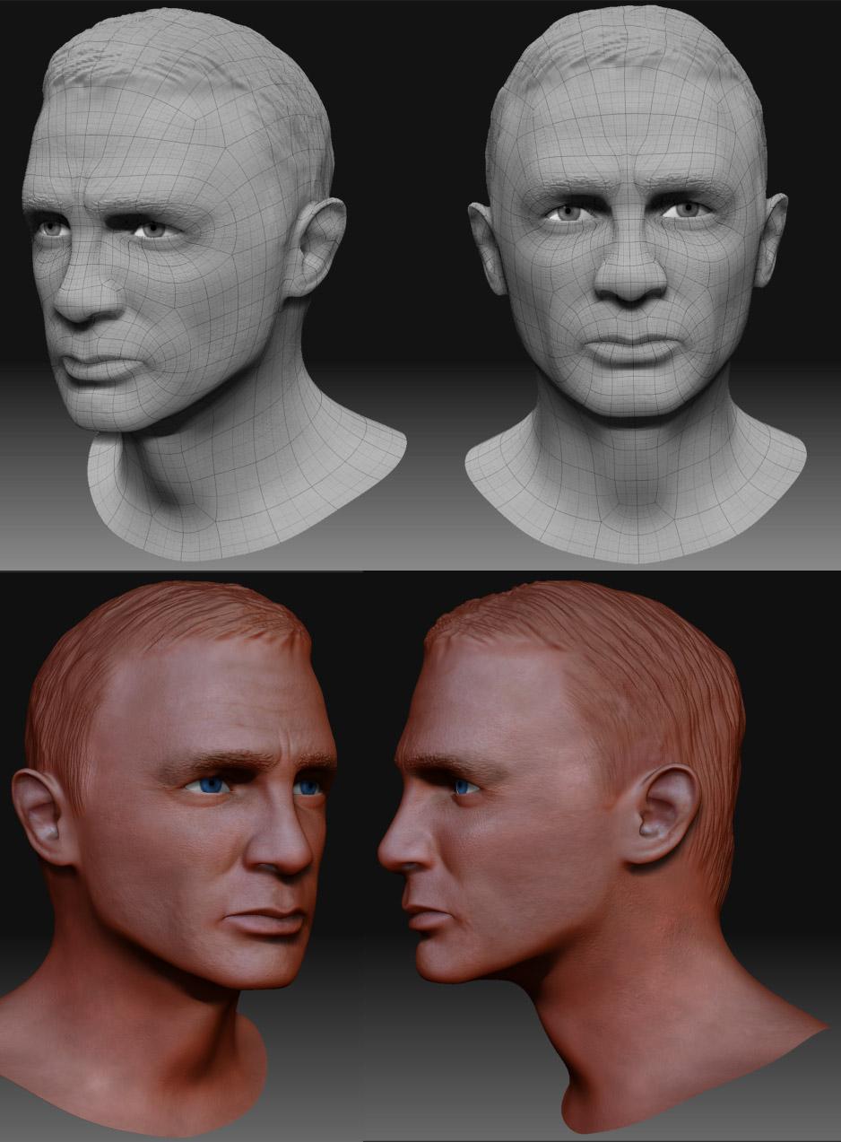
trying to put them all inside this model since I ended up with like 20 different lighting, 20 different hair styles, 20 different facial gestures…
I tried to achieve resemblance at any angle and not copy a particular photo (that would have been easier but I wouldn’t be able to rotate the object without loosing resemblance). In the next fed days I’ll try to render the model in a different angle and see how it looks like.
Once again, Thank You for your support!!!
Great look!
I admire your tackling a subject with such an odd nose…
Looking at your reference pix, the widest point of the head is across the temples, at a line above the eyebrows.
It looks as though your widest point is across the eyesockets. This squares the head (as previously mentioned) and obscures the taper along the jawline that’s there.
This is a big improvement over the last one
I think the part that looks most off is the bridge of the nose. It looks like you have struggled with this before (and it looks better now) but needs more work. Before you had the correct mass and angle… but the edge appeared to sharp and unreal. It looks like maybe you softened/smoothed the bridge of the nose and lost some of the angle and the mass. Another area that also appears wrong- the eyes- the reflection, hi-light, and shadow feel too generic. I think they are okay- but not the strongest part of the work.
Hair looks much better- brilliant. Is the hair render being done with Zbrush or another package? Jaw also looks good- very impressive.
Good luck
Craig
Latest version is great. I am into celeb heads myself and I find the real make or break is in the mouth. I think on yours the cupids bow lips is a little too pronounced and too symetrical.
You are right, the stare blindness is a killer. A good trick is to temporarily mirror the rendered image, its surprising what jumps out at you then.
I think you are nearly ther with DC great work.