ZBrushCentral

dAnconia's Sketchpad

HAHAHAHA!!! Awesome Twitch completely awesome. Thanks so much for that critique. Thanks for not saying, look at reference. That comment should be allowed only one time per thread lol.

Thanks for the mock up man, Im glad we can critique each other so well and thoroughly. Im super excited to see your new sculpts. I know there will be a major improvement.

I saw the neck problem too and tried to give it that pillar you are speaking of but it gave him a more feminine look than i wanted. I will fiddle with it some more and see.

You tha man Twitch!!!

DAnconia,
thanks for hitting me up on my post, it is nice to feel the love. :smiley:
Your work is real good, but I have a couple of crits.

First is actually a congrats, your image of the guy on the beast…
I absolutely love the pose, the form, the movement everything of that piece except the Matcap that is used. I don’t know why but it feels as though it takes away from it. Maybe try the sincity matcap, something with more dramatic lighting.

Second, your beast on page 4 is real nice but I am having issues with the extreme lack of shoulder blades on the guy. You have the hump going up right in the middle of his back but there is no allusion to his scapulas. Seems to take away something by not being there.
Otherwise great piece, can’t wait to see what else you do with it!

Thank Bauer!!

Yeah i tackled that sculpt way too early. I still have to be able to identify shapes and forms with a bit more finesse. I will go back to it in a few months and maybe even start over. We shall see.

I agree about the MatCap. It is way too distracting. I am just gonna use the Green/Gray MatCap from now on.

Thanks again!

in my opinion, as well as every art teacher that i’ve ever had the privelage to be a student of - becoming a good artist depends just as much on your attention to detail and ability to use reference as a guide as it does on your talent and developed skill. a big part of being a good artist is learning the ability to disect your own work against good reference. when people say, “look at reference” they might be expecting too much from a newer artists, but it is definitely something that you need to be able to do on your own as a professional artist.

look at your first version of the dude on the lizard… then look at your second try at him. it is obvious that you had reference on the second one. you looked at the reference and you saw where the first model was flawed.

i would recommend that you pick up the book anatomy for the artist by jeno barscay. ( http://www.amazon.com/Anatomy-Artist-Jeno-Barcsay/dp/1586631748/ref=sr_1_2?ie=UTF8&s=books&qid=1225295494&sr=8-2 )

overall, i’m seeing TONS of improvement and that is a good thing. keep it up!

just a crit, not a rip…

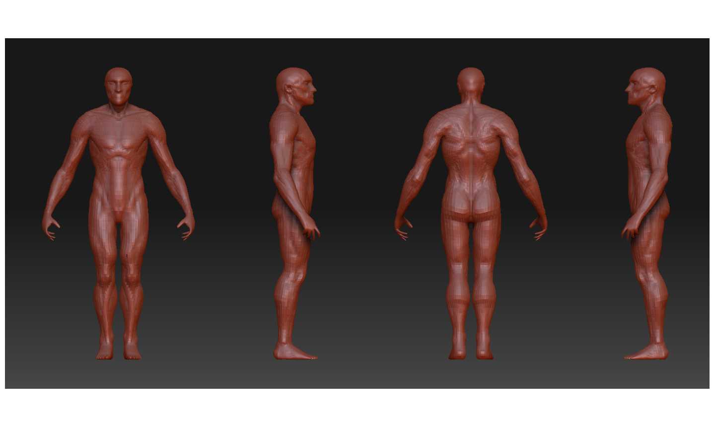
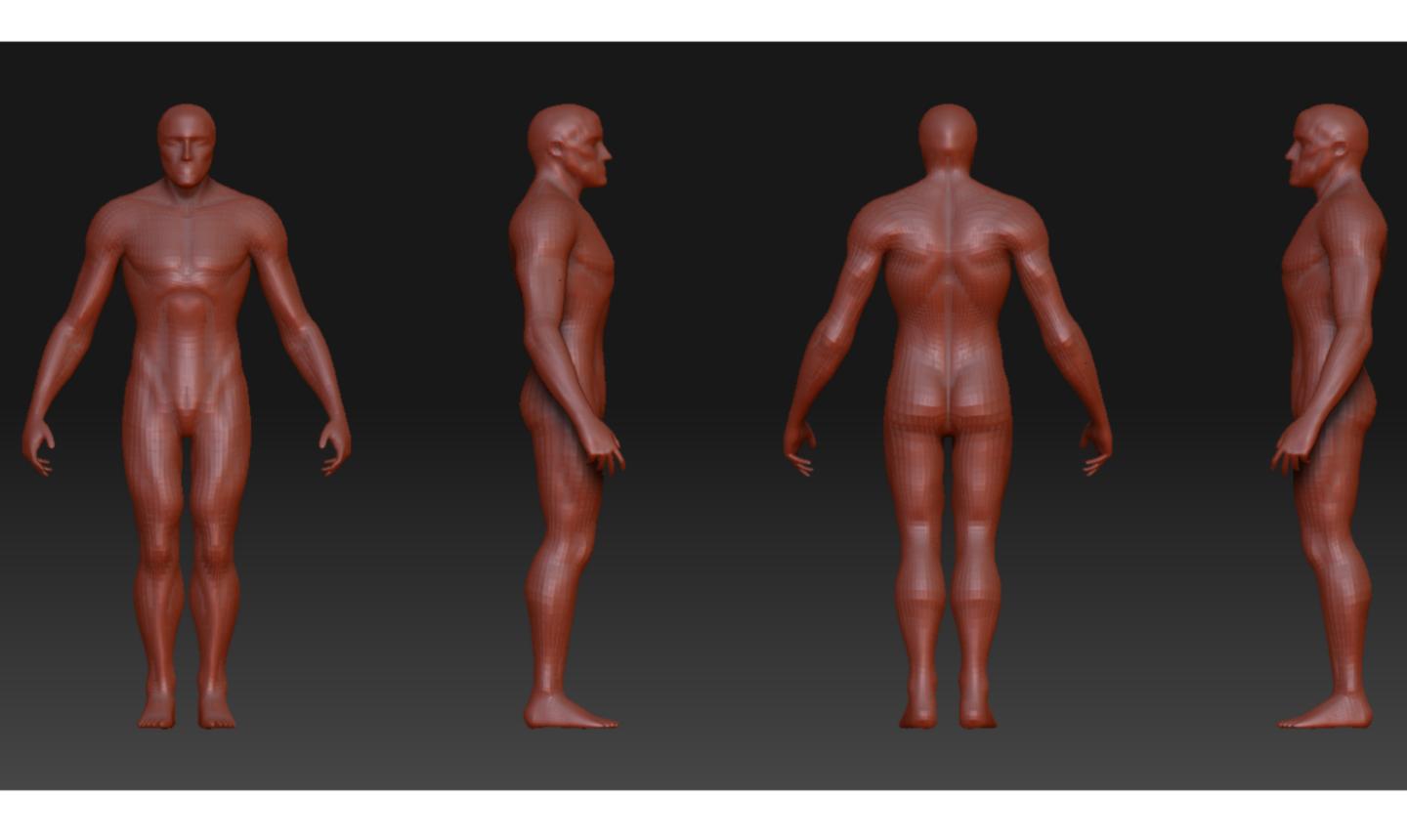
his neck is far to long, and perhaps to thick (side view) (unless you are going for that).

His head (skull) needs more of a crowning on the top, right now, if pictured without the hair his skull would be way to flat, it needs to be raised up a bit (suggest the thirds method to see what I mean).

The part of the skull where the bridge of the nose meets the brow ridge is to high, forcing the rest of his nose to look like its sitting to high.

The frontal part of the zygomatic (cheek bone) looks a bit to round.

The chin is far forward giving him an underbite (unless that is part of this character) in conjunction with the fact that there is now fleshyness under the back of the jaw (where the head meets the neck) making this area look stretched and tight.

Consider understating the Hyoid (adams apple) a bit.

If you picture the neck and torso junction as a two cylinders intersecting at right angles, this might help you understand the masses at this point would not have such a large “radiused” look.

The clavicles should disappear under the trapazoids about midway to where they terminate (in a relaxed position)

Some of these observations would apply to a non hyperreal characters anatomy

Again, I am just trying to help here, no rips intended.

Just my 2 cents :slight_smile:

_K

Kansuke: Thanks for the crit. I thought the neck was too long too. Really havent had time to fix the few problems with this sketch yet. Just got Fallout 3 and its pretty dang cool.

I never consider a critique a RIP unless there are some negative comments. Please feel free to be as honest as you can. “The truth is like a kiss on the lips” No im not saying we should make out :lol:

WaterfromDust: Thanks for taking the time to critique my work. I actually bought that book a while back. George Bridgmans Complete Guide to Drawing from Life really hit home for me. I just recently finished the head part of the book and it was so helpful. Right now Im on the neck section where it seems i have the most trouble.

Appreciate everyones feedback. Its extremely helpful.

Cool :slight_smile: I think honesty is the best policy. I’d rather have my heart broken by the truth, than fattened with false flattery.

Keep it up bro :slight_smile:

Cheers

_K

Sketch

[Thumbnail.jpg]CharacterStrip2.jpg

You might want to recount his fingers. I think humans have…let me check…five, yes, humans have five fingers. But, aside from that, it’s quite a good sculpt. The form is solid and the gesture is fluid throughout.

The only thing I would say is that right now the hand looks to be pronated, and the forearm supinated, otherwise barring my anal-retentive, perfectionistic tendencies, it looks really nice form-wise :slight_smile:

_K

Been sketching like crazy and it has helped tremendously. I have just been drawing every single example in George Bridgman’s Complete Guide to Drawing From Life. I love it and i need the practice anyway.

Gonna work on the hands and feet tomorrow night.

[[attach=117961]CS1.jpg[/attach]]CS1.jpg

your proportions need some work! I did a overpaint for you. maybe that helps you a bit.

greetings, gordon!

Hmmm thats weird. I did the 7 1/2 head proportions. I measured it out by taking the head of this character and Shift+S and set them up on top of each other and started from there.

Appreciate your paint over.

this is just a suggestion! at a second look my head is maybe a bit too big!

im also still learning anatomy!
just wanted to help out. keep it up, gordon!

By the looks of your models you have a good grasp of anatomy. Like your Spider Man and all the poses. Great work Gordon!

[CS2.jpg]

Hey, D. Things are looking pretty good here, but I do have a few things you can look at. The arms look a bit too long. They’re almost there, but they definitely feel just a bit too long. I’d also look at the back musculature. I see the erector spinae and trapezius clearly defined, but the lats don’t look quite right. The shoulders are also awfully broad, but that is a personal call. Besides that, things are looking good.

Hey Twitch its nice to hear from you! You going to enter the Action Hero Contest?

Yeah the arms are a little long, but when i shorten them up they just look off to me.

You know, I just might go ahead and enter the contest. Of course I won’t even get close to winning, but participation would still be fun.

As for your problem with the arms, I’d play around with the ratio of deltoid to upper arm to forearm. They look pretty proportionally sound, but you might find that decreasing the size of one part might look a little better than shrinking the whole thing uniformly.

Ill work on this later. Check out my Action Hero entry ADRIOT DEX. Let me know what you think.