So Im looking to beef up my portfolio and wanted to see if I could get some solid critique on this work in progress. Some of her proportions are a bit exagerrated, but I still want her to feel realalistic. Any help would be greatly appreciated!
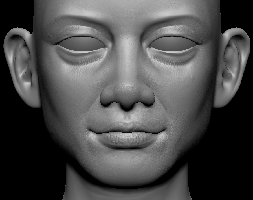
Hi Ryan - nice face!
The only comments I have for you are: The nose looks a little “plastic” as compared to the rest of the face which looks very natural.
The ears feel too smooth compared to the rest of the face - but that could be the render.
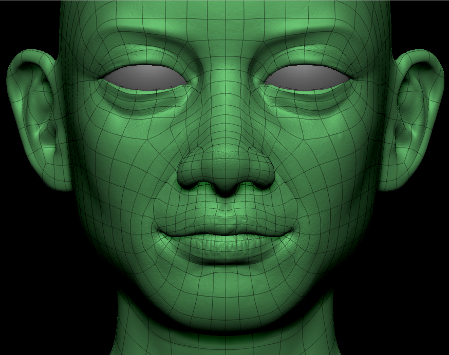
As per the mesh, I won’t even dare to comment on that since I have no idea what “good” topology is supposed to be.
Maybe the only other things would be to define the very edges of the mouth more and give a little more definition to the eyes? But that might be just personal preference.
Great looking face, and looks believable to me. Would love to see some color on it
nice face can u post more views of the face.
Thanks for the tips Martym. I have already started implemting some of those changes. I added more flesh to the corners of the eyes and added a bit more gravity to the eyelids. I also started adding more fatty tissue to the corners of the mouth. Here are the extra angles that karthik had asked for. Thanks again for the comments!
Started working on the body. Not sure I like the shirt yet, but it is a start. If anyone has a good technique for clothing wrinkles I would love to hear it, I am still trying to figure out a better method for myself. All comments and crits are welcome!
Very nice. As for the shirt: I think the issue is not so much the technique for making wrinkles as it is placement. With tighter clothing, you tend to get fewer wrinkles from draping and more from bunching. On a tank top, a lot of the wrinkles will be around the waist, and they will tend to follow the form (so: more horizontal). I’d get rid of the diagonal wrinkles coming down across the stomach, and maybe de-emphasize the ones above the breasts, or even get rid of them entirely (the shirt will be stretched tight there). Do a Google image search for “tank top”… you’ll get a bunch of clothing catalog images that you can peruse to get a feel for how wrinkles tend to form on that particular piece of clothing.
Thanks Felderin! I agree with your comments on the shirt wrinkles, so I started blocking out a new layout. I am much happier with the results I am getting now, what do you think?
the eyes a bit big i think. draw the usual line down from the center of the pupils and see how it’s way past the corner of the mouth.
Thanks magbhitu. I agree. I scaled her eyes down and it is looking much better. I also started blocking out a pose for her. I haven’t touched the small details like the fingers yet, I want to get the right silouette and wieght distribution. Tell me what you guys think.
Looking good, I dont know if its because im tired but the head seems really big.
I agree Mandance. I guess I am still used to doing cartoon characters from my last job. I scaled her down a little, but I kind of liked putting a small emphasis on the face. I still feel like the pose is a bit awkward. Any tips from anyone? I want her to feel confident and a bit aggressive.
she is looking nice, especially after modifying the eyes. i like her cap. and i agree with Mandance about the head. maybe you should make it smaller a bit. and also she has a cubic chin as a man. you may need to make her chin more jagged in order to obtain a tender appearance.
and finally im not sure but maybe the clavicles are should be a bit more far from each others?
waiting for the updates.
I like the expression and all in all quality, but the eyes are way to big. It looks almost cartoony wich doesent seem to fit to the realistic –and very well done– rest of the caracter.
I thought about it a little and want to specify my last post. Its IMHO not only the eyes but the face parts in gernal who are to big. So I’ve taken the libery of doing a bit of a Photoshop paintover to show what I mean. I hope You don’t mind.
Flashback: I have received a few comments on the chin being too masculine, so I will work on changing that in the next update. As far as the clavicles, do you mean that where the two clavicle bones meet in the middle of the chest should be further apart?
MacRobi: I would love to see your paintover, but It isn’t showing up in your post. Zbrush Central has a different way of posting images than most forums, so you may have to upload it using their system. If you get an opportunity, could you repost the image?
Thanks for the comments guys, it is really helpful!
Oh, I see. I try it again
Thanks MacRobi. I think you are right. I started working in some of those changes. I made the eyes and nose much smaller as well as brought the chin in a bit. Here is a small update before I have to start work again on Monday.
The face is better now but it still needs work to make it realistic. Especially the eyes area.
I’d suggest to check some photo refs.
I agree with nfuchs. It’s getting better, but there are still a few proportion issues. I photoshopped again slightly on the head and the left arm. If you wanna see exactely what i did you can put this picture as a Phothshop Layer on top of yours and click it on and off to watch the before/after effect.
Attachments
Thanks for all of the critiques guys. My work always looks better when a fresh eye can look it over. I’m a little tired of my Aviator chick so I started working on this guy. Again critique is more than welcome.