ZBrushCentral

Captain America

Hi All,

Just thought I would post this Captain America model up to get some initial feedback. Have been wanting to have a crack at this model for some time so here it is. It id not finished yet…I know I have to spend a bit of time sorting the face out.

All crits and comments welcome.

Cheers

[attach=75819]cap.jpg[/attach]
cap_cu01_mBlur.jpg

Attachments

cap.jpg

This is nice. I’m surprised there are no comments.

Looks good, but the pose is a little off and his neck looks like it’s broken. :cool:

I agree with mustan9, he looks to be well sculpted but the pose is throwing me off. Actually, I get a stiff neck just looking at it, haha. But other than that, it looks like a promising start.

I look forword to seeing the colors.

good sculpting … i agree with the guys about the neck tho and the arm up … otherwise … very good model and texturing captain america should be fun.

Bigd17,

Definitely agree whats been said about the pose. Besides whats been said… the hand holding the shield in what is supposed to be a throwing type move is very unnatural and awkward. Imagine trying to throw a frisbee in that position let alone a shield. I think having the arm go over the top of the shield and gripping the edge of it on the far side would be best with his palm facing downward. As one would throw a discus if you get my meaning. Will be watching for more updates, keep it up!! :+1: :+1:

Hi All,

Thanks very much for the comments, I had thought about having the arm go over and will investigate the pose further. I have done a quick turntable ( http://www.youtube.com/watch?v=PHxaszShics ) and would be grateful if you could check it out…I don’t know whether it is the angle that the still render is taken at that makes it look really weird.

Thanks again everyone and I will keep you all updated with the progress on Cap.

Cheers

Bigd17,

Yep… once you fix the head… and pose the sculpt a bit better then you’ll have a fine sculpt. Its got some nice things going on with it overall truly! Just got to tweak the head/neck alignment, make some posing changes and you’ll be set. :+1: :+1:

Hi All,

So here is a bit of an update. I have re-posed the model a bit with the shield under the arm and have started to add on a bit if colour. Still have to work on the skin texture/shader, but it’s a start. Comments and crits welcome as always.

Cheers,

Dan

[attach=76275]cap_col_comp_HR copy.jpg[/attach]

Attachments

cap_col_comp_HR copy.jpg

The head is still bugging me …

Sorry to keep badgering everybody but I have obviously been staring at this model too long. Can any one tell me what it is about the head and neck that is wierd…have rendered it out from a couple of different angles, front and back as I am not sure whether it is just the viewing angle of the last render that makes it look odd.

Thanks for the comments so far.

Dan

Hey Bigd. I will have to agree with the others. The model is excellent, but the first thing that jumped out at me was the angle of the head. It looks almost as if his neck has been pushed past breaking point if you know what i mean. I’de say try to repose the head to a slightly less extreme angle, or bring the jaw closer to the base of his neck. It’s only a tiny movement thats needed though.

Excellent work otherwise!

Hi there :slight_smile:

i think the look on the face doesn’t fit the pose of the body
that’s why it doesn’t look good as a whole. He ought to look more downward, anyway great great job :slight_smile: :+1:

sry 4 english, hope you uderstand

Best Regards
Marcin

looks great but fix that neck dude!

verygood!!!

To me it looks like it would be more at home on a Zombie than cap … It is at an unnatural angle. Not that the human body can’t go there but it just doesn’t normally.

This isn’t the same angle but I looked up discus thrower’s in google images and found this. http://www.team75plus.com/vvfiles/9/9ef381d8ab1587a4f76f4663c50dc428.jpg

I would imagine Cap to be looking at the target and not cocking his head to the side so much. He might be looking at the target but the rest of the flow isn’t really there.

Still, it is a nice base and just would take a minor tweak.

Pretty good. But Cap’s costume has blue leggings

Maybe it’s an alternate universe Cap.

Hi All,

Well here is another attempt at fixing that troublesome head/neck area. Sorry about the number of tweaks…will hopefully get it right one day!!! For the purists I have altered the colour of Cap’s tights as well, although I left a bit of my own detailing.

Once again, all comments and crits welcome.

Cheers

Attachments

cap_zb_comp_v03 copy.jpg

Bigd17,

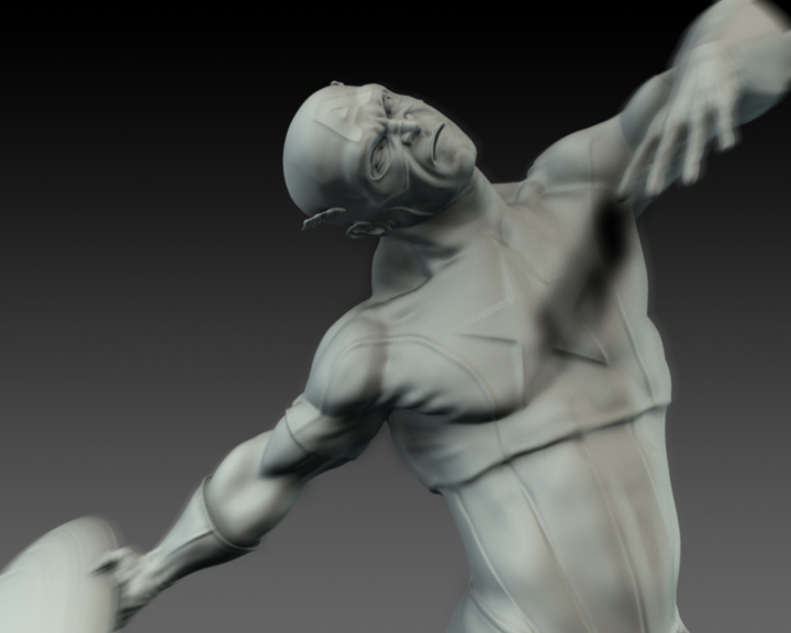
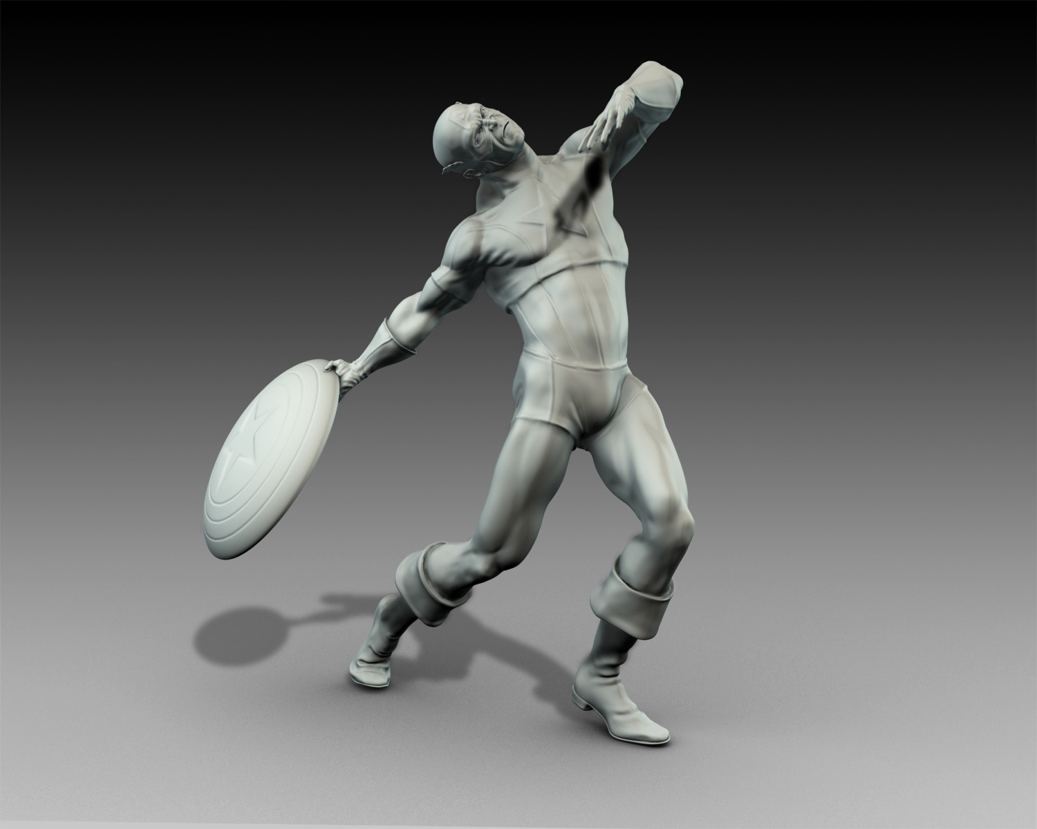
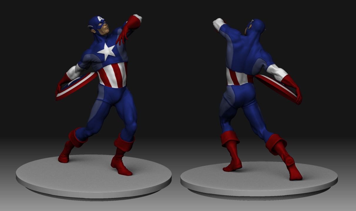
Hey nice!! Neck looks much improved. I knew once it got better alignment the pose would look promising. Funny I saw this thread last night and you looked to still be wanting some insight to the pose/neck area. So I quickly took the demo-soldier transposed him with a quicky shield piece I whipped up. Then I even added super-average man transposed into a “scene” for kicks. Figured maybe might spark some food for thought for you. I figured i’d post it this morning to show for you and low and behold you had your nice update already:laughing: . I got some good transpose practice in at least. I put em in the thumbnail here anyway, figure you can see what I was going to show yah. Keep up the great work, will be watching for more! :+1: :+1:

[attach=76712]Shield throw-all views copy.jpg[/attach]
[attach=76713]Shield throw+victim-all views copy.jpg[/attach]

Attachments

Shield throw-all views copy.jpg

Shield throw+victim-all views copy.jpg

Hey AngelJ,

Massive thanks, those poses are going to be really helpful. I guess I have just had the original pose in my head for so long that I have become a bit blinkered. Might try and push on a little further with the colour and then try and bang out a few different poses…more work but want to get the best out of it.

Cheers again.