ZBrushCentral

Bison

Hi, I’m Dan, from B-Town, Vermont, and I lurk too much. That’s all there is to it. :smiley: Well ENOUGH! Here is my first sculpt in ZBrush.

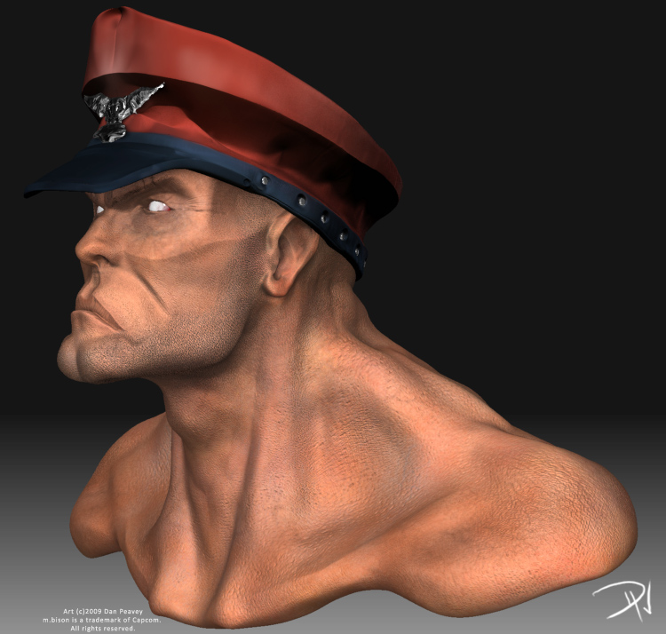
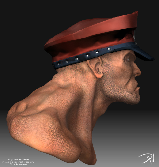
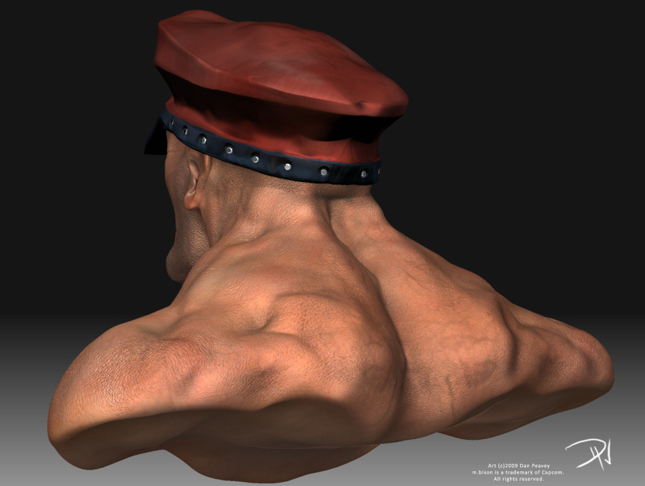
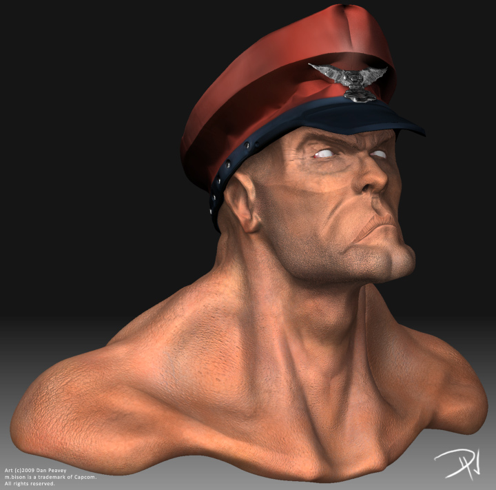
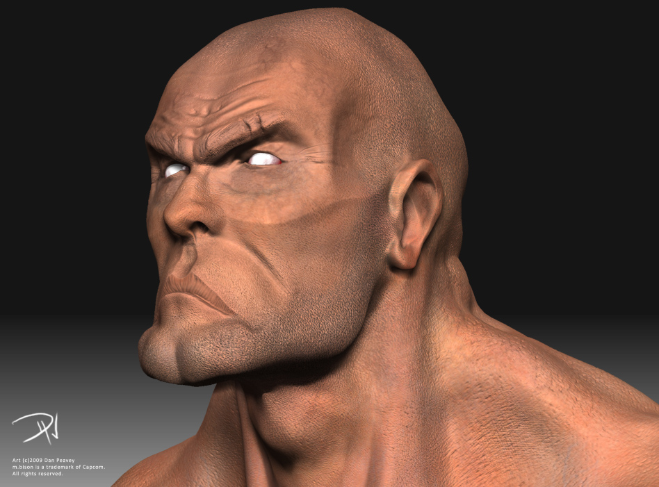
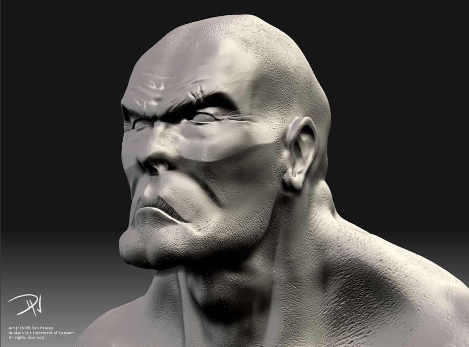
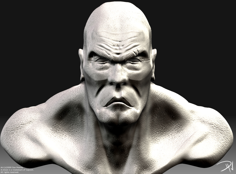
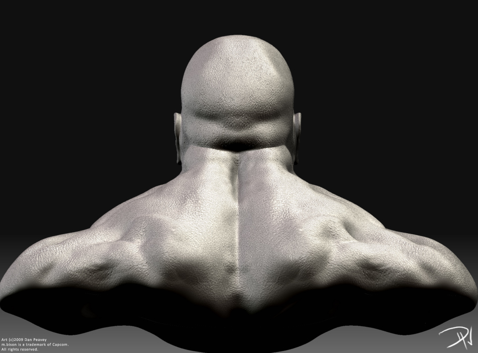
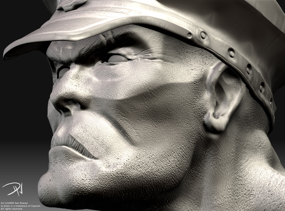
This poor guy got the brunt of most of my experimentation. I have to say, having started with Mudbox to learn the basics of digital sculpting, I am far more pleased with how much more of a complete package ZBrush is. Now that I am more comfortable with it, surely my workflow will be far faster! Plus, the results I’ve been getting so far are just insane. I can’t believe I didn’t grab this app sooner.

C&C strongly encouraged, I really wanna dive back into this piece ASAP and make it stronger!

[attach=127695]1.jpg[/attach]

[attach=127696]2.jpg[/attach]

[attach=127697]3.jpg[/attach]

[attach=127698]4.jpg[/attach]

[attach=127699]5.jpg[/attach]

[attach=127700]6.jpg[/attach]

[attach=127701]7.jpg[/attach]

[attach=127702]8.jpg[/attach]

[attach=127703]9.jpg[/attach]

Attachments

1.jpg

2.jpg

3.jpg

4.jpg

5.jpg

6.jpg

7.jpg

8.jpg

9.jpg

I like the stylized sculpt you have on him. Looking quite cool. I’m sure you will soon be a ZBrush addict :slight_smile:

Solid: Thanks dude! And you can collect the money for your bet already - I’m hooked.

I’ve since ditched the hat as it stands, and going back into the face to fix a lot of issues with the following: labial folds, forehead folds + wrinkles, wrinkles around the eyes, and I’ve been receiving this rather ambiguous critique (which is NOT to blame the critics for - the problem is pretty odd) that the eyes are “too small”. Despite the fact they fit in the 5-eye rule, they still feel small. Part of the issue may be the eye socket and the fat-packet under the eye. Oh well, I’ll sculpt something up.

And again, screw the hat, I’m not happy with it. xD

Snake: Man, you can cash in your bet right now. I’m obsessed.

More critiques are very welcome!

Here’s some updates.

[dPeavey_bisonnew01.jpg]dPeavey_bisonnew07.jpg

Attachments

dPeavey_bisonnew02.jpg

dPeavey_bisonnew03.jpg

dPeavey_bisonnew04.jpg

dPeavey_bisonnew05.jpg

dPeavey_bisonnew06.jpg

I like it a lot, too. Very expressive. I think maybe the brow could come out abit more, though. The whole area around the eyes looks a little bit too sharp in its definition, if that makes any sense.

Neuro: I agree with your observation of the brow. It’s too close to the bone and it isn’t actually making much sense when compared to the muscles and skin wrinkling of the forehead. Also, as my professor put it, “The tert detail around the eye is looking a bit thin – like he’s older than his physique appears, or smoking for 40 years, or both.” I believe there is commonality in this critique with your observation of the eye-area being “too sharp”, and it’s one I certainly agree with. I think I will thicken the wrinkles of that area and see what effect it produces, and also reduce or soften the amount of wrinklage. Thanks!