ZBrushCentral

Battle Chasers - Gully - WIP

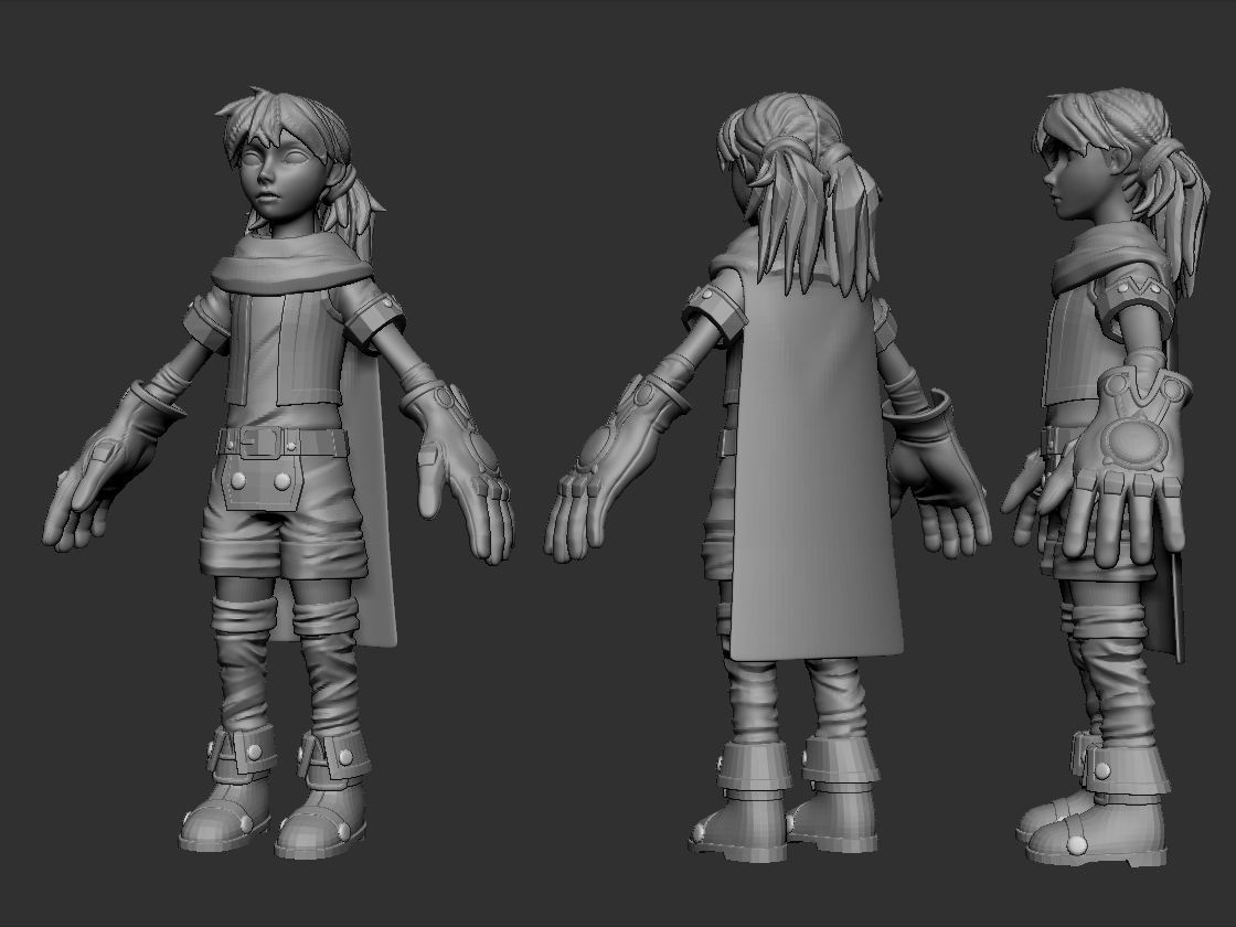
Alright a new side project. I recently game across the comic Battle Chasers and although it had no ending I enjoyed reading it. I’ve decided to sculpt one of the characters for fun and I’ll post the progress here. I’m liking the direction so far but something feels off that I can’t pinpoint. It might be the proportions or maybe the posture but I’m not sure so I’d be happy to hear some input. Anyway, hope you guys like it.

Attachments

DWlHGDe.jpg

Hey nice start you got there. I think she needs to be shorter and the gloves bigger. way bigger :slight_smile:

Thanks nasossa, I completely agree with you. Here’s a tweak.

6csIRfE.jpg

Another update. I think the neck is a bit long but I wanted to show the cloth sculpting to see if anyone had any suggestions for it. (specifically the cape and vest).

I2tEDLE.jpg

I think it looks ok fro stylized stuff ;]
If something that sticks out to me is the hair, a bit inconsistent sculpting, with sharp top, and smother separate parts.

Thanks for the tip slocik. I was actually uncertain about the hair strands. I haven’t sculpted them yet but I wasn’t sure how they’d translate to low poly. I was wondering if each strand should be it’s own object at the end or if I should combine them in to on big chunk or replace them with hair-planes.

Added more detail to the hair and gloves as well as some general cleanup of the sculpt and a color test.

Finalized the sculpt and now playing with colors. The color is just a blocking but here we go.

looks great. I really like it.

Thanks, I’m glad you like it. Here is an update on the last of the texturing I’ll do in Zbrush. I’ll be moving on to the low-poly and final texture touch-ups will come last. I’m also playing around with making a highpoly pose. I’ve haven’t really tried that before.

Been gone for a week so I didn’t get a chance to post updates but I did some low poly work and worked on the highpoly pose/display. The lowpoly is looking a little dull (in comparison to the highpoly) I find and I’m working around ways to make it pop more but I haven’t found a way to go about it. I think the normal map needs to be a bit more prominent. Let me know if you have suggestions.

jU0SuBk.jpg

WLWH4IM.jpg

I just… don’t understand the giant man-hands on a little girl, but otherwise nice model.:slight_smile:

Yeah, the hands are part of the character’s design. I find it helps the silhouette though.

I took the model into keyshot. I rendered out a turntable! That feature is pretty great.

DuPVRE5.jpg

lxiw0Mq.jpg