and the texturing and rendering is so damn solid.
Yeah! the bat’s mask is a little wierd, but that’s a powerful work, congratulations.
Great job bro insane details on the suit.
take care.
Amazing work! Quality and realism is unbelievable!
Wow. I am really jealous. Your are truly a master with zbrush. That has got to be the coolest batman conept I have ever seen. You are the master. I am a student and currently learning 3d modeling and animation. I have zbrush but just at beginners stage. I have along wqay to got to reach your skills. I spend most of my money on dvd tutorials. If you ever released one , I will be the first to purchase
great work! I would love to see this as a full feature movie for batman begins or something like that.
keep up the great work
cheers!
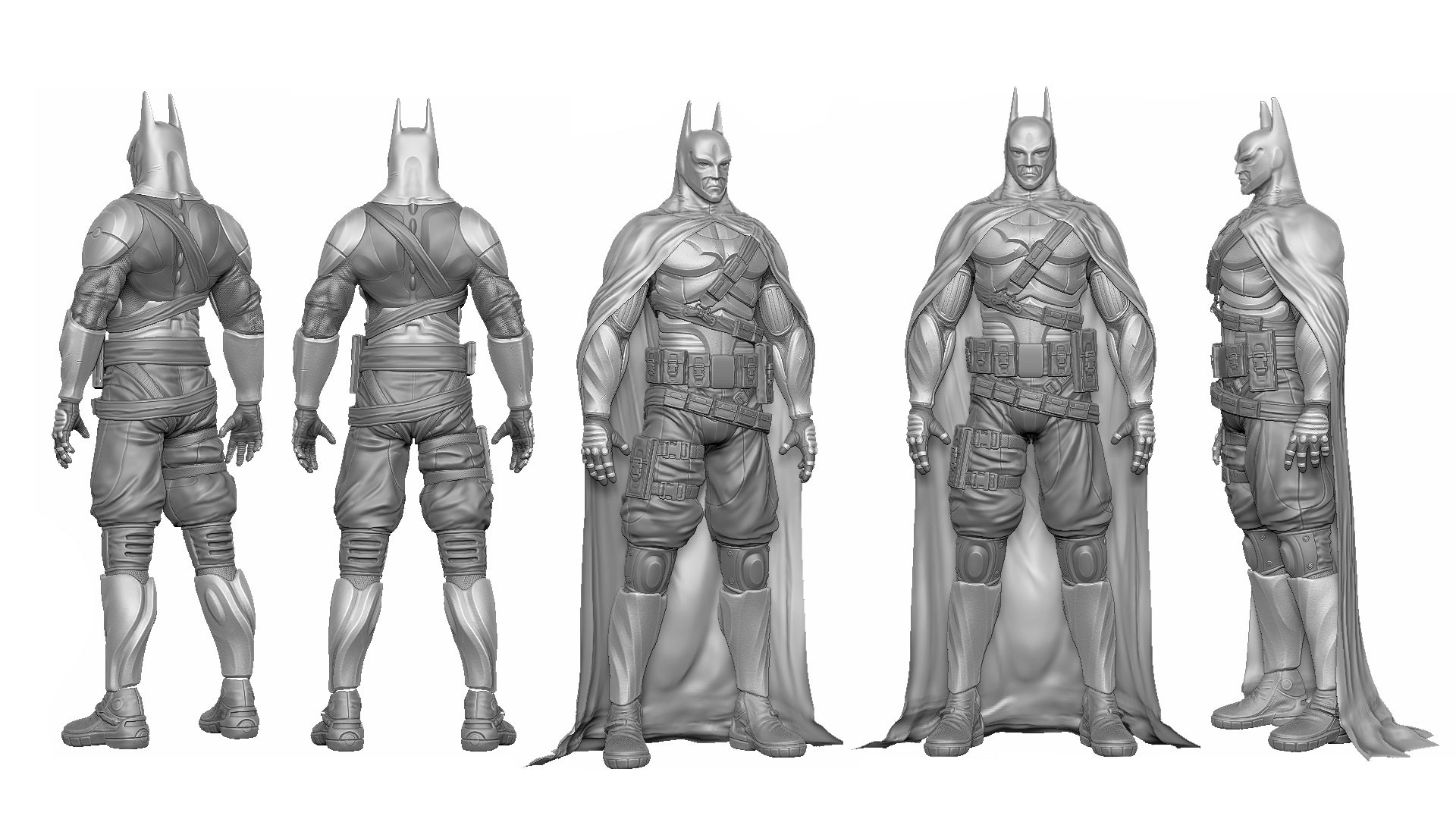
The lower belt seems likely to fall off or at least restrict his movements. The neck and sternoclastoid muscles seems too thick but it might just be the cowl creating a illusion. I think the materials and lighting is great and your chest plate is awesome. I agree the first pose looks good.
No opinion on the rest as it’s not my cup of tea.
I think the comments about the head have to do with the face not being big enough and improperly positioned on the skull. The back of the neck is also a tad thick and tends to give a visual impression of the face extending even further out from the skull than it does already.
ps: I had to compress the image more to upload it, I think after my liquify tweak you can see the point about face placement best on your far right figure (even if my execution is a tad sloppy). The head after the face adjustment could be enlarged slightly. I tried to adjust the face on the others but I’ve only got so much time to make a point 
Attachments
Cool stuff! Congratz on TR 
 .
.
Awesome man, really awesome. Great sculpt, very inspiring and thks for the sharing the Wip’s
WOw thats amazing…i really lik de render and cloth materials…ur version of this BATMAN is lik de combination of prince of persia & batman
Nice rendering!! and detail~~:)
mjolnir: Dont worry man, your critique was perfectly justified.
no offens taken. i posted this so people can tale me what they liked and what they didnt
otherwise is just a “look what i cand do” post. and thats seems meaningless to me.
so thanks for your opinion!
Liquid-metal, rjsmal, Kerem, TAMPA55, d-pan, GX@W, Etcher, sezar, Anand lionking: thank you so much. it means a lot.
and being at the top row it a really wonderfull achivemtnt for me. i ve been wating for having the time to do this for two years.
thank you so much everybody!
her is some composition process
<img src=“http://img18.imageshack.us/img18/4762/compoprocess.jpg” alt=“Image Hosted by ImageShack.us”/><br/>By <a target="_new" href=“http://profile.imageshack.us/user/aridiel”>aridiel</a> at 2010-05-21
Really beautiful render and sculpt. I give you 5 stars for rendering and 4 stars for sculpting. This might be not the best Batman sculpt but still it’s appealing to me. I don’t understand why some people gave you 3 stars!
Yeah, for sure this is a 5 stars work, congrats man!
AND IMO, the ratings should only have the “5 stars” option,
So people would only vote for those works that they really think is top noch,
And it would not allow for people who just what to bash other members work
to vote for like “1 star” and totaly distort the average of the ratings,
It is really ridiculous for this thread to be “3 stars”
Just my 2 cents
Cheers
excellent work!!!
btw =) we speak the language of art here. no corrections needed.
when I saw this the first time I thought in the first moment, hey great pose materials and lighting… and … model…?..but the model itself fades into the background. the materials are very dominant and overdraw the lower quality of the model.
I don´t like the model itself without materials. the idears are great. but the details and execution are bad. the head is definitely too small. and for me it seems not to be intended. the face-design looks not real. the proportions are a little delayed…
and everything seems to be modelled with mouse (without tablett). as it would be a rough model and not finished yet.
material small_orange_diamondsmall_orange_diamondsmall_orange_diamondsmall_orange_diamond
light small_orange_diamondsmall_orange_diamondsmall_orange_diamond
pose small_orange_diamondsmall_orange_diamond
model small_orange_diamond
I really like the accesories, materials and rendering, but for what i know, the anatomy is wrong, not just the face but the arms, check the triceps muscle is very low for the realistic attemp and the overall pose is a little forced, but i should say it again, good work!
hey where did you get those Teflon/ carbon fiber textures from?
did it in photoshop. mixing some rust textures and geometric shapes.
everything you need can be done mixing textures that you will find searching images in google
cheers