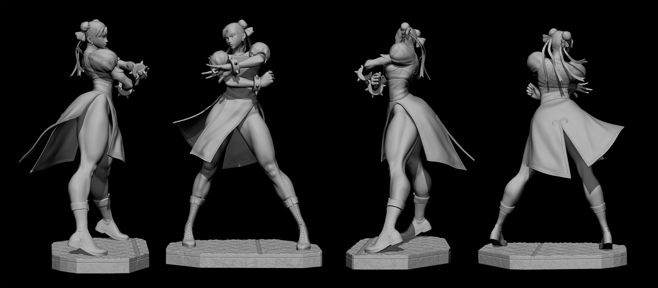
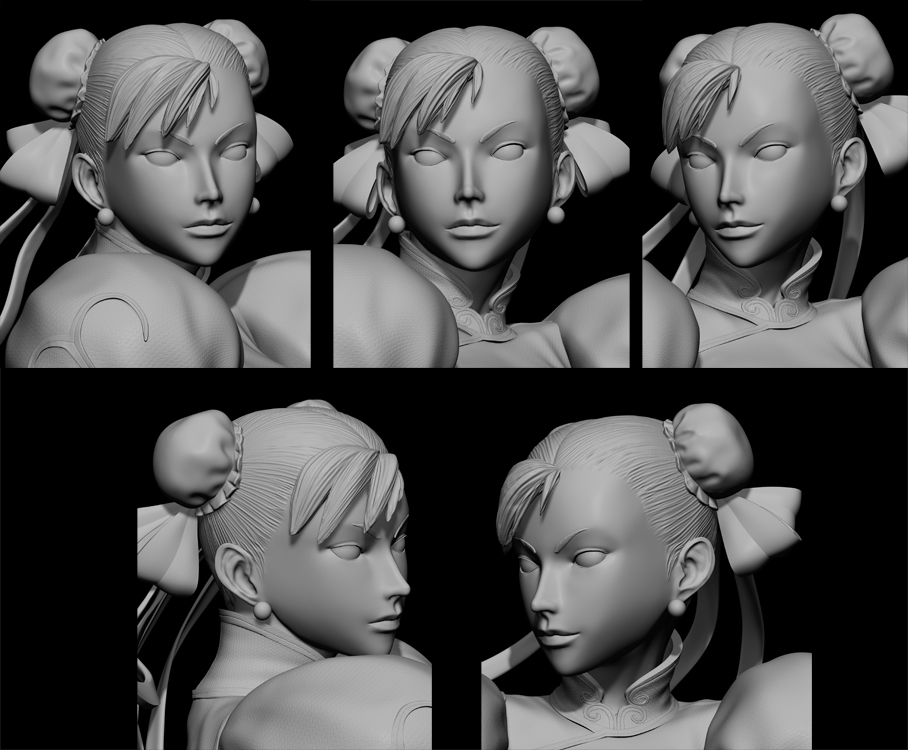
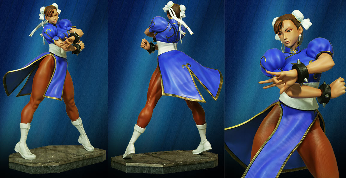
Marvel vs Capcom 3 Chun-li 1/4 statue
Art Director: HCG
Printed: Ownage
Paint Master: Fred DiSantos

Thanks for watching
Attachments
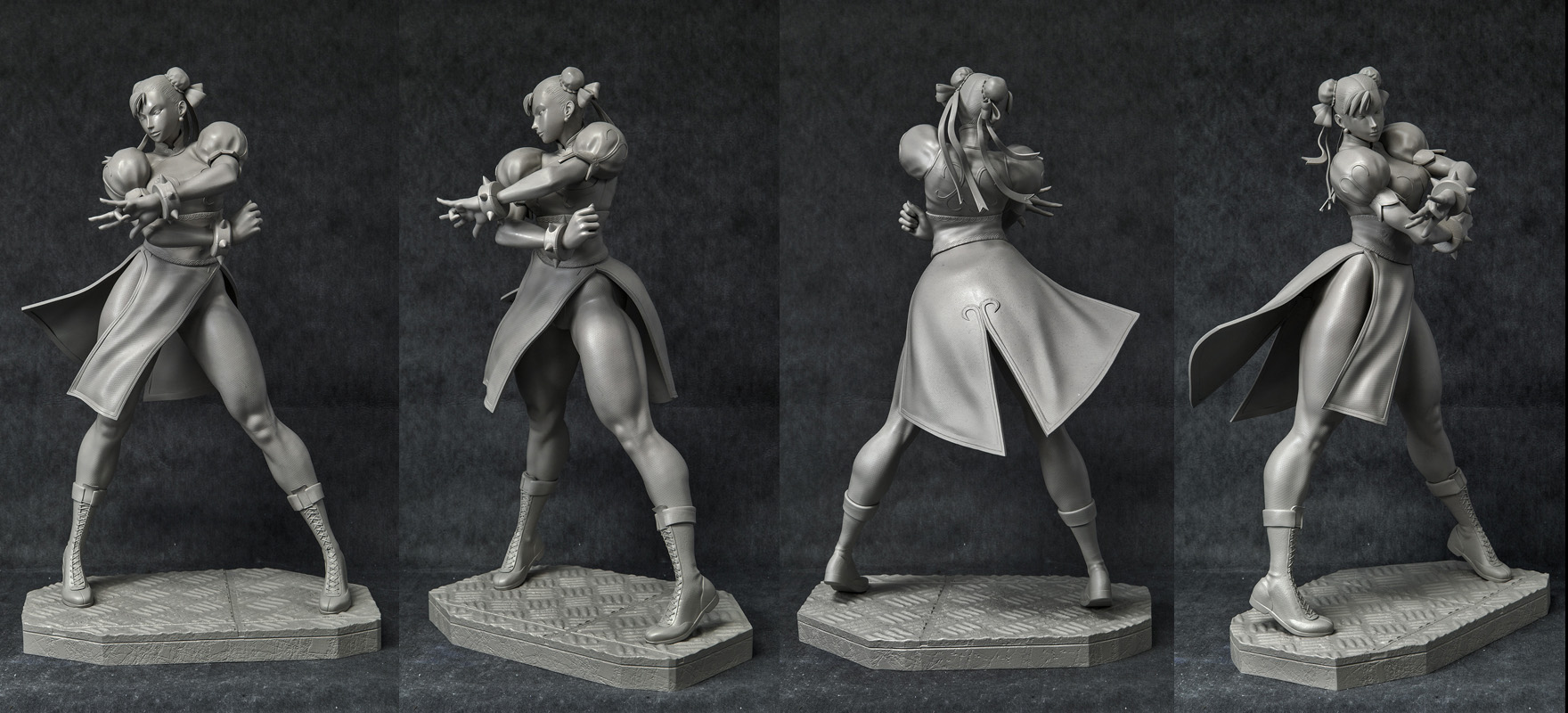
Marvel vs Capcom 3 Chun-li 1/4 statue
Art Director: HCG
Printed: Ownage
Paint Master: Fred DiSantos
Thanks for watching
great model!
Looks like she is Shooting spiderweb…

Jake
Lol! Thanks Jake! blame Capcom for the pose!!!
Now, I have re-rendered these pieces playing around with zbrush features and then some photoshop effects, I am not looking for a “real look” but an “illustration look”.
Comments/ Critics/Suggections/advices about the renders are more than welcome. Consider I don’t want to leave zbrush to do the renders. Thanks in advance. Anything is welcome!!!
and two more…


Thanks
Hi,
from my point of view all of these would look better,
if the background color was somehow present in the
lighting of the figures.
J! Thanks for the input: I am planning to have all of them with the same background according to the faction they belong, so what if I use a non textured background? a standard back as the ones you can see in my first post in this thread when I first showed my first design?
I’m still learning how to comp passes in PS as well. I personally like the textured background, but I agree with jmeyer. You could adjust the color balance on your light passes to match up with your backgrounds.
You are refering to the colored ones,right?
Same thing there,it’s more about the color mood than the texture.
Our brains need something of that color mood on the figure to
accept it as integrated.
So a colored rim light or a lightcap material could be a solution.
Or painting it manually in postwork.
Awesome!
J! Got it!!! Thanks a buchn for the afvice!!
Synn! Wil try to do the Color balance tip! Thanks
Asec! Thanks, glad you liked them!
Keep on zbrushing
A
Three more renders, some tweaks here and there and I am almost there…
Comments/suggestions are welcome


good,
Looks very good to me bud. Really like the coloring you went with for the background.
Definitely an improvement.
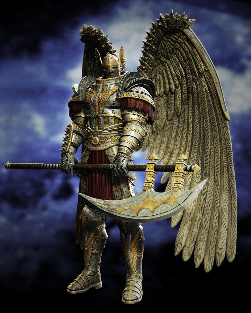
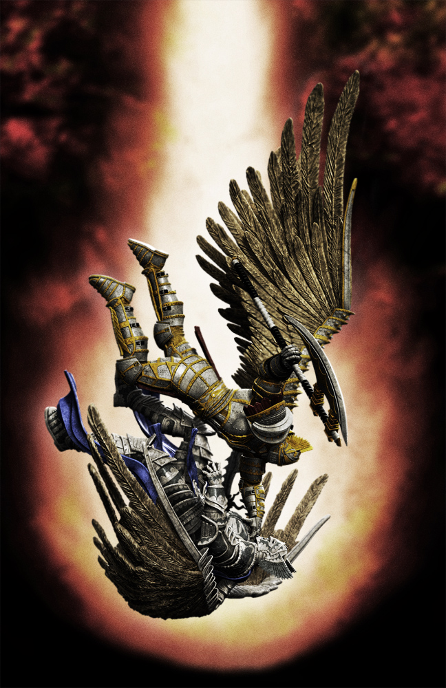
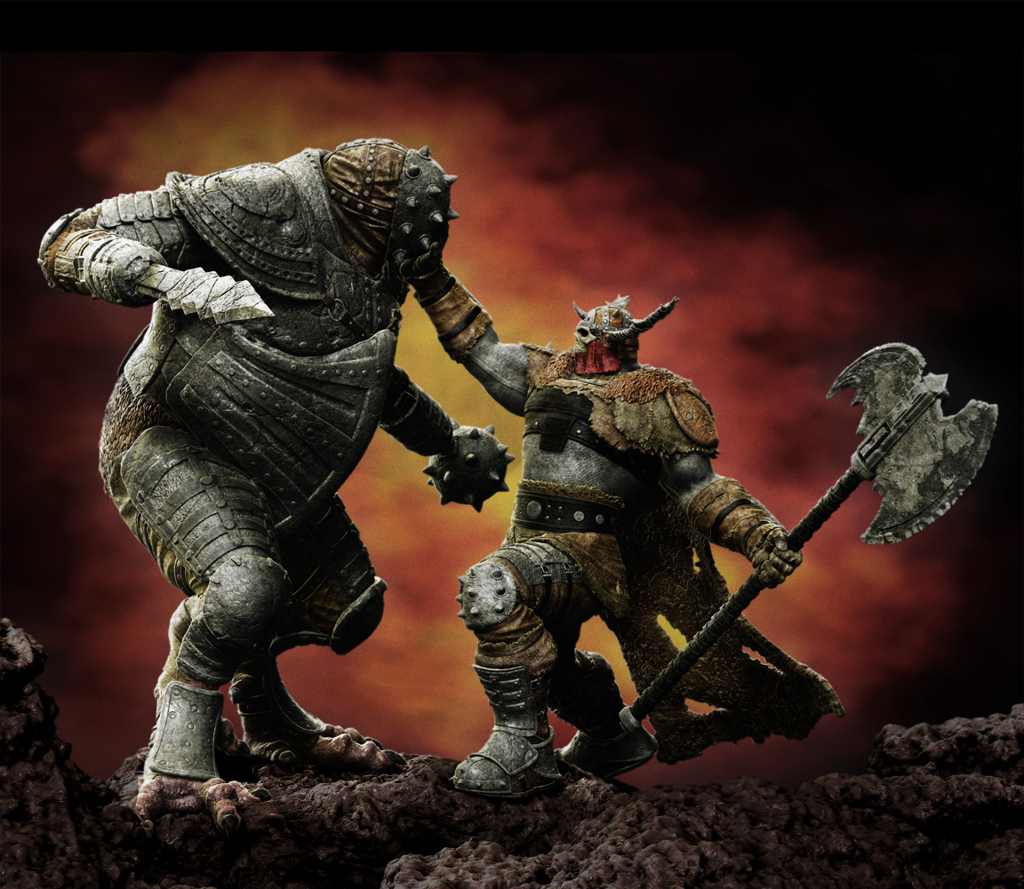
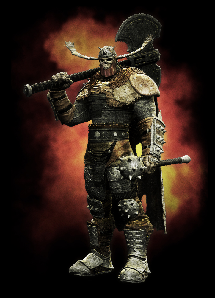
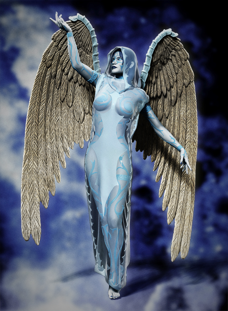
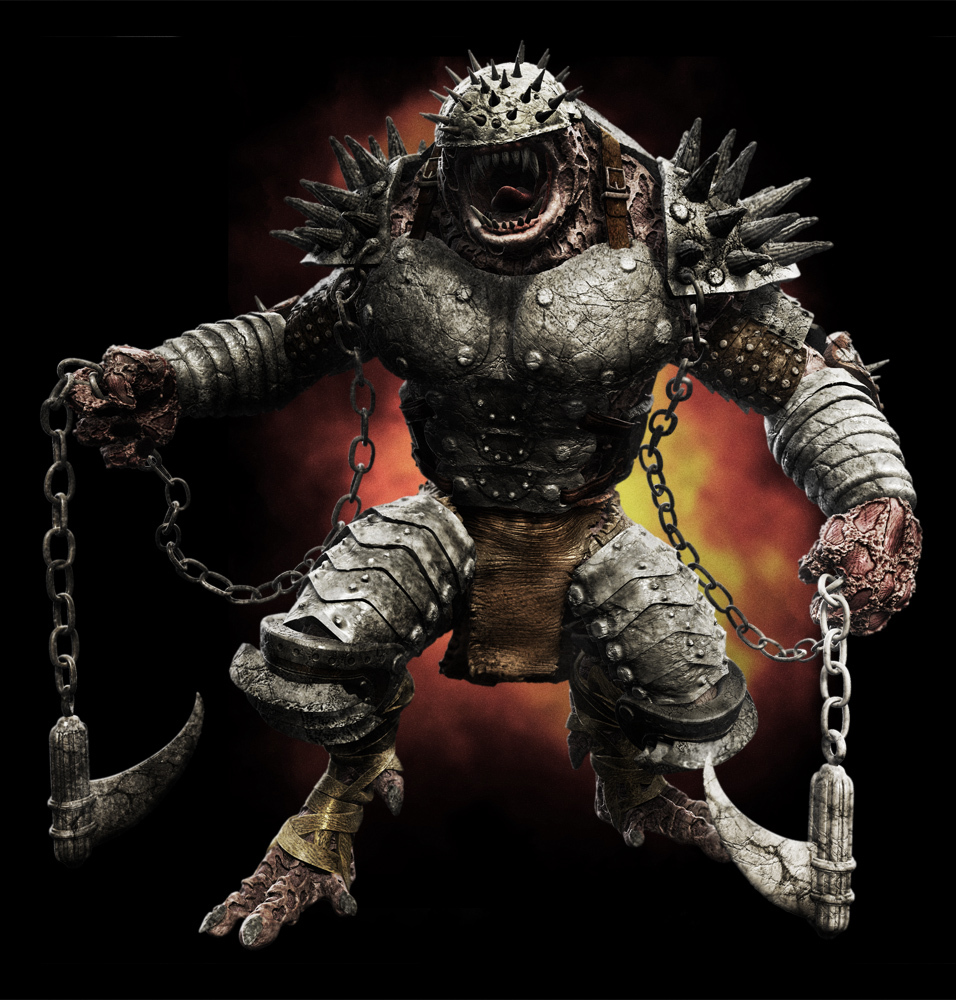
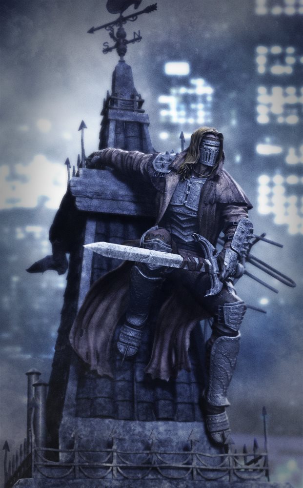
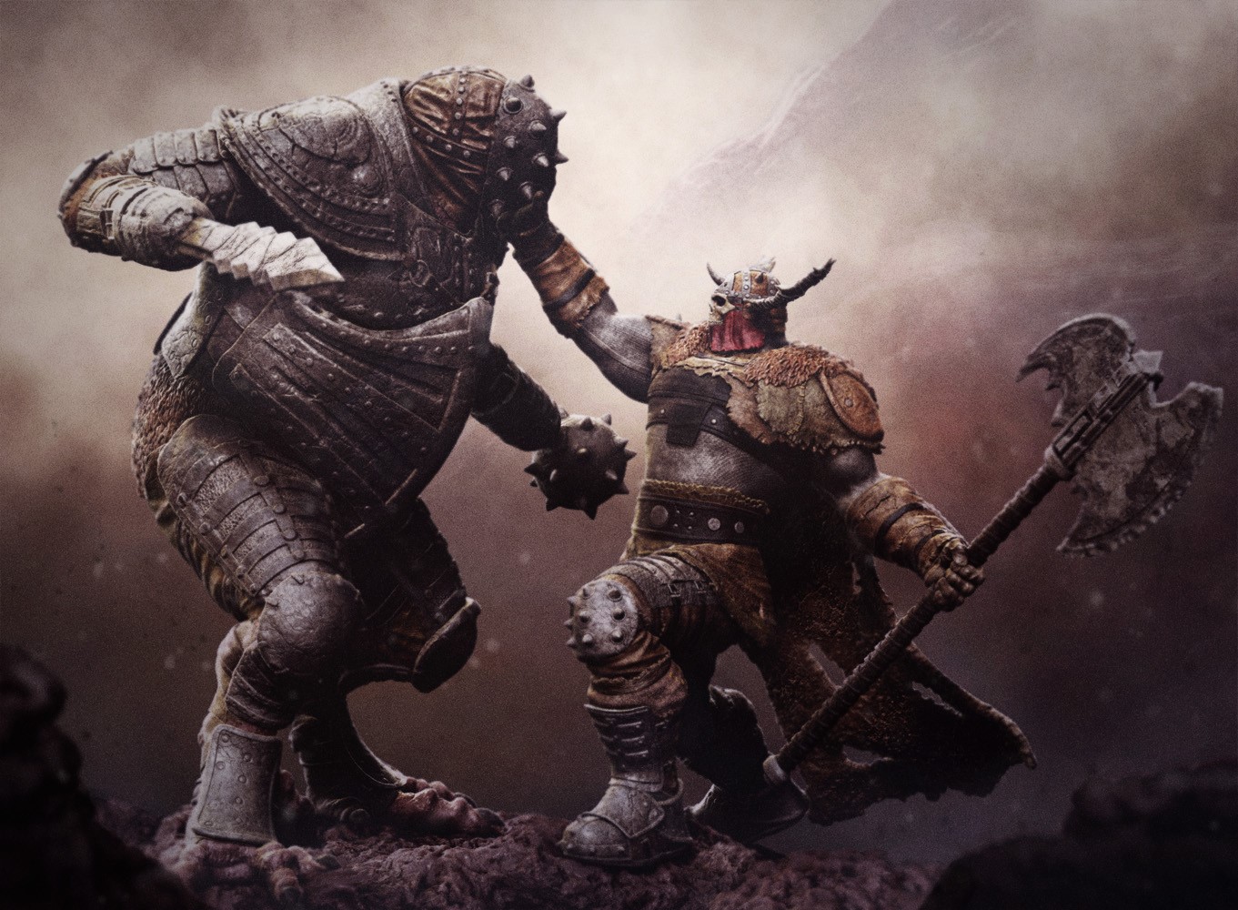
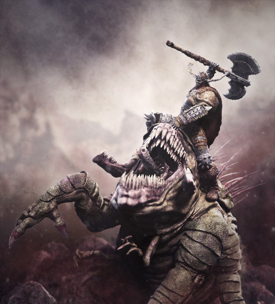
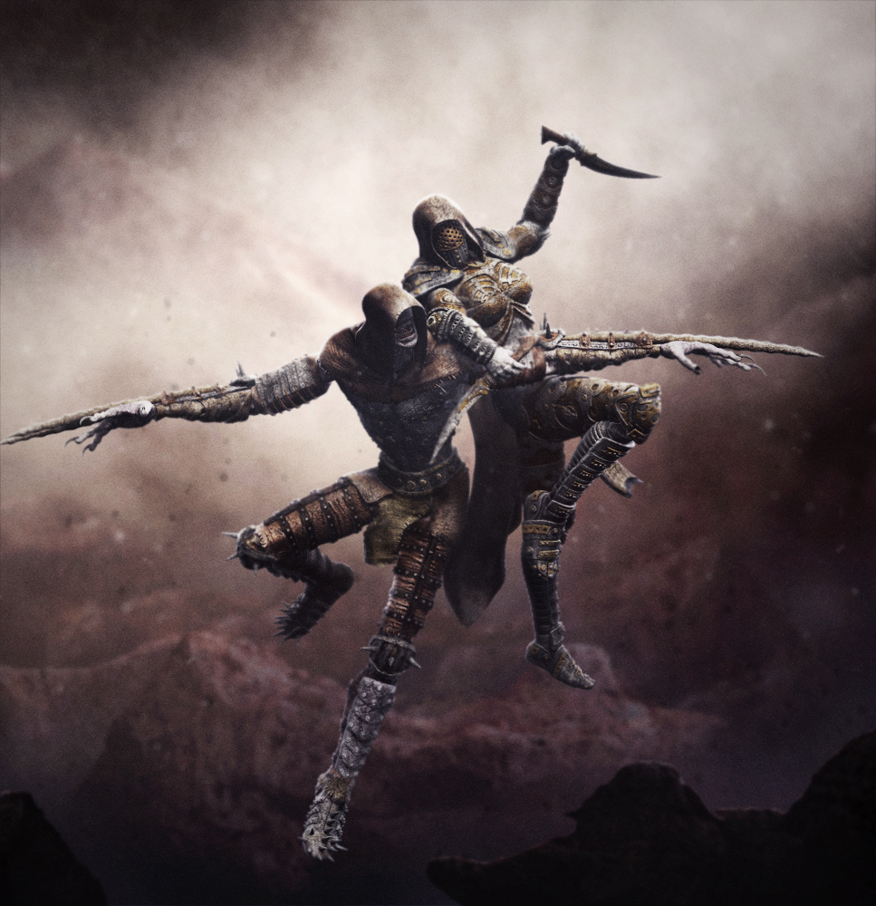
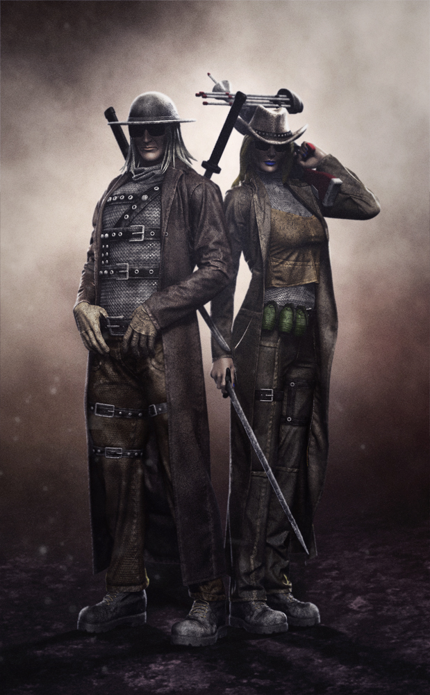
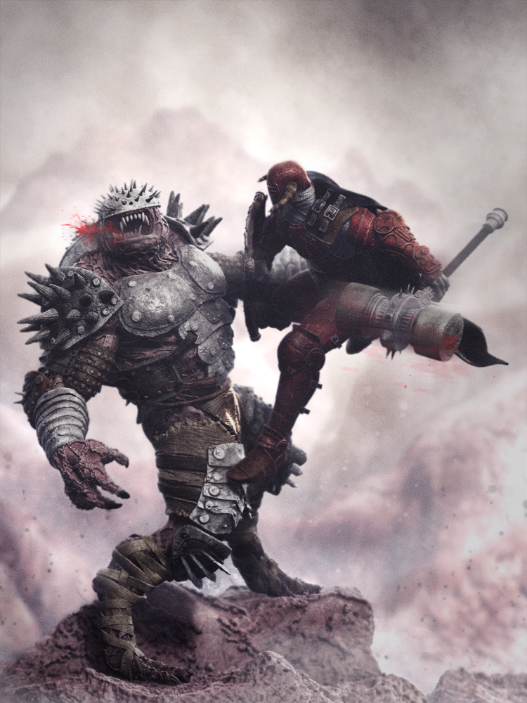
Thanks all for the comments! Really glad you like the improvements… here are a few more, this time with some enviroment development… So far I have posted test renders from the Cleric standing, The Deacon and The Vicar improved. now lets give a shot to the Cleric figthing, The Deacon on rooftop, The nun and the Vicar figthing and two more hunters together: The Preacher and the Abbadess… comments/critics, advice are welcome…
like those,
Awesome work in here! Especially the last few images, really inspiring designs.
awesome Work!! oO
i love it!
Last pices getting better and better. Also you renderings are quite impresive. Any word about that?
Looking very awesome Alterton! Anychance of your render pass breakdown?