ZBrushCentral

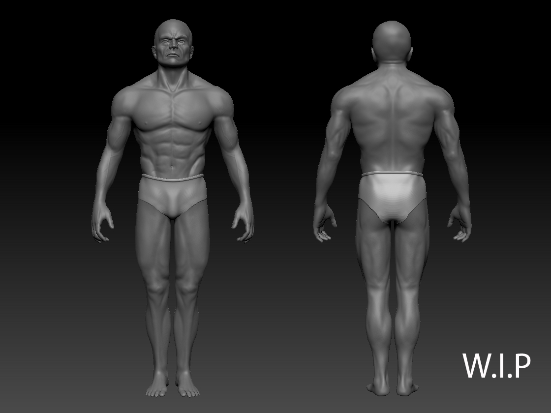
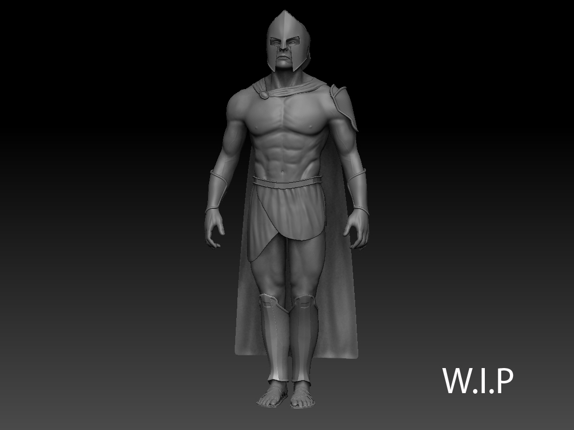
A warrio from 300 (my first post :) )

Hi, i’m new here, but i follow ZBrushCentral for 2 years.
So i have decided to post some of my work :slight_smile:

It is a warrior from the film 300.
It is still a WIP.

I havn’t start to scult the armor, but the body is almost finished .

Any comment is welcome :D.

[spartiate%2001.jpg[/ATT]%3C/font%3E"][ATT=]spartiate 01.jpg[/ATT]](http://%3Cfont%20color=%22#9A9A9A%22%3EATT=)
[spartiate%20turn.jpg[/ATT]%3C/font%3E"][ATT=]spartiate turn.jpg[/ATT]

Attachments
spartiate 01.jpg

spartiate turn.jpg

Hi.
Here a render of the warrior.
Done in 3dsmax in mental ray.

Any advice are welcome.

this is not too wors for your first post…allot the guys here are going to rag you on the things i am sure you know are faulty n stuff but keep at it…good one in my book

I quite like it,

One thing that seems to spring out at me as being ‘off’ (i am an absolute beginner myself by the way) is the left hand. Specifically the fingers and knuckles, the angles of the fingers in relation to their position on the hand makes it look to me like a guy with dislocated fingers.

Thank you for your advices, i ll try to do something about his fingers.

Here a picture of his head.

tete.jpg

Before you do that id get a second opinion from some of the more experienced guys around here, like i say im a complete beginner. It’s just something that i noticed looked a little off.

was the 1st thing i picked up on was his hand…and the lighting can be a bit more open for now so we can see the model details…i still like this one

oh and the joint (bend at the elbow is a bit off too)

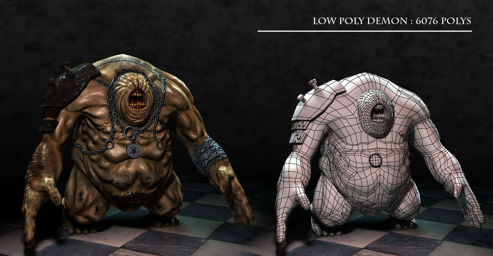
I have done a low poly version of the character.
He has 7200 polygones.
This is the picture

Trancegenix, you think that the light is too dark?
I was thinking that i ll make a darker light for the high poly :D.

Anymay thanks you for your advices.

Hi,
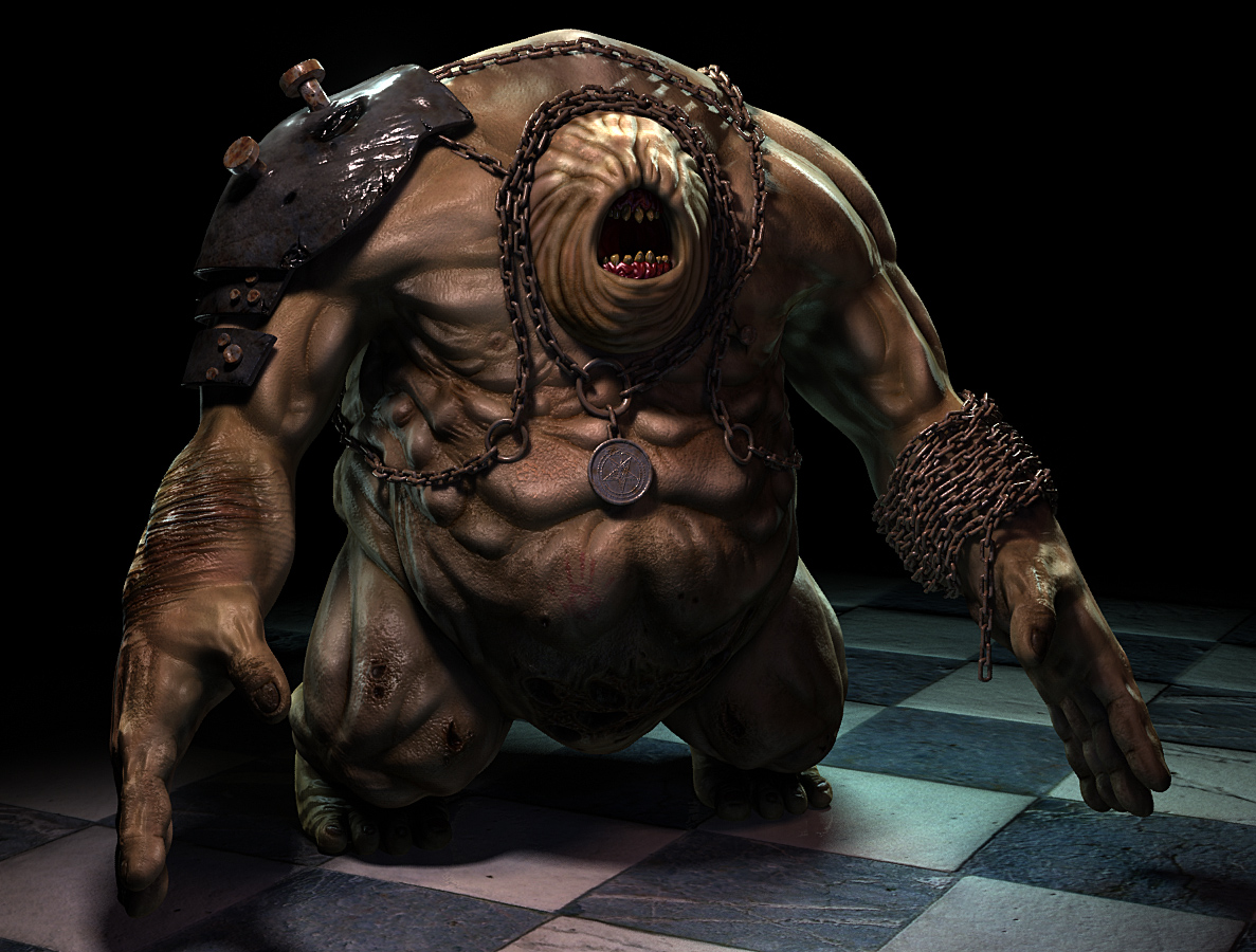
This is my last personal work.
It is a demon inspired by darksiders.

I have used mental ray, zbrush and 3dsmax.

I have done the rotopologie with Topogun.

I hope you ll like this.

Any coment and advice are welcome ;).

Monstre HP CG.jpg

The weird creature looks pretty cool but I’d say the chains are far too shiny, they need dimming down and rusting up a bit

Agreed. Same goes for the skin and gums in my opinion. It’s really cool but could use some more detailing especially on the texturing side.

Good job though!

I love the material used on those chains! Along with the bloom effect they looks really cool. the chains with the pendant also have a cool mother of pearl metal effect. both are very neat. But i do agree that it doesnt go along with the monster.

Nice creature…Maybe put a little weight in the chains, so they appear to hang instead of float…nice sculpt

Thank you for your advices :+1: .

I m doing a LP version of this charater, when it ll be finished, i ll try something more rusty on the chains.

chiines too shiny and all metal parts, skin too reflective, side chains are floating in the air, his biceps are too short, thumbs too short, bend his fingers, give him longer fingernails, more skin folds on legs and around top part of mouth, a lot more. Chains could be at least 2x bigger maybe even 4x. Cut the chains around his neck into his skin. Pronauce the place where he would have eyes, with soem bones sticking under them, as if the have grown over them Give him man boobs.
All i got, i think its going in a good direction, but you can really push this model, it has a lot of potential. ;D

I have changed the chain’s texture and put more weight on it.
But i prefere the first version (for the texture), with this on, i find that the picture is too smooth, there is not enought contrast…

Test.jpg

Slocik, Thank you for your advice.

Attachments

LP Planche CG.jpg