ZBrushCentral

A new head

Hello.

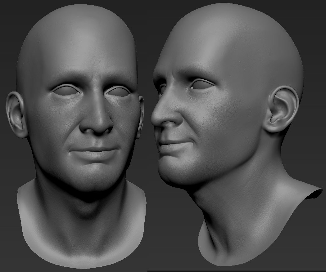
So, I started a new model since the previous one wasn’t too good, and I didn’t want to improve it over and over. I’ve spent 3 days on this one so far. Hope you like it.
ps. the skin details are barely visible for now, but they’ll pop up more on the displaced low poly.

[zbrush_2views.jpg]

nice head man , i like it :small_orange_diamond:

rabieart - thanks, your models are awesome as well. :+1:

Hi. So here’s the latest render. I’ve been working mainly on the shader and lighting. It still needs some tweaking though. The funny thing is, the sss2 in vray has relatively few settings, but it takes ages to balance everything together. :wink:

 Hope you guys like it. ;) Cheers
 

 [head2_render5_thumb1.jpg[/ATT]%3Cbr%20/%3E%0A%3Cbr%20/%3E%0A%3C/font%3E"]

](http://%3Cfont%20color=%22#9A9A9A%22%3E[ATT=246232)[head2_render5_thumb1.jpg]head2_render5_thumb1.jpg

[![head2_render5_large.jpg|682x1024](upload://eG9jPKQtiL2eHuZAt3U5KVKMmJz.jpeg)]

Awesome work on the shader. I think the thing that is making it look a bit like silicone is the reflection/spec map.

In reality silicone has an even and perfect unified reflection/spec all over, but human skin is a bit more organic and has a cross shaped high gloss area (usually) .

So I think that is the thing that is missing to finalize this. (especially the refl/spec lower down the neck and I think under the eye, it varies I know, but I think it would benefit from this)

Hope this helps. I love the fine pore work and the eyes:cool:

I totally agree with koyima, with some spec tweaking it will be even better then it is! Good job.

haha love it, though if you can make it more than just a photoreal head study, Id be really impressed as an artist

Thank you all for comments. I agree about specular. I’ll get right on that.

koyima
- what do you mean by “cross shaped high gloss area” ? Could you please show a picture or something? :wink: Or maybe describe it more precisely? thanks :wink:

Hi again.

So, I’ve finally managed to finish the shader and the eyes. I also did the hair and some clothes. Now I’m working on the composition, but I think the clothes and the hair still need some work. Im also wondering, which of these two versions I should use as a final picture. Maybe you can help me with the choice. :slight_smile:

Cheers

[composition1_portrait2_thumb1.jpg]

Looks good, but I actually think the skin looked better before this latest render. It looks too bumpy now, like it has some sort of skin decease on his cheeks.

You don’t see a lot of models like this, that aren’t super heroes or beautiful women. Usually the male faces are very rough looking (in like a gangster, or criminal sense). I’d smooth back the face a little bit again unless you want his cheeks to come across lumpy.

Good job on the hair! I might suggest giving it a bit more body but people do have hair like that so it’s not unrealistic. I think it would just look better with a bit more body.

Keep it up!

Gloss cross is the shape that is created by the most usual high oil (and gloss) areas of the face. This is where gloss is more than the rest of the face usually.

Attachments

cross_gloss.jpg

Also nice renders. I would go with color. Black and white suggests you didn’t get the color version correct (that’s how I see it, cos that is what I used to do).

One more thing I think looks a bit off is the forehead wrinkles. I believe that people might have them, but I think other wrinkles might look better.