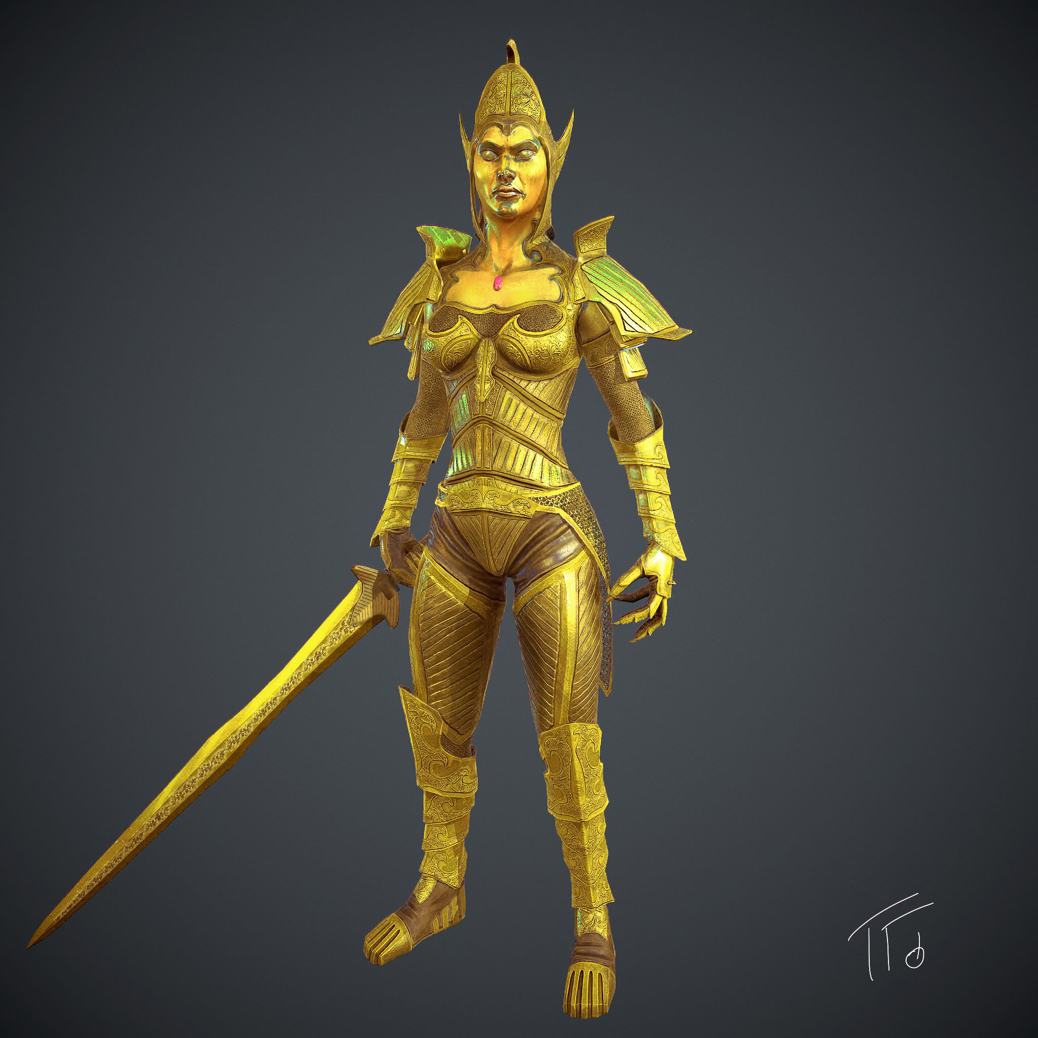
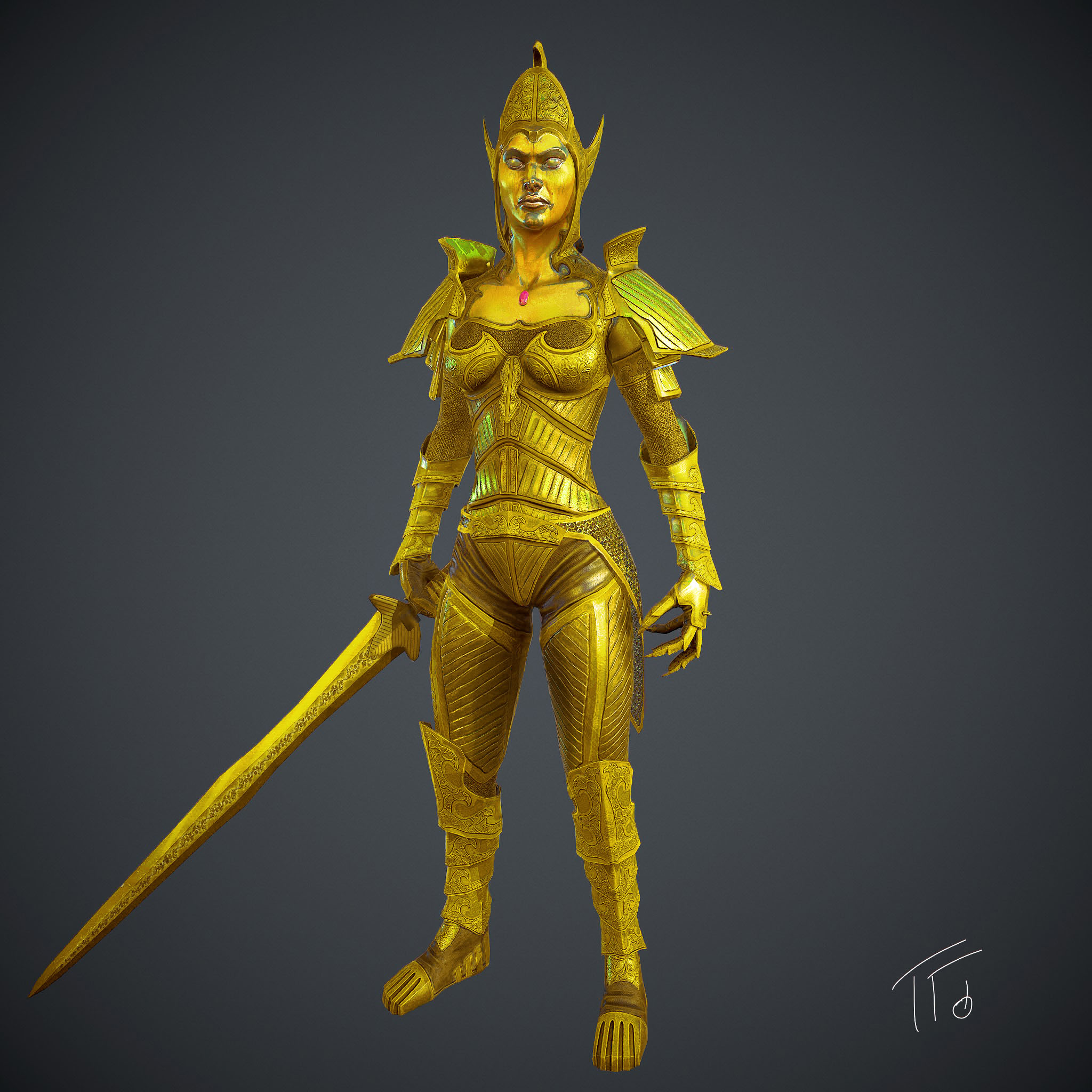
Wow! Great work. I can’t tell you how many of these lovely daedra I hunted down to fill soul gems 
This is a great take.
I’ll offer some critique on the color and materials, and then the topology.
The color and materials are just a personal preference as a Morrowind fan.
The topology comes from my experience as a character artist.
For the color, I would brighten her up. More saturation. A bit less red in the color to make it read as gold instead of bronze.
I would make certain areas more polished and higher spec, and some less polished, to help all the detail you’ve put in it group well, and also stand out.
Just specular changes can make a huge difference in the way a model reads.
Surface differentiation is a key to making your work look professional–and you’ve done that with the chain, versus plate, and the wear on her face where the plating has come off.
In your render, I would always kill the black shadows. I trained as an illustrator, and I hate black shadows. They almost never exist, unless it’s night. And black and yellow make green, so your black shadows were turning your gold green, and killing the vibrance of it. I tinted them red and brightened them a bit, to make the gold feel shinier.
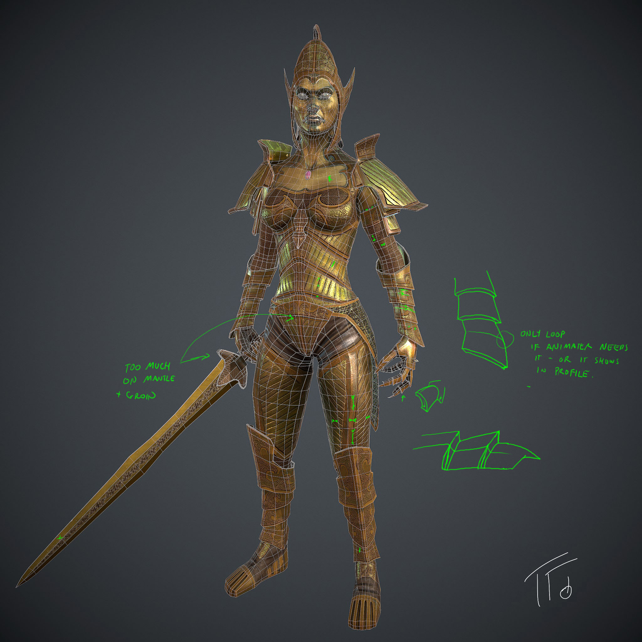
Now, for the topology, I’d be happy to edit the actual model if you trust me with a copy of it, and sent it back with my 2cents on edge loops to collapse and rings to remove.
You can get a feel for what I’d look to edit out in the green lines on the attached jpg. It’s a quick and dirty note on where to start.
The basic rule is, don’t leave the geometry in if it doesn’t change the silhouette anywhere, and if the animator doesn’t need it. So, you need some extra loops around joints that don’t give you much form, but they’re needed for animation. But for instance, the loops you have around the the different levels of the forearm armor don’t do anything for you, except bloat your polycount.
If this model is more than 10k polys, it’s way too high.
I’ve worked with modelers who started in the “next gen” age, when you had 10k polys for a main character instead of 500, like I used to have (get off my lawn!); and some of these guys don’t get that every poly counts, even if you have 10k in the budget. The game as a whole can only push so many, and the polys you waste on your character could be plants or flapping cloth, or anything else that the player will actually see and enjoy.
What you can get away with depends on the device you’re putting your character on, the engine, and what else needs to be on screen at the same time. If this is your main character on the PS4 for a 90" tv, maybe you need these polys. For an iphone, you’ll never see the difference if you cut out most of this geom. For a portfolio, I’d go with the leanest model that still looks amazing. Don’t cut out loops that make a difference, but don’t keep the ones that don’t.
The exception here, is if the animators absolutely do not want triangles around the joints. Sometimes their rigging tools need quad loops around eyes, mouth, elbows and such.
Thanks for sharing this model! And sincerely, I’d love to optimize the model to show what I’d do with it if I were your lead.
Cheers!
Attachments


 I really appreciate!


 small_orange_diamond