You are on a good way.
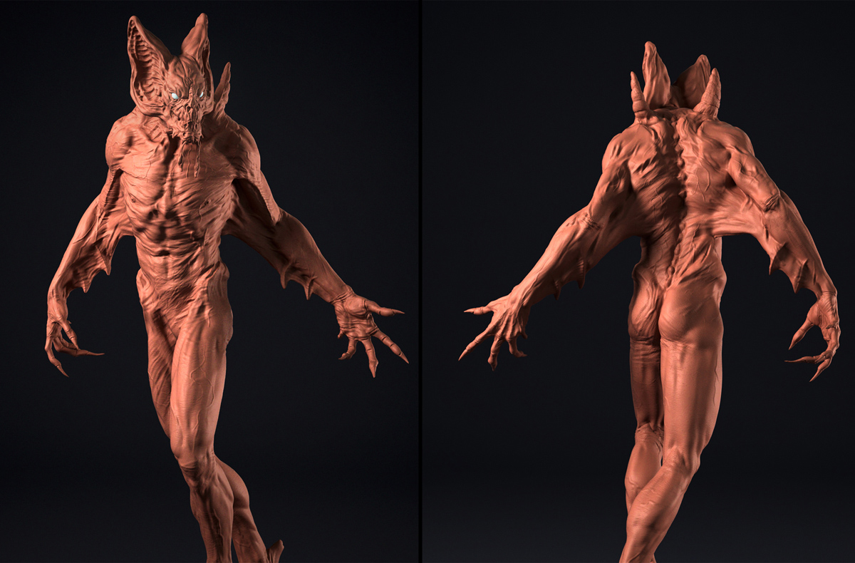
My crit -> Overwork the upper skull.
Everything over the eyes is to short.
Not the forehead only.
Could be one third taller.
Good luck!!
You are on a good way.
My crit -> Overwork the upper skull.
Everything over the eyes is to short.
Not the forehead only.
Could be one third taller.
Good luck!!
Thank you all!!
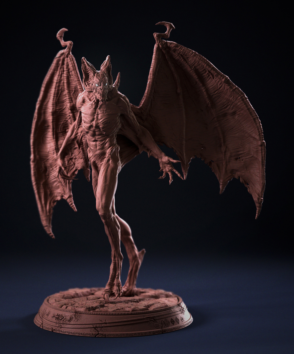
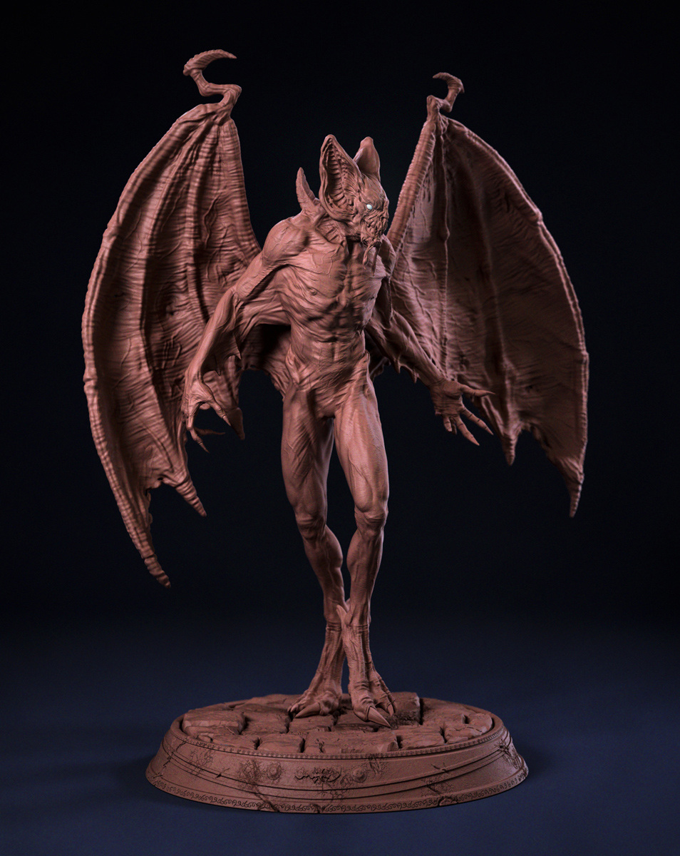
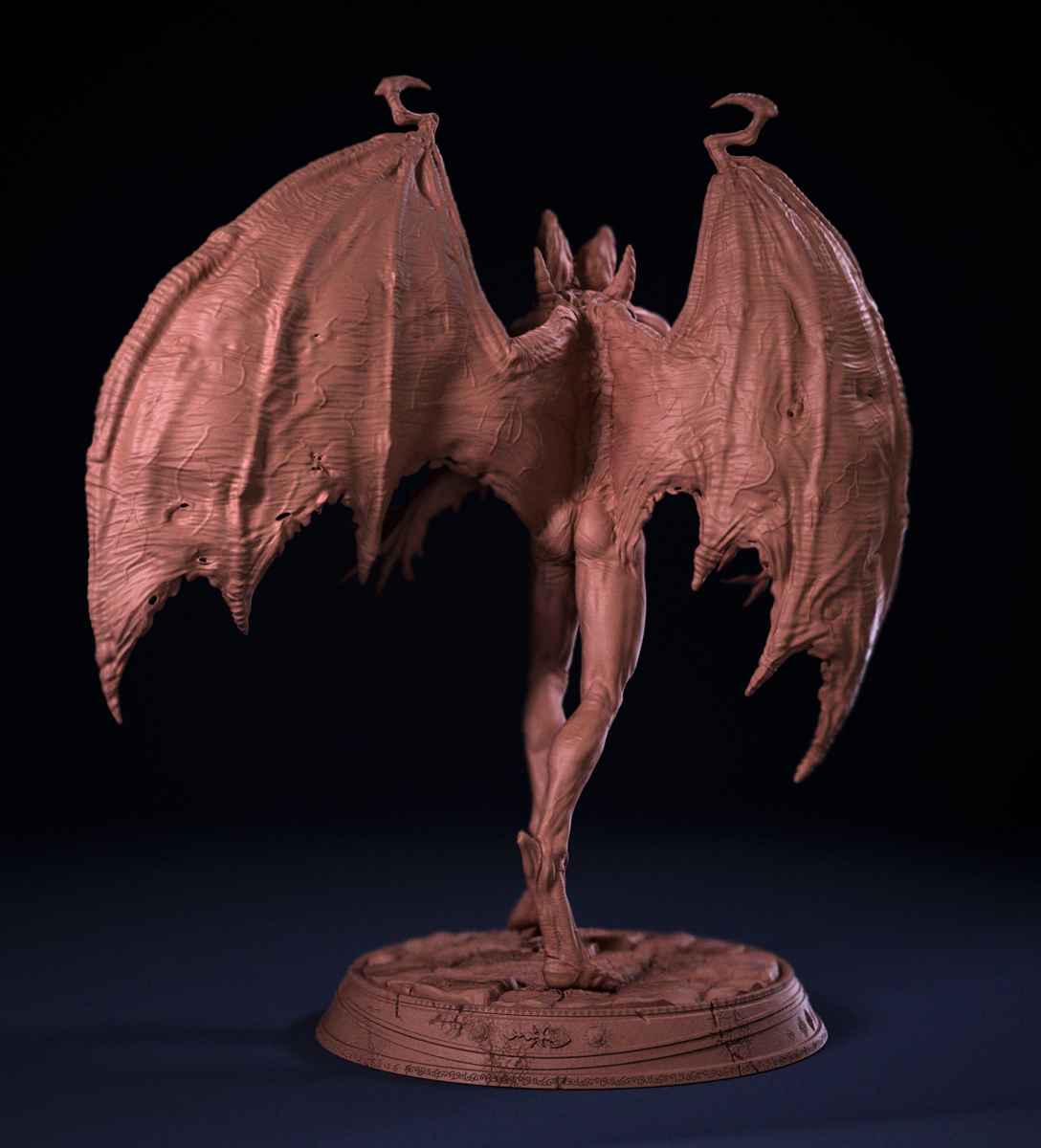
Hi, this is a model that i did for Carlos Huante’s Cghub Contest, link for voting: http://cghub.com/forum/showthread.php?t=14078, here is some pics:
outstanding!
(voted for you  )
)
Love it I participated as well in this contest very nicely done. Good luck With this piece.
@arctech - thanks a lot my friend!
@nassosa - thanks for your words, by the way, your model is really cool!!
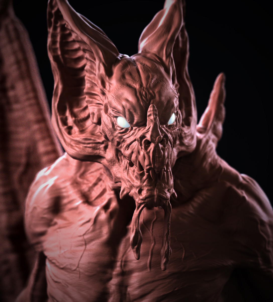
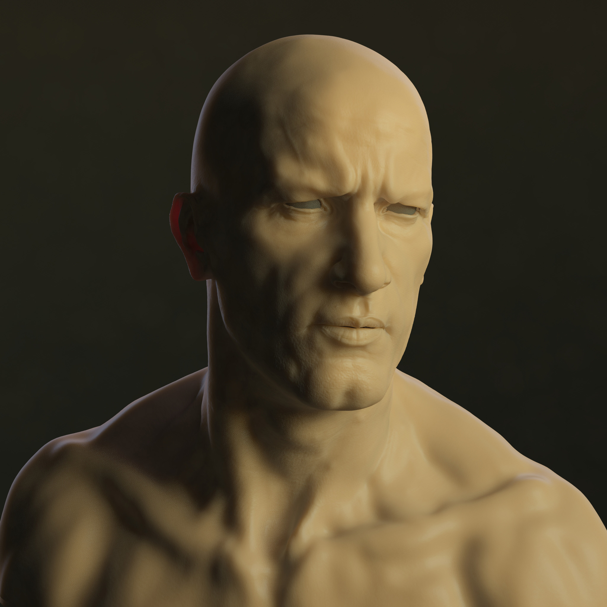
here is some polypaint study i did last night:
Wow love the bat creature great design…!!!
As for your likeness piece( thomas jane) great work as well …I think the relationship in the mouth are are off however
@renisance_x - thanks a lot for you feedbeck!! i tried to ajust it, i think was because i sculpted him with a open mouth i little bent.
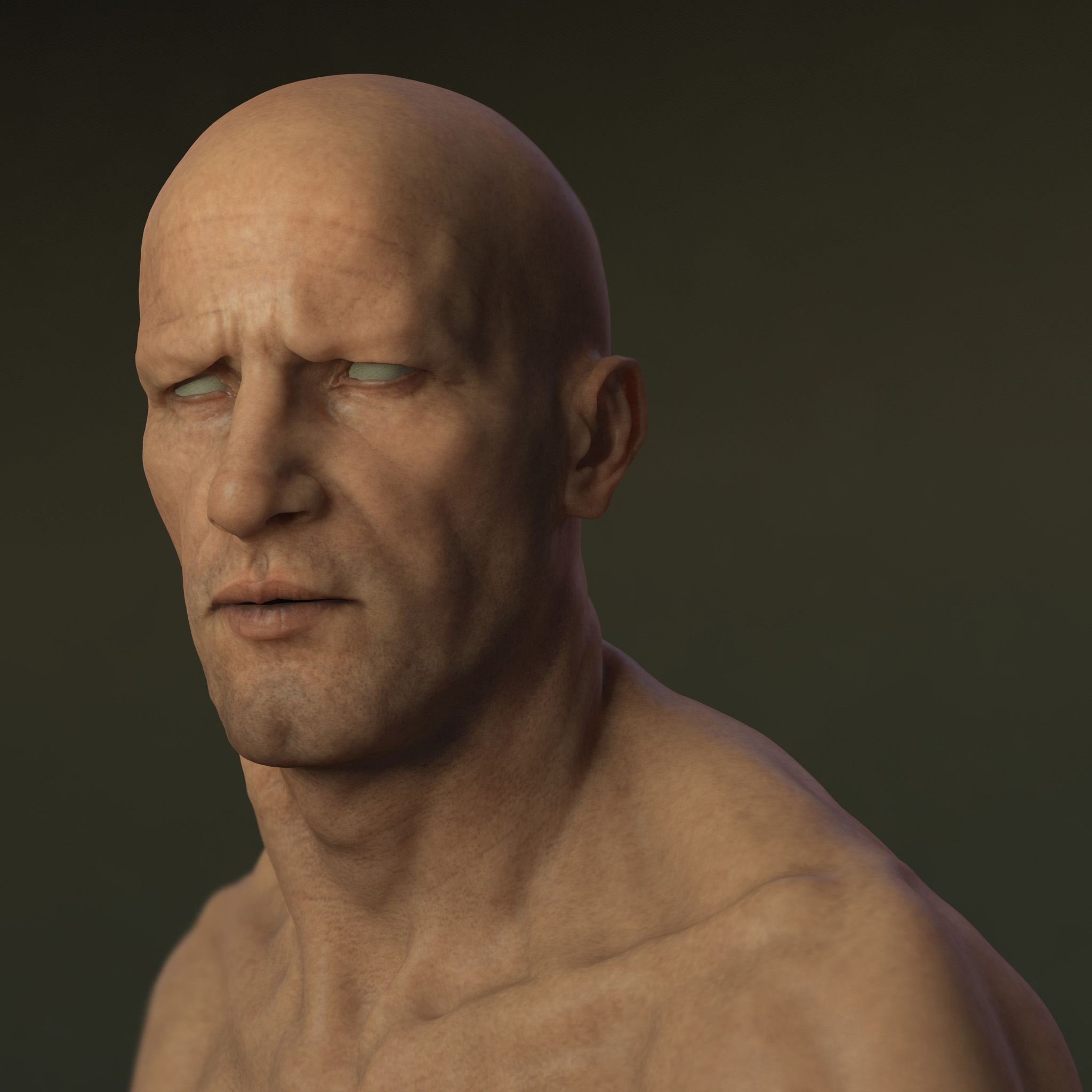
update with skin test:
very nice work 
Excellent work.
Hi, not to sound stupid, but how do you attach a big image, as every time I wanted to upload a huge image, it says image too huge.
Great work !
@Ray’s spirit - hey, thanks!
@pkd - i just down the quality of the jpg to be below the 500kb and then i uploaded.
@Philuxius - thanks, my friend!
@tomaszlanski - thanks, a lot!
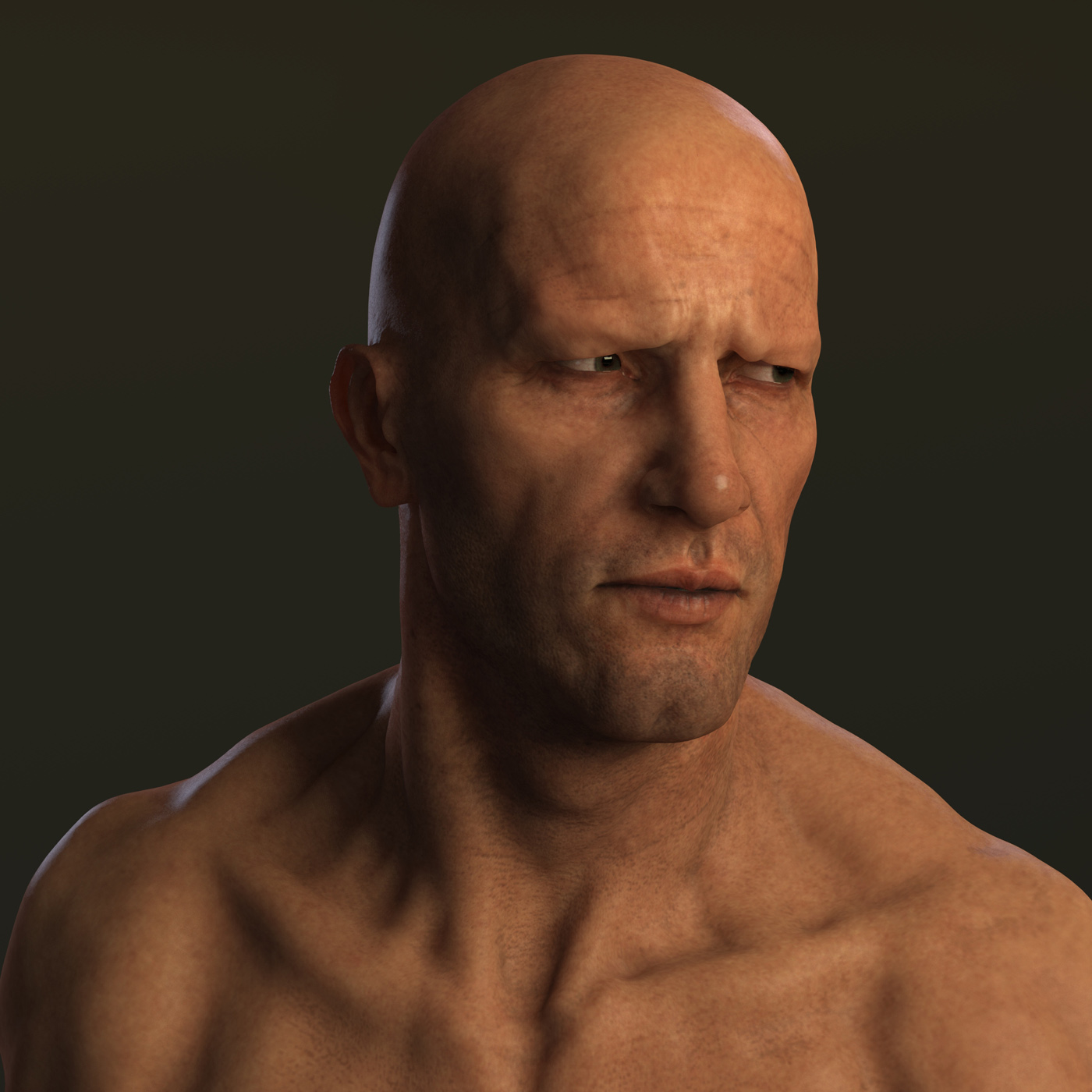
little update with mapping tests and lighting, still lookin like latex, critics are welcome:
Looks great, really a lovely portrait. 
Cheers, David
Talk about big. Anyway, thanks for the reply. I guess my image have too much color, hence the issue with uploading big image size.
About the image, I think the tearlines under the eye can be more smooth. A lot of areas, like the collar bone have a slight wavy surfaces. I think this could be due to too much sculpting work in the high polygon division region.
Normally, I recommended people to do sculpting at the min level possible to get the correct shape, & use higher division level for finer details. This way, you can maintain a smooth shape, while having fine details when you need it.
are you doing any blue red green orange under painting to the skin? blue for veins blood … that kind of thing?
chalkman - thanks, david!!
pkd - thanks for your words, i tried to adjust the areas that you said, thanks a lot!
BlackMath - no, the blue veins and this stuff i do for the epidermal, the under skin as you said, the subdermal, i did more blurried, redish color.
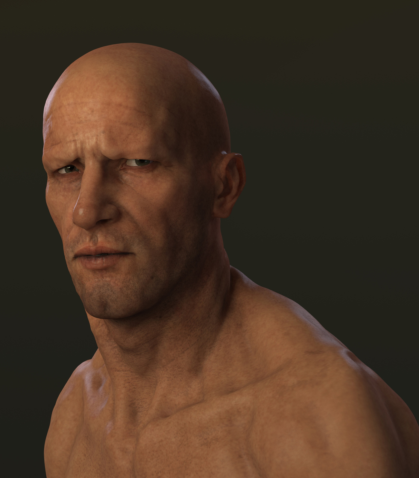
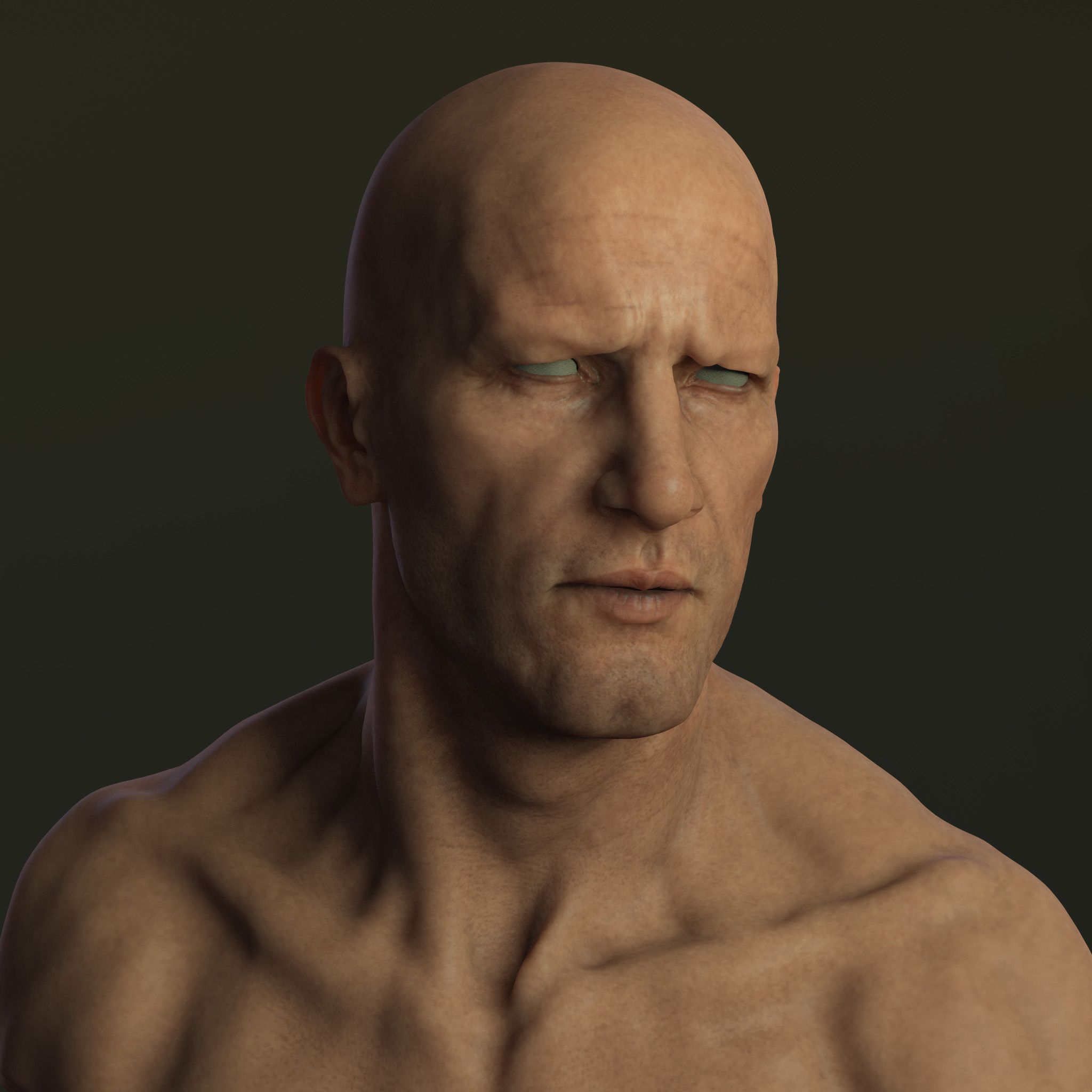
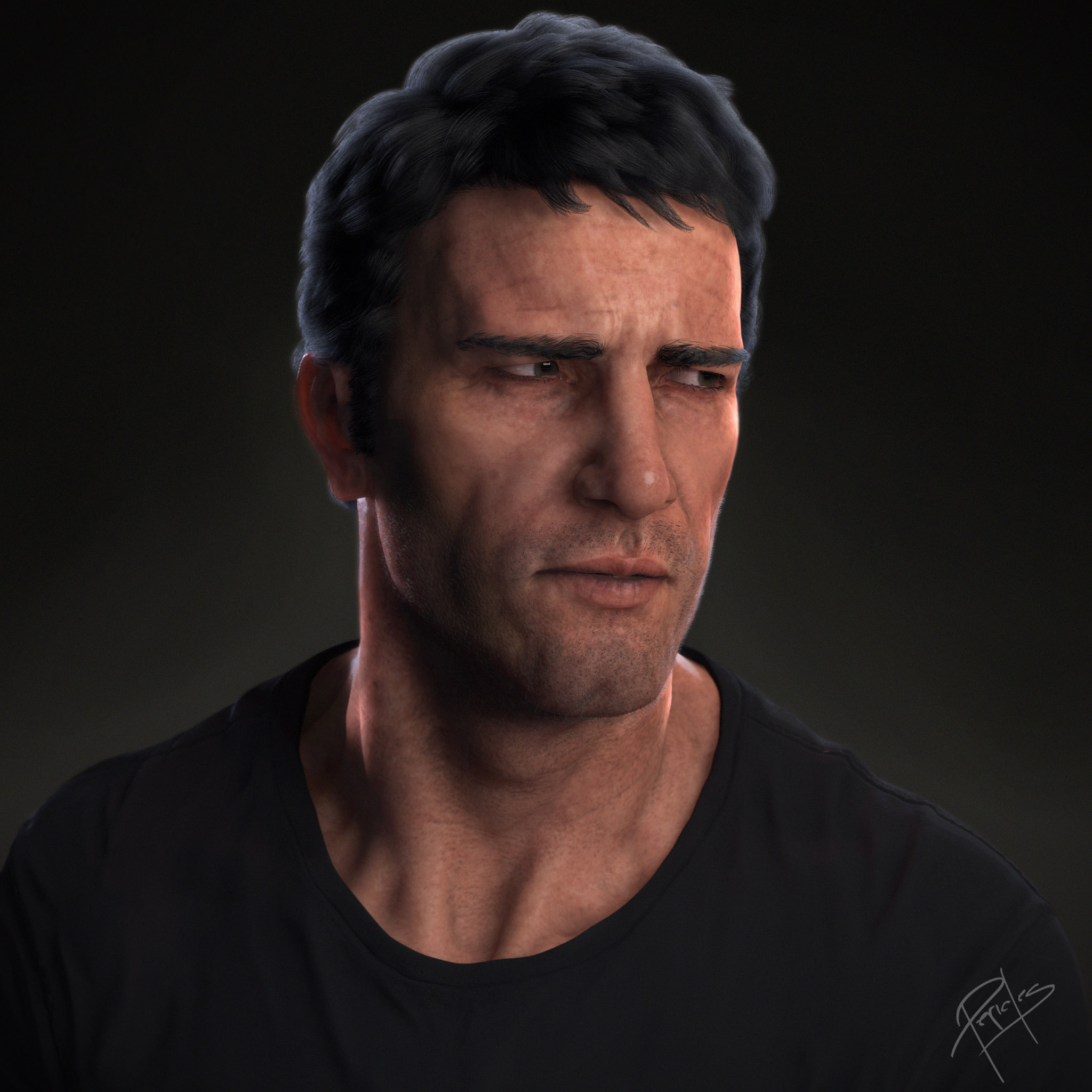
some update with light tests and another angle, c&c are very welcome!
the skin may look a little too blotchey/dirty to me but that might be part of the plan for the final image.
wow man nice renders! keep up the good job! cant wait to see the finished piece.
robertrageson - i tried to soft up now, thanks!
zborn - hey, thanks my friend!
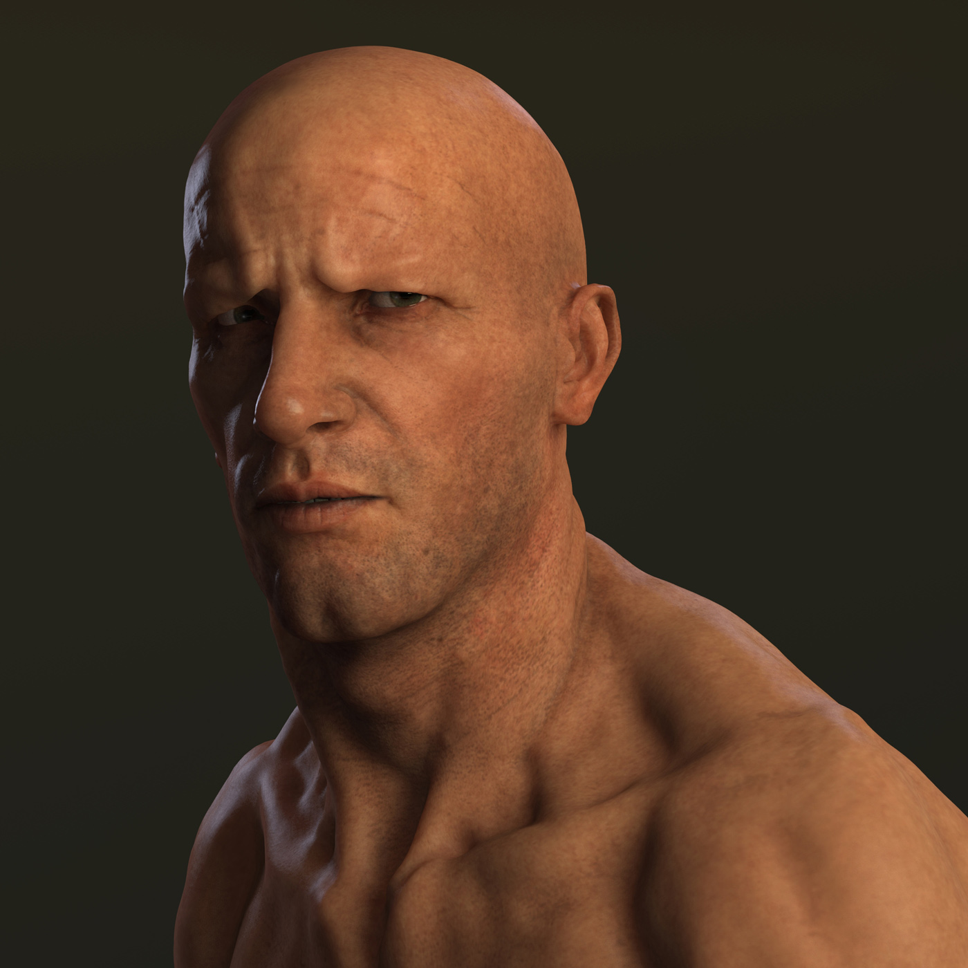
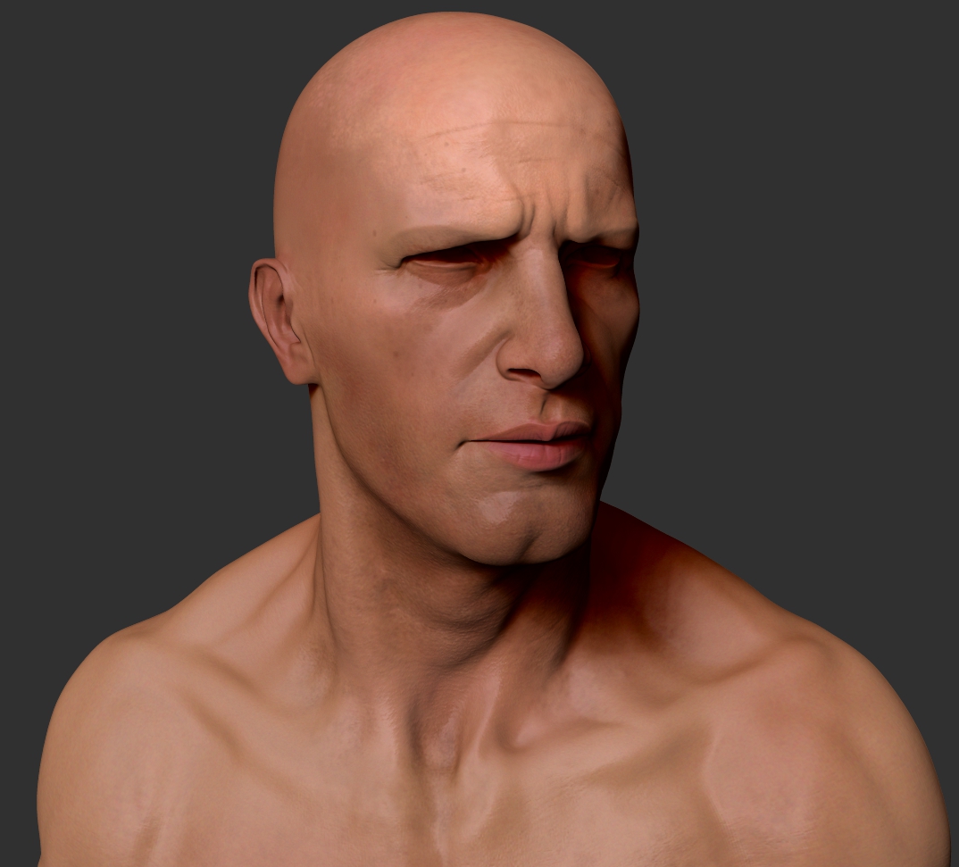
here is the final comp, hope you like it
The Punisher:
Great work, i like!