ZBrushCentral

Scared Silly Entry by Thao Le

I like the last two the best but wish you could see the graveyard gate/fence in the scene like the second from top has.

Bottom two just really pops out. I would pick the very bottom one if the zombe standing by the tree and grave was in it…maybe standing by the grave with the cross on it. He’s great. Well, the entire scene is!

Good luck!!

I like 1 and 4

nice job m8 :slight_smile:

Thao Le,

In order of the ones I think stand out the best and center on the theme better would be:

  1. Like the use of elements and space which helps center on the main image/theme of the composition. Only thought would be maybe a standing zombie toward the left bottom corner in the foreground would help add more appeal. Could either be fully standing moving toward or near the others to help his friends. Still as is its my favorite!

  2. Does somewhat what 3 does but the angle view of the back of the sarcophagus isn’t as visually interesting as the view 3 gives.

  3. Looks ok, has less elements though stays true to the theme good. Prefer the other two above more so.

Can’t wait to see the end result of the final image!! :+1: :+1:

This is looking great. Nice work.

Hi Thao Le, great post! My preference (like AngelJ) is definitely for #3 followed by #4.
#3 has the most interesting composition. It has a whole lot of diagonal lines running through it that lead the eye in. I have taken the liberty of drawing on your image to show what I mean. I also like the Zombie in the foreground climbing out of the earth and I think there is more movement in the group - this angle gives more of a feeling of pulling to get the trapped zombie out.
In #4 I like the shape of the tree and the zombie on the right, but perhaps too much so - maybe they steal interest away from your main group.
Whichever you go for, you are working towards a great final piece.
Jason

[attach=74106]ThaoLeComp.jpg[/attach]

Attachments

ThaoLeComp.jpg

Great work. I agree with the others on scene 3. However it seems a little strange where the ground seems to drop away in the background. Maybe some additional elements back there to break it up. Say an old fence and half open gate that the zombie is walking through.

Cant wait to see the finshed product.

Dondemaker references to support number 3 are pretty spot on, definitely agree. My personal out look is if you can take the overall image make the positive space a black silhouette and the back ground negative space image leave white and it looks interesting then you got a solid composition!! Soo…

PICK NUMBER 3 M’LORD!! :+1: :+1: (yes its a shrek reference):wink:

Number 4, because i like the importance of the tree, and i got the impression to be into the scene.
I really enjoy the tombstone in first plane in the 3rd image, if you can do the same thing in the 4th image It will be great. maybe on the left.

Please excuse my english.

great job.

One more thing, The shadows in the 3 image are really good, if you can get the same in the 4th image it’s nice. :slight_smile:

Hello, great work so far.
I would choose #4 but with the gate in the back left side. And maybe you want
crop some of the top and the left side (more like a classic 70mm movie format)

Cheers

Ralf Stumpf

I actually like 2 but needs to be brought into the action a bit more.

I just like the way you can see the other two Zombie leaving in the background.

Pete B

This is looking :+1: :+1: :+1:

All textures look very good, looking forward to the final piece :wink:

really good work, I like so much the realistic proportions! Congrats!

:wink:

I just want to say thank you very much to your imput everyone. That is very helpful to me when I finish up the final.

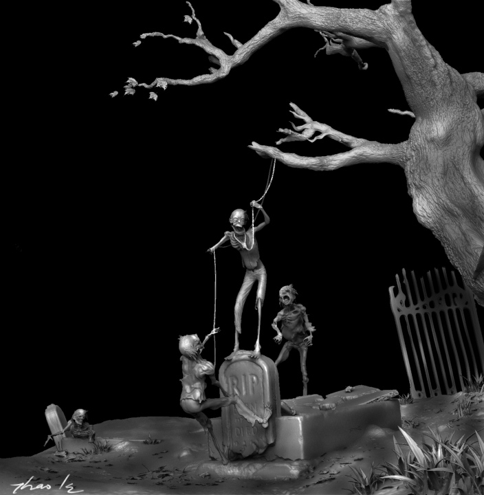
After thinking for a while I have decided to try out the other direction. You guys please tell me what you think. The reason I want to try out this new composition because i always have a feeling that the original concept I have lacks of silliness. I want to add more silliness on my final composition. So here we go. Please tell me what you guys think. I am very thankful for your imput now.

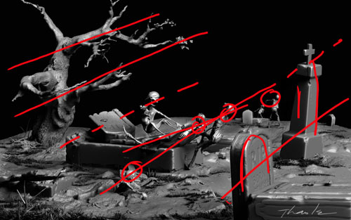
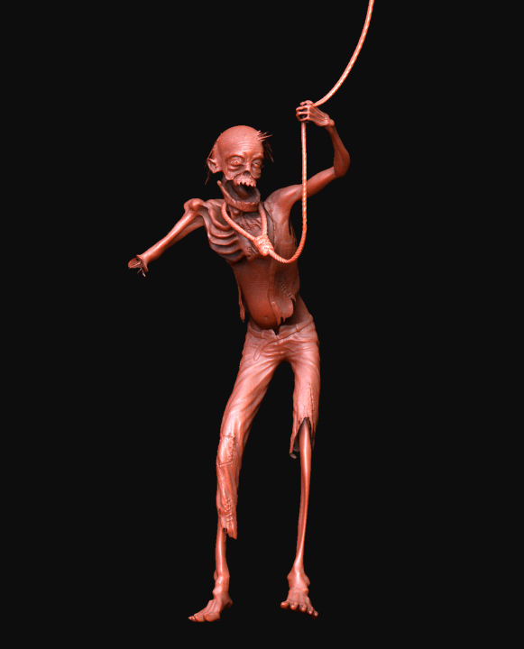
This one again proves to me that Zbrush is an awsome software. Everyone who works in cg industry know that we have to make changes constanstly due to boss, customer, clients… and sometime we have to do it fast. Just like my situation now, I have to do it fast. I stayed up late last night and here what i have.
Ps: Transpose tool is an awsome tool in zbrush. Think about this if I want to change the pose on my model which already textured and detailed. With Max or maya, I have to deal with alot of work. But with zbrush, all i need is 20 minutes of work!!! I personal prefer this new one. it makes me laugh and i like it. I called it " Little Fun on Haunted Hill"
Thank you
Thao Le

[attach=74241]test.jpg[/attach]

Attachments

test.jpg

No down about zbrush can create awsome details. For the final shot, this zombie doesnt’ show this close. The tool i have right now has 6 subtools and alot of polygons. work flow is awsome.

Here is the suicided zombie.

Thank you
Thao Le

closeshot.jpg

Thao Le,

I agree Zbrush rocks, and its great to see your striving to get more from yourself so your happy with finding the elements and composition that you feel works for your entry. However, I dunno about it compared to the others… I still prefer the original setup I think. If you really wanted to push this new composition concept then get really silly maybe you need to go further. Perhaps the zombie could be already have hung himself and the other 3 doing a “Pinata” type scene with a blindfold and bat/stick trying to take swing at the zombie blowing in the wind(not to mention his innards would make good treats for the zombies). Something like that would really push the silly especially considering that you did such a good job all the sculpts though lean more toward a realistic style and the textures. Just my .02 cents worth, keep up the great work and will be looking for more. :+1: :+1:

(edited to add few comments)

great work! i love all!

Alex Oliver

great idea for suicide !..i follow this thread !

Love It!!!

wow that is really nice