ZBrushCentral

Red Innocence

Hello.

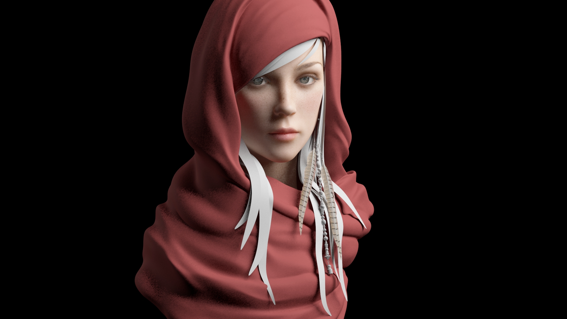
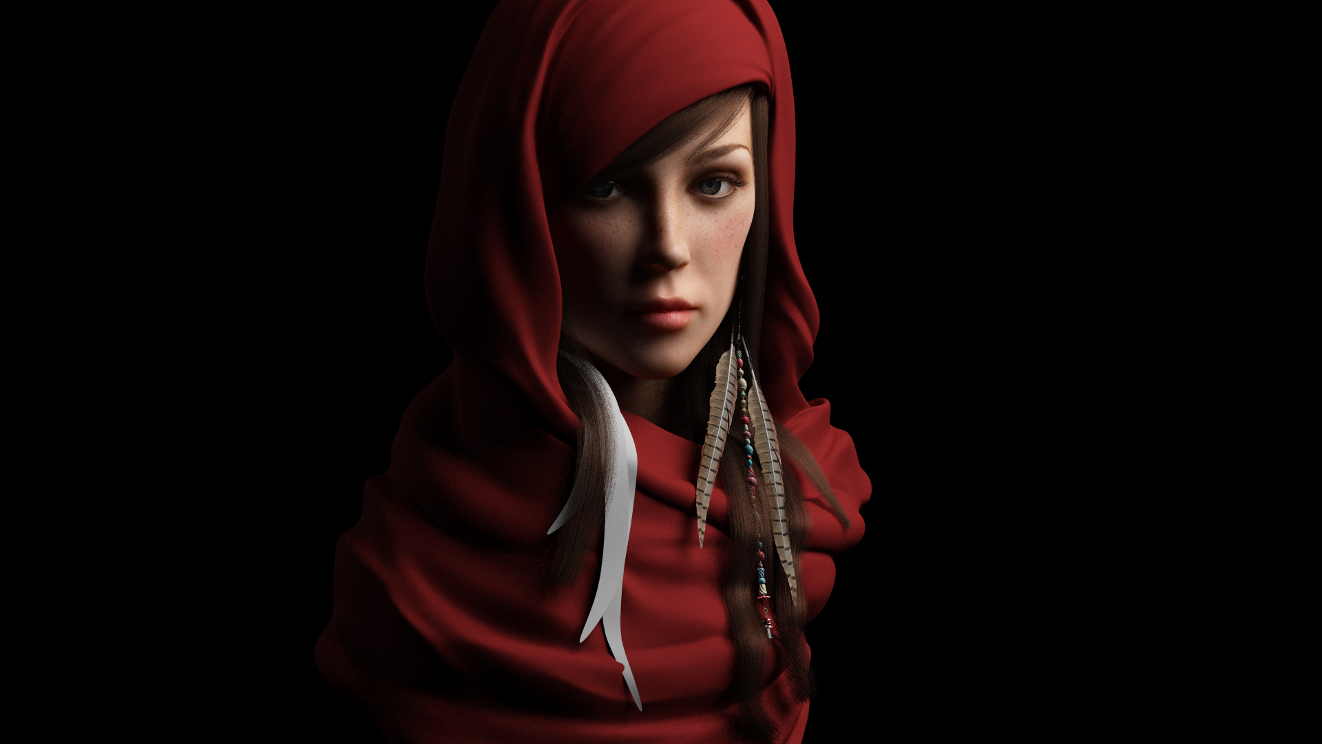
I made some changes in her face structure. which one do you think is better. save image to your pc and flip between :slight_smile:

I havent gamma corrected any of those. I just wanted to see what you guys think.

i think the new update looks more cute and innocent?

1 is OLD
2 is NEW

Attachments

1.jpeg

2.jpeg

In my opinion the old ā€¦number 1 is better ā€¦ she looks younger and more innocent

I think 1 is better. She looks more innocent & cute.

Baby face are always innocent. With soft structure. Your 2nd version of her is so mature to have a innocent feeling. I hope i help you for your work !!

I feel the same way, number 1 looks much younger. Maybe you got them backward? Number one looks much better if you are going for a young innocent look.

1st is better :stuck_out_tongue:
If you want to achieve Innocence, you should change the way sheā€™s looking at you :slight_smile: and maybe a bit the eye brows a bit :slight_smile:

the first one is much much better and younger :slight_smile:

second what everyone else saidā€¦number 1 feels betterā€¦its looking greeeeeeat tony said

#1 for sure!

I was thinking maybe the bottom lip in #2ā€¦but checking in photoshopā€¦#1 unchanged just nailed it! :slight_smile:

I agree

very nice face ā€¦good job!

I agree,ā€¦ the 1st one.

1 looks more cute and innocent to me too.

1st one is looking awesomeā€¦

Yea, skin looks better with the freckles.

I guess Iā€™m going to be the only one to vote for #2. Again Iā€™m going against the innocence vibe, assuming that she exist in a time where things might be tougher. Of course its called ā€œRed Innocenceā€, not red warrior. However with those changes she does seem more realistic to me. #1 is closer to a stylized, idealistic look. (Put the fat back in the cheeks though, regardless)

Thanks so much for the input guys. I think what throws off the innocence in the second change is the cheek bone, I think too prominent may be? i will try to average the face between the two changes and see what comes up. if nothing works then we already have a back up. I have been playing with hair and i am not happy at all.

Anyone can recommend what can i use for hair?

For this i used maya hair.

Attachments

kjh.jpg

The difference between the first picture (on P1.) and the last rendering (on P4.) points to just how sensitive our brains are to faces. The second one has a world of experience. One could write a novel on the life events between the two. I like the first one because it is an illustrationā€¦one that isnā€™t realistic but it offers an ideal view. The second moves more towards the realm of photography and documentaryā€¦the girl becomes more real and less symbolic. I agree with you about the hair (though, I actually liked the stylised ā€œfelt stripsā€ as hair) as they kept the face as a symbol of innocence. Nicely done on both counts.

Impressive work!

I think ur right a softer transition for the cheeks would be nicer for the innocence look.
overall is a fantastic piece, looking forward seeing more.

Which hair would you prefer? With braids or without braids?

Attachments

which-hair.jpg

I think the braids are a nice touchā€¦ depends what you after in the composition, they do take my eyes off the face some what. Could we see the braids maybe just on the right side, maybe an interesting look and also keep the eyes moving.
Great job so far!