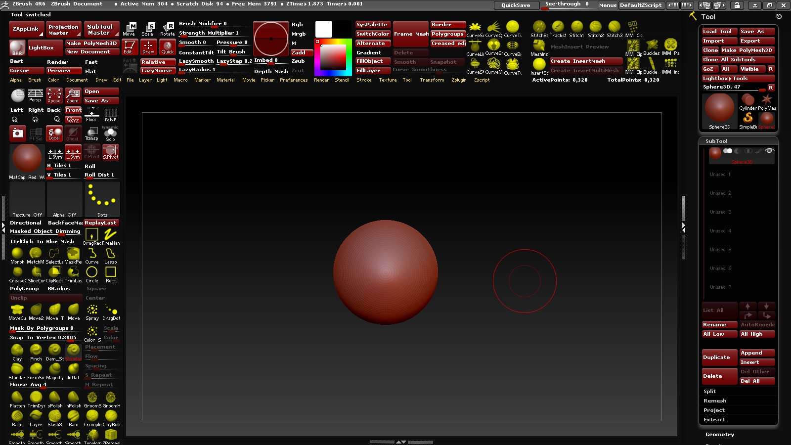
I wish so an interface for ZBrush 4R7 or 5 (where the menu points are down, not at the top, where you have to stretch you):
Attachments

I wish so an interface for ZBrush 4R7 or 5 (where the menu points are down, not at the top, where you have to stretch you):

Feel free to try mine…
Each person has their own preferences so I don’t mean any offense but that interface looks like a nightmare to work with.
Thx you guys for you Feedback.
But i think finally i’ve found my personal Interface (I work better when I have everything in front of me. Especially in ZBrush, where the interface / menus are so messy. Only in this way, I do not Forget all the cool/horny functions as a beginner. I hate it, to open a thousand of menus, or scroll up and down menus, only for something small.)
And with the key [Tab], I can hide everything and make the screen bigger to work:
B brings up the brush pallette. You have brushes everywhere. No sign of small sliders to adjust mesh(deformation pallette). Whatever, your UI.
I’d vote to keep zbrush’s UI as it is and let users tailor their own layouts, should they somehow want… this.
I’ll second that 
You can use the “Large Menus” plugin in this post to create your own menu buttons that you can put where you want:
There are 3 things I really want to see changed for 5’s interface options.
That’s really all I want to see different. I currently use popup windows for different interface options. G=main tools and concept tools, H=hard surface stuff, Y=good tools not used as often, tab=switch between no interface and standard interface.
Anything on top of that is just icing. If pixologic wants to go all crazy with interface stuff, ala Modo, Max, Maya…every other package on the planet that is fine too. But really what I want is the option to move the interface off to another screen.
beta is speaking the gospel.
everything he just said would be SO fantastic.
B brings up the brush pallette. You have brushes everywhere. No sign of small sliders to adjust mesh(deformation pallette). Whatever, your UI.
Small Sliders not benefit me much, because of this Sliders has too much.
And some good Slider only works with an Project. Open I a new Document/Project, this Slider are not more visible in the Interface.
And others of good tausend Sliders, are all in the same -Tool- Menü, because why i should put this Sliders in the Interface if many more Sliders I also need are all also in the same -Tool- Menü (Makes no sense to me).
Better i go in one Menü, and this are the -Tool- Menü. There are all good Sliders. One open Menü, one Way. There makes not sense, to put this Sliders from this -Tool- Menü out.
But other Sliders from other “small” Menüs, together with Brushes makes for me more sense, because i need not all things/option of small, some other Menüs.
Therefore i take the best things from this small Menüs out to my interface, but a Big Menü, like The -Tool- Menü I’ll let it as it is, because anyway I need everythings in this Big-Menü.
That’s now my finish-interface. I’ve yet again set the menu points below, because I’ve trouble with the [transforme/Activation of Symmetry. I forget often to activate the Symmetry and it does not notice that].Therefore help me, to set and use the menüpoints below. To have this menus nearer to my Canavas. And therefore i hope that pixologic set in a new interface the MenüPoints below.
The [Create InsertMesh/Create InsertMultiMesh] corner, help my to have my favorites Insert Meshes, the I use often. All other “more important SubMenues” i’ve in the Tool-Menü right, only right as only Menü.
The Other Menus, like Texture-[Lightbox] ect. ect. i’ve with this Interface-Idea, nearer to my Canavas, and therefore i must not set/open this Menus to the right or left side.
And scroll often up and down I have to do anyway, but i need these Menus nearer to my Canavas , because i set this Menues not to right or leftside, like the -Tool-Menü set right. These are my logical thoughts about.
And again: With the key [Tab], I can hide everything and make the screen bigger to work:
I don’t think I would want all the brushes hogging up space like that on my own custom interface. Each to his or her own I guess. My vote is to keep thins as they are so we can all customize to our own tastes.
Ok, I understand. But you can choose which Brushes you put in the interface. Brushes are anyway everyone’s own thing. But some menues, sliders or buttons are important, and these are not funny to open again and again while you work. These are my thoughts about my interface.
Ant the other thing is: If you are a Beginner, with this Interface method you learn faster, what options or functions are cool or you can us often than you remember, while you work.
Also the many Brushes help you to remember what other Brushes are cool and use to, for make your work more easy.
My gf just said that this layout reminds her of her grandparent’s internet explorer 
To each their own. If this UI works for you then it works for you, but that doesn’t mean it will be helpful to new users (especially if all they just see a giant clutter of information that they don’t need to see 99% of the time). It’s like when people insist that they like their messy room because they know where everything is; that’s not going to help a stranger find things. By default it’s better to have a minimal design with only the most vital options visible, with organized menus for the rest. If a user finds one of those options to be useful enough that they frequently use it then they can manually bring it out and place it where they fancy.
Personally I think his UI should be featured on Hoarders.
Yes, I understand you. But you must look my interface more closely, and not only as Kaos.
I have everything logically well-ordered. Topic to topic!
And that’s what makes my interface.
You want create InsertMeshes or MultiMeshes?
The buttons are available in front of your eyes in this interface.
You need for this Insert or MultiMeshes the Main-options of the Curves?
There are available in front of your Eyes.
When I started with ZBrush, there were so many options and functions that I could theoretically nothing Beginning with all these, because it was too much for me.
I forgot a good and cool Function or option after the other, because it was too much.
As soon as I had learned a feature or option, I had forgotten again, because a new good and cool Function or Option came in a next tutorial.
How will you learn ZBrush as reasonable, if you do not keep this very so many other good and cool features on your point of view?
You will then always use only the same few functions, right?
And learn not the others.
I would still years off, I must have to remember also the other great and good features.
I’d always forget.
Hi,
My unpopilar opinion is that even thou its visually allot, i can sorta agree to the layout with all the things used visable when you first start out.
I absolutly love that you can costumize how the interface looks depending on your own preferance.
My main problem is that zbrush’s default interface, before you get to know zbrush and learn how to change the interface, its waaay to outdated and caotic.
Zbrush does allot of nice things i wish other sculpting programs did. but the other programs are also on a compleatly different level on how easy they are to use.
I just wish zbrush would do something about that.
I love that there are so many things one can do in zbrush, and that you can change the interface, so i hope they keep that and maybe add even more features.
But the interface desperetly needs help. Espeshally now that the Tablept zbrush has been released.
I’ve looked at zbrush and used it allot. When i look at videos, you can see that zbrush added new features, however, the interface itself is practically the same as it was 17 years ago. its more that they added a bunch of new features and just placed it in whereever there was space. this isnt to discredit whom ever made the interface and work thats been done over the years. but more a hint of the need to change.
Most ppl choose to use tablet via pc for zbrush, cause its usually simpler. but the interface is kinda design for mouse and keybord in a way. I wish they made it more tablet friendly and beginner friendly while keeping all the features and personalizations that can be made.
I feel like they could take some inspiration from photoshop aswell as as blender.