I decided to make my own variation of link. Here is my progress so far.
concept:
process:
current:
Attachments


I decided to make my own variation of link. Here is my progress so far.
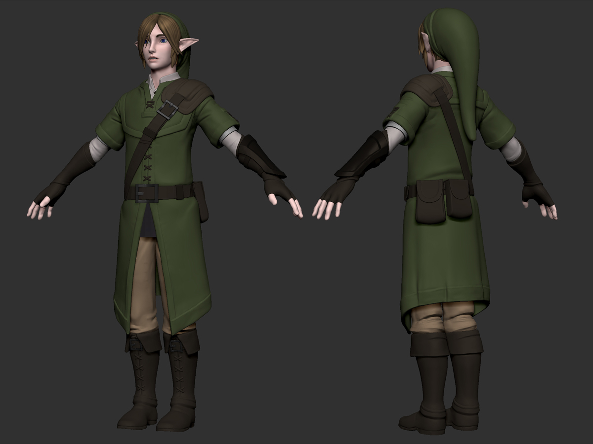
concept:
process:
current:
looking forward to the shield ; )
I will get on that shield soon enough. Here is a color test and some detail updates:
Good work, i like the design  .
.
Two small thing, i think the hands are too big.
And the face looks too female for me.
id love to see your progress  what do you have i mind later? is it gonna be animater or somethin? or is it just a sculpt? i have to agree the face looks a little too femaleish, i would do slight changes on the nose. the hands are ok for me though. good job so far.
Thanks for the input guys. I agree the face is a bit feminine and I’ll see what I can do. The final idea was to finalize this as a game model and pose it for rendering in real-time. If this model turns out I had wanted to do a set with link, zelda and ganondorf.
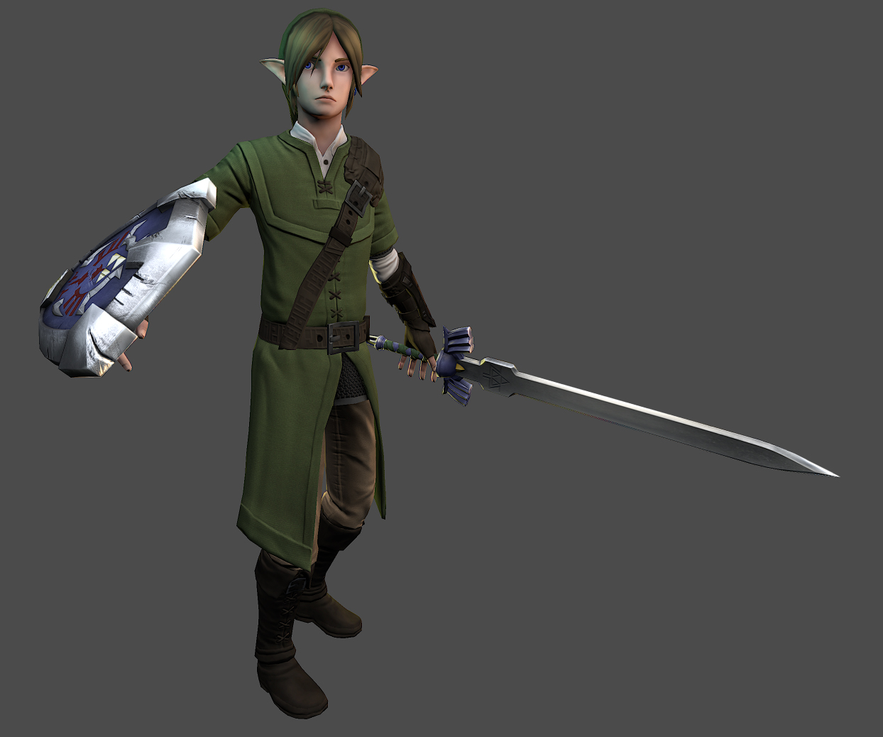
Here is an update on link. Just the final touches on the high-poly. I adjusted the face with a broader jaw and lowered the brows to make him look more masculine. It might be hard to tell since I removed the color for sculpting though.
and here is the shield I promised

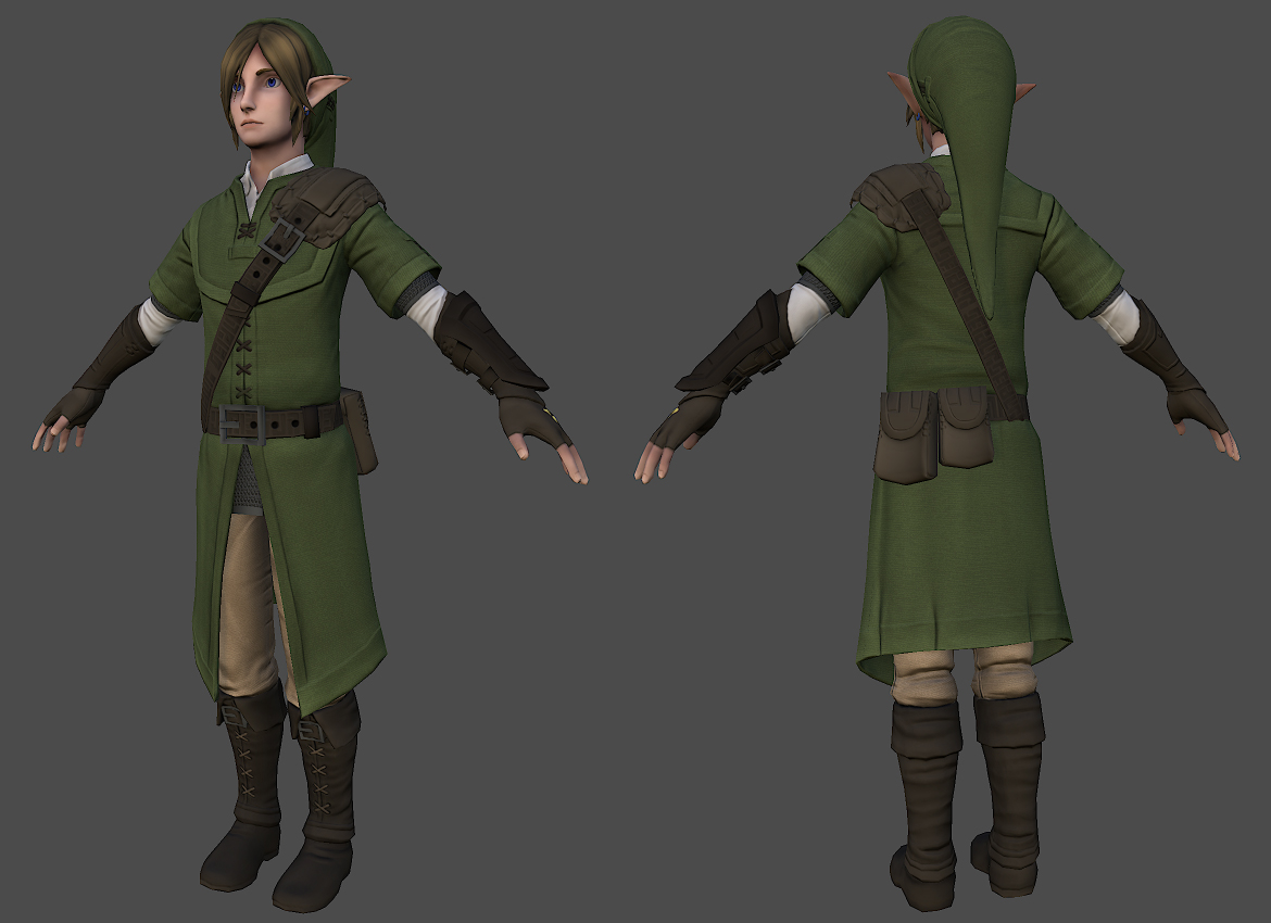
It’s been a while since I’ve posted here but here is the low-poly and the start of the diffuse.
Looks cool, I love to see classical characters remade. The only thing I’m gonna point out is that if I were you I would have defined the nose a little more and made it sort of more pointy since he is an elf (hylian I guess). But everything is looking good.
Looking good. I like the clean-stylized design, in my opinion, a great reinterpretation of Link.
Keep it up!
Thanks for the comments. I made a few last adjustments and here is the result. I might make modifications in the future but I’m leaving this as it is for now.

Looks like a college-student-aged link which I don’t think I’ve seen before. Really nice work!
If it’s okay I would like to ask you a question, I’m making a model that has a similar object to yours but I cant figure out how to get the main indent as smooth as you have got yours, I lose the main shape everytime I try it, lol. could you give an explanation on how you exactly were able to achieve that? I want to keep the actual shape of my object and still have the indent clean. The indent I’m talking about is this one:
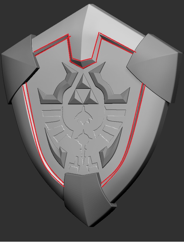
Would really appreciate it if you could explain how you got that so clean.
Thanks Derity, I’m glad you like it. For the shield I made the base in 3ds max. I’m not sure if this will be helpful but I’ll try.
Good luck with your project.
Is the fairy supposed to look like she has silicon implants? Her breast look so totally unnatural and stuffed out.
nope but thanks for the heads up.
Try to get them a smooth surface from the tip to the shoulder. The unnatural aspect comes from the ball like end at the top border of the breasts. It could well be a design decision, that’s why I asked - many people like that style.
But I have one little thing on link that looks strange to me. Doesn’t have to be an error, can well be FoV related - He appears to be rather thin in the depth.
And to not only criticize: I like the general design and modeling till now and I think these small things could push it even farther quality wise.
Thank you again. I really appreciate all the advice. I do think the it could be the FOV as I did reduce it because I was getting a weird fish-eye effect. I’ll definately look into fixing all that at some point. 
Awesome! This is exactly what I needed, thank you so much, going to follow this and remake mine now 
Alright! Good Luck.