Neat. I think his head’s too small for his neck but neat all the same. 
I agree - everything looks great except the head needs a little adjusting…
hi, thanks for the critiques and comments.
ive made a little modification to ilustrate your point.
Dont you think it looks a little short with a bigger head?
EVERYTHING IS AWESOME. But I feel the cloth can be improved upon. The cape’s general flow can be improved and the cloth in the thigh area needs more realistic folds. Still, everything else that you’ve done is plain awesome :). can’t wait to see the next update!
Its like Batman and a Navy Seal had a baby. Then, that baby was trained hardcore, Last Samurai style, and then, Bruce ‘Samurai Seal’ Wayne Jr. was charge with the legacy of protecting Gotham…even though the walking corpse that is Alfred calls him Junior and chastises him for not truly being his father (but loves him regardless)…lol.
Nice man!
I too think the cloth and face are a little out of place. I also think the breastplates of the armor is a bit high and throws off the rest of the torso. Not bad, just doesn’t seem to harmonize. Nonetheless, a great over piece with excellent mood. You should be proud beyond these crits. I know I haven’t made something of this caliper yet so you are above me and many others right now. So keep at it! 
This is beautiful work, my only critiques would be the anatomy of the head which seems a bit off - especially the chin which seems “weak” for such a hero. Also the wrist seem oddly shaped, but it is hard to tell with his gear. Lastly, the texturing shaders seem a bit overblown in some places - I realize this is stylized (which I love), but the shininess seems overdone so some details what you obviously put so much love into are not emphasized as much as they could with more contrast I am thinking. GREAT work though - awesome and I love the pose in the render! I hope my first character which I am working on right now turns out as nice:).
needs more utility belts. i mean cowbell. Great job.
Absolutely fantastic! I whould like to see this haracter in the movie… Great design. I love the mask mostly but the rest of the armor is stuning too!
TOP ROW!!
hi!
thanks again for all your comments!
lovely backround youve imagined “Mahlikus The Black”! 
about the cloth, the only thing i can say is that the cape was supposed to be replaced for a simulated one in the animation, but i dont think thats a good excuse for the lack of precision in this model. sorry about that. ill try to improve it in an upcoming version.
ill be posting a turntable soon
here are some process images
<img src=“http://img517.imageshack.us/img517/7606/pechera2.jpg” alt=“Image Hosted by ImageShack.us”/><br/>By <a target="_new" href=“http://profile.imageshack.us/user/aridiel”>aridiel</a> at 2010-05-18
Good stuff. Love seeing the process! Thanks for that
thank you!
more process here

By aridiel at 2010-05-19

By aridiel at 2010-05-19

By aridiel at 2010-04-07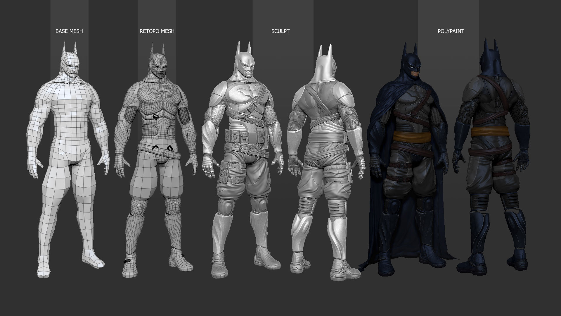
Attachments
the body looks great. the head needs to be reworked. i mean it looks like you put alot of work into this. the face though just doesnt llok like it fits the polish of the rest of the model. it needs to be resized. its way too small. kinda looks like a kids face on an adults body. if you fixed that this model would be aces, man.
Yes, you hit the nail on the head (no pun intended) when you mentioned earlier that you sculpted the face around the mask instead of the other way around. You can see it clearly from your early base mesh. It just needs to be pulled and pushed around a little. It will be such a strong piece once you get that head fixed. As cool as he looks overall, don’t forget that there’s a man in that bat suit, and that has to be just as important as the suit itself. BTW, he’s still missing his cool bladed gauntlets. lol
I really like to the look of the lighting/render…can you post some screens of your lighting and render setup in max? It would be very appreciated. Thanks!
Does that ‘Process image’ say that you used the Ram brush for the armor divisions? I can’t read it that well and the Thumbnail confuses me. 
You know when I first saw this, I immediately looked at his chin and figured
that his head was too small. But now that I have been seeing this over past
week, the more the size of his head has been growing on me and I like it that
size. It looks like a whole other style, kinda like how anime has large eyes! I
think that if you were to change the size of his head then he would just
become another generic batman. This one sticks around longer in memory
because of his unusual head and the balance of good materials and sculpting.
Really enjoying your posts of your process.
The face looks fine. Anyone with this much padding and armor on will have a smaller head any way. Batman has always been an abstract looking comic book character; as a result, his image is left to different interpretations. This version is very stormtrooper looking. Maybe this the Batman if Nazi Germany had won the war. I like it!
What programs did you use to create the base mesh, UV mapping, and retopologizing?
just to say, good job
Hi man , can i have the Left , the top and the front of the base mesh ??? I started 3ds max and zbrush and id like to try to cretae a batman character . Obviously i will change completely the mesh .
It’s probably the tiny chin that throws me, not the overall size of the head. If the chin was beefed up it would help bring more presence to the man behind the bat. Check out the chin on the base mesh, it’s flat and deflated. I don’t think the classic superhero jaw is neccessarily the answer, but something stronger would be helpful. Still love this Batman…Joker beware!! Hey, let’s see you’re version of Joker next… : )