In the process of trying to construct a better mental picture of anatomy, I’m trying to sketch a bit a few days a week.
I really aspire to all the amazing work I see on here, it definitely pushes me to keep trying.
I would love to get some feedback if possible, I would really appreciate it!
Cheers 

HI! Good to see you are progressing. Sculpting anatomy from memory might be really tricky, I’m often practicing it and hell… there are always something to learn.
Here are some suggestions from me
- First of all I would recommend to refine a Linea Alba in the middle of the Rectus Abdominis muscle. Right now this area looks very vague. As well as the navel below it. I think with adding this small crisp details your sculpt will gain additional spots of interest
- However I would suggest to do the opposite - to smooth several areas which appear a bit lumpy. The most weakest spot, IMHO, is the flank pad of her left External Oblique (pic 1). From the silhouette it just doesn’t look right, too bulky. Personally I would make her left contour more elegant and smooth… sure there is compression since she is leaning towards this side, but I believe that major plane-changes (like skin folds) should happen more towards her back. From a second picture this area looks OK so I assume the problem is where External Oblique meets the rectus Abdominis at semilunar line
- There is strange almost vertical line going across the side of her body (again picture 1). This line direction looks similar to the anterior border of the Latissimus Dorsi. If so, you need to shift it more posteriorly cause it doesn’t leave enough space for External Oblique. It is even more obvious in the armpit area: this furrow is so close to her breast so it looks strange
- Since she is so well fit, I believe you might make the muscles of her thighs more pronounced. I mean this distinct flipped V shape for the Tensor fascia latae and Sartorius. Plus her right ASIS (Anterior Superior Iliac Spine) appears too low, causing additional problems with muscles surrounding it
- From the back view it looks nice and almost without big problems. It just appears on a stage when you need to spend additional time polishing it and refining the shape. The only thing - her right buttcheek looks a bit odd. I mean this place where the gluteal fold terminates, here is a strange continuation going up. maybe this configuration might exist in real life but for me it appears strange
That’s it, I hope it was a bit useful 
Hey Vir,
Thank you very much for taking the time to critique my work! I have started reworking the figure while keeping your comments in mind.
I’ll post an update when I’m satisfied with it, thanks again it was very useful
Well in the end, I decided to scrap the last torso since I still wasn’t happy with it.
Instead, I’ve started a new character!

Did a bit of progress on the character. I’ve roughed in the clothes for now… Haven’t really done any work on the arms/feet/ears.
Also, I’m still not too happy about the face, I think it still looks manly from a distance but I can’t pinpoint the reason, so any feedback is most welcome!


OK, so here are some tips that hopefully might be helpful to you.
- I think that one of the main thing that spoils her face is the absence of the brows. I even have a rule which says about never posting characters without brow-hair. It shouldn’t be the final type of hair, sometimes just a simple mesh or even a mask representing a hair might help a lot. Without brow-hairs all models tend to look very strange and surprised.
- The next thing is a proper ears. I’ve seen many beginners sculpting heads without ears at all… they just concentrate on the facial features, leaving an empty space for the ears and later wondering why the hell it looks so strange. Regardless, you actually have an ears. I simply suggest to add at least some inner structure in the beginning stages. Cause usually the inner structure, especially the antihelix, are defining the contours from a front view. Meaning they often sticking out a lot. Without it your ears appear too flat and pressed to the skull so overall it makes the head narrow-looking. Perspective distortion is also might cause the head to look strange and warped. It is hard to recommend some Focal length values since the camera in Zbrush works with very weird logic and also depends on your model’s dimensions. Just play with it if you are sure that the ears are actually fine but it it rather perspective distorts them.
- Lighting and material might also break the feminine look. Maybe try much softer light, increasing the shadow angle to 25-30? I also never use materials with cavity detection for the characters. And especially for females. cause cavity shading might add dirty looking effect, distort your actual shapes in sculpt and even make the person to look older.
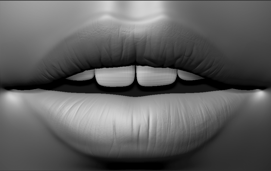
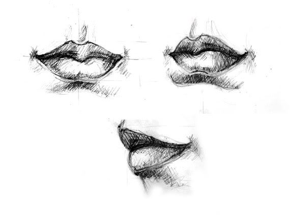
- For a sexier look, you might want to give her lips some additional structure. I mean the mouth line, where too lips are meeting each other. You’ve probably heard about five main volumes creating the lips. The very defined central bulge on the upper lip, gently resting on the lover one, IMHO, makes female mouth much more attractive. Example http://img.photobucket.com/albums/v11/wwarriorww/lips.jpg
That was about femininity. And here are some anatomical suggestions about the face
- Again when talking about the lips, try not encircling them with one harsh ridge as you did. Here is example from my latest character, notice how it is much faint in the lower lip close to the corners. It is hard to achieve and might not work if the structure of the mouth is wrong. Also, notice how upper lip overlaps the lower one. You really need to understand the mouth corner. The thickness of the lips is almost the same along their length. They appear thin in the corners only because lips are twisting before inserting to the node. Just think about the thickness of the cheek that comes next to it. People often pinching everything towards the mouth angles and it means that cheeks would be paper-thin. Also, mouth corers should be slightly recessed with node bulging juust a bit above. Don’t overdo this.
- Mentolabial sulcus looks strange and somewhat pointed. Just google this term to see what I mean. Also you might add some volumes to the lower portion of the orbicularis oris.
- The white of the eye is too much to the outer side. I think it might be resolved by tweaking the eyelids. Especially the upper one. For now its curvature is very uniform with a peak almost at center. I would lover the outer half, shifting the peak to the left (well, you know this for sure about the rhythm of the eyelid’s curves). And overall the outer corner looks strange. Maybe make them more pointed?
- And the last one - I think you should read some more about the structure of the brows and implement this knowledge here. This structural units are very faint and easy to miss when looking at real-life reference. But when you know about stuff like the recess of the glabella, its interlocking with superciliary arches, zygomatic process of the frontal bone and this fat pad that goes above the outer half of the eye - you will start to notice this barely visible planechanges.
That’s all for now. I hope it was useful

