ZBrushCentral

A tired Viking

I realized I didn’t share any of my references or inspiration images.
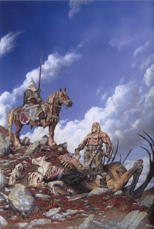
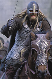
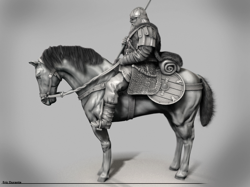
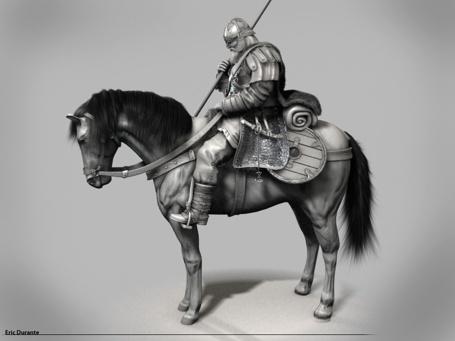
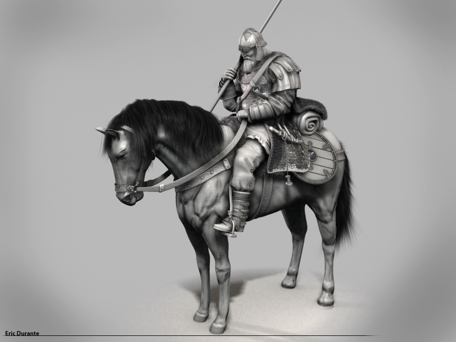
The main idea for this piece came from a painting by Paul Bonner “Mittland”. I was looking at the painting and I thought the guy on the horse looked like he had fallen asleep and I thought that would be a fun idea to run with. The riders of Rohan were an inspiration because a lot of their gear were inspired by viking gear.
[Mittland.jpg]riderofrohan.jpg

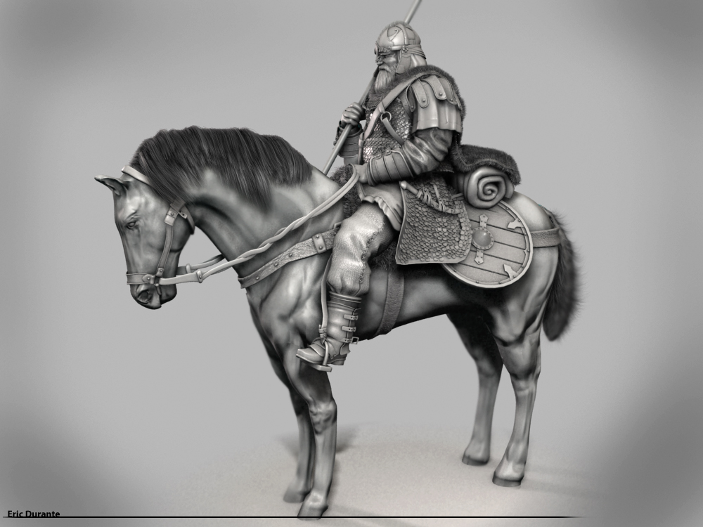
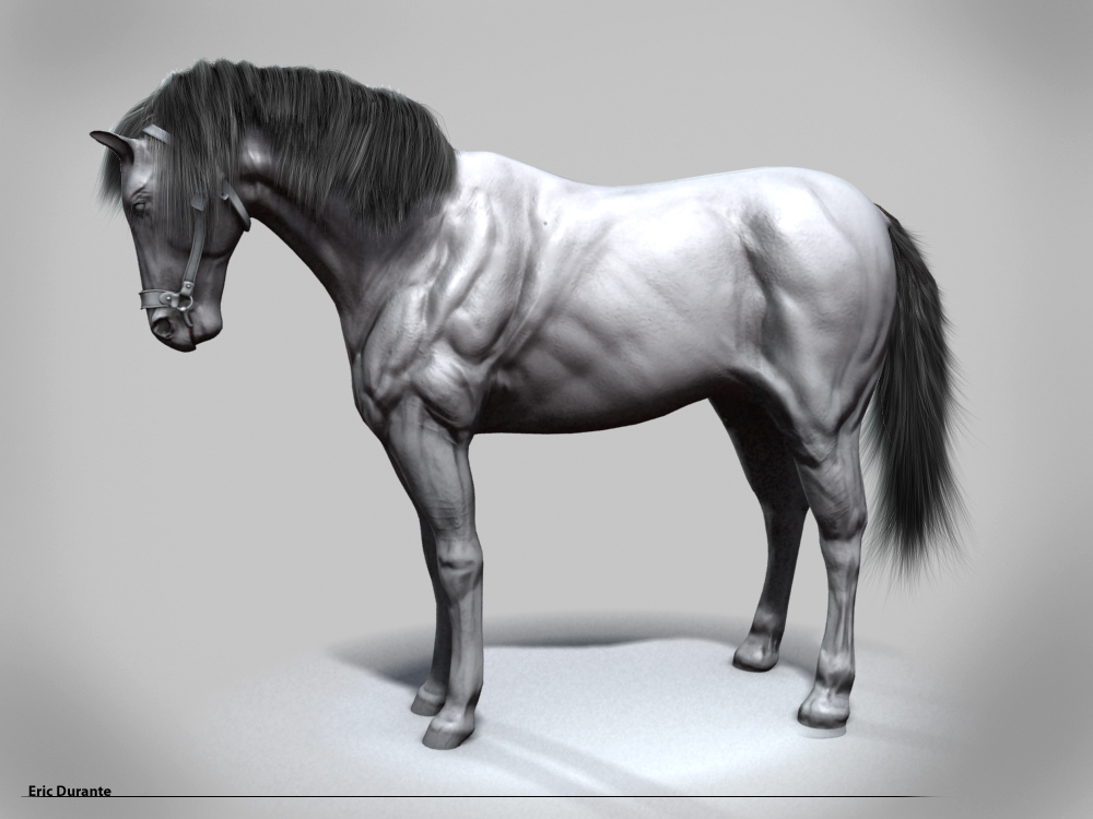
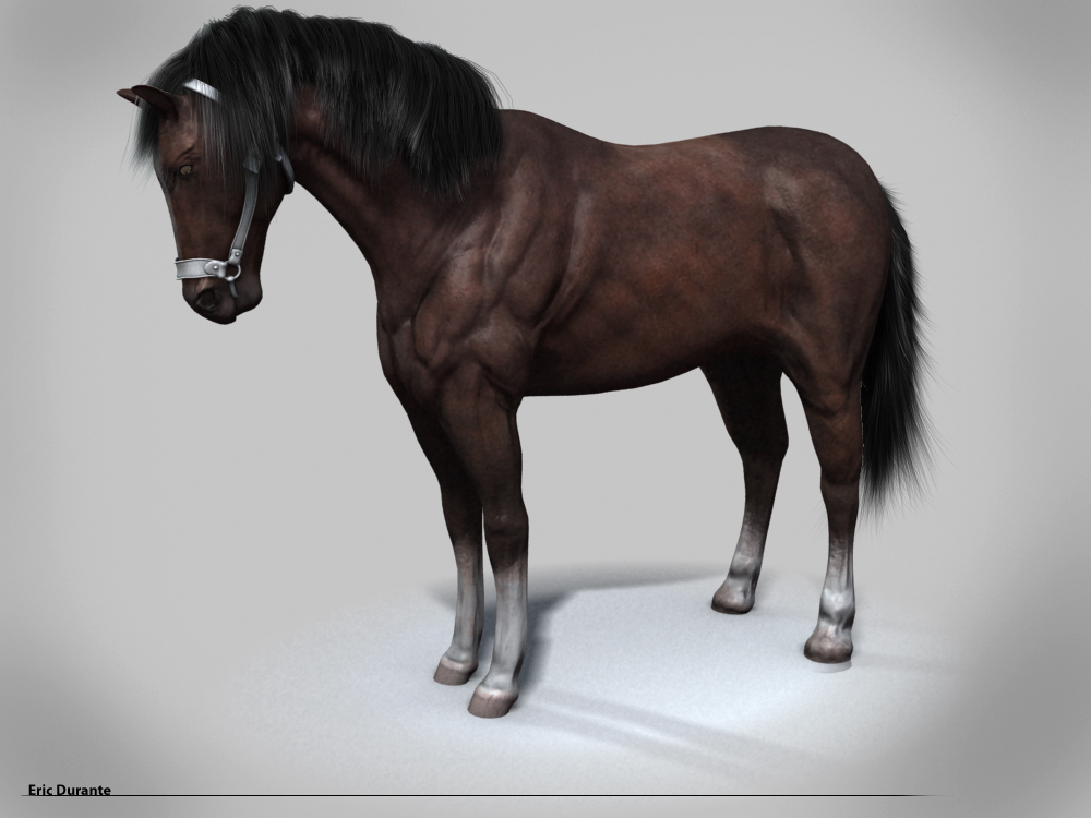
cherub_rock: Yeah I’ve been playing around with proportions a lot. I still move the legs up and down a lot trying to find the right length for them. I usually do all my models in “T-pose” but with this one I decided to model him in pose, which has been tougher than I thought especially when a horse is involved.

Cannot believe … I am working on a similar figurine, a celtic warrior on his horse… haha

Your warrior looks very great!!! I love the style.

Really well done! Though the proportions might be a tad off in places, it does not bother me at all. It really suits the mood of the piece rather well.

You plan on texturing this piece?

I’d love to see that textured :+1:small_orange_diamond:+1:

The link below is an awesome resource for horse sculpting. I think a couple of the links are bad but it has great resources.

Link to horse sculpting resources.

Great job,considering the combined work he should be arrested
for cruelty to animals.
Time in the furlong would not impress…

Very nicely done so far… Love it

Some nice work there. I agree with the general comments about the horse. One idea I might offer. I think the overall story would be improved if the horse also looked tired, dropping the neck and head to make them “hang heavy” could be a nice touch.

Keep up the good work!

WOW NICE WORK!!!

how did you get so much detail into your render?? is that mental ray?

this should be topr row when your done.

Thanks everyone for the comments. I’ve been playing around with proportions a lot. So not much of a modeling update. I really need to do another pass at sculpting the horse it especially needs more work on the legs.

Blaine91555: thanks for the resource :+1:

nerveink: I used Vray to render the character.

[ZBC_THUMB02.jpg]Viking081909_02.jpg

Attachments

Viking081909.jpg

you know, after seeing your reference of the painting, i saw that your proportions were perfect. according to the painting anyways… but the new version looks spectacular. it really does add so much more beleivability and realism to the model. its perfect i think. nice job man.

I discovered Paul Bonner`s art recently but I have never seen the painting you were inspired from. Any idea where I can find more of his works (except his site)?

The details add a lot to your models quality. Unfortunately I also see some problems like the proportions, already mentioned above and the horses feet. The front ones have a strange curvature and the muscles look off in most of the places. Also, I think it would be a good idea to model the hair and the tail of the horse in ZBrush.
I hope you dont mind my observations, Im trying to help because I like the model.

yellow is better but not perfect, and now you have to change the red part, okay? jajaja you can do it,

[attach=153733]Viking081909.jpg[/attach]

Attachments

Viking081909.jpg

Im about 50/50 on this sculpt. I think your character looks really good, from what I can see. The horse is a different matter. I think you’ve made some improvements along, but you have some more to do. You really need to look at how muscles flow. Thats your biggest problem with the horse now. the back area is really bad if you trying to go for a realistic muscle look. I would love to see more shots of your character. the hair on the horse tail doesnt look right in the last render. I thought that the hair in the first render was better. did you change any settings for the horses hair? keep up the good work. You"ll get there.

yeah, the muscles in the back legs. with the tail and mane, try refering back to the painting… see how long the tail is? really long. almost to the ground, looks pretty cool too i think. and the mane is a tad too kept, or rounded and fluffy. could be more stringy or scragly to add realism. the resizing of the head looks perfect. the reigns, i dont have a problem with them. maybe if you added some fine texture to them. give them some material. silvaticus, who commented on your hair has some really nice models. he has alot of texture in everything and it adds alot of depth to the model. you should check his stuff out. its inspiring. your almost to the end of this model. top page worthy once finished.

Thanks for the feedback.

silvaticus: Paul Bonner is great! I actually bought his art book and that’s where I found the painting I used for reference. It is on his website though. It took me awhile to find it but there are tabs on the top of his gallery page that have more work in them.

marvel_modeler & marvel_modeler: Yeah the next thing I’m going to tackle is the horse. I’ll probably be doing a total re-sculpt. I never resized the horse’s tail hair after I changed the proportions so that’s why it looks strange in the new render.

Thanks again!

i dont think you should resculpt the entire horse. it looks fantastic.

Here’s a little update. I did some more sculpting and I even painted a quick diffuse texture for the horse in zbrush. I tweaked some more proportions and I’ll still probably go back at some point and detail the hoof area a little better. oh and yes it looks like the horse is on steroids.:wink: 
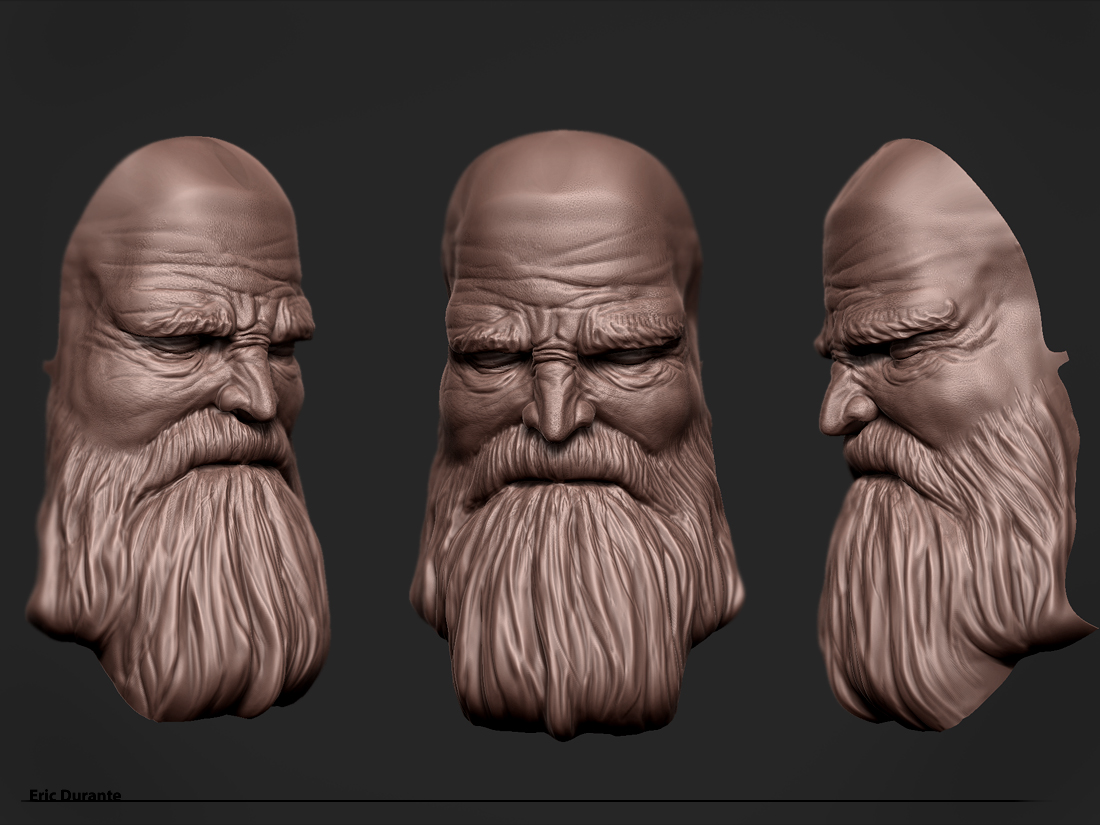
I also posted a screen grab of the vikings head.
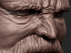
[ZBC_THUMB03.jpg]Horse_gray082309.jpg

Attachments

Horse_Shaded082309.jpg

VikingHead082309.jpg

Goooooood :+1:small_orange_diamond:+1:small_orange_diamond:+1:small_orange_diamond:+1:small_orange_diamond:+1:

It’s got that “fantasy” look, looking at this picture I feel like I’m reading Conan :slight_smile:

I like it black & white, render is good!

Keep up good work!

abishai: Thanks!

So here are some renders with proportions changed on the horse and character. I also got the Viking into his pose a little more. I think for the final I’ll have his head leaning against the spear.

mjolnir: Can you find the mjolnir?!:smiley:

ZBC_THUMB05.jpg
[[attach=154658]Viking082409.jpg[/attach]]Viking082409.jpg

[[attach=154659]Viking082409_02.jpg[/attach]]Viking082409_02.jpg

I think that the horse has much better proportions now.

One thing - horses tail - if you want it to look real than make it real

http://images.google.pl/images?q=horse%20tail&oe=utf-8&rls=org.mozilla:pl:official&client=firefox-a&um=1&ie=UTF-8&sa=N&hl=pl&tab=wi

some google images - generally hairs in the tail should be thiker and stiffer than any others in my opinion and not as much fluffy as you did.

And I think taht billow of the horse is to high.

Overall - great work.

Another horse: http://i34.photobucket.com/albums/d136/Tala_of_Black_Magick/Photography/Calypso4.jpg