Great Work Alex! From a fellow FX guy!. Jamie
Help! He’s looking straight at me…:o
Outstanding work! He must have great hearing with those great big ears of his. In fact, I think he can hear me…
I better move to another thread…
 small_orange_diamondsmall_orange_diamondsmall_orange_diamondsmall_orange_diamond
Eeeeeek! Love it!!
HI
guy this is very good
i need to do a question, you are Brazilian(tu e Brasileiro)? 
Fabio_Henrique-hi Fabio ,yes i’m a brazilian guy!
jit_gohil-thnaks!!!
avatarsw–wow , your stuff are amazing!! thanks for you reply!
plaguelord- i just did a texture 4096 for 4096 in the texture menu,
then in the projection master i painted it, using some textures images,i used the zaaplink in some details too, thanks!!
Hey Alex Good to see you’re still working on this I played around with the image in PhotoCHOP What do you think of something like this. I basically just desaturated the yellow and adjusted the hue and sat on the reds then desaturated the whole image. I hope you dont mind me making alterations to your work and If you dont like it just tell me im dumb and shouldn’t quit my day job :lol:
[
][color=DarkSlateGray]
I was thinking if you were going for more of a sunburnt pale look you might wan to just push the reds some more so that it contrasts a bit more with the pale skin tones. Either way just a suggestion
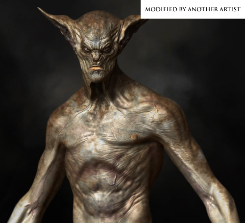
I must admit i like this color scheme better,
Great job Alex
looking cool, but i agree, i like the desaturated version a bit more. I tend to enjoy works that are a little less saturated, they feel a little more real to me. good work. I do like the darker areas around the arms and shoulders
my only crit is that the texture feels a little soft and mushy, almost a little blurred.
cool stuff Alex, You have been turning out a lot of cool work .Keep it up
Awesome work! I like the desaturated version better. Also it seems that you can see some of the polys in the stomach area. This seems like a zbrush render.
Wow, absolutely love the final version that you posted at CGTalk. Such a unique looking vampire
Yep. That color scheme is much better.
Evan Gaugh-hey buddy! thanks it looks better now!! i posted one version with changes on the cgtalk!
thank you again!
elfufu-yes ,sure!!
ZippZopp-thanks!!
monstermaker-thanks man!!! ps;i saw your new work in makeup mag!!! the next best makeup Oscar will be to you!!!amazing!!
womball-yes , sure it’s a zbrush render
metric-thanks!!
Ooo Nice Render on Cgtalk Now I’ve got a new desktop For my first monitor.
Agreed, he turned out fantastic, great job.
today i’ve decided to work on something and dedicate myself to it.
but then it started to look familiar, now i see why 
Beautifull work!
one crit maybe, the nipples are looking a bit weird, maybe moving them a little bit or reducing there size?..anyway…very impressive
Dang, sounds like I’m a little behind on my crit…lol
I disagree with changing the scale of the nipples, however they do seem to be migrating into his armpits.
My biggest issues are with the ears however, I think the cryptic turns and patterns in ears can sometimes seem random and, too artists, like a good place to fudge it. I would have liked to see more order and thought put into their shape especially seeing as they’re such a prominent feature.
I look forward to more from you.
one of my favorite headmodels since ive started at zbcentral to sit&surf and watch an stun…
although im new to zbrush i would like to share my thoughts.
the texture on that creature is too vital imo. i would get more of a dead-skin expression to it. some more grey or brighter brown/light yellow stuff maybe?
not sure about it.
the second thing i always dislike on those demons/vampires etc. stuff is
that the head mostly is perfectly done but imo the body looks often too humanlike (although i like the upper arms on that model and the skin surface of the body. couldnt be better). i know thats the hardest part of creating a
really unique character without repeating wellknown anatomy.
just my 2cents