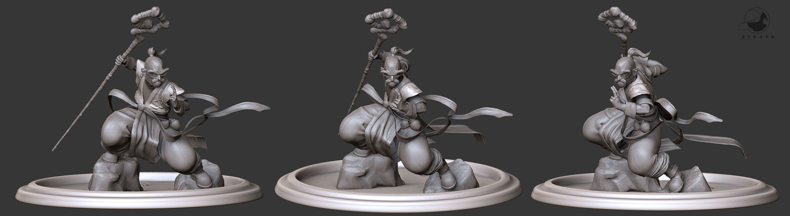
Thanks Guys , this is the work already has some time, was a good study, but already I made some new things after this. some studies of anatomy. it follows there. I wait that they like. thanks
my English is bad also
Thanks Guys , this is the work already has some time, was a good study, but already I made some new things after this. some studies of anatomy. it follows there. I wait that they like. thanks
my English is bad also
hope we would to get see the making of it soon, looks like we could learn a lot from it…specially noobs like me, hope u understand…! :)

Wow, really exceptional work! Top Row sculpting quality. Would love to see him get textured! 
Hi guys, thanks all coments, this is an old model. Im posting a new render with a better material.
I dont think i will work more on this model but maybe do a new one.
Link for my new model.
http://www.zbrushcentral.com/zbc/showthread.php?t=63042&highlight=zangief
[attach=110237]Render_Alta.jpg[/attach]
Very Well Done! Compliments! 
Very cool work man.
Very nice work Pixote_Mushi !
L
Pixote_Mushi, it’s looking great so far! I had a few minor comments:
a lot of the shapes Joe makes are about the angles, you’ll have a gently curving line that transitions to another at an angle. You’re doing it on the loincloth part, but the cloth areas on the knees are a good example of a place you could add some angularity, and also the top of the head. it’s subtle, but it’s a big part of his style. He usually does the fingers more wide and flat, and I think you could make the forearm a little longer and it would give you more space for the cuff of the glove. It kind of seems like his head could be more compact, might be a little too narrow or the face too far forward. It also seems to have more volume along the jaw line in Joe’s sketch, maybe whiskers there? Anyway, keep going, it looks really good so far!
best,
Gray
Edit: OK, he doesn’t have whiskers on his jaw line! It still seems like he could use a little more volume there though, but it might also just be the viewing angle. . . .
[]This has evolved into a great sculpture. Very stylized and interesting to look at. The gesture from the illustration was a great reference and inspiration to work from, good choice. In regards to the latest paint overs by g.g.; There is a certain amount of balance that should be maintained between illustrative inspiration and sculpture. There are so many things wrong with the form of the illustration, especially from an anatomical perspective. For example, the thumb of his left hand gesture. I would like to see someone get their hand in that exact position like it is in the drawing. Some of the angularity that g.g. is referring to, particularly the pants, would be a great addition. But making the forearm longer to match that of the illustration could hinder the result of the sculpture when presenting different angles. Even from a 2D perspective, the arms are too long, but you’ve maintained a more realistic representation of how long they should be in your sculpture, which goes back to the balance between 2D and 3D. You already have a great stylized transition between the two and which some minor tweaking, you’ve got an absolutely amazing sculpture on your hands. The choices you’ve made so far have been good ones, so keep up the good work.
Firerbert: agreed, there’s a point at which you would need to put aside the concept. But if the goal is to get it to look like a sculpt of Joe’s character those are the things I would be thinking about, but maybe that’s not the goal. Still a great piece for sure!
Hi Everyone,
Thanks for the comments. I am very happy for the comments, I agree to some. certain things in the model 3d had not functioned so well how much in 2D. I agree that concept of the Joe more has the accented angles and more volume. thanks for the tips. see you later