pinata zombie! now that is silly 
I really like the new scene! Gave me a chuckle. 
I am almost there. I will post the final version tonight around 9 PM california time. I hope its till ok by then.
Feew…Here are what i have for this entry. However, I am having hard time to pick the final one. You know, when you put so much love to each of them , at the end you have hard time to pick out the better one. Also when you look at one thing for so long, it happens the same too. That why i need your guys help here.
Please tell me what you think which one you like the most.
Thank you so much you guys.
Cheer
Thao Le

Attachments


Thao, you gotta go with 3 or 5! Nice work ethier way.
p.s. Check your email!
I think the last one. The backgrounds the nicest and makes the objects pop out of the screen. I also think it’s funnier then the others, I think the concept gets a bit lost on them.
Best of Luck
Pete B
I’ll really mess you up here. As far as impact and composition I like the first one in the series. As far as the theme and humor the suicide is by far the funniest. I think I would move the suicide to the first scene?
Personally, I like #2 the best…it is almost the same as 1, but the background fits better with the lighting scheme of your objects. The suicide ones are good, too, but I think helping pull a fellow zombie from his grave is funnier than suicide.
For me, it’s a tough call between 2 and 5. I think I like the last one best but I would try filling it with more ‘stuff’ (graves, zombies in the background, etc.) like in number 2, because I really love the visual ‘density’ in number 2.
I can see how it’s hard choosing from so much eyecandy. So much toil and love went into them, and they shine!  Beautiful atmos in all of them, but you must be in a hurry, so straight on to my small opinion:
Those zombies are so great and detailed that the closer up the camera is to them, the more I like the image. I enjoyed the last image for that reason, and because it shows the zombies in the best light/contrast. On the other hand I think the other (stuck zombie) concept will work well too if you could put the camera way in there, and really show the struggle going on. In most of the first images it’s hard to spot what arm belongs to what zombie for instance. The first image I feel would improve much from a lighter background (the moon right behind them), like you did in that last image; that way their silhouettes would be more clear and strong. The more I look at them I feel a more contrasty background would help a lot.
Apart from this, again, totally awesome artwork; really, really love them.
Good luck with the last though descision.
Thao Le,
Its a great thing when you got tough decisions when they all look great  . That said, they fall for me in the following manner:
-
As I stated with my reasons previously its the one I feel I enjoy the most
 . I kinda wish some of that darker blueish purple background with moon was in the upper right hand corner of this pic that you put in some of the other ones it helps those other images and think might with this one as well, though, hard to say without seeing it in there. Also kinda wish the one zombe being pulled out was facing toward the viewer and not away from us. A tad part of me feels a bit more subtle silly here(maybe a zombie using his leg to help leverage the tomb off the one) could of been used but still overall think I enjoy the lay out more so.
 -
Now that the colors have been added to the decision making I like the mood here in this one and how it works with the applied sillyness of the suiciding zombie.
-
Both 3 and 1 are relatively close to me in appeal, think 3 wins out due to more substance in overall placement of the shapes.
-
Centers on theme activity nicely like the others, its well done.
-
Again looks good but prefer the others.
3 was my fav. But for silliness I think 5 for sure! It totally works!
5. Yes 5!!
I still like #2 the best (as for the B&W ones). If you prefer the hanging scene, I would go for #5. They are all good of course, it’s just a question of which is better!!
I’d have to go with #5. 2 is a close call, and I kinda like the action in it better, but everything just seems to pop out a little nicer in #5.
This is just AMAZING stuff, ThaoLe 


I lean towards #5 for its simplicity of composition & the more overt ‘silliness’ factor
that is apparent in the characters’ gestures & expressions 
#3 is a chasing hard on #5’s heels though; Hmmm…!
All-in-all: awe-inspiring and top-quality character work 
Chris
Hello zbrushers,
After colected all the votes from everyone’s reponses (BIG THNKS), and also my favorist one, I have picked the final version. This has been a wild ride for me. Alot of hard works on this one and most of all, I have learned so much from this. ( I will post what I have learned on here later after I colected all my notes).
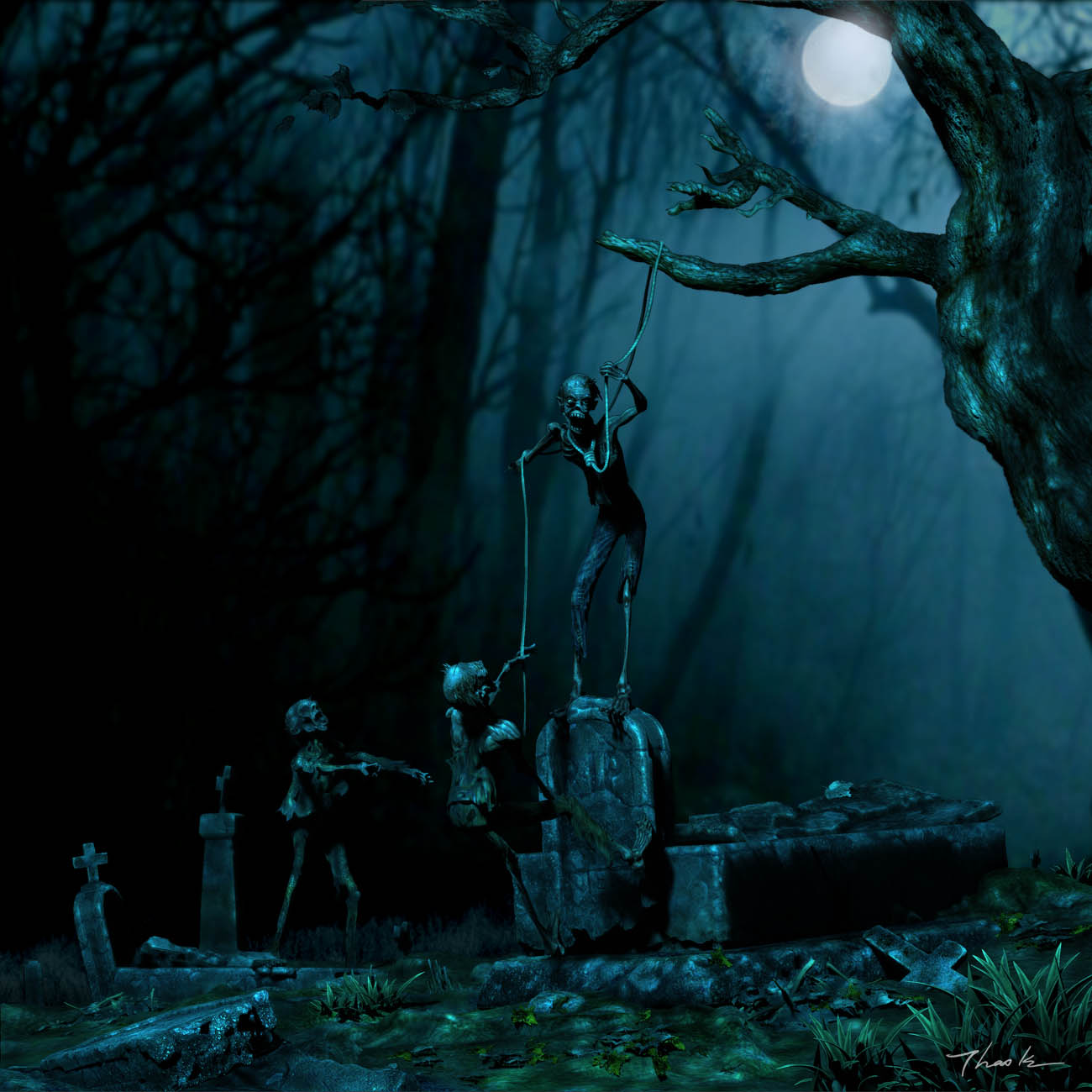
The reason I picked this one for my final entry is not just only from most everyone’s favorist but to me it depicts about this challenge about: Scrared, Silly, Composition, Lighting done by zbrush. To me, Zbrush is well known of creating details for monster and characters, but still have a big question mark about if it can handle and create a scene, composition, lighting just like other package. I just want to find out and see if I can go for that. After almost 3 weeks with lot of hard works, I have found out that zbrush not just a great software which can do those things but can be used to compose and touch up like photoshop as well.
Modeled, composed, lighting, touch up (thanks to Shaddingenhance and Highlight brushes) are all done in zbrush. The only thing use Photoshop for is zaplink for texturing and create the backgound picture (silhouettes trees).
The composition are done by 9 layers in zrush included the background picture.
Thank you and good luck everyone!
Happy zbrushing.
Cheer
Thao Le
And here is the Final:
Title: LITTLE FUN ON HALLOWEEN NIGHT!
Story: There won’t be scary tonight because these fella zombies are busy having little fun for themselves
present size: 1300X1300
large size: 3200X3200
Click this link to go to higher resolution image.
http://www.thaoarts.com/WIP/suicidedzombie2_touch6.jpg

Attachments


I love this scene, so much depth it really really does feel 3D…if you know what I mean?
So many good entries this is one of the top.
Pete B
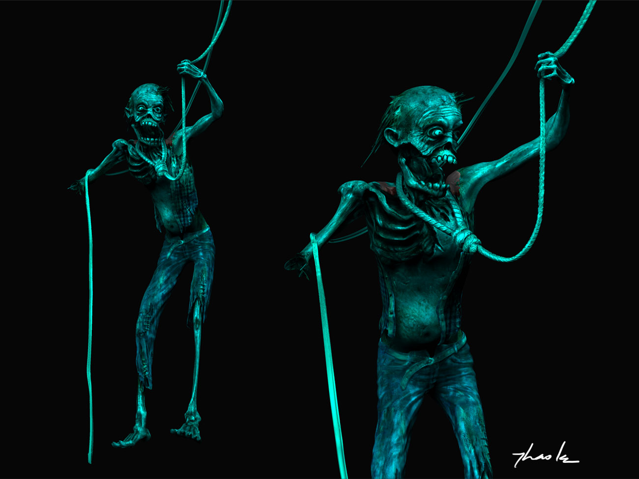
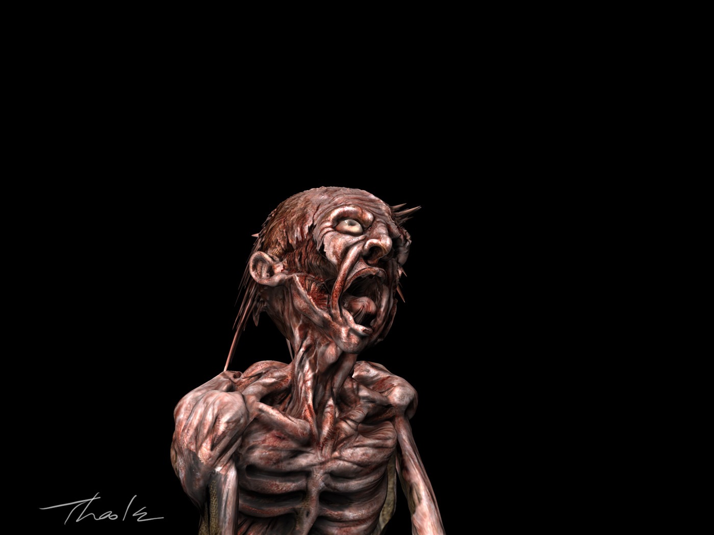
Great work, ThaoLe! Love the zombie closeups. 
Congratulations ThaoLe, it looks really good. It was also impressive how many different versions that looked almost finished you managed to push out in the last day or two.
The best of luck to you in the voting.
Jason
Thao Le,
Yours among some of the others is truly awe-inspiring. Couldn’t go wrong which ever one you went with… masterfully done. Thanks for your entry!! Will be watching for more details 
 .
.
that is some good sculping. Cool theme!