ZBrushCentral

Mountain City

LOW POLY MOD.jpg

Sorry for posting this stuff again :confused: . But i realy like to know why i have to miss, on the second time, my entire Picture in my first Script Post :mad: .
(http://www.zbrushcentral.com/zbc/showpost.php?p=321993&postcount=32)

If sombody delete that picture, i would like to know why :evil: !

Roland !

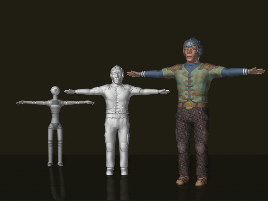
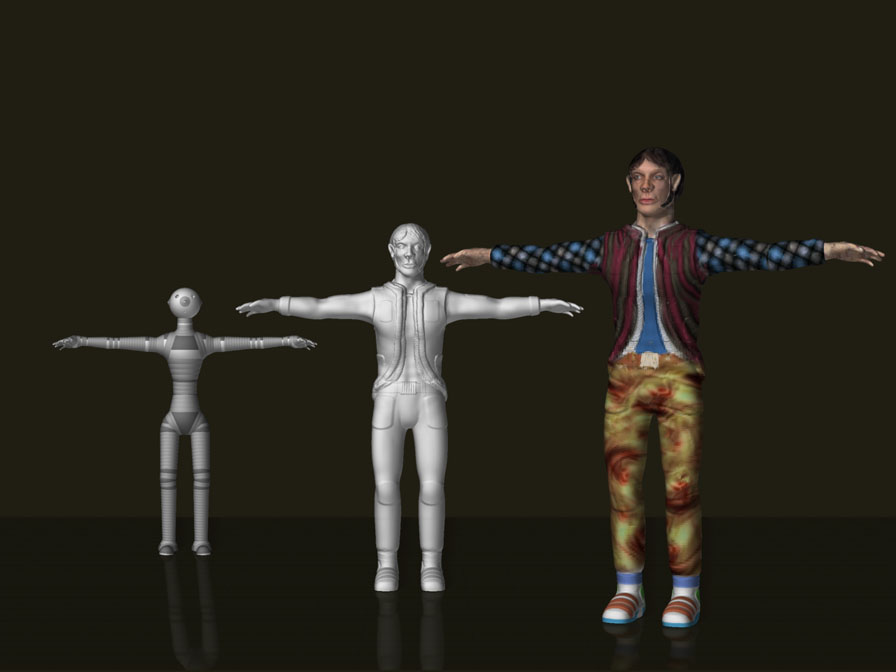
some people asked me, how i made this detailed Buildings.

here is a little Script which i recordet for Space Man.

There’s another Script and a short Tutorial that shows the same modeling tecnique. I made them for the ā€œHead Realay Challangeā€.

http://www.zbrushcentral.com/zbc/showpost.php?p=310055&postcount=14
http://www.zbrushcentral.com/zbc/showpost.php?p=309885&postcount=12

Greets to all and Space Man[/QUOTE]

Good work in those buildings. I still like the cleaner renders though.
Lemonnado is thinking of ā€œThunderbirdsā€ of the International rescue" team.

Your work is some of the most incredible, and original Zbrushing I’ve ever seen. And very inspiring.
Your buildings are amazing.
Top row stuff surely.
Thanks for showing it, I’m looking forward to seeing more. :slight_smile:

Yup, Thunderbirds it is…
Great work!
Lemo

Thank you very much Rolland. A really awesome work. Thx for the modelling script. Very useful.:+1: You are my hero.:grimacing:

very good job and even greater progresress through the sugestions…
I find amazing what is going on in this galery!!!

So, thers is one more Version with a little bit more contrast on the sky.
I sink the Spaceship on the right site comes a little bit more out now.

mountain city extendend version light effects darker sky web.jpg

Greets
Roland

is a really nice image but i think that the trees arent the best to fill in the background, and the flare is better if doesnt have the rounded thingy of red , it really puts all the quality of the image down. In my oppinion the buildings in the background would need to have a little bit more of shadows in their right, and make them darker further away. The little person are really cool, but the arms seems to be really stiff.
Anyway, hope it was a constructive crittique.

cordially

Luis Faus

So, Guys

once again i’m changed some Things. I add new peoples.
Specialy for cannedmushrooms i add a waldo.

i made the background a little bit darker.

I think it realy looks cool now and for me that version is looking ok now.

Thanks again for all constructive crittiques.

Roland Kaiser

MOUNTAIN CITY (where is wldo ).jpg

Good background check on who waldo is. Very detailed stuff. The people do look better especially the guy in the lower left. I noticed on your old one it looked like a ramp fell on him;) lose the guy in the yellow shirt on the foreground ramp next to the guy that is sitting on the ramp though. And a slight blur on the sitting guy.
Ahh so you did a robot already I see. Nice. I would use your knowledge of DOF (aka blur) on the robot also.

welp off to work as usual;)

Hi cannedmushrooms

sorry but idont understand your last Post. There is no sitting person on that image.

I made another Version where you can see clearly there is no sitting one.
There is one with a yellow Shirt with one hand in his pocket on lower left.

The probleme is you can’t see it here all detail, because the post size is not realy high

Greets
Roland Kaiser

MOUNTAIN CITY (where is waldo )2.jpg

OW I see now hes not sitting hes on a spiral staircase.
I can even make out waldo;)

Looks alot better;)

Here are two People Models off my Mountain City

I did them real quick and i add not so many details. Also the Textur is not very much detailed, because you can’t see the details on the Illustration.
But i like to show them biger here
Ok, Greets

Roland Kaiser

[attach=48212]Mountain City Men1.jpg[/attach]

[attach=48213]Mountain City Men2.jpg[/attach]

Attachments

Mountain City  Men1.jpg

Mountain City  Men2.jpg

So, here is one Body in Pose

Greets

Roalnd Kaiser

body posed .jpg

nice sculpt what matrial is that in the last one?

Regards,

Will

Hi Longsight,
it’s just a Basic Material with Cavity Intensity on, in the Material Palette.

Greets
Roland Kaiser

ah I see thank you Ive seen it around and been wondering about it.

Regards,

Will

1 the people are too big,

2 over detailed for their imprortance.

3 environment seems the subject, not people.
focus there and persective on it to any form of relation, people object ship mountain, from there build.

other than that structure is cool, needs more variety of color, make it very vast. needs center and point of intrusion for the eye to acept. where do you want us to begin our eye? what do you want us to think? this should encompas your illustration.

Hi Aceala,

the peoples are defently not to big. Just watch the step size of the stairs!

I don’t sinking like you. Sorry

Roland

ok np, ill post refernce of my thought sorry if we dissagree. >_<’)/