ZBrushCentral

Lava man

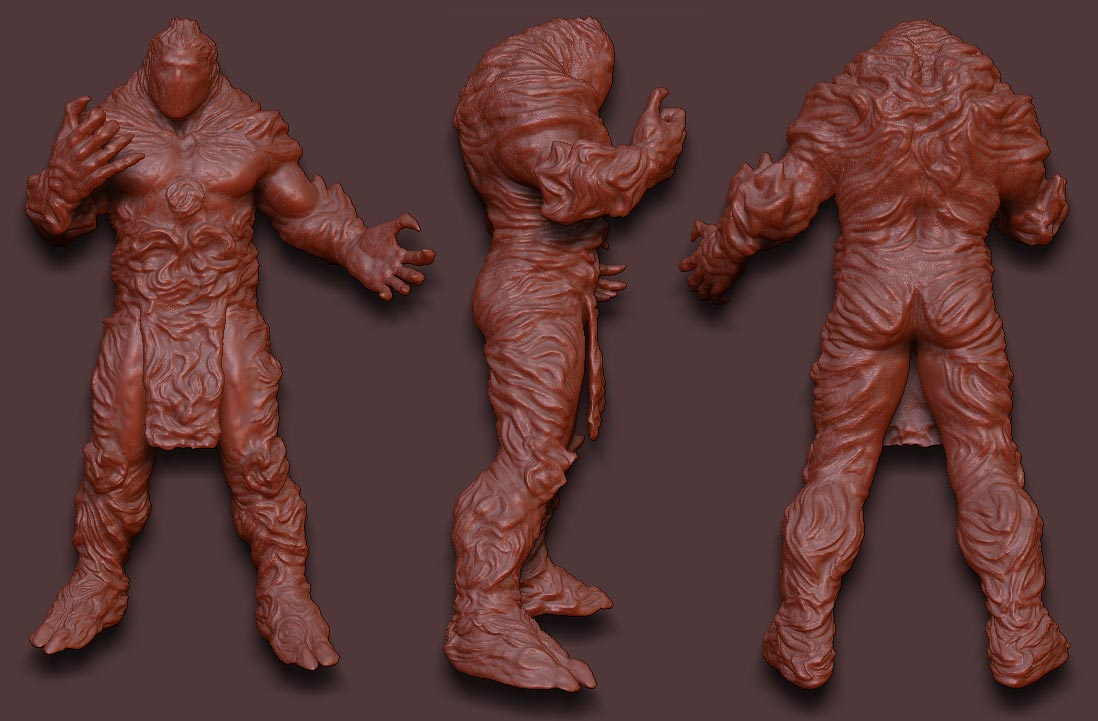
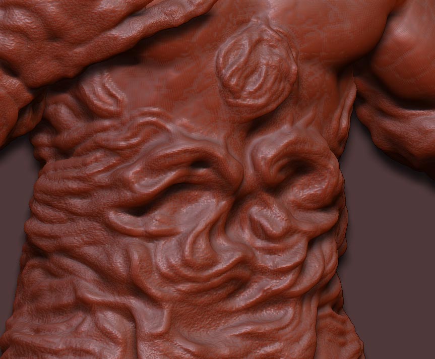
Does Zbrush3 allow you to make a selection like with the mask in move mode,( Holde Ctrl+click and drag ) to hide parts of your mesh instead of masking?

That would save a little bit of time, not having to click multiple times to get the little part you want to see. Especially if your model is posed.

edit: nevermind, the option is there and how I wanted it to work.

nice! :smiley:

Now it’s pretty much to the point where it’s hard to notice the extra detail unless I zoom in close.

so…almost done.

I need to do another wrinkle pass on the left arm, fix both hands and add the fine details with alpha brushes.

marid-10.jpg

Attachments

marid-10b.jpg

heres a hint: if he actually is a rock-lava monster then he shoulnt have muscle bulges.

You are correct, but in a different term.

I expressed the same concerns when I first started on this model and as It was explained to me, this character exists in the afterlife, the whole game will be in this realm.

The form this being takes is in essence a self perception. This breaks the rules of reality in which he would not have clothing, armor, muscles etc.

The concept I got from them had cloth, tattoos, eyes, nose mouth… Looking much more like a human.

I was able to get it to this design and still be acceptable for what they are looking for.

compromise :wink:

I’m done with the sculpting, my computer gave up…

Now textures

marid-11b.jpg

That’s alot of wrinkles… :smiley: where’s the lava ? perhaps a better name for him would be Wrinkle-Man!

Now seriously, i would tone down all the wrinkles quite a bit. This is getting too much, so much it’s difficult to see what the character actually looks like.

/ Max

Too much huh…?

I’m going for a look more like cooled lava.

http://images.google.com/images?hl=en&q=cooled+lava&gbv=2

Anybody else think it’s too much?

I think it would be good to tone down the alpha brush crack texture.

Gabe,

No, NOT too much. I get your going for cooled lava.

Great Job on this! :+1: :+1: :+1:

Here’s a link to a turntable vid.

http://home.comcast.net/~gabe687/lava-pan.mov

sorenson video 3 compression

Started laying down some colors with polypaint. Very cool feature.

This is just the base lava layer, I have to go in and color all the rocky parts black like on the sketch. I just put a basic wet shader on there.

marid-12.jpg

Hey!
I’ve been following this thread since you started with the character and I seen some good progress with it. Good Job!

I think the lava in your character looks a little bit too shiny. I know you trying to give him a wet feel but you have to remeber is melted rock. I would say for some of the bright areas (yellow spots) I would recommend to you to use the Highliter Brush to make those areas more intense.

Also, I know it’s still a WIP, but it will defenetely help to put more attention to the face(Eyes, Mouth, Ears). Specially the eyes when ever the character would like to make eye contact witht he audience.

Keep the good work!

Javier Loredo.

looks like the wet shader wont do on the black parts, and maybe not on the lava either.

I know, I just put it on there without tweaking. Just to have something on there…

I’ll use a special shader for it in max. A combination of shaders most likely.

small update

marid-13.jpg

The shader looks great from the back. I don’t like the yellow areas on the front. I think you should make those areas more like the reddish orange areas on the back.

Now make it look like its glowing from the inside.

Still working on the orange cracks.

its not really gonna look like lava till you add the glow. The update will make that better cos you get to see more of the uncooled lava, but the cracks might be too much. (especially around the buttocks. they look like they should be solid color, maybe all black and more black on the legs.) Also could you give us a current render head on? I want to see how the chest is looking.

He reminds me of a burnt marshmallow. :wink: Cool stuff.

I think the loin cloth gets lost in all the other details…and I’m not sure you need it anyway…wouldn’t it just burn up?

Also, the circle in the middle of the chest is a little distracting…I’m not sure if you have plans for it or if it’s significant, but you may want to tweak it a little so it’s a little clearer/more obvious as to what it is.

Looks like it’s coming along nicely. This is a neat character. I enjoy watching your progress.

grate progress man u done welldone waoo