ZBrushCentral

Kratos

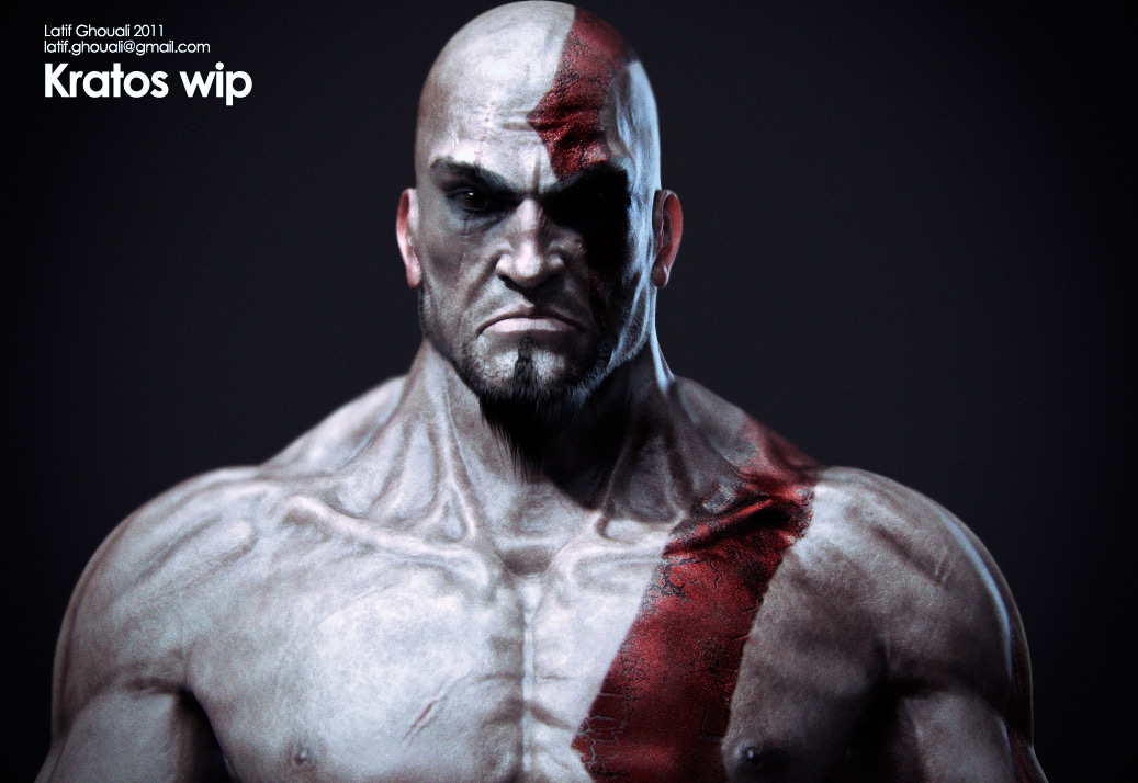
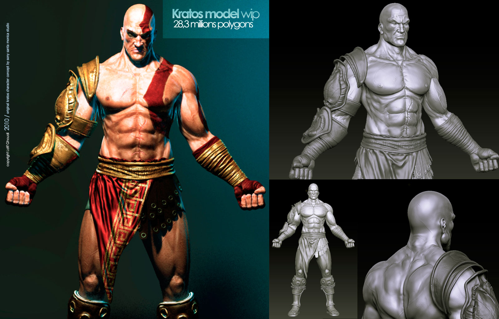
[Hi guys, this is an update of the character kratos i posted here 3 weeks ago, rather than the head i tweaked to make him look alike the kratos from the recent ps3 version everything is newly modeled and sculpted, iam almost finsihed the sulpting ( miss only the blades ) and ready to start to UVit, polypainting and shading in lightwave, it would be nice to have some feedback from you guys just before this important step, so heavay CnC are ve]1.jpg

[![9.jpg|1120x840](upload://rgszgbEj3e4fCFqLNMI3W0RXT1u.jpeg)]![8.jpg|1120x840](upload://qObmI0369hfwDKi44jZ5xhuEr2a.jpeg)

[

](http://%3Cfont%20color=%22#9A9A9A%22%3E%3Cbr%20/%3E%0A%3Cbr%20/%3E%0A%3C/font%3E)

Attachments

2.jpg

3.jpg

4.jpg

5.jpg

6.jpg

7.jpg

copyright? LOL

You can’t copyright an already copyrighted character for one and two even if you say copyright it doesn’t matter unless the paperwork is filled out. Other than that decent likeness. You could use some higher res skin textures though.

Salmosta, Droma : everybody knows that the Kratos character is originally created and owned by sony ,the copyright isn’t related to the character design itself but its about the execution, i use to put the copyright word in addition to my e-mail into works i design from concept to final image, and i repeted it this time without thinking but i didnt forget to mention that this is not related to sony and its a fanart in the first post !

For textures as mentioned before isn’t final render, except the head which isnt fully painted, nothing is textured .

Looks great man, the face is much better than in the first post.

If I may comment, the triceps is not shaped correctly. its too thin and not divided into two halved. Other than that, looks pretty damn good ! Congratz.

magalhaes - thanks for taking time to write back :slight_smile: its better than talking about copyright stuff and really constructive.
you’re right about the triceps, i was looking to the images i posted here and noticed something weird with them, thanks to confirm it , will correct that in my next zbrush scession :slight_smile:
Thanks again man :slight_smile:

I’m lovein’ it.
The sculpting part looks fine, if you’er going for a realistic Kratos.
But if you want it to be like the game version, then you should do a little research. check out the making of for God of War 3 They tweaked him a little unrealistically to make him look better in game. Anyway Great stuff, I should work on something too :wink:

TroyRichardson - you said that if i wanted to make him realistic and this is the point !! in my first attempt with the armor i tried to make a realistic and anatomically true version of kratos , but seems taking this way ended with a character that look like him but not him ! after i played the ps3 version and focused on cinematic i definetly get what was wrong with the first version.
I finished the game lately and watched the making of and honestly that version of kratos in smooth shading tweaked by this modeler in zbrush wasn’t what iam looking for , so i tried to get likeness of this version with realistic features, i mean no exageration in face features , for the body i prefered to keep it realistic too with well balenced body parts. i think the important when we reproduce a character is to add a special touch, look for exemple to al the versions of marvels character like hulk , every comics book designer brough his version from 3 meters height to 6 or ten, same too for body structure, face , hairstyle …and this is what hapend with kratos version from 1 to 3 .
thanks again :slight_smile:

Hi guys, here some renders from progress stage since then i modeled the blades, remodeld the hands to make them fit the sright proportion of the blades handles, retextured / shaded the skin and some other parts and worked on the fur and hai and triedseveral ligh setup to reach the mood. iam looking for. plz let me know what you think before starting final renders, composting stuffs.
[kratos_closeup-wip.jpg[/ATT]%3C/font%3E"]kratos_closeup-wip.jpg%3C/font%3E"]
](http://%3Cfont%20color=%22#9A9A9A%22%3E[ATT=242049)

Attachments

blade1-copy.jpg

blade2-copy.jpg

gallery_booklet_kratos.jpg

:smiley: 
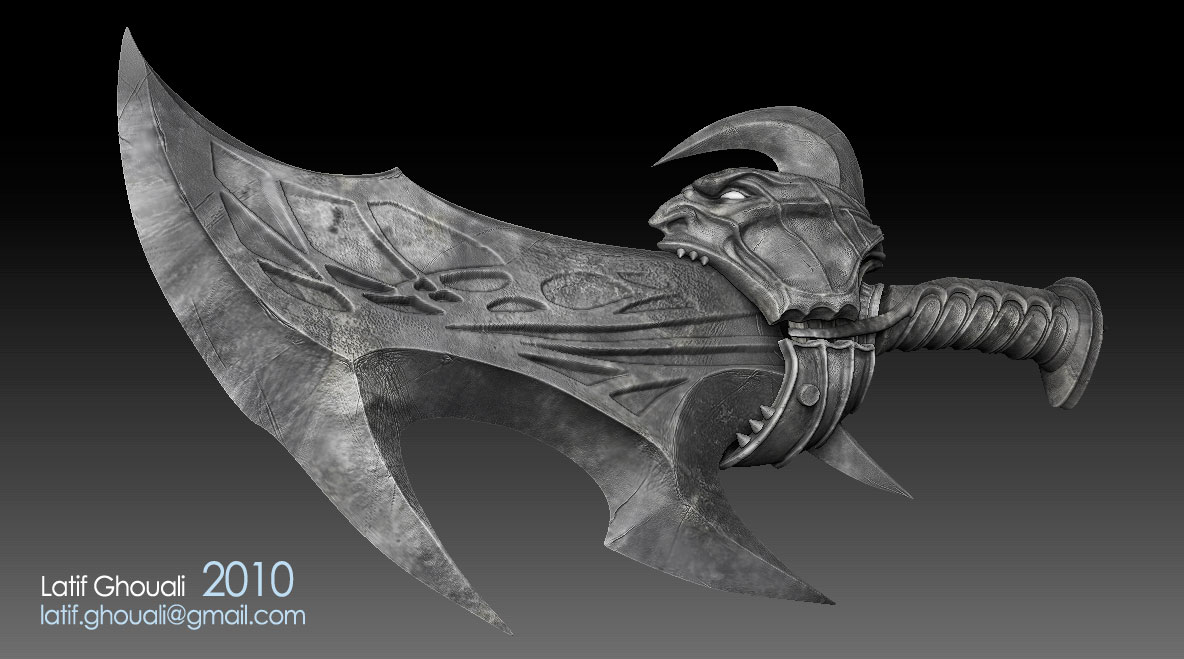
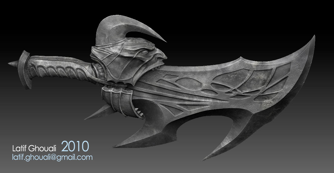
That is awesome, I was screaming in my mind :lol: when I saw the new stuff. I would use the dam_standard to sharpen those edges on the armor and sword. Unless that was the look you was going for, well give is a try see how you like it:cool:. And for the stretching on the blade sword’s design pattern, it look like you use the layer brush. and that causes stretching, you can fix it by using to smooth Valance or hPolish at very very low intensity. But I would give it one sub-D before trying.

Thanks TroyRichardson, its always good to hear from you :slight_smile: iam glad that you appeciate the latest addition, it make me things that my efforts arent waisted for nothing.
i’ll give a try to the brushs you talked about ( i remember have using the dam_brush and its mean its already on my ZB brush list ), one of the hard part was the chains turns around the arms, believe me they looks simple but making them mary the arms shape without interpenetration was a nightmare , right know iam working on the wings that i skipped few weeks ago, but know after finishhed almsot everything i think its good to give it a try, they aren’t indsipensable but i believe they should add a big plus to the final shot, just they must be well done with a feeling of real feathers, and its depend of a technic iam using which consist of blending mapped feather with fur renders.

Thank you very much, i’ll post some updates soon :slight_smile:

Hi guys, here the last update of my kratos that i worked on since several months now, i think its enough and its a time to move to another personal cg stuffs, let me know what you think about :slight_smile: thanks in advance.

[Kratos_GOW.jpg[/ATT]%3C/font%3E"]

](http://%3Cfont%20color=%22#9A9A9A%22%3E[ATT=244054)

wow top ROW!!! this is amazing. you got skills fella :slight_smile:

As a whole, this piece is pretty cool. But I think if you worked your anatomy a bit more, it could a whole lot better. For example, I think his nipple is too high, his sternomastoid muscle could be more pronounced, His rib muscles like the external abdominal obliques and serratus can be more prominent as well. Hope that helps.

Great Job

thanks guys , much appreciatted :slight_smile:

Wow didn’t notice until you said something. Ok you’re all most done:cool:.
On top of what sankar82 said the final render looks dead, in the eyes that goes with out saying. But the over all lighting needs work, your lighting from a week ago looks better (the full body color one:p). Also the Red cloth on his hips, it stands out like nobody business. It looks like silk but shaded wrong and/or CG-ish :confused:. There are some great rendering techniques in the forums, use them;).

  • Happy Zbrushing

ok guys let me know what you think of that .
[

%3C/font%3E"]](http://%3Cfont%20color=%22#9A9A9A%22%3E[ATT=244596)

Not true, not in the U.S. Any work is copyrighted automatically the moment the creator is done with it. See this for reference to this fact: http://www.copyright.gov/circs/circ1.pdf

Specifically:
“Who Can Claim Copyright?
Copyright protection subsists from the time the work is created in fixed form. The copyright in the work of authorship immediately becomes the property of the author who created the work. Only the author or those deriving their rights through the author can rightfully claim copyright.”

(Now, the art here may already belong to someone else BEFORE this person copyrighted HIS VERSION of it, but that would be a civil matter between the two copyright owners.)

And today’s law lesson is complete.

I think it’s coming along nicely, that said I have a few suggestions. The muscle detail in the abdominal and thigh area feels really flat, as if they were simply carved in with a brush without any volume. The nipples feel off to me, I think they are just too high. Just push the muscle volume more and the piece will be stellar :slight_smile: well done!