Thanks Adrian 
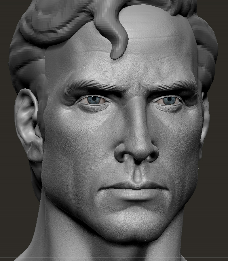
Low poly head (done in 3Dcoat since that Qremesher plug is still MIA >:(
rendered in Marmoset Toolbag, and a lo - high comp at the end,

Thanks Adrian
Low poly head (done in 3Dcoat since that Qremesher plug is still MIA >:(
rendered in Marmoset Toolbag, and a lo - high comp at the end,
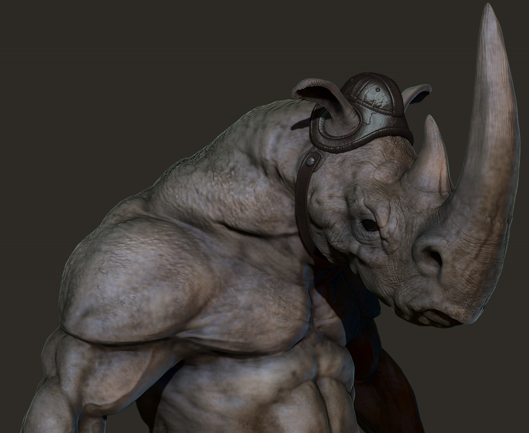
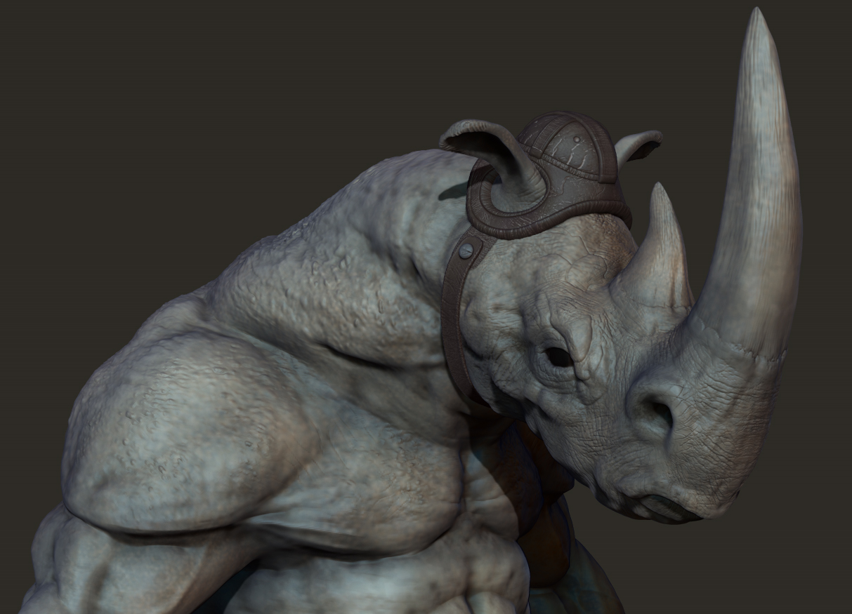
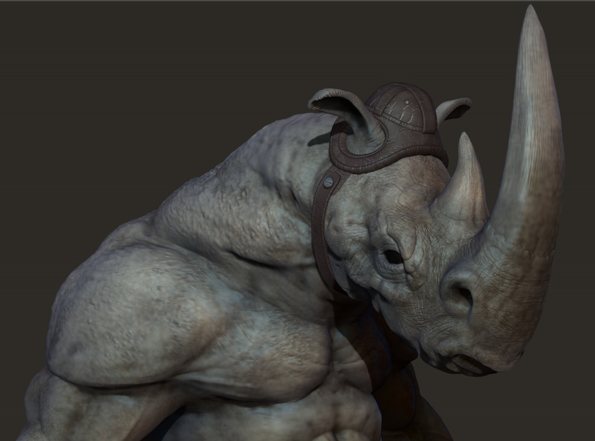
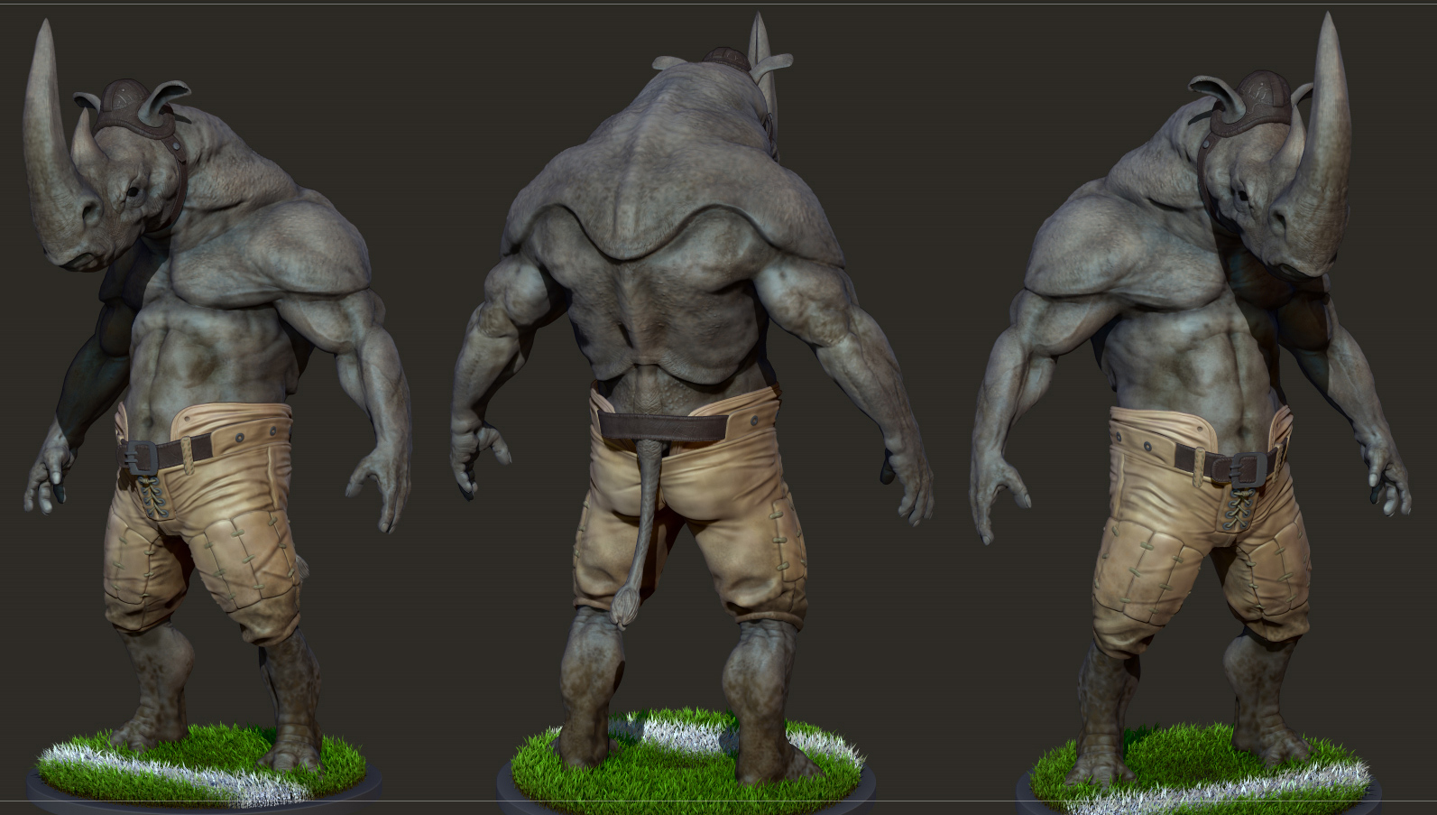
polypainted Rhinobacker:
Cool work, i like the model. 
Thanks Philuxius:)
working on this today:
That’s one badass rhino,looks powerfull
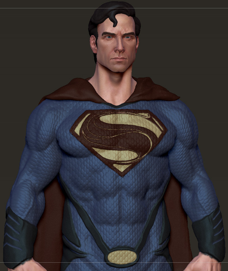
love the rhino,Supe’s looks good.
Looks ace man, terrific work … keep at it 
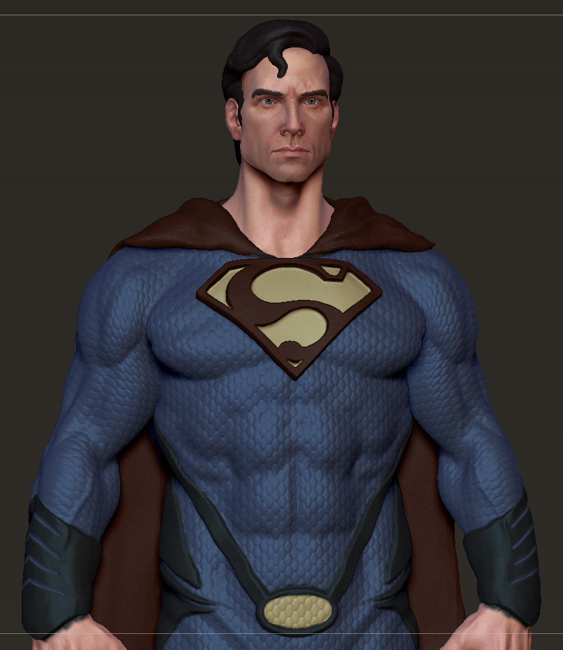
that is a cool work you did there ! especially the rhino ! also, you need to make less symetry for the superman head… especially with pores ! because it will feel quite weird ^^;
Thanks guys:) allaze-eroler; worked on the symmetry, cheers:)


The rhino is amazing 
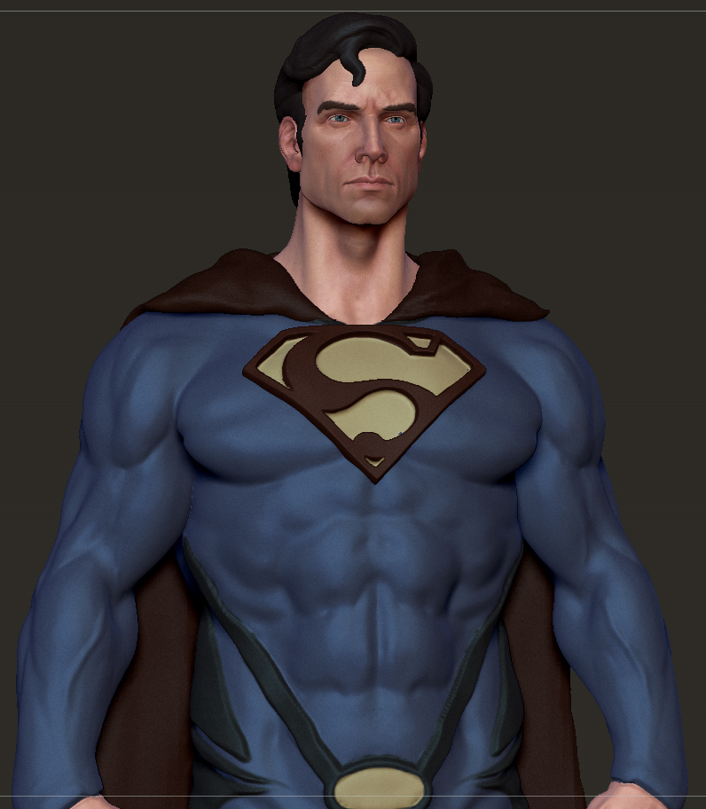
…good work, but you have the same problem with multiple heads with the proportion of eyes… the distance between the eyes is always another eye…
It is very important to have a realistic appearance…
WilDT, thanks dude:)
Thanks cornelius, the eye’s were bugging me but I couldn’t quite tell if it was a size or position thing.
updated eye’s as well as some other changes after some great feedback from Ryan Jackson


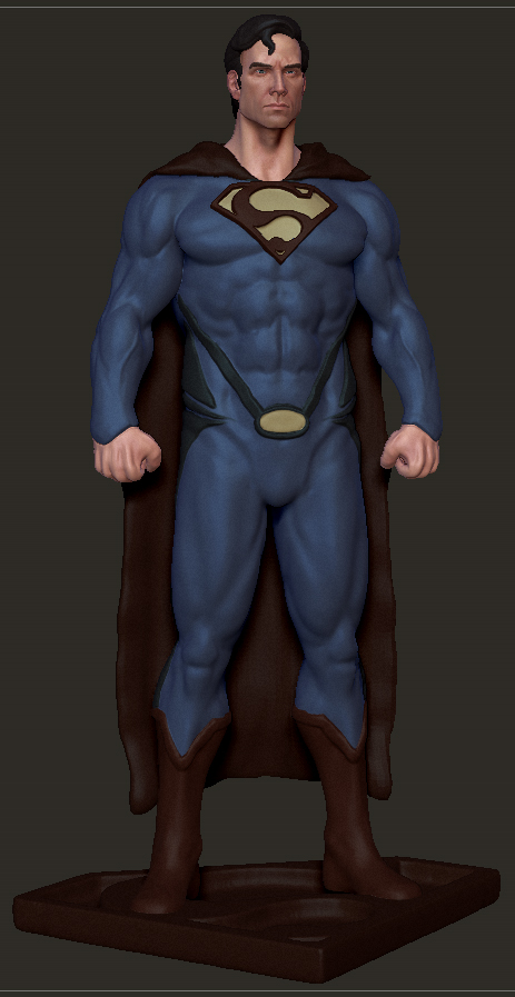
i think his whole head it too small for the body. I’m no expert though. If you put his hand up in front of his face as reference, his head is pretty small.
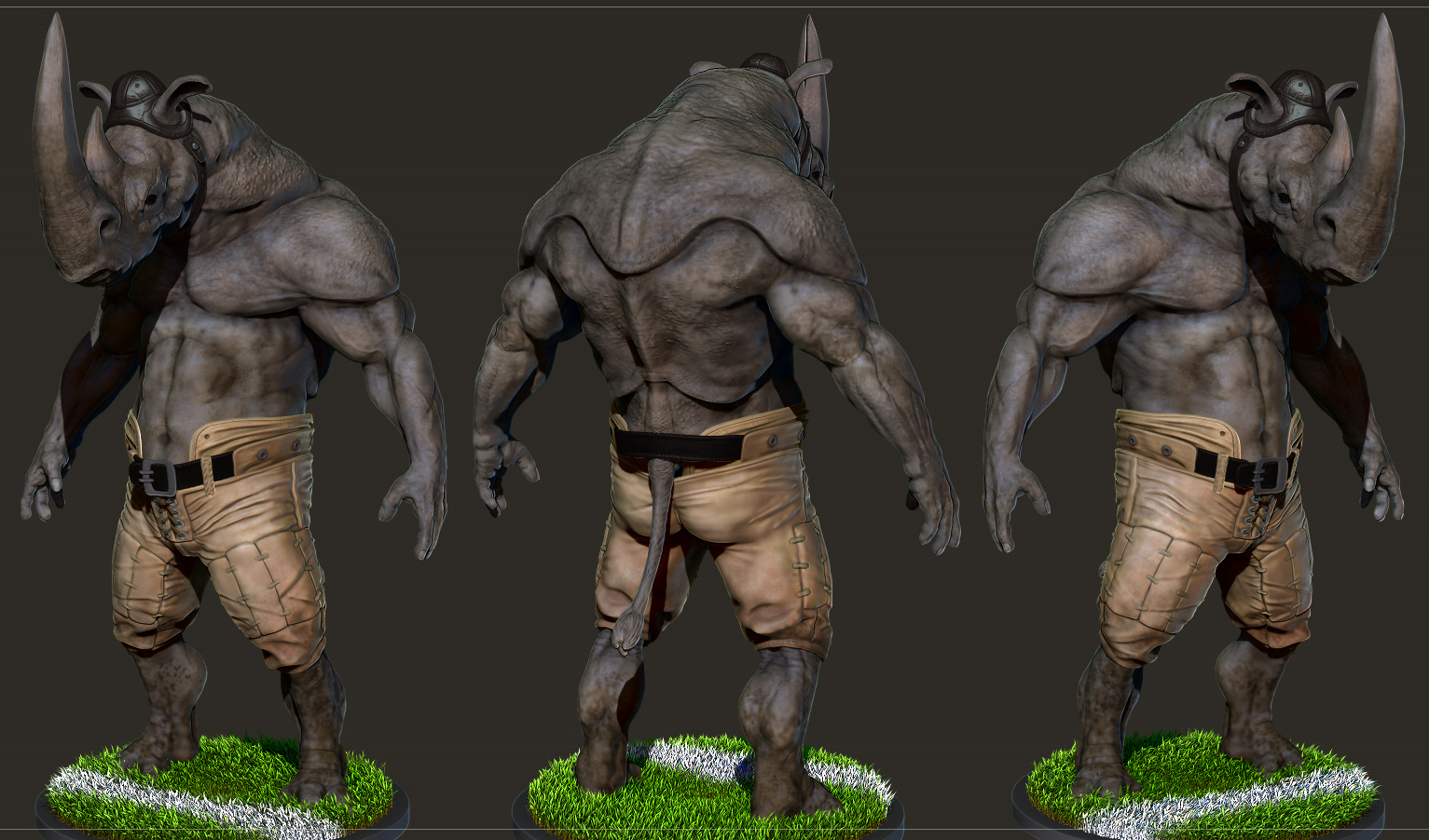
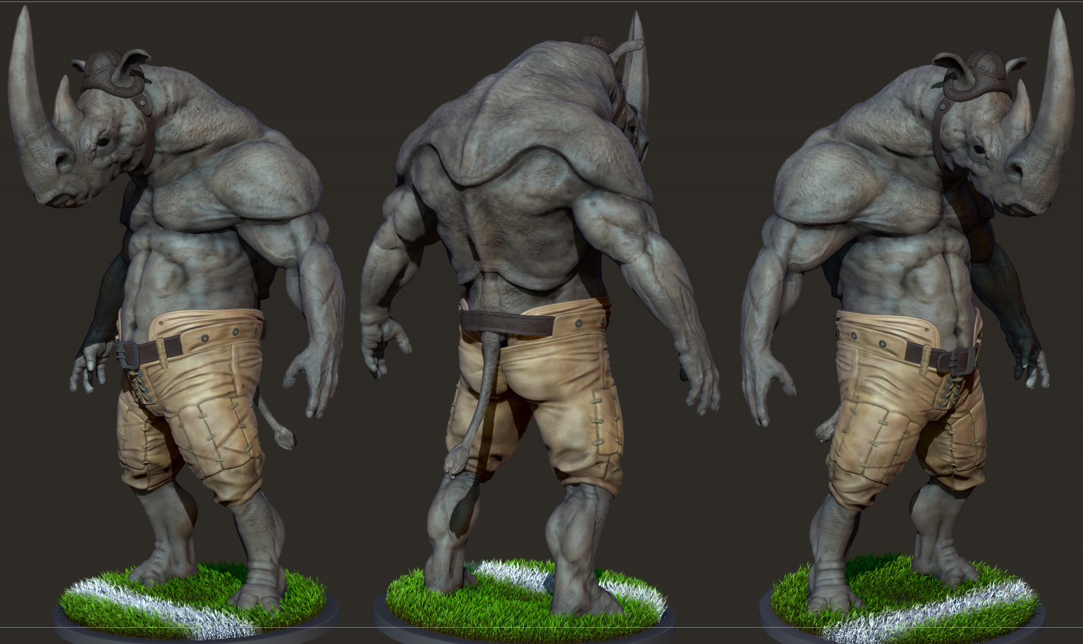
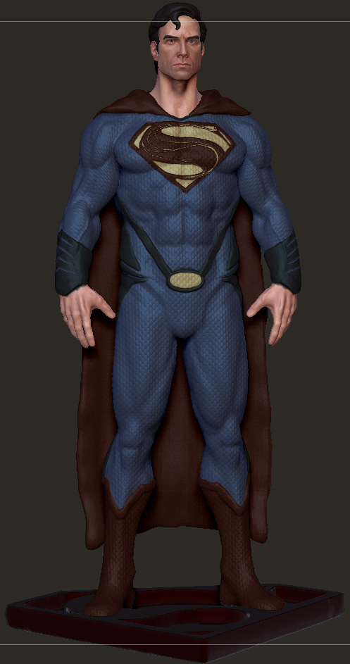
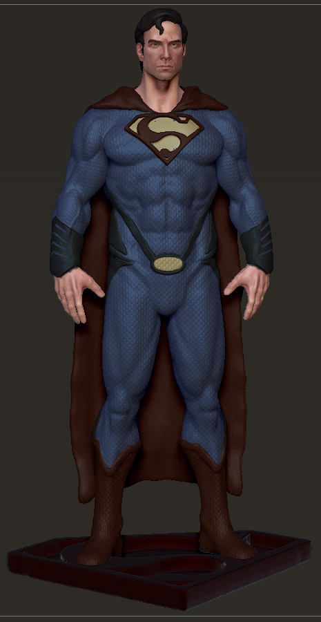
his hands are a bit too big atm which kind of thows off the rest of the proportions  here’s a more recent full body:

superman is looking pretty good. at first glance, to me it looks like his neck is too long and skinny. The waist also seems to be quite thick. it could be the arms and shoulders are too close to the body, or the waist is too wide, im not too sure but something just seems off with those proportions. The shoulders should be noticeably wider than the waist. The pectoral muscle should flow into the deltoid, it looks as though its sort of smashed into it right now if that makes sense. The last critique i have is for the bumps over the entire model. theyre very pronounced and kind of distracting. In my opinion i think it would look much better if they were smaller, and less noticeable, they also stretch over the forearm. hopefully you don’t mind so many critiques, but personally i want people to tell me everything they see cheers, hope it helps

If i were going to adjust proportions this is what i would do. Obviously you are pretty talented already; the texture on the head is good, the sculpt overall is well done (visible stretching of the “bubble” pattern on the suit at the forearms though) and the anatomy is there just slightly out of place in my opinion.
Shepard.B: Crit’s are always appreciated dude:)
robertrageson: that’s awesome man, thanks:) I think some of those points are a result of the transpose on the arms and shading. Here’s the default T-pose which should show those area’s a bit better. The stretching in the pattern is due to applying the Noisemaker pattern without UVs, so the “side area’s” get stretched across the model.

a quick test pose and ZB render for my Rhino:

Cool image , i like
Bad ass rhino!


