Love the character but I think the composition could be better if the rocks in the foreground had more detail.
hey,
good work on the lava man! but i think the foreground push back the quality of the picture
I like lava man, he’s very melty.
Very cool sculpt, paint and render 
Looks terrific and original!! but the fg and bg need more details imo it gives it a 2D feeling.
cool stuff small_orange_diamondsmall_orange_diamondsmall_orange_diamondsmall_orange_diamond
Hey Jesse.Great works…Volcano Characters very nice.Love ya vid:)
terrific design and flow of that Volcano guy.
excellent!
cherub_rock: thanks dude! You’ve been improving leaps and bounds this past year. Glad you stopped in. 
Droma: Agreed. I think I went crazy with the dof effect but it definitely could use some extra detail. You’re seeing the side of the base there…
HUN-Firebat: Yeah totally agree. There’s no turning back now though. I mainly want your eye on the monster but I can see how the FG is distracting…
sgrell: hehe - melty was my goal on this one.
Etcher: hey man! thanks! love your stuff.
SuperHer0: oh most definitely.
DELTATHUND3R: hey bud - thanks
Julian_K: thanks a lot! love your work as well.
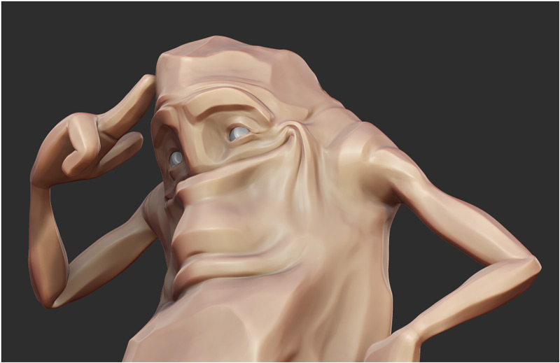
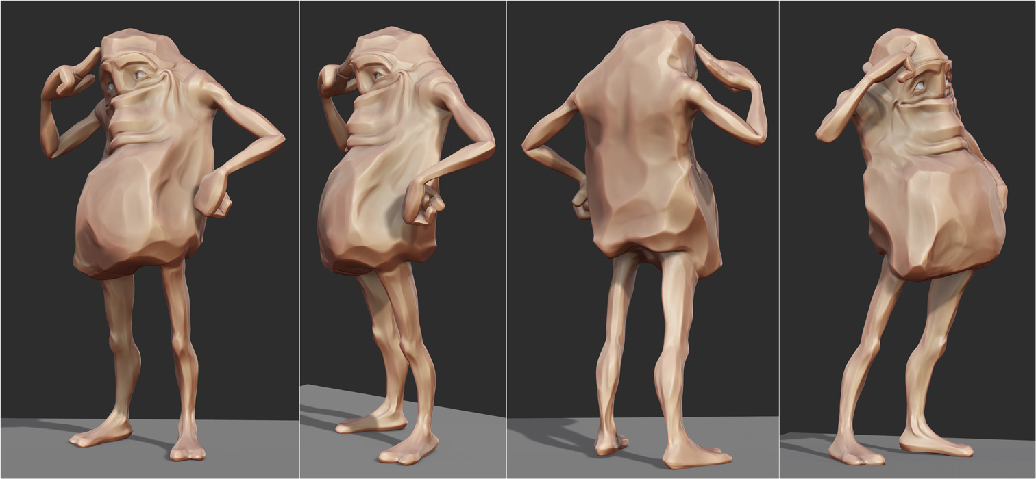
Ok, so here’s some BPR’s of the sculpt:

Attachments


can’t help it, but have to say it again: the flow of this sculpt is just wonderful.
Beautiful piece, both textured and as sculpt. Great job.small_orange_diamondsmall_orange_diamond
What a wonderfully well designed piece! Placing this in my favs folder!
Cool design!!!
wow this looks great. Your work is always an inspiration. Question, you still doing the monthly 1 hour tutorials?
Total agree with Julian_K, the flow is amazing!, the design, the sculpt just brilliant!!!
I think the foreground is executed perfectly. IMO more detailed rocks would distract from main character. Look at some molten lava and you’ll see it flows just like in the image. 
Lava looks the way you see it on the character sculpt. The foreground rocks just look like a fast photoshop paint over and distract from the detail of the model because its a blurry mess. Even flowing lava or recently cooled lava/rock has more detail, bubbles/cracks/chips/flakes ect. The background looks fine with that effect because you’re focusing on the model and its supposed to be liquid/blurry/heat haze. I just think the foreground either needs more detail or should be cropped from the image before I would put it into a portfolio. As just a cool looking image I think this is excellent but I’m currently in the job hunt mode atm so I’m judging everything I see based on what an art director would pick apart in piece of work. Composition is as important as the sculpt or textures.
Edit: I don’t want this to come off like I’m bashing his work. The sculpt itself is excellent and the texture and lighting very well done. Props to you sandpiper.
Nice one jesse, nice sculpt mate!
Julian_K: ah man thanks again!
maxinkuk: thanks!
KrakenCMT: wow thanks man! love your stuff too.
marianosteiner: hey thanks!!
adio38: Sure am - except now it’s called CGNUGGETS.COM and it’s TWO videos a month. aw yeah
manzarek123: thanks! your bustwork is really cool.
Paint Guy: Good point. 
Droma: Everything’s subjective of course and you’re entitled to your opinion. …it could go either way really, smooth and blurred out, or rough, detailed, and rocky…no biggie. Since I was the art director on this one, I suppose I approve of the FG. hehe
mutte696: thanks bud!
Hey friends!
Here’s a little mascot I created for my character creation tutorial service, cgnuggets!
Lots of use of hPolish and TrimDynamic - my favorite hardsurface brushes. Really fun to hammer and smush stuff around with those.
ZB bprs:
Attachments

As far as nuggets go…you nailed this one. Really. Simple, but so well done! Sometimes you can’t explain why something resonates:)
Great professional site too!!
All the best,
Neville