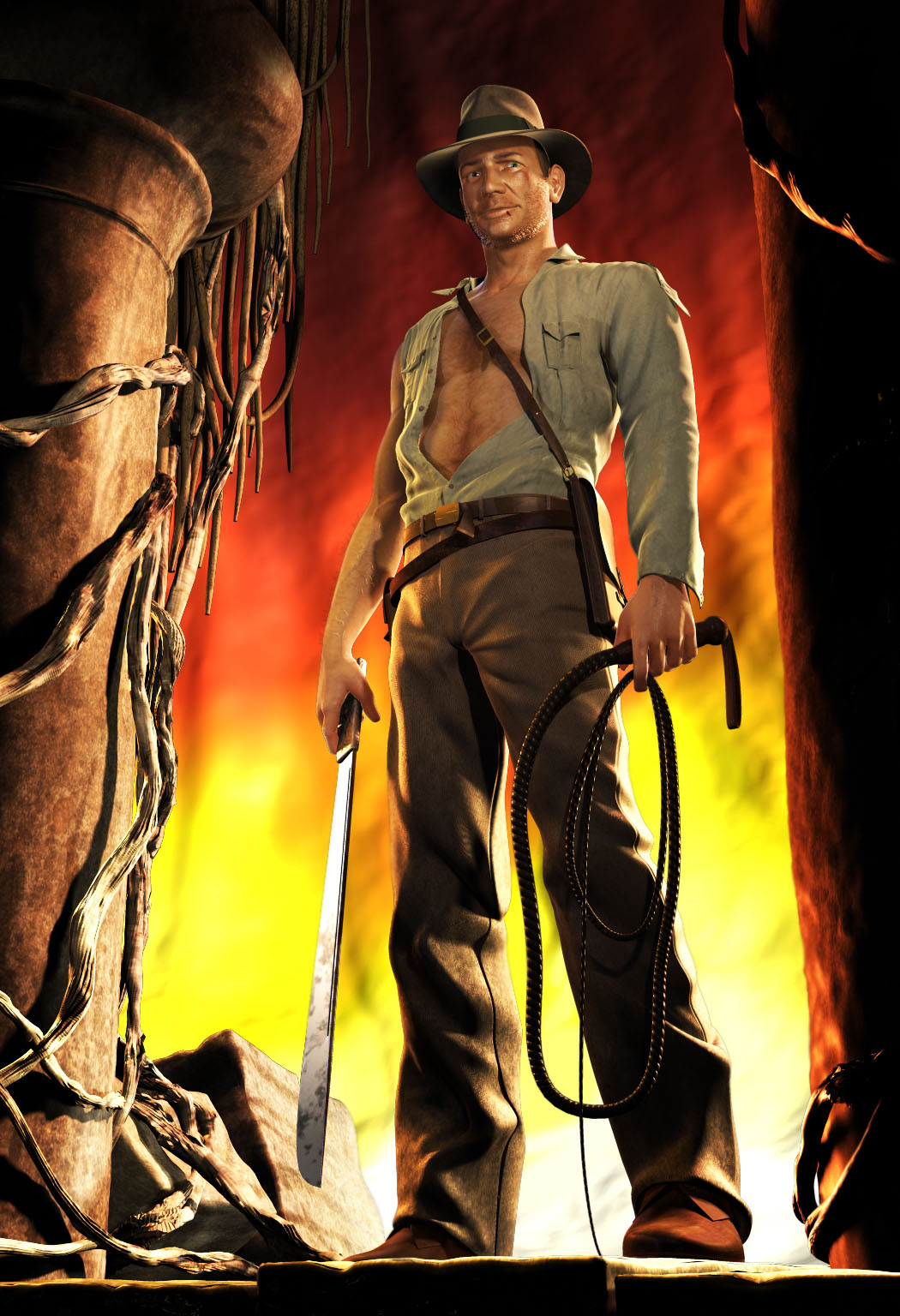
Its a nice start, but the face doesnt really look like Harrison Ford. The jaw line’s off, the brow isnt quite there, the nose lacks the little bend in it, and the whole model seems to be a bit skinnier, and lacks the muscle definition he had in that movie. I really hope to see this through, I love that movie poster!
I am liking it. I agree with feder!co, you should make some kind of ancient arch to put him under. I really like the wrinkles in his cloth as well. however, the only problem I have is his face. It looks good, but it would be awesome if you had it more of a likeness to harrison ford. Overall I really like it and its great. maybe add in some wireframe?
Haha my girlfriend has been telling me for 2 days now that he didn’t look like Ford enough, guess I should have listened. The funny thing is that I worked on his face first until I got the likeness down as you can see here:
[[attach=137499]Indy.jpg[/attach]]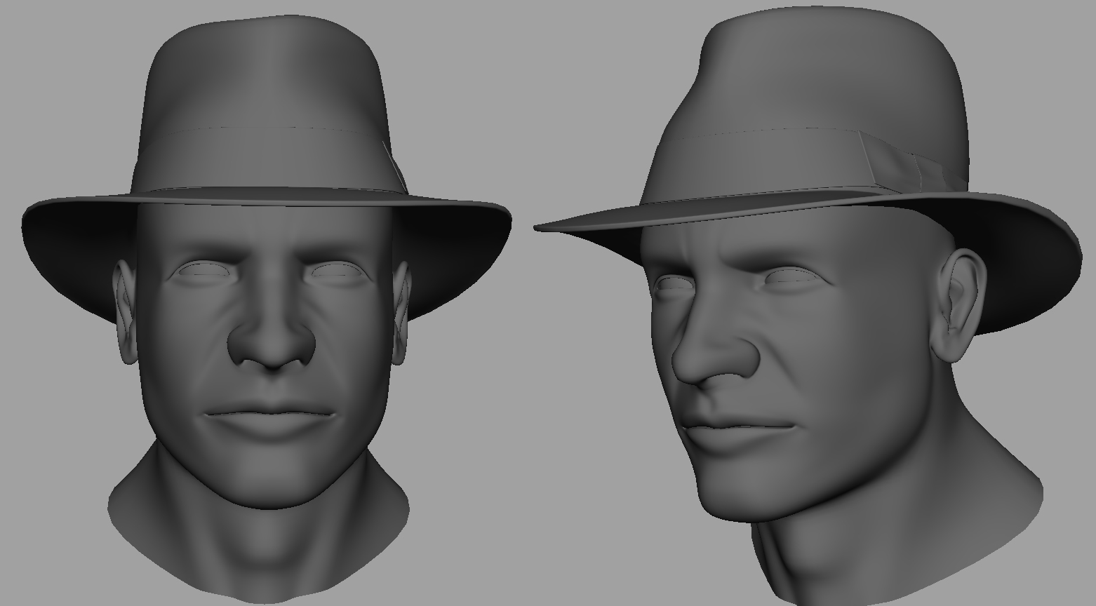
But I guess something went wrong along the way. Well I will fix it. Don’t agree that he is too thin but he could use a little more definition maybe. Harisson ford was definitely buffed up for Doom but he was no body builder. Will have a look though 
Thanks for the comments guys, I’ll get right on it and post some updates. And I’ll post a wireframe as well. First sleep…
Cheers, M
I’m liking the sculpt alot, although the render is somewhat lacking. Color and lighting specially. Needs more contrast or/and stronger colors perhabs. I’d play more with it. Great work!
The bridge of his nose is too wide. The length is right but the width is too much. Also, his mouth is a lot longer than it should be. This is where the likeness gets ruined. You may want to work on it a bit more.
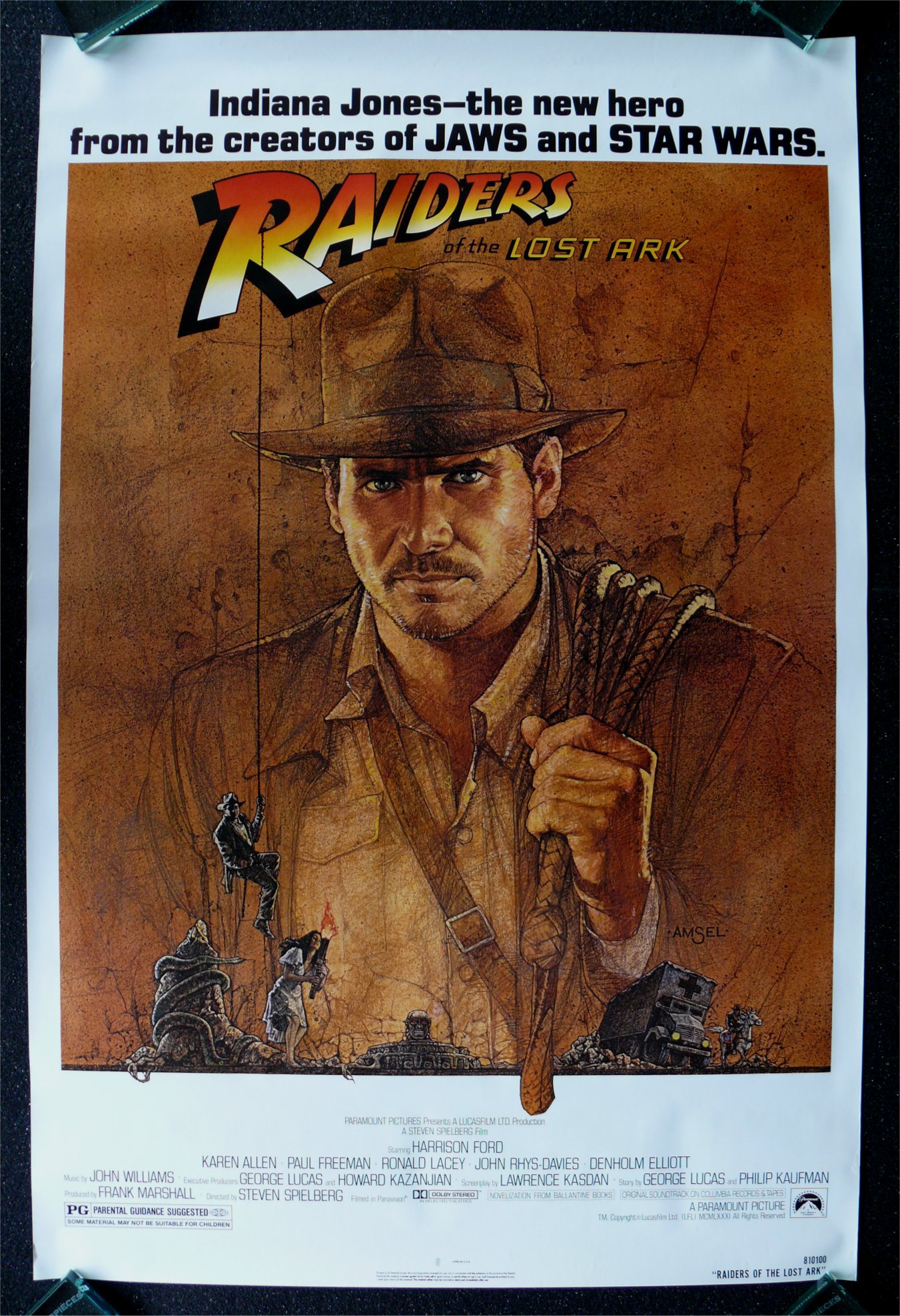
Look here:
http://trev-solo.deviantart.com/art/Premium-Indiana-Jones-sculpt-83922630
notice the size of his nose and mouth in comparison to his face.
Ah that is a great ref image teyon, thanks, getting right on it!
And now that I look at it again, the colors are a bit mute, it can only get better…
(until it gets worse of course)
Well I did a lot of tweaking and still not completely happy about his eyes for some reason. Nose and mouth feel a lot better. Other then that I tweaked the lighting and added dirt and scratches to him as well as some hair on his arms.
And this is the direction I’m heading in:
[[attach=137613]indy_WIP.jpg[/attach]]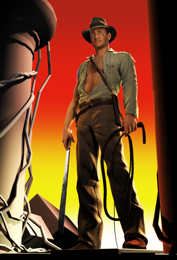
Still much to do…
Cheers, M
[ ]
]
Its looking a bit better, especially from the angle (looking up at his face) you have him in your last posted image, yet the likeness is still not quite all the way there. Judging from your head close-ups, it looks like you could still add a lot more detail in the face (why not? It’s ZBrush!). I know what your probably thinking, “but the final image will never be that close!”, however, I think the detail will still read from a distance when the light hits it. Also, a spec map would do wonders in selling the skin textures. Right now, the skin looks a bit too flat and dull, you need to show the oils, sweat, dirt, 3 day old beard, and blood that come along with adventuring! Keep up the great work!!
it feels very much like the poster now, well done!
u could probably enhance the skin around his eyes to make it even better.
just a suggestion :), cheers
I just spent a bit more time looking at your image, and some other harrison ford images.
I noticed your model was pretty much lacking a adams apple! It’s there in the head shots, but not in the full body shots. Ford’s adams apple is fairly prominent. Also, take a look at how the fat outside and above each eye droops down when he squints, and also how the bags bunch up. (http://tranarproducts.com/MoviePosters/Indiana%20Jones%20&%20The%20Temple%20of%20Doom.JPG)
As well, his chin has a bit more of a “butt” than your model shows, and just above, he has that distinctive scar.
His cheek bones are also a bit more prominent than what your model shows.
Looking at his lips, his lips are a slightly more defined, and his lower lip is more “flat” if you were to look at him straight on, whereas your model shows it moving up to the corners of his mouth too quickly.
Your revised model has a better nose indeed, but it still looks like it lacks the odd bend he has below the bridge. It is more obvious in the Raiders poster here: (http://www.cinemasterpieces.com/raidersrolledjune07.jpg) and in this photo: (http://images.google.com/imgres?imgurl=http://www.elasticpop.com/IJTemple_Still_PK_C-18.jpg&imgrefurl=http://www.elasticpop.com/2008/05/dvd-review-indiana-jones-and-t.htm&usg=__sV0wZb4IXWl2dXgzjXghA5CrCro=&h=3600&w=2344&sz=1122&hl=en&start=80&um=1&tbnid=jzVhlL3DHRlPeM:&tbnh=150&tbnw=98&prev=/images%3Fq%3Dtemple%2Bof%2Bdoom%26ndsp%3D18%26hl%3Den%26rlz%3D1C1GGLS_enUS313US313%26sa%3DN%26start%3D72%26um%3D1)
Also, you might want to tone down his chest hair a little.
I hope this helps!
Hey Max and omni, thanks for the comments. I think you’re absolutely right max, more detail is the way to go. There is actually more detail then the big headshot I showed earlier (that was actually how far I took it in Maya, no detail added yet) but it needs more for a better specular (again there is specular but he needs to be more sweaty, defintlty).
Now that bend on the nose, I never noticed that but I can see it now, good eye I actually changed the lips after looking at the sculpt pic teyon send and some other reference pics. I’ll have a look again because the face needs to be spot on. Also the fat around his eyes is the key I think.
I really appreciate the input guys, helps tons! I’m gonna work a bit on the background now because I worked on his face yesterday and variaty is king, hehe
Cheers, M
looks way better then before, if you’ll add more detail it will be really good. 
it is looking a lot better. I really like what you did with the cut on his lip and the bruise on his face. I am also liking the way you have him in the image, with the pillars. Keep it up.
Thanks adio and tintop, working on that detail
Here’s an update with a lot of work done on the pillars and vines around him. Still need to do some work on it but I’m pretty happy with the way it’s going. Tomorrow I’m gonna concentrate on his face add much needed detail and finally nail that likeness (I hope)
Hope you guys like it,
M
[ ]
]
Man that looks great, coming along nicely. A few critiques for the face; add the scar on his chin (maybe I can’t see it because of the image size), also on your model the bottom of the eyelids look like they are a little upturned like he’s squinting (if this is on purpose then mission accomplished, maybe because in your render he’s looking up but in the poster he’s looking at the viewer). Other than those nit picky things, great job.
Ok last update, worked on his face, sweat (hehe) and put some extra detail in the Background. I might revisit it later to put some more detail in it in the form of bugs crawling around and maybe some branches in the foreground just to add a little more depth. But for now I’m calling it finished.
Care to comment, I made a big render
This was a fun project which gave me the chance to get up close with one of my childhood heroes.
As always,
Cheers, M
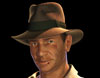
Really good.
I have one crit, his eyes!
He has a crazy strange look to his eyes, that scare me lol.
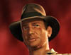
Rad. You did a really nice job on this! Great job, the improvements really paid off! One last little crit I have is the way you “posed” his left eye (the right eye in the image) makes him look a little worried…
What was your technique for the vines? I love the way they turned out!
Thanks guys! Yeah I know the eyes… Damn they are giving me some problems. i will have one more pass when I have some time. It’s that last little bit…
@Maxsunset, the vines, yeah they turned out nice right? I was pretty pleased with them myself. It’s just simple tubes I modeled in Maya then brought to ZBrush and sculpted them. Then they were rendered with displacement and a wood texture, nothing fancy really. But I’ve been using Headus UVlayout and I have to say that prohram is fantastic and gives you really nice UV’s so maybe that has something to do with it
Cheers and untill the update! Appreciate the input.
M
Just tubes huh? They kind of looked like paint fx vines… I’ll have to give headus a try…