great sculpts and renders 

Like it very much… the simplicity is awesome … and its like telling a story in an image…
great work !!
Thanks for the positive comments!
This is a lowpoly model I have been working on lately…
[attach=263464]spacegirl_main_small.jpg[/attach]

Attachments


any texturing workflow of your a small tutlike would be helpful
awesome work
Red hand guy is so cool. Last girl is nice too.
One thing about red hand dude hands - they would look more relaxed if the hands were slightly rotated outward. It is unnatural to make them so straight, in one line with forearm imo.
Hey overall, not bad!
good!
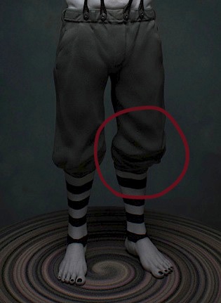
That RED HANDS guy is creepy! What’s going on around the left knee/lower leg area? It looks odd to me, like it is disjointed, or something. The lower leg seems too far back.
[attach=263566]Legs.jpg[/attach]
Attachments
It’s good to hear some crits as well, they can only make me better!
truthhunter: the only thing I did different to other lowpoly characters was the gloss map, to get that shiny suit look I used a light green colour in the gloss map and a noise in the specular map. But if you want to know anything in particular let me know. You can have a look at the texture sheets here:
http://www.muntes.com/?page_id=1765
JoseConseco: I actually took some photos of myself with the arms and hands position and tried the rotation of hands in several angles until I thought it was alright, but looking at it again, I think his left one could be rotated a bit more, thanks!
Webhead: hey! brightening my images to find my mistakes eh! heheh  I agree, the leg seems further back because there is too much volume in the front clothing, I’m going to have a look into that, thanks!
Jerik, arthurduuqe: Thanks !
The red hands guy is pretty much how i see every mime in my mind. If you work on his chest some more it could go of as an actual photo, teh face, hands and legs ( ignoring the volume problem ) look perfect ;D
And your xmen character looks great, but i have a problem with her cotume, not one wrinkle or material stretching, as if it was made of perfect rubber ;f Especially seems of in front where the zipper would probably be.
Hi!
I would like to get some feedback on a model I’m currently working on, please let me know what you think.
I will pose him with a laurel crown and a drinking horn…
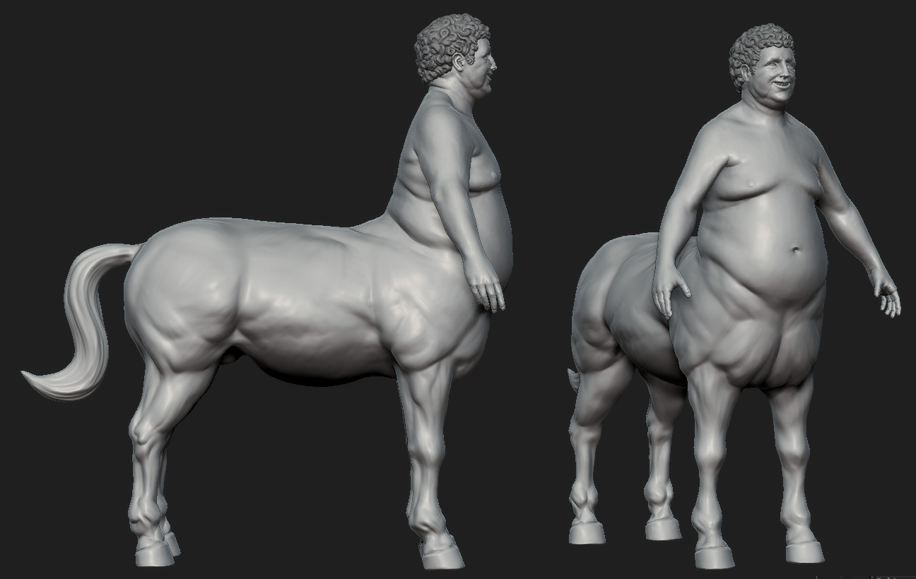
It’s based on an Aaron Sims company concept.
Thanks for the suggestions slocik!
Attachments
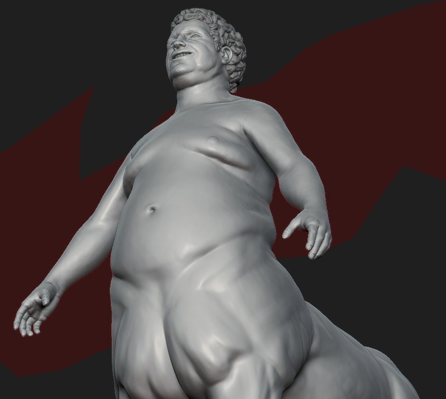
i dont know, he is so fat in front, and so low body fat in the horse part, looks a bitr jarring.
Honestly he is just too fat, unless your are going for it, im not feeeling it ;/
I am really digging the fat human part of the centaur. However, try to make the horse part fatter too, the contrast between the muscular horse and the fatty human just doesn’t do it for it.

