Great job! Came out real nice. Maybe some shots of model with no texture?
That’s fu@!kin creepy!
ahoahoa…Exelente work!!! nice model and textures!!!
Cool!!
Thanks everybody, really!
But after changing from my home monitor to my work monitor and back I’ve realized that I added too much contrast to the image! Still, I decided to add just a little bit of DOF and some fine tuning on the levels and colors. And I’ve worked out the tattos (not so hard black, a little bit wear out), thanks to the great feedback I’ve got here  Should be posting the revised image later today, plus some screens from the model in ZBrush.
Thanks again,
Ricardo
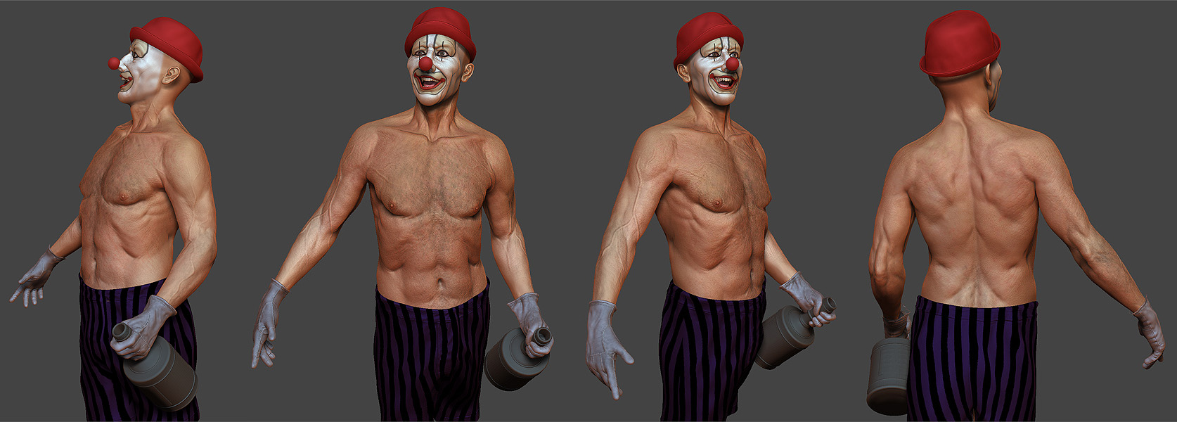
Some Zbrush screenshots!
[attach=151236]clown_comp_Z.jpg[/attach]
Attachments
Great work Ricardo! 
Great. It seems real. Congratulations, because I assume that you go to the top row.
Adjusted the contrast/levels a little bit, tweaked the tattoos and added some depth of field (composing in photoshop using the z depth info from 3ds max). When reducing the image (it’s original resolution is 3600x2922), the dof effect got really subtle, but that’s ok 
And again, thanks everybody for the comments!

awsome man. beutiful sculpt and the textures look great
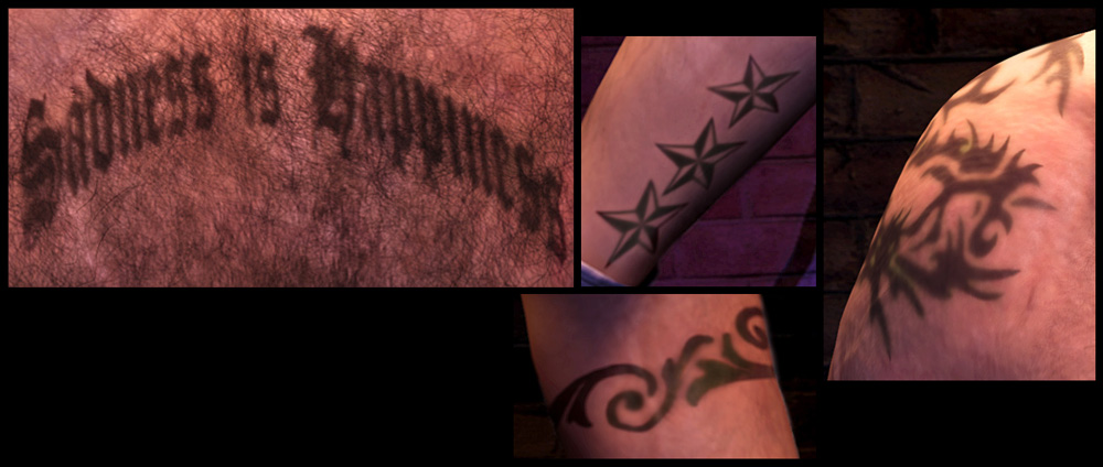
Its a nice piece - though still the tattoos look a little off - they are kind of trendy and new, maybe would look better with an old fashioned faded (sailorish) look
Top Row!small_orange_diamondsmall_orange_diamondsmall_orange_diamondsmall_orange_diamond
Very good, Congrats.
That’s a really nice composition, though I have to agree with the tattoo comments.
The color is off (way too black, the tattoo ink never gives that color once the cicatrization is done), and the contours too sharp. A mix of black / blue would be more realistic.
When you tattoo somebody, no matter how many needles you use the ink tend to spread a little bit in the skin, giving it a little blurry effect.
If you could just correct that it would be awesome 
Top top row!!! c’mon! this is awesome, once again, congratulations, the detail, that textures, the render all of that is so cool!
cool!
Thanks everybody for the comments, really
catata: this is so close to perfection, I think that’s why everyone is so adamant about the tattoos. I think, if you really want to make them appear correctly, you could tint them greener and take down the opacity of the tattoo layer in photoshop and either use something like multiply or one of the other layer filters. Like I said, this is really close to perfect, and I am truly impressed. If you can’t seem to get the tats just right, maybe leave them out? It is still a very strong image without them, based on the facial expression and pose alone. Your modeling skills could not be better, IMHO.
I absolutely agree, I’ve spent a few hours trying to understand a little better how the tattoo ink spreads under the skin. I’ve seen some brand new tattoos ans some old ones… I’ve done some changes on my character’s tattoos based on these and on your feedback.
And really, thanks again for all the feedback!
Attachments
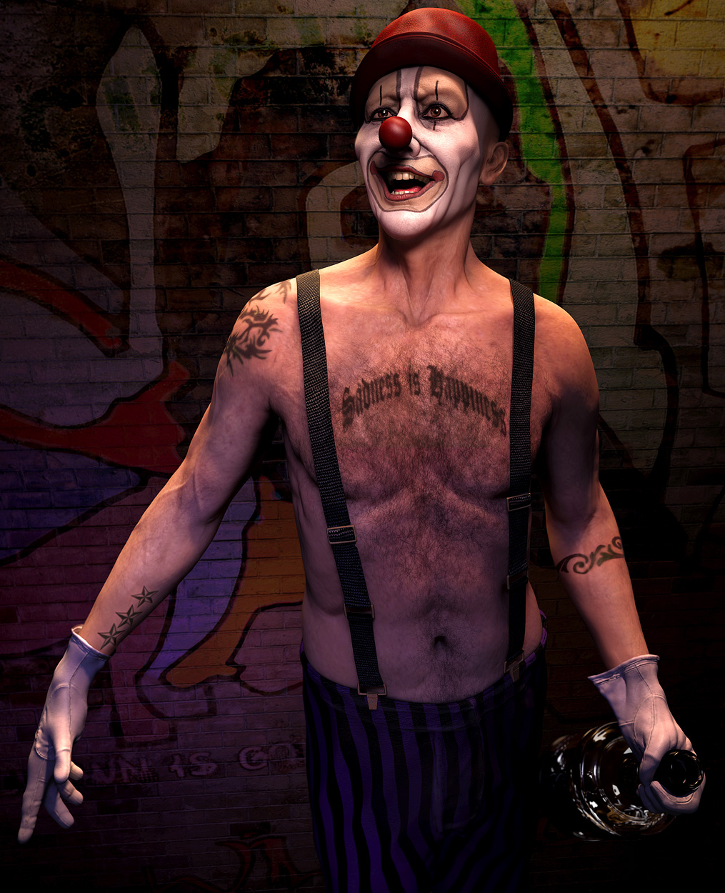
That’s so much better !!! Thx for having taken the time to correct it. 5 stars more than deserved
Now that’s what I’m talkin’ about! Very much improved, and I also give it all 5 stars.
The best work is always the last,. Expressive and detailed at the same time. Five stars for me!