It has that 60’s B-Movie feel. Like the monster form the green lagoon. If you’re after that, I think you are very close. Any case, I can’t follow on that ‘Joust’ comparison 8). But then again, I never played it.
Lemo
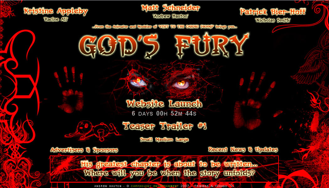
I was hoping that I wasn’t the only person who didn’t get that comparison…I was hoping for more of an angry, hatrid, fierce feel to the site…guess not…I was trying to portray the confusion that goes on in one’s head when pissed offf…guess I gotta hit photoshop again…Any suggestions Lem…
Maybe some edgy swirly stuff with a bit more than only a couple of eyes and two hands. You have to see some more of a character to sense emotion. And anger is not smooth, it’s edgy and blurry. Maybe work a bit on the background of your image and see what it does.
L
Hey Lem, which were you talking about, the attachment a few convo’s up or the actual website. Here’s the link again :
http://www.carphology-entertainment.com
please confirm …
The sample in the thread. I like that more than the current site.
It’s not looking ‘bad’ anyways. You might just stick with it.
My perception might not be the one of someone else.
L
Hey, well here’s the thing, the attachment in the earlier convo is the old site, the actualy site online now is the temp site and here is the official front page to be launched in March…
Attachments
I’m currently compiling some images of the zbrush completed characters, 2 male and 1 female…hopefully I can get them prepared before Sat to put online…