Got the hair looking decent. Still need pointers.

Got the hair looking decent. Still need pointers.
It looks pretty good, but I see what you mean about something being “off”.
I think you should make the mouth less acutely triangular for starters. I get that you’re going for the old-school Joker, and his mouth should indeed be very enlongated, but if you look at the upper lip on your model, it almost creates a sharp “V”. Another thing you could try is to make the jaw a bit wider, right now it sort of blends in with the neck.
Still, it’s looking good.
Johnny, thanks so much for your help! I tweaked the mouth a little, but still left the “v” shape more or less in place. I also widened the rear area of the jaw and narrowed the neck a touch. At the moment, I’m playing around with paint and materials. I like to give a basic paint job because for me it seems like sometimes it saves time when I can paint a detail as opposed to sculpting it.
Here is an ortho shot and perspective. I’m leaning toward the ortho for the finished product, but the perspective does have kind of a neat hallucinatory feel to it. Give me your thoughts everyone.


Really digging your take on the Joker, and I can see what you mean by it being a lil off. Your trying to go for the look that’s inspired by the comic, I’ve found that sometimes it’s really hard to convey the same geometry you see on a 2d image into something that is a 3-d model without it looking off. I would say something you could focus on that seems a lil off to me is the structure of the jaw, specifically in the rear. I think you may need to accentuate more of the Masseter muscle. You can still keep that v shape to convey the “comic” look your going for, but focus on the sides towards the rear maybe just make those muscles just a lil more visible. Keep up the good work.
I can just concur, overall you are on the right way and really looking forward to your progress mate! In his side view the chaw is looking off a bit mate, maybe you can rework a little of the shapes!
Keep it going buddy!
Happy zbrushing,
Kenny and Truubluu, you guys are the best! I gave the masseter a little more volume as you guys suggested and it really improved the front view (at least to my woefully untrained eye.) The side view is still a little wonky looking to me, but I’m not going to worry too much about it, since my end result will be a straight on face view anyway. Not real unprofessional, I know, but since I do these for my own satisfaction I’m not too worried about it:D.
Truubluu, you weren’t lying when you said how difficult it is to translate a 2d image into 3d. I went and looked at your Nicholson Joker sculpt and vomited in my mouth a little when I realized the inadequacy of my own work, but I guess I’m getting better.
Anyway, thanks again for your help you guys.
Here’s where I am now.

Great job Vooddoo, kudos to you. I know you’ve been a little hesitant to get going on organics but I’d say you’ve definitely broken through. Keep it up.
Ezra
It keeps getting better, and it looks like you’re close to a finished still. But in case you still want pointers, I drew out some very basic guidelines on a screen of your first attempts, just to clarify what I was talking about in my post:

As you can see, when I talked about the jawline, I mostly meant the lower jaw muscles, where the angle of the jawbone is located. And the mouth can have the V-shape made less extreme and then pulled back a bit without loosing the overall “joker”-shape. If you look at your own mouth in the mirror and then grin, you’ll notice that the corners of the mouth are drawn backwards as well as upwards, and even though the joker’s mouth is deformed and extreme, it would still follow those same basic mechanics.
Also, you could define the ridge of the nose some more, and pull the nostrils back a bit. You have correctly translated the fact that nostrils flare and go upwards when grinning on your model, however, they do not go outwards very much. In your image the nostrils almost protrude more than the tip of the nose, which looks a bit off.
But again, these are just tips and pointers, and just in case you still feel you want them. I’m not trying to put your work down in any way, it’s looking better and better for each screen. 
Oh, and you nailed the hand. Very creepy and skeletal fingers.
Thanks Ezra! I’m really enjoying this one.
Johnny, my MAN! I can’t begin to tell you how helpful your last post was. Seeing it in the diagrams you made was exactly what I needed. I was able to tweak the mouth and jaw into a good approximation of what you had although I didn’t pull the mouth back quite as far as you had it because it threw a lot of other stuff out of whack. The nose and forehead were really bugging me too, although I didn’t realize it until I saw your overpaint. And thank you for the nice comment about the hand. That was the thing I had the least confidence in, hating sculpting and posing hands as I do.
Here’s where it stands now. Still lots of tweaking and I need to add another element or two before it’s done. Any suggestions are very much appreciated.

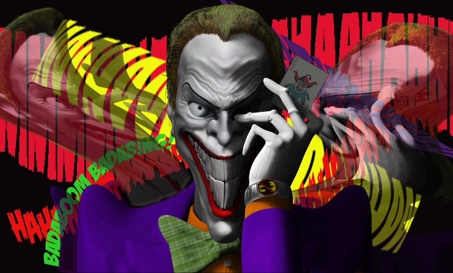
After many lighting and material changes I think I can finally consider this one done. Comments and crits as always most appreciated.
Nice job Voodoo, LOVE the background. I think the definitely help convey your comic feel.
Thank you Trrubluu! I’d still be sitting here frustrated as hell if not for you and Johnny and Kenny helping me out when I needed it. It’s much appreciated, believe me!
Experimenting while waiting to be gob-smacked with inspiration for a new project. I was thinking of Harry Dresden’s blasting rod when I did this.

I did this in about an hour tonight. Thought it looked interesting, so here it is.
Building some low-poly assets for an environment piece.

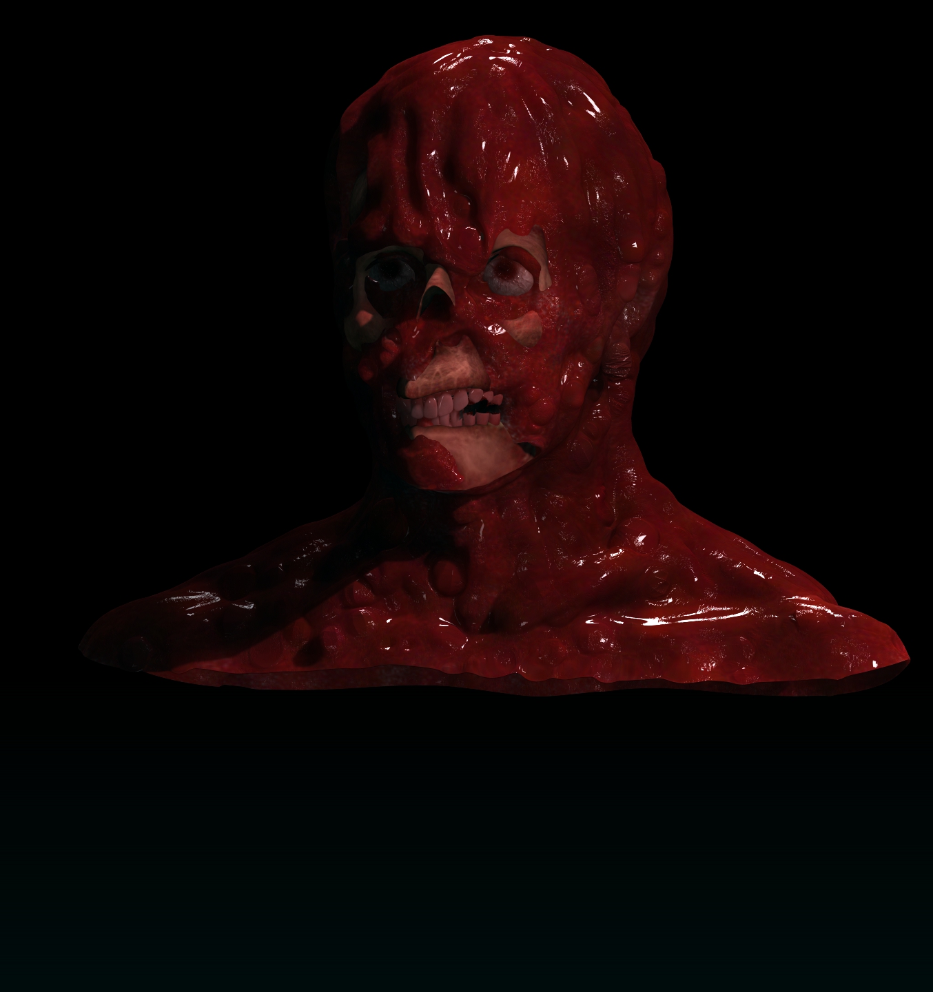
Nice clean look to your candle sconce…Melted man is pretty scary looking except for the nose cavity ( it looks a little strange to me ) but then that has been said about me too…
Thanks, Blue. The Melting Man is based on the movie “The Incredible Melting Man”. I think it was made in '77 but somehow got a '50s era title. I watched one of my MST3k dvd’s of this last night and just had to give it a shot. I think the combination of the angle and the fact that I removed too much “flesh” from that area is making it look wierd. I may go back and clean it up a little at some point.
Here’s some progress on the environmental piece.
keep up the good work
looking good…