Hello.
I can tell you have put alot of time into this so well done for sticking at it. The female form is not easy and takes alot of practice.
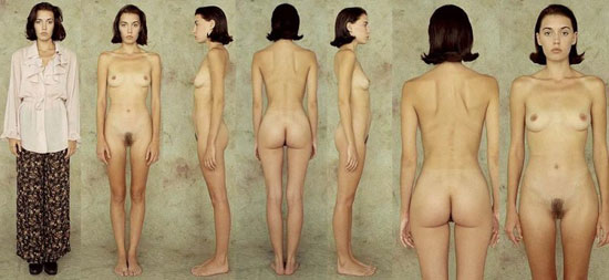
Im very familiar with this refference Natalie as I have it, as well as many more from when I joined 3d.sk. Some refferences I found such as this one should not be used to tight, as they dont offer the average form, and give natural gesture.
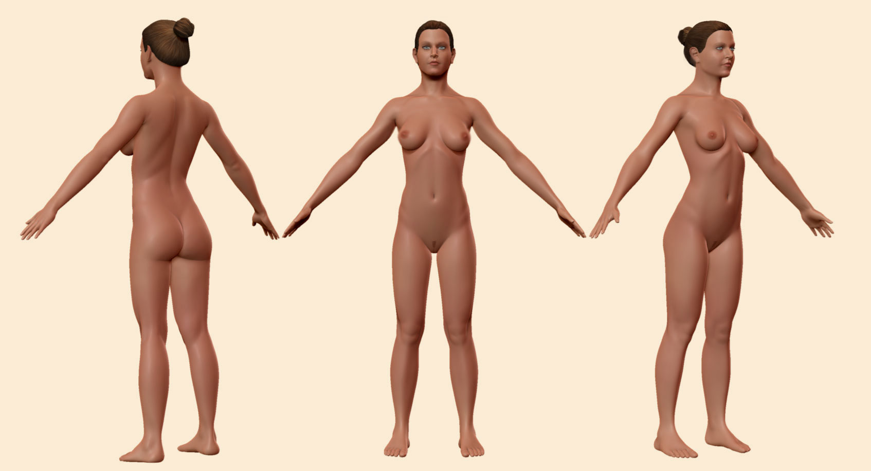
When you start learning general anatomy, you can see where to deviate from the refference to get a more natural sculpt. Here are some things that I myself would change to get her more realistic. I try to bend the arms a little, and loosen up the hands. Enphasize on the natural way the pecs attatch outwards to the humerus, and how the delts overlap. Ad a bit more fat around the belly, and soften out the edge of the rib cage. Add a bit of fat to the knee area, and show how that forarm is twisted. Dont be afraid to dig a little deeper to show more rythem between the muscles, and how fat flanks sit, you can always use layers and smooth down what looks to hard.
 ](javascript:zb_insimg(‘198836’,‘ZBrush-Document.jpg’,1,0))
 ](javascript:zb_insimg(‘198837’,‘ZBrush-Document2.jpg’,1,0))
 ](javascript:zb_insimg(‘198889’,‘ZBrush-Document.jpg’,1,0))
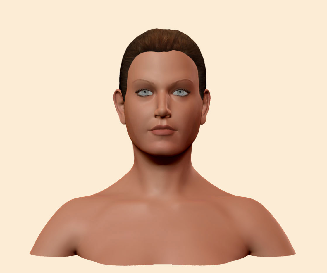
 You’re right about the brows, I ended up flattening them out too much.
 ](javascript:zb_insimg(‘199498’,‘asymmetryFace.jpg’,1,0))
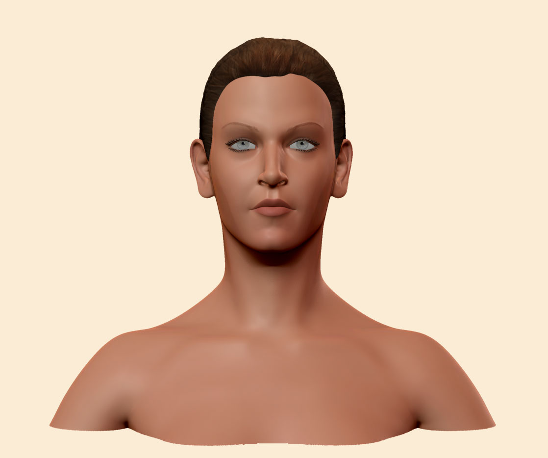
 ](javascript:zb_insimg(‘199557’,‘asymmetryFace2.jpg’,1,0))