ZBrushCentral

[CRITIQUE] Template Body - anatomy and gesture

Yeah it does! Thank you! That thing with reprojection is kind of what I am thinking about. I thought I could sculpt one finger with clean topology and some subdivisons and dublicate it. After that I would leave ZBrush and model the rest of the hand in another software and when I get back with the entire hand, I´d project the details on the fingers. This of course requires that the position of the fingers don´t change while vertex modeling… So I am not too sure about how convenient that workflow will be. I have to test it.
Right now I am doing what you described with dynamesh and ZRemesher. I run into problems though when trying to change gesture with zsphere rig because of the still relativly messy ZRemesher topology. Maybe I need to prepare better guidelines first.

Though I am still far away from character concepting, it is good to know what hand gestures can tell you about the person. So I´ll make sure to remember that!

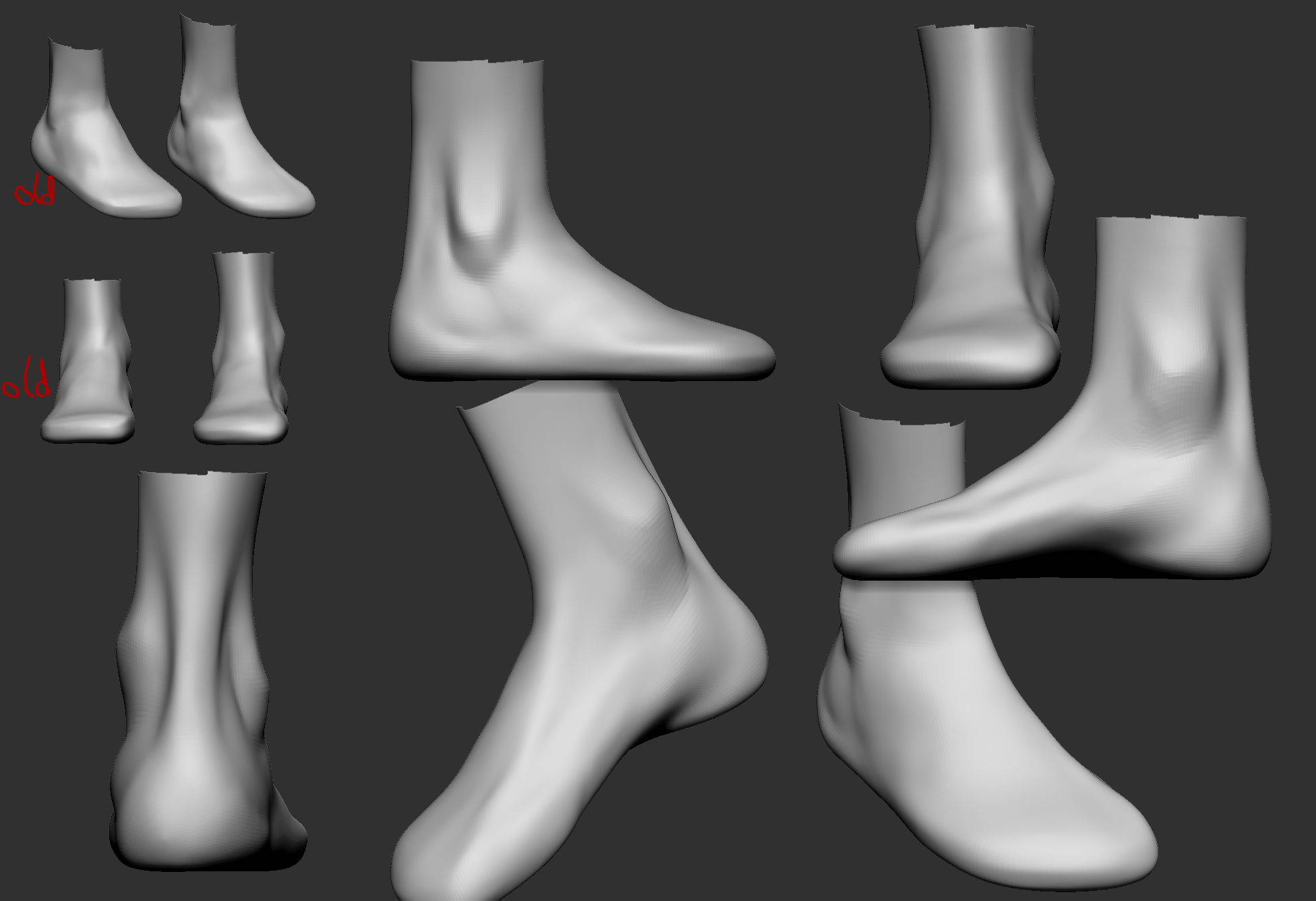
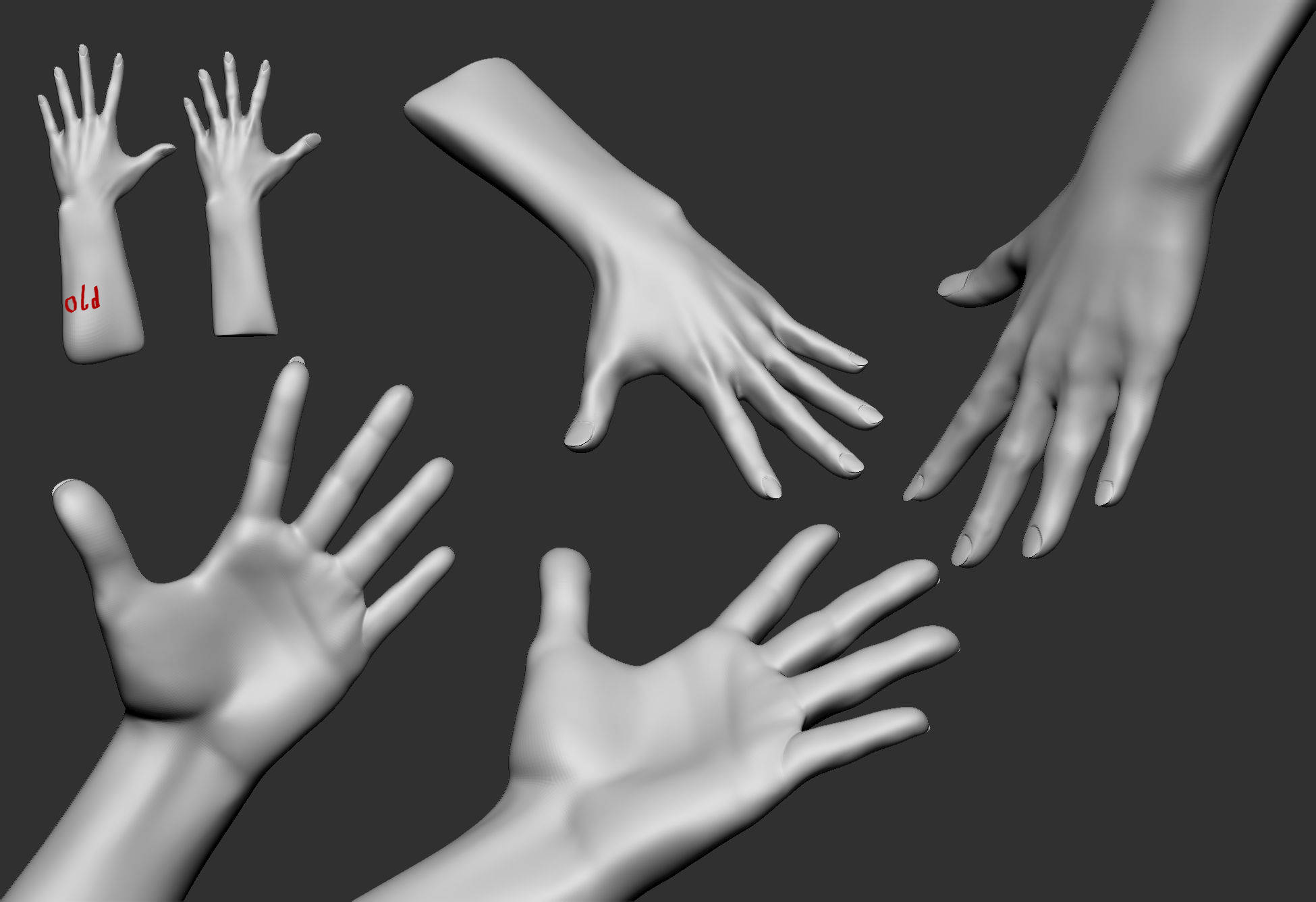
I was hoping to get more results but I think my knowledge about the basic volumes and anatomy is too sparse to improve fast. Anyway here is what I have been working on:

For the feet I tried to establish better volumes and some landmarks for the toes. The hand I shortened and worked mainly on the thumb and middle + index finger. To improve on the thumb I think I start a new project solely concentrating on the thumbs form + anatomy and the connection to the hand.


You are doing great. Nothing really to add right now. Maybe both maleolus… es? (Have no idea how it should be pronounced in plural form), well, both ankle bones are a bit too high.
The anatomy of hand isn’t that important so there is almost nothing to learn. The most important things to understand is the placement of joints, the cupping of metacarpals when flexing fingers and this distinct step down from forearm to wrist that gives a nice gesture. In terms of muscles it is even more simpler: the form of first Interossei, common masses of thenar and hypothenar and tendons of Extensor Digitorum Communis and those extending/abducting thumb (their muscle bellies still relate to forearm).
Good luck!

Haha your right! I was so focused on getting the shapes right that I haven´t even noticed them moving up…

So I worked on the hand gesture again; gave it better topology with zremesher and improved the position of my zsphere rig. For now it did work out for me but I think in the future I will hand model the topology first. The volumes of the thumb I mainly shifted back and forward until it felt right for me. I tried to use my own thumb as reference, though it doesn´t look like mine at all^^

Another question regarding my proportions:
Do you think the form would improve anatomocially speaking? In the past when I started with human anatomy I used Ryan Kingslien´s anatomy model for taking meassurements. Now I found out I made a big mistake on meassuring the ribcage`s width. This is probably the reason, when pushing the hips of my model, it would look out of scale to the rest of the body -due to the small ribcage and 8 head model size. I made a rough overlay over a real life reference with mouse and move brush.

The hand looks much better now :+1:
Speaking about proportions. You know, right now it is all about personal preferences and tastes. I don’t really know what is your ideal female type. I prefer tall, slender yet curvy girls. So my answer that right version looks better can be biased. The left one seems too massive though I did some measurements and it appears that you mostly compressed her vertically without changing torso width. She is 7 and 1/3 heads now which also makes her close to reality and less heroic.
I am also not sure about the breasts. Usually nipples above the second head mark are only in very youth. Or in case of short people. Which is kinda truth now after your proportional tweaks.
I would probably suggest searching for golden middle between this two versions. I know it is quite tricky to do. Sometimes it is even hard to guess what exactly requires tweaking, so for example you might compress her body while it is rather head should be sized up etc. But small ribcage or narrow shoulders isn’t a reason that hips look wrong. Example

Nice! High five… lol^^

It is kind of hard to explain for me. I am already quite sure where I want to push my proportions after this. More in the stylized and unreal area, however now I want to find out where I stand with my realistic model. I always thought I´d be your average 90 60 90 guy xD So I always tried to not go overboard with female forms and stay on my guard. I think you see a lot of this (I guess more 2D) stuff on artstation. But now it turns out I am sculpting and pushing my forms to quite a slender sillhouette. When somebody adviced me to widen the hips I was like; ok I don´t think it is necessary but I can see how some widening goes, that´s easy! But it wasn´t… no matter how little I pushed the hips in my eyes they looked out of scale.
So I guess my main concern is to find “the best” proportions for my inner eye, not to sculpt them because they fit my tastes the best, but to evaluate from them. My view from real world to screen seems quite distorted.

For the model on the left I actually widened the rib cage from the 0.5 head mark to 0.75. In front view you can barely see it I guess. I actually forgot to put a link to the reference: http://www.fineart.sk/sites/default/files/photos/005/005_0_2.jpg
I have already integrated some of that proportion change into my model so hopefully this will be my golden middle;) But before that more work has to be done. I want to focus on the arms a bit more and then finally return to her shoulders and back.
Btw the pic you posted is awesome! If I would have seen that as a 3D model I definitely would have thought this to be stylized. If this is really not photoshopped then this girl has some insane curves!

Speaking about the reference. I remember this girl - she is retired pornstar. I searched her bio and it says she is 165 cm tall so her seven and one third height is quite natural. When I saw your model first time I assumed she is quite tall. If I am right then eight heads would work for her. Cause I find this rule about 7.5 very misleading. Its says that regular people are 7.5 heads tall while heroic and idealized ones are 8 and taller. After reading this people start thinking that eight heads should be applied to stereotypical muscular characters like superman or wonder-woman. But this is not true. This proportions are more tied to person’s height and not the muscle development. I have told this several times before on ZBC - I am 188 cm height and have almost 9 heads tall. So overall if you see a tall person then most likely it has 8 heads or more. Otherwise tall person with canonic 7.5 will look very massive and tank-like.

Another image in your reference is from Loomis drawing. While I really enjoy his works and books, I always thought this diagram of “Ideal” female is plain awful. It is far, FAR from ideal and looks more like a man with boobs in corset. Two heads of shoulder’s width? Just bizarre.

I know what you mean. I often find myself unsure about right proportions. And the more I look at model the more I start doubting. It is also a psychological thing - when you work on particular female body for too long you are getting tired and lose interest. It doesn’t arise such a strong excitement as it was in the beginning so your brain attempts to retrieve this feelings, forcing you to make unnecessary changes. At least that is how it works in my case. Right now I am resting from the last character because I worked for too long and caught myself thinking that I need to redo her hips since they don’t excite me anymore. But I know this is not true since it has a good shape and very close to original drawing.

The influence of stylized art is yet another story. You really should be careful with it since it indeed distorts your perception of reality. I sculpted by itself and watched a lot of images of girls with broad hips and big beautiful breasts. They look big only at the beginning but later this proportions start appear as regular. So when I came back to realistic character I was really confused by the lack of curvature and volume.

Yeah, this Asian girl has great curves. I dunno whether it is photoshopped or not. I sometimes see girls with similar proportions. Whatever, we as sculptors have a freedom to push reality forward and make realistic character slightly better. If it doesn’t look odd then there is nothing wrong to sculpt something curvy like on this photo. Some more. This are probably shopped. One, Two

I went through my huge library of artwork and picked up images of female characters in different styles which are pictured from a straight front view. Here are 3D renders plus one drawing. I did measurements so people can see the average height (the head length is a unit). Two vertical lines are also one head apart and their main purpose is to see the distance between the nipples and their relation to waist width. Two horizontal lines below represent relationship of waist to hips broadest points. For clarity sake I added the divisions of thirds.
In models with hair the head length was established considering that inner eye’s corners are at the center line. Some stylized characters have big cranium so when measuring haired ones from the same author according adjustments were made. And keep in mind that perspective distortion can affect the measurements so don’t treat it as gospel. I hope this would be useful to you and others.
PS All rights belong to credited authors and blah-blah
LINK

Actually when I first posted this I had not ever thought about character design or how tall or small the model should be. I am pretty hyped, now that you told me! I played a bit with the head size and instantly I am able to see the model in a very different manner. And indeed it makes a huge difference what proportions you apply to the body. This is very valuable to convey a person´s body structure!
And I agree with you on Loomis ideal woman; far from ideal for me as well :wink: 
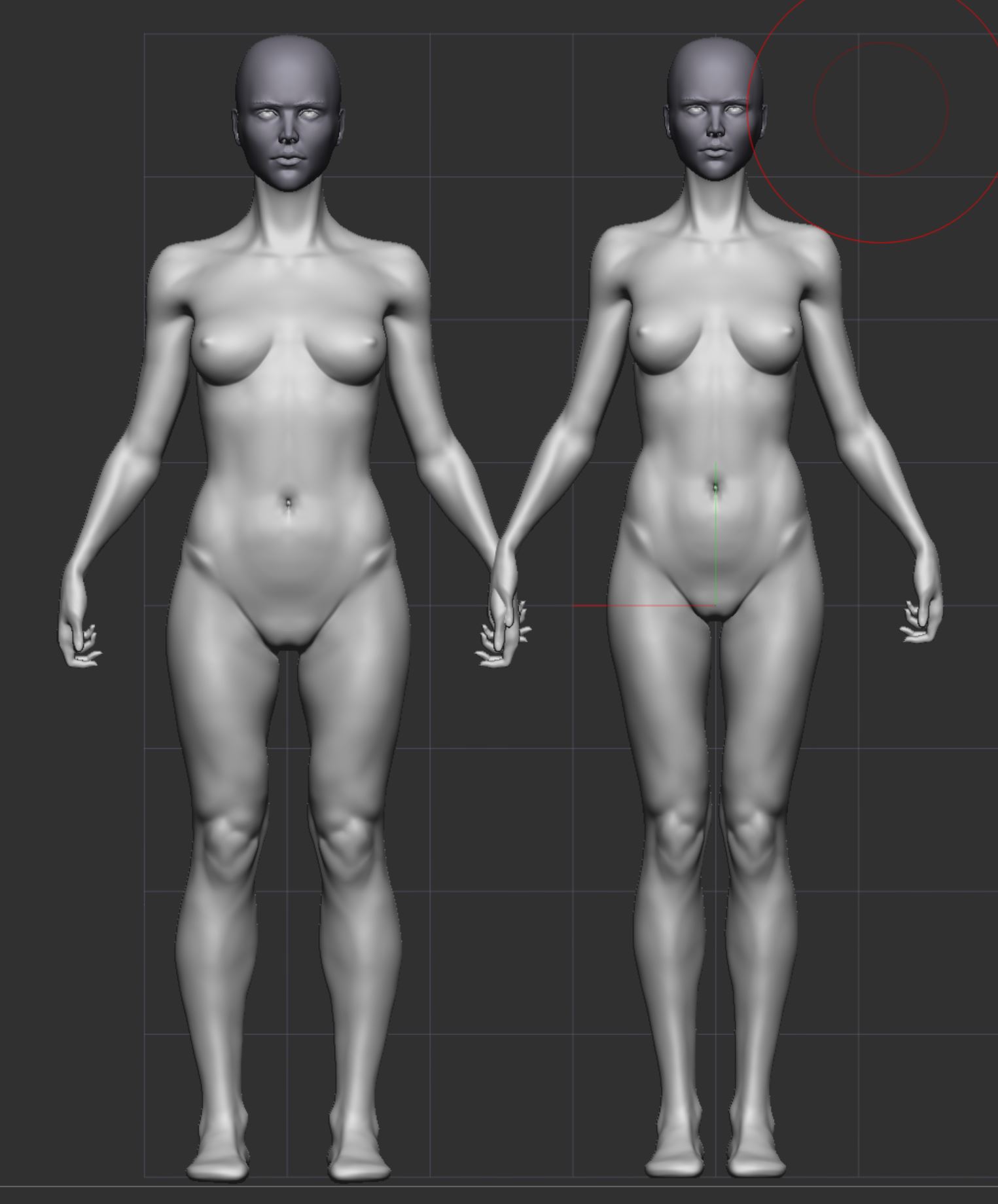
Maybe in drawings you can do this but in 3D his proportions look really weird…

And chapeau for doing that proportional analysis! It is gold! Wish I have had this sooner since it is really helpful. Hopefully others will find this as well. The rightest image was actually the reason I decided to get more serious with 3D sculpting. I was like: “I wanna be able to do this as well!”^^

Right now my model comes in with 7.6 heads. I think I have to step back from it again for some days and compare to my 8 head model to see what I like better. I also worked on the arms and the back again. For the arms I tried to incorporate the slight rotation of the elbow when in semipronation, not easy in my opinion. And the back, yeah… it is an ongoing zone of doubt and misery. (Also tried myself at some sculpted hair, but meh… it looks more like a mop placed on the head so I better practice some more before posting:)


Yeah, when I saw this stylized blonde girl I simply fell in love. She is so accurate and delicate. Though in my case the first model forced me to start learning 3D wasn’t a cute girl but rather a monster. It was a creature called the Darkness and was made by Steve Jubinville (too sad this guy disappeared from forums and there is no news from him).

The model looks good. Some problems here and there but overall really nice. The forearm needs more adjustments though. The twisting during pronation is prominent mostly distally. Proximally not so many changes in terms of volume. In your case it appears that common mass of ridge muscles (Brachioradialis and Extensor Carpi Radialis Longus) steal some space where wrist flexors should be. And since we are here, I will suggest to practice more the forearm and especially the side of extensors. After the back shoulder region this is probably the most complex and confusing part of the body. Right now it appears vague and smooth while even in this relaxed pose you can find a lot of interesting shapes: ulnar furrow, the bulge for Extensor Digitorum Communis, the slight prominence of Anconeus and dimple for Lateral epicondyle.

PS I don’t know if you are doing this while working but I will say it anyways (I’m judging by all images in your thread). Try making renders with different lighting - this can drastically change the appearance of your model. Default Light position is good for seeing model overall but it tends to flatten your shapes and kills the drama and shadows. It is especially good when your model is still symmetrical - nicely positioned lighting will hide this greatly. Also try using different matcaps. They will help refreshing your eyes. Keep in mind though that some of them might be deceiving, especially those with cavity shading.

I think for me the game Spore got me into 3D sculpting although there´s a huge timegap between where I left the game and the first time I opened a modeling software. Also my study is very close to computer games and graphics, however it only covers the mathematical stuff so I enjoy exploring the artistic side to it!
Usually while sculpting I switch between standard mat and one from zbro. I have been using the standard a lot lately, so maybe I should start to switch more often again.
I think I am going to spend some days practicing the arm based on your adviced. Also it will give me the time I need to step back from the model. Maybe I get some hair done as well and conect the head to the body to wrap things up;) I already have a model far exceeding the expectations I had before posting and that is because of your awesome advice and the time you spent to critique my work! Can´t say it enough -thx mate!

I took my sweet time to step back a bit from this project and compared different proportions to find my personal golden middle. It is really weird but it seems my view from “real” life to 3D space becomes quite distorted. Maybe it´s a beginners thing however after spending some time working with new proportions I see the old model in a different light.
Thanks to Vir Norin I learned a few new things, such as the proportions should change relative to the person´s true height and that the size of the head compared to the body is the main indicator for the entire body size. Before that I was like: “the person should be taller? just scale the mesh a little bit^^”

Anyway this leads me to my probably last tweak on this model. Sure there´s still much to improve like the arms (they are quite the nightmare for me) and I am not happy with the knee area at all but I think there is no end to that anyway. I want to move on to my next project sculpting the male body and continue to build on the things I have learned here.
For fun I tried to zsphere pose the model though I have to say I don´t know a thing about posing, except that the arms shouldn´t be parallel xD

My thanks go again to Vir Norin whose critique and support is outstanding! Thx a lot mate! :slight_smile:


female_body_milestonesculpt_angles3.jpg

<iframe src=“https://sketchfab.com/models/1afa3fa46b6843a79b724e9835bf9bf2/embed” allowfullscreen="" mozallowfullscreen=“true” webkitallowfullscreen=“true” onmousewheel="" width=“640” frameborder=“0” height=“480”></iframe>

[Female Template](https://sketchfab.com/models/1afa3fa46b6843a79b724e9835bf9bf2?utm_medium=embed&utm_source=website&utm_campain=share-popup)
by [zaxel](https://sketchfab.com/zaxel?utm_medium=embed&utm_source=website&utm_campain=share-popup)
on [Sketchfab](https://sketchfab.com?utm_medium=embed&utm_source=website&utm_campain=share-popup)