ZBrushCentral

[CRITIQUE] Template Body - anatomy and gesture

This time felt very tedious… I am really struggling now.

  • I reworked the whole shoulder part but it still looks like a construction zone…

  • Revisited knee area; added u shape

  • shortened her lower back

  • added serratus muscles

  • refined the front however she looks either to ripped or smoothed out. can´t seem to find the right balance

  • I slightly changed the volume and shape of her rib cage. To me it felt like the front plane had too much volume and was missing certain plane breaks. I marked the spots I am concerned about in green. Maybe you can give me a hint on how the rib cage should flow there. The left torso is the new one in case you´re wondering;)
    And as always, thank you for the outstanding help!


The front view looks more natural and interesting now. The bum is better too. Speaking about the volumes of the ribcage - I also often have problems getting it right. This requires constant rotation around the model and checking it from all angles. So it is hard to tell from one shot. But for me it looks OK.

The medial borders of shoulder blades appears curved, while in real life they are quite straight. If it was intended as a bulging mass of Rhomboids then it should be more clear and refined. Yeah, I think that because her shoulders are slightly drawn back you might accentuate Rhomboids more with tighter cleft in between (along the spinal column). I know it is very tricky to do. IMHO it is much harder to sculpt a skinny person where bony landmarks appear mostly as ridges but sometimes gradually becoming recessed compare to sculpting muscular individuals where pretty much all bones lie deep surrounded with bulging muscles. This transition where hard edge of protruding bone becomes in level with muscle fibers and then dives below is what causes the most of troubles. So gather all your patience and polish it again and again until you find a good balance. Same with costal arch. I often define the cartilages of ribs very prominently and then sculpt Rectus abdominis and External oblique with brush strokes oriented in the same direction as muscle fibers. If I find that smooth brush even with low intensity tends to destroy my forms I change it to Smooth directional - totally different feel and often helps a lot.

You changed her lower back but looks like you didn’t correct the Lats accordingly. They now taper too quickly again (towards the centerline instead of high points of iliac crest). Also the heel tendon is wonky right now.

Maybe take a break. Just rest from it and after couple of days you will look at her with fresh eyes. Or switch for something different. Maybe sculpt a hair - that is very important element of female beauty.
Good luck and you are welcome!

I think you are right! Maybe I should take a break now. Only problem is that I have semester tests right around the corner so I won´t be able to sculpt till next month…

I had a look at another reference model and tried one last time redoing the back. I think I at least corrected some mistakes with the lats. It´s exactly the point that I often wonder what should be bone and what muscle. My main sculpting reference is Scott Spencer´s book Sculpting Anatomy, which is really neat for beginners but the model is super packed with muscles. I also have a small female statue with skin and muscles showing but it is hard for me to derive what is bone and what flesh as well.
Also I had some remarks at polycount that her torso and neck seem quite long. With the neck I can agree but with the torso I can´t find any evidence looking at may 8 head grid.
I lengthend her arms a tad to get the wrists closer to the midline.

Overall I am really happy with the result! Looking at my first post, she has really has gone a long way in only a week and that is solely to your awesome critique! Maybe I can find some time to start getting involved with the hands but my realistic guess would be that I have to wait for 2 weeks…

Always wanted to try uploading a model with sketchfab so I think now is a good time^^ Maybe it can give a better overview of what I have been doing.

<iframe src=“https://sketchfab.com/models/1afa3fa46b6843a79b724e9835bf9bf2/embed” allowfullscreen="" mozallowfullscreen=“true” webkitallowfullscreen=“true” onmousewheel="" frameborder=“0” height=“800” width=“600”></iframe>

[Female base Mesh (work in progress)](https://sketchfab.com/models/1afa3fa46b6843a79b724e9835bf9bf2?utm_medium=embed&utm_source=website&utm_campain=share-popup) by [zaxel](https://sketchfab.com/zaxel?utm_medium=embed&utm_source=website&utm_campain=share-popup) on [Sketchfab](https://sketchfab.com?utm_medium=embed&utm_source=website&utm_campain=share-popup)

When I do critique I always trying to keep my personal preferences and give suggestions based purely from anatomical standpoint (of course considering possible exaggerations and stylization). So yes, for me the neck was a little bit long but still in range of normal. Along with expressive position of arms and facial expression I considered it was your artistic choice to sculpt that way. Differently colored head might also be a reason why it appears longer. From my experience (I also prefer sculpt heads and bodies separately) I can say for sure that even with same color not yet attached head might look really odd due to the absence of smooth gradients between head and neck). The length of torso is perfectly fine for me (I even did some measurements: 2-3 cm longer - that is not crucial).
So yeah, be careful when listening to people’s critique. Cause you might find situations where people will simply try to fit your model to their own standards of beauty. I encountered this many times and hear a lot of crap like: “Lift her boobs, make them rounder, less perky, make bum smaller and blah blah”.
I wish you good luck. I will disappear for some period of time. So I will see you later.
PS Sorry for mistakes - long time no sleep.

And that´s exactly what makes your critique so valuable in my opinion! I´ve already seen in your portfolio that you have certain beauty preferences so I knew I could trust your advice without worrying much:D

I am new to 3D forums in general so with the head, hands and feet I thought it would be a good idea to present everything to give a better feel for the whole body. And with the pose I guess it is something personal. I just can´t work with a stiff figure… it makes me really demotivated looking at an uncomfortable pose.

As for critique in general I hope I am not too influenceable when it comes to that. For me, sculpting the body develops to be a set of rules that can be varied to a certain extend to stay in the realm of the possible. And in this certain area I modify the shapes to my taste. That´s also why I still haven´t put much fat tissue on the hips. I haven´t been able to increase the volume while keeping it visually pleasing to me.
Since I like the torso´s proportion the way it is and since I couldn´t find anything impossible about it, I see no reason to change it. With the neck however, I found that it looked possible but a little long when looking from the side but fine from the front. In the end I figured that lowering the forward tilt while keeping the heads height the same would solve that issue for me. The pose has a strong S shape so it would make sense that the neck is quite straight. With the arms I checked with my anatomy figure and concluded that lengthening them would be closer to its proportions. They still are a little bit shorter though because more length looks strange to me.

But enough talking from me :slight_smile:

I salute once again for all the advice you´ve given to me and all the time that it did cost you.
With your help I was able to exceed my expectations I had for this model. This has certainly become a good quality reference for further sculpting.

Cheers! And hopefully see you around sooner than later!

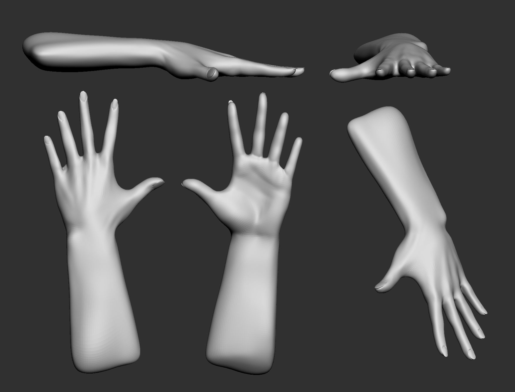
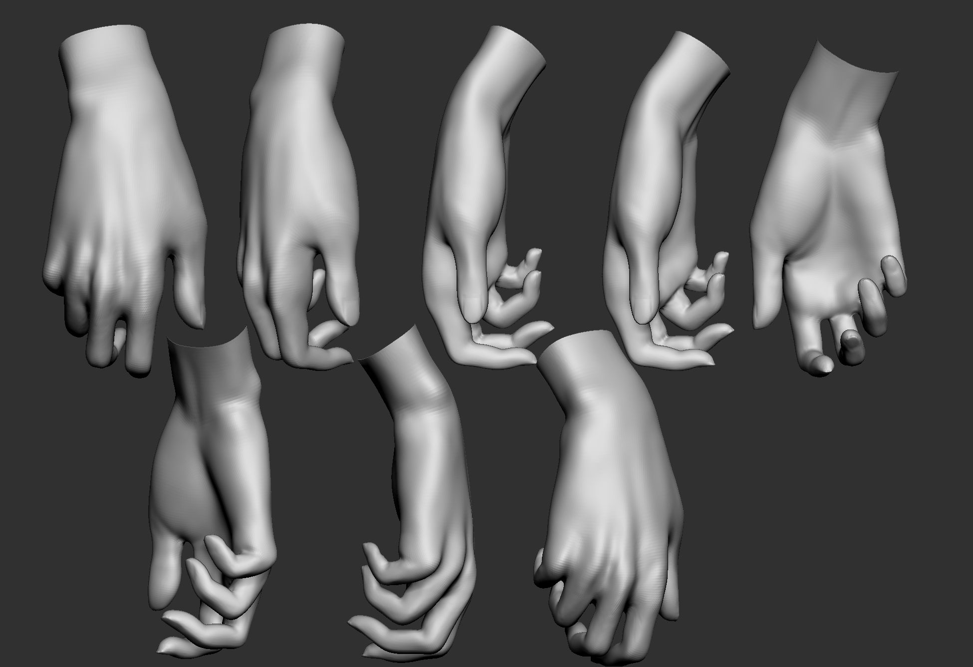
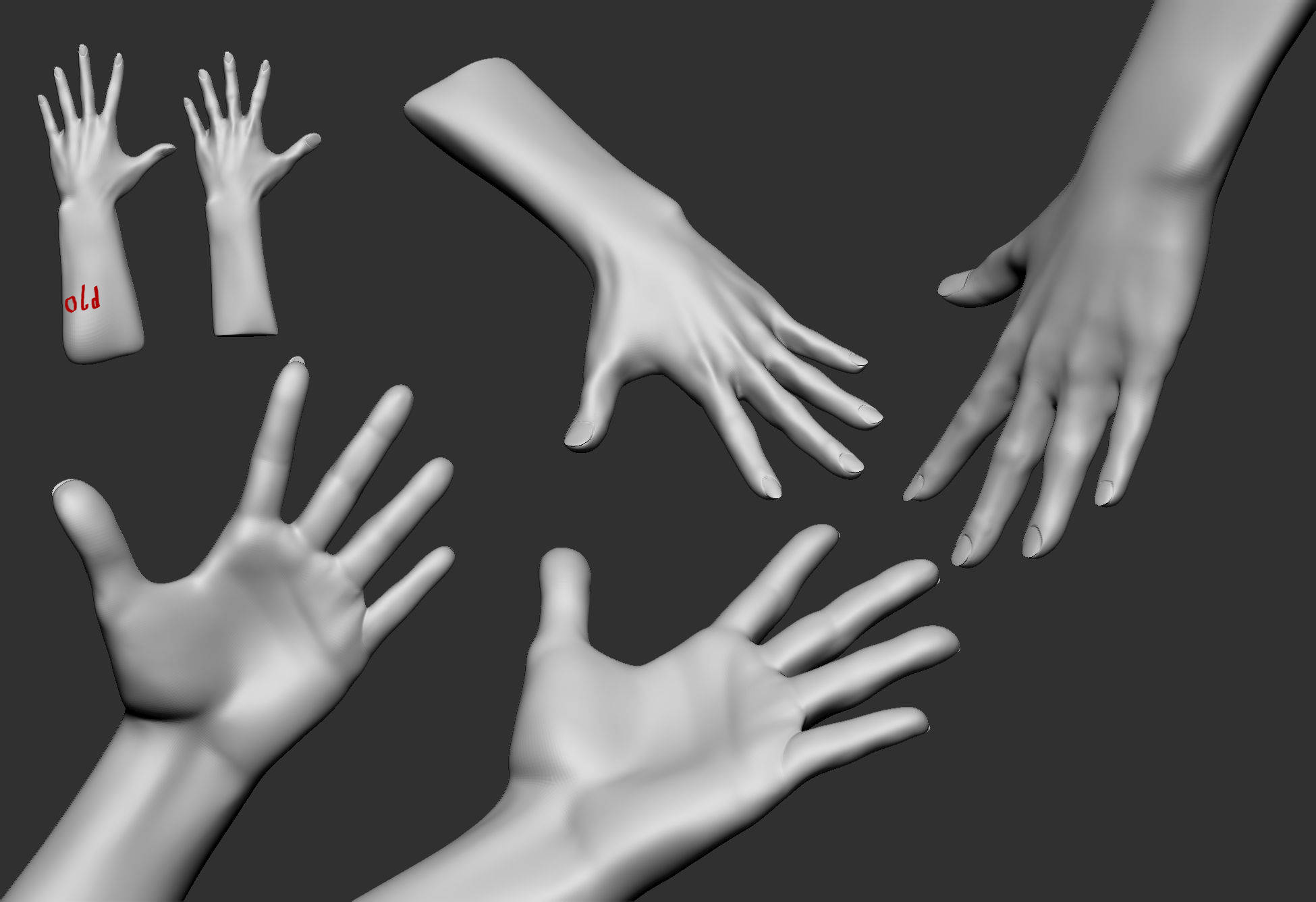
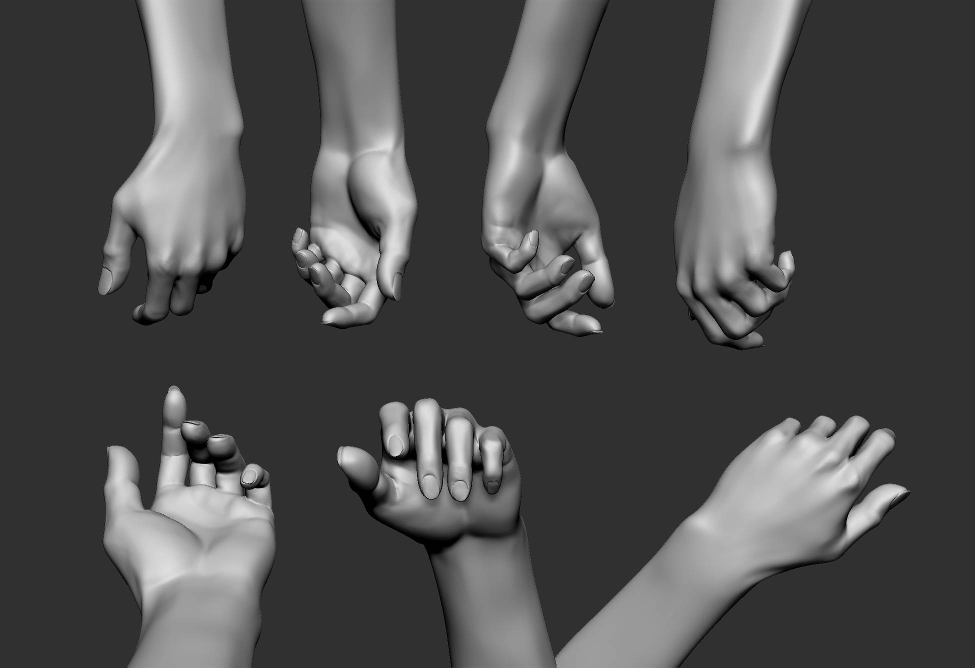
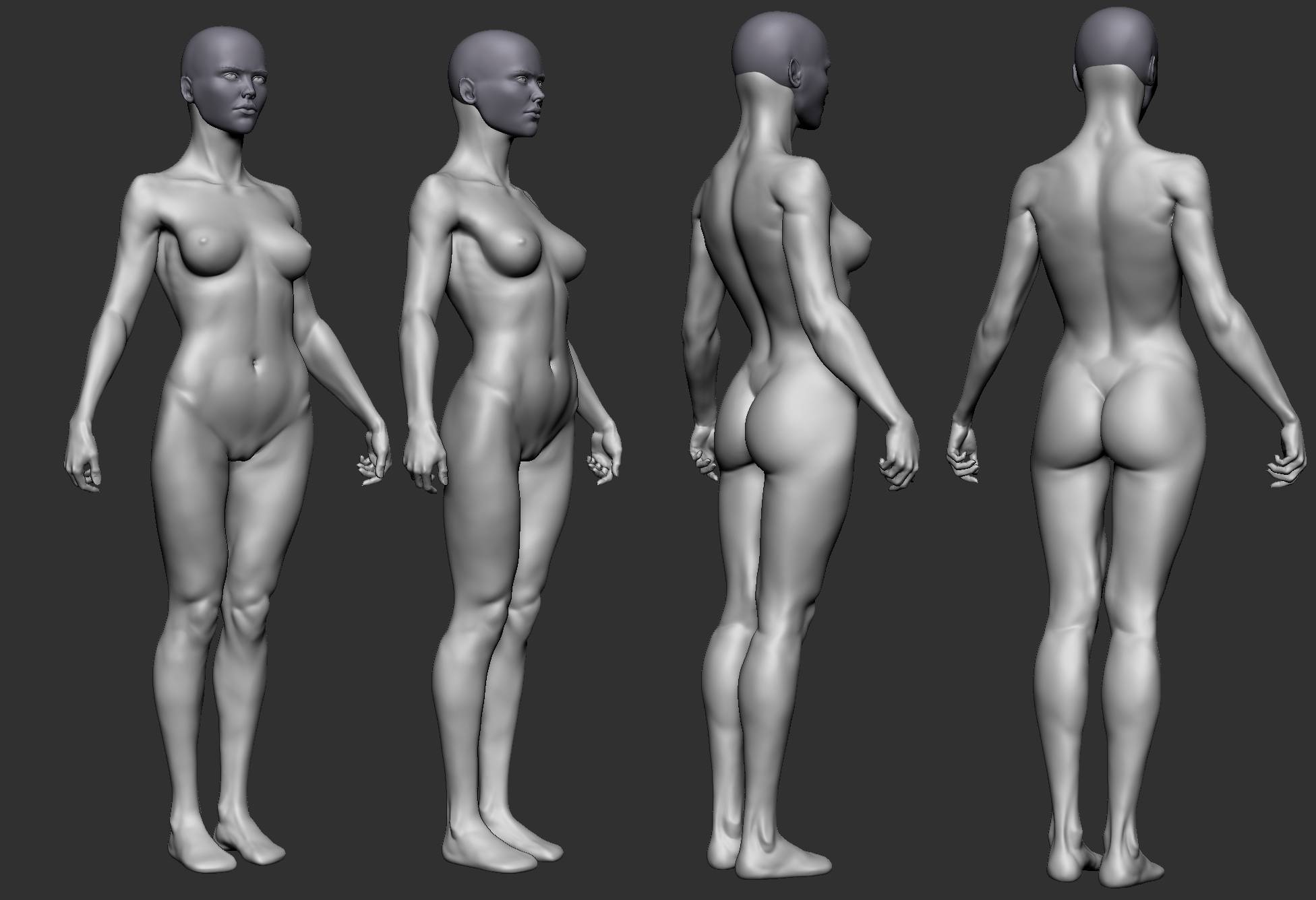
So for the past days I was studying the hands and feet trying to wrap my head around the basic forms and the skeleton.
Not easy stuff! I find the hands to be quite expressive and therefore a stiff and flat shaped hand feels unnatural on the figure.

I sculpt the hand spreaded before I change the composure, which brings me to my problem. I can´t seem to understand the thumb area at all. Either way I model the thumb´s length to feel “right” but then it wouldnt reach far enough when rotating next to the index finger. Or modeling it to reach to the index finger but then looking akward when the hand is spreaded.
Maybe some hand expert can help me on that :slight_smile:

female_body_milestonesculpt_handsh.jpg

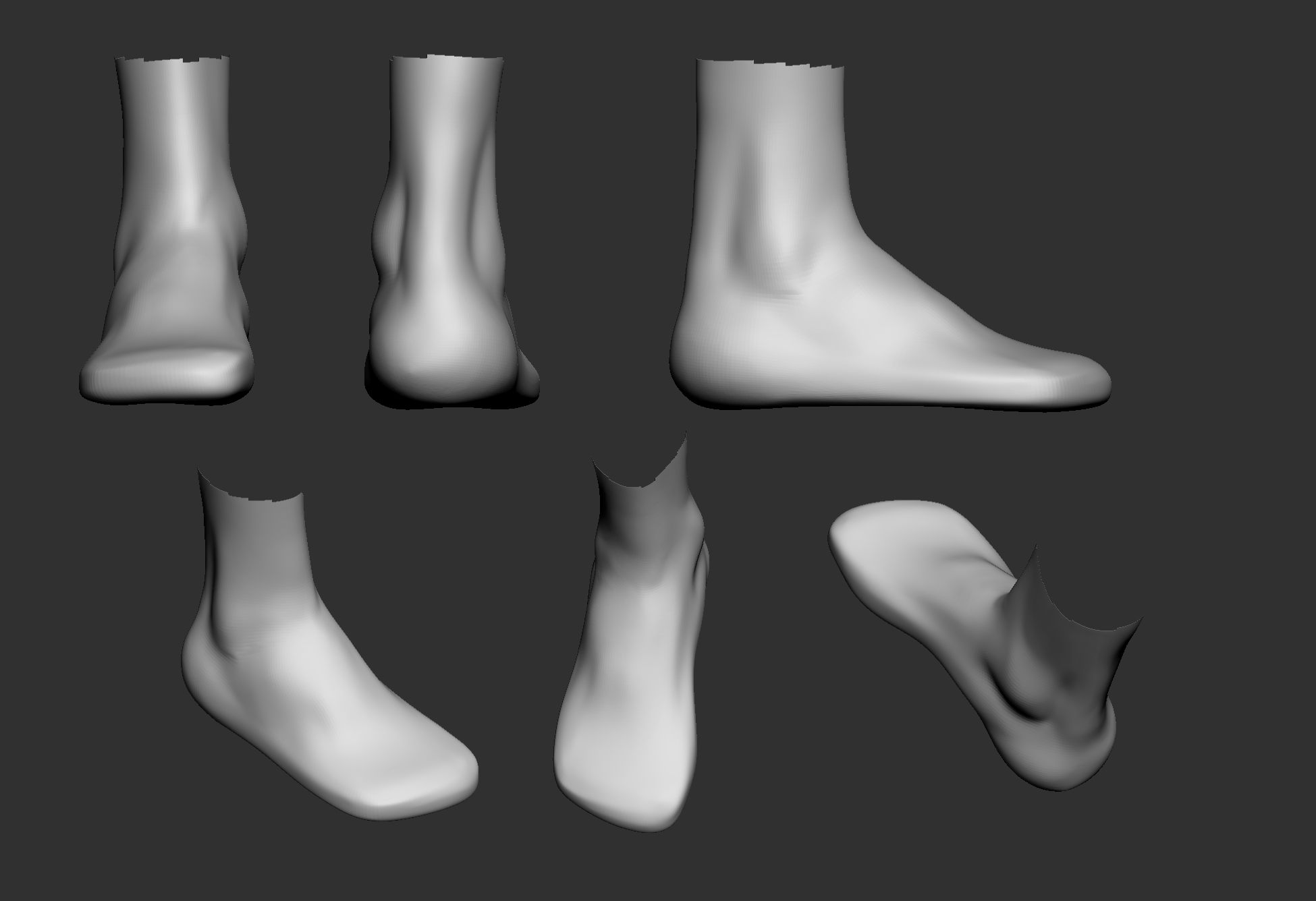
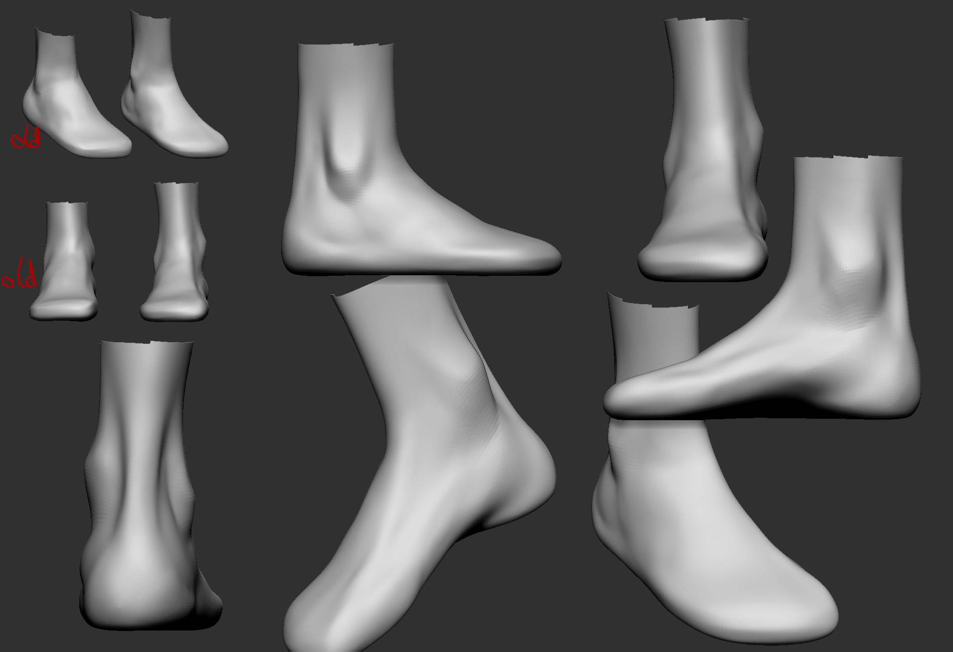
For the foot I decided I only need the correct shape and planes (because I am lazy xD and) since in most cases they will be covered by shoes.
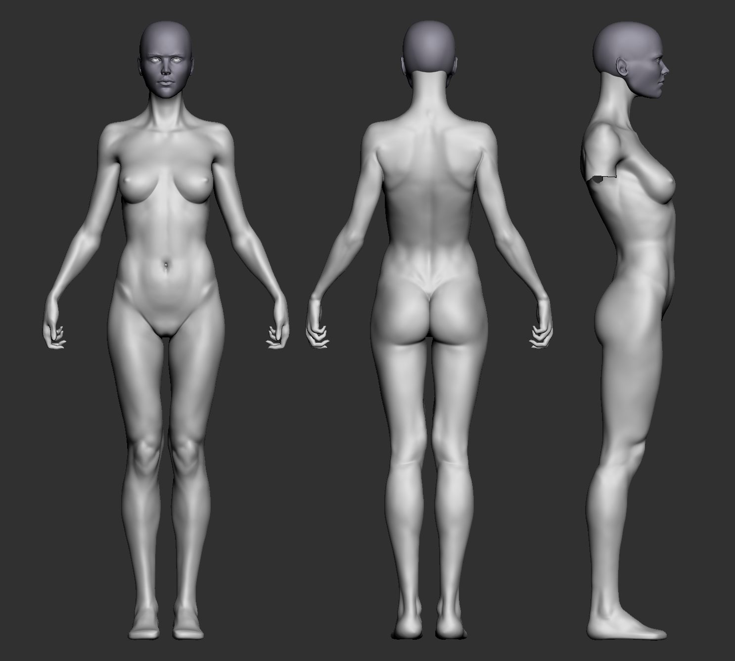
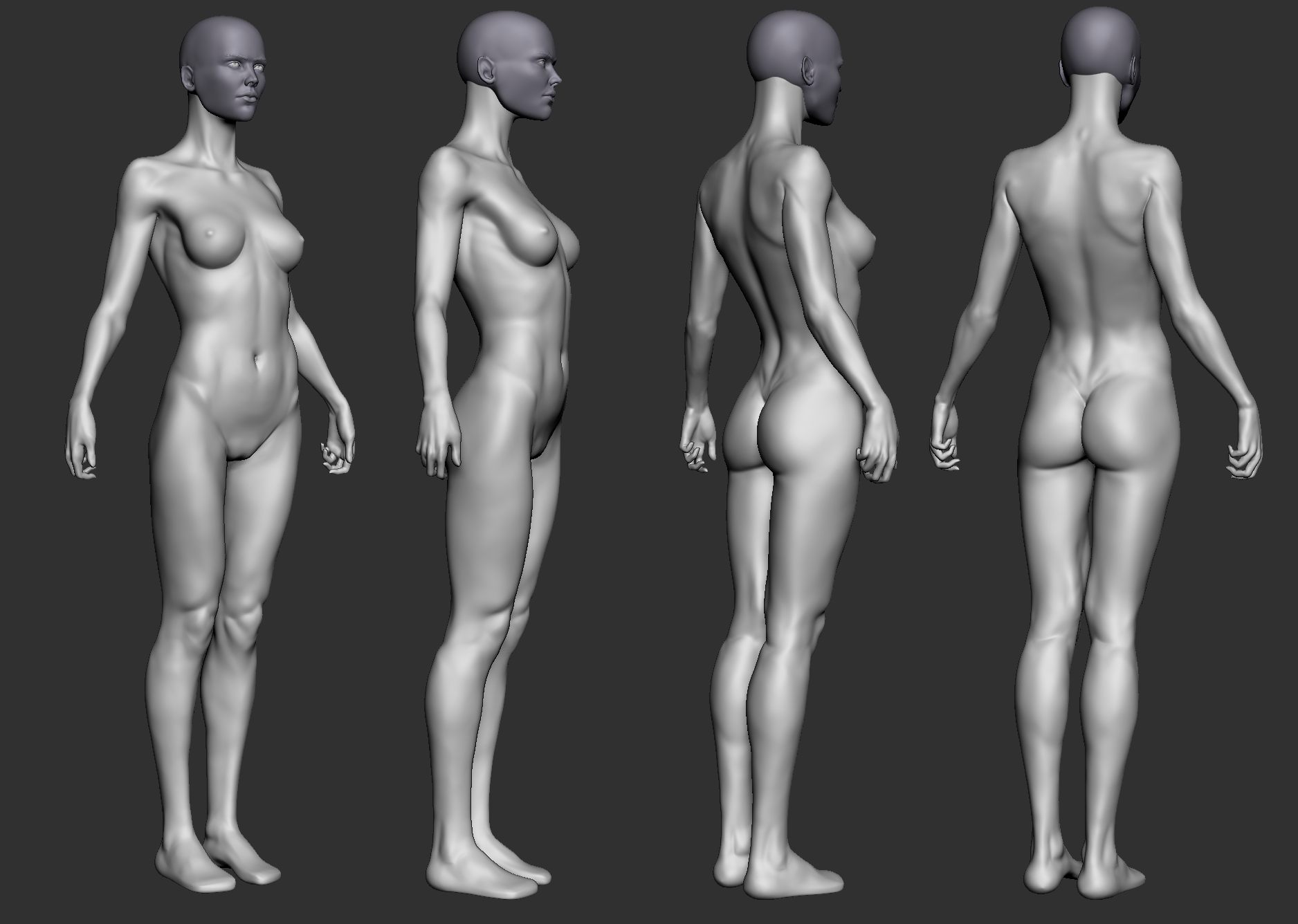
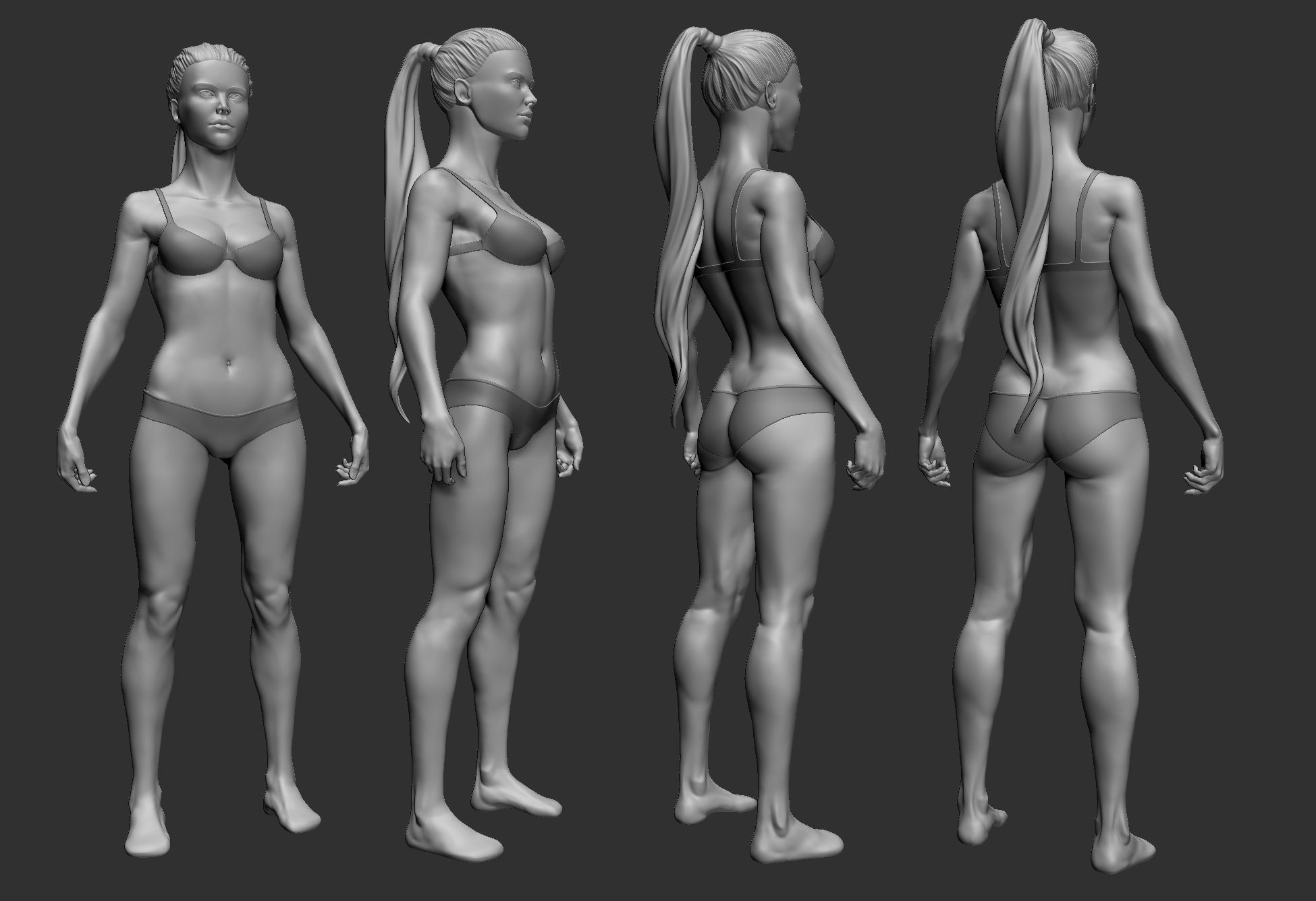
female_body_milestonesculpt_foot.jpg

The entire figure:
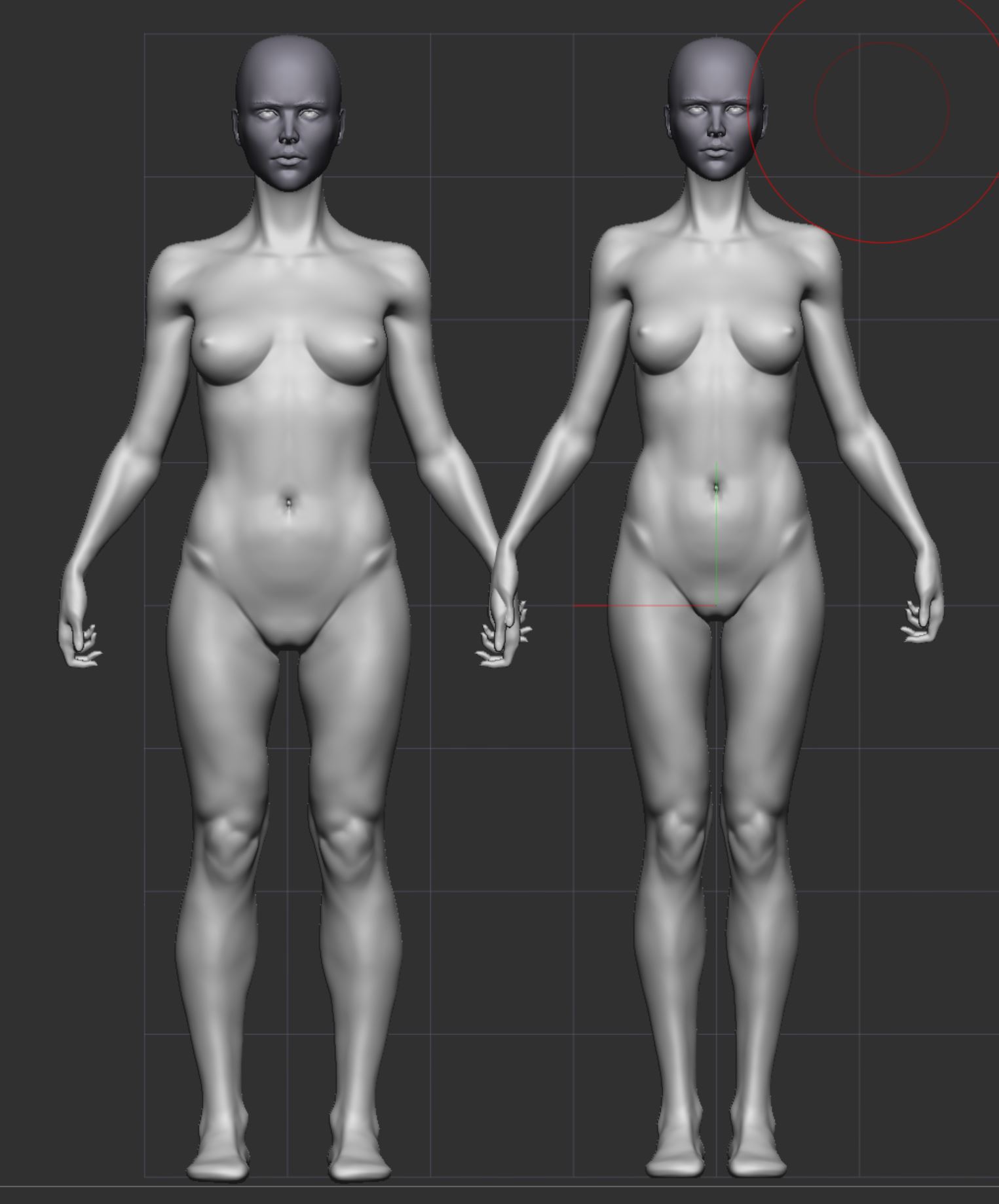
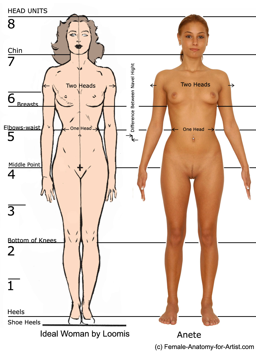
-> I have been spending some time figuring out how to solve the upper body feeling elongated, as mentioned to me over at polycount, without breaking the proportional guidelines I know. In the end I found that for most 8 head models the waistline lies above the third head line so I increased the hip fat deposits to move the waist up. I hope this solves my problem.

-> For the crotch area as well I didn´t want to neglet what I learned from Vir Norin and after looking at some more references I found that the mons pubis greatly differs from person to person. To improve the crotch area I decided to go for this shape.

Other than that I worked on the legs, reducing the size of the calfs as advised as well.
After spending like forever on the knee and the popliteal space I am still not happy with those parts… they look artificial :confused:

Comments and feedback are greatly appreciated!!!

female_body_milestonesculpt.jpg
female_body_milestonesculpt_angles.jpg

Ah… hands and feet. They are always challenging. Especially hand and this freaking thumb. I did a good amount of them but to be honest, each time I make thumbs I sculpt it like “I have no idea what the hell I am doing”. There are some proportional guides for proper hands (which I always forget), but for the most part it is just a constant polishing till it looks natural. Personally I can describe two main reasons why the thumb look wrong:

  • Wobbly shape and bad proportions. Always check the circumference from all angles. Bend your phalanges to make them more obvious and measure their length. Also the thumb is a special finger and its metacarpal plays very important role. Make sure you know its length as well and understand where it connects to the carpus. The silhouette of the thumb have small nuances (bumps for joints) which beginner artists can miss. Though you captured them very well.
  • Wrong orientation. If the shape and proportions are good but it still looks odd then probably its axial rotation is off. The more flexion in carpo-metacarpal joint - the more it rotates directing nail outside.

In your first pic with flexed fingers you have a nice gesture. But overall it looks too elongated with fingers on a thin side. And the head of the fifth metacarpal looks too prominent and low. Also you can make the first interphalangeal joint more interesting. It is hard to judge from this angles but the dorsal side of joint appears as a straight line across entire finger width. Usually the flexed joint is raised bump fused into cylindrical finger (or rather square with rounded corners). Sorry, it is hard to explain. Maybe I should search a photo.
Also, if it is not a dynamesh model then you can place fingers closer to each other (in area where they grow from hand). In this position they shouldn’t be spread apart.

In your second image with straight fingers the main problem is in forearm. It widens too fast. Remember that muscle mass is concentrated in upper half of the forearm. The sides of the lower half is almost parallel.

The foot looks fine for me. Just needs some polishing and small details. The heel looks a bit bold for female. I know you are lazy to finish it but in case you decide to work on it more, pay more attention to landmarks like Head of the fifth metatarsal, bump of the navicular bone and egg shaped volume of the Extensor Digitorum brevis muscle.

PS It is almost a midnight. Really tired to judge about the torso. Will look at it later when I have more free time.

Good luck!

Dang, I actually wanted to post the things I worked on this evening. But the day turned out to be busier than expected…
But thank you so much for looking into my stuff this late! I really appreciate it!

I have a question regarding your workflow with hands. I realized that a proper topology really helps to pose the hand afterwards and judge the finger planes. ZBrush becomes somewhat orthographic when zooming in so it becomes hard to judge the true forms. Just now I have found a switch that turns this off, so maybe this solves that issue anyway. However I don´t want to model the shape for every individual finger. So I thought up some weird idea that is way too long to explain in some proper sentences. Just found out while trying^^ Haven´t tested it anyway.

I´d like to know how you approach hands. Do you use a proper base that you pose or do you just sculpt the form along the way?

Sorry for any weird sentences I am super tired!

The forkflow for hands really depends on situation.
Previously I was sculpting all my models from basemeshes (just a primitive box man). It had very basic geometry so each finger had only four verts in circumference. And when I was subdividing my model I kept smooth off so it maintained planar quality of my model. Fingers in their nature are quite squarish so it’s an effective way to quickly achieve their basic form and then round them after adding couple of subdivisions. At least when I was beginner for me it was much harder to make desired shape with lots of polygons.

Later I started using Dynamesh more extensively. The main disadvantage is the unorganized topology. With low resolution it is often hard to judge about the shape of the fingers, but when increasing it becomes harder to manipulate geometry and major tweaks require constant smoothing. From the other side it allows some quick cheating. Like sculpting one finger and duplicating it three times. That’s a real time saver. You can do the similar trick with regular meshes and subdivision levels. Just instead of replacing fingers you reproject details from finished finger to unfinished ones.

Right now I use this workflow. I start my hand as Dynamesh separately from body. Make a basic shape and establish proportions. Refining one finger and then replacing others with its duplicates. Quickly Zremeshing the hand to get organized topology. Then polishing each finger separately adding individuality to them so they don’t look copy-pasted. Then I merge the hand with body of my character. If it is a simple practice or one-render character (meaning it was sculpted straight in pose and will not appear in other projects) I will leave the Zremesher topology. If this character is in rest position and would be rigged, posed for many other renders then I will do manual retopology of entire model (Zremesher is still not smart enough).
The pose of hand depends on character. Personally I’m trying to match the hand’s type and pose according to character’s temper. For example my character Flora is very shy, delicate and nerdy girl. Hence her hands are tiny, childlike, a bit plump and posed so all fingers are slightly flexed together, creating some sort of a cup (I see this pose in many kids). In opposite, Nastya is very strong, full of energy and sometimes can be very aggressive so her hands posed accordingly - fingers spread, three last of them are flexed, the index and thumb are extended, prominent joints and very strong tendons due to pose. Or a typical Zombie - clenched or grasping fingers, revealing their animalistic nature. I am writing this to show that hands depend on their character and when the temper is not established then I don’t pose my fingers. Either way, all the posing happens when the hand is already attached to forearm and has good organized topology. Because masking each finger manually for transposing is not fun at all.

I hope that answers your question :slight_smile:

Yeah it does! Thank you! That thing with reprojection is kind of what I am thinking about. I thought I could sculpt one finger with clean topology and some subdivisons and dublicate it. After that I would leave ZBrush and model the rest of the hand in another software and when I get back with the entire hand, I´d project the details on the fingers. This of course requires that the position of the fingers don´t change while vertex modeling… So I am not too sure about how convenient that workflow will be. I have to test it.
Right now I am doing what you described with dynamesh and ZRemesher. I run into problems though when trying to change gesture with zsphere rig because of the still relativly messy ZRemesher topology. Maybe I need to prepare better guidelines first.

Though I am still far away from character concepting, it is good to know what hand gestures can tell you about the person. So I´ll make sure to remember that!

I was hoping to get more results but I think my knowledge about the basic volumes and anatomy is too sparse to improve fast. Anyway here is what I have been working on:

For the feet I tried to establish better volumes and some landmarks for the toes. The hand I shortened and worked mainly on the thumb and middle + index finger. To improve on the thumb I think I start a new project solely concentrating on the thumbs form + anatomy and the connection to the hand.


You are doing great. Nothing really to add right now. Maybe both maleolus… es? (Have no idea how it should be pronounced in plural form), well, both ankle bones are a bit too high.
The anatomy of hand isn’t that important so there is almost nothing to learn. The most important things to understand is the placement of joints, the cupping of metacarpals when flexing fingers and this distinct step down from forearm to wrist that gives a nice gesture. In terms of muscles it is even more simpler: the form of first Interossei, common masses of thenar and hypothenar and tendons of Extensor Digitorum Communis and those extending/abducting thumb (their muscle bellies still relate to forearm).
Good luck!

Haha your right! I was so focused on getting the shapes right that I haven´t even noticed them moving up…

So I worked on the hand gesture again; gave it better topology with zremesher and improved the position of my zsphere rig. For now it did work out for me but I think in the future I will hand model the topology first. The volumes of the thumb I mainly shifted back and forward until it felt right for me. I tried to use my own thumb as reference, though it doesn´t look like mine at all^^

Another question regarding my proportions:
Do you think the form would improve anatomocially speaking? In the past when I started with human anatomy I used Ryan Kingslien´s anatomy model for taking meassurements. Now I found out I made a big mistake on meassuring the ribcage`s width. This is probably the reason, when pushing the hips of my model, it would look out of scale to the rest of the body -due to the small ribcage and 8 head model size. I made a rough overlay over a real life reference with mouse and move brush.

The hand looks much better now :+1:
Speaking about proportions. You know, right now it is all about personal preferences and tastes. I don’t really know what is your ideal female type. I prefer tall, slender yet curvy girls. So my answer that right version looks better can be biased. The left one seems too massive though I did some measurements and it appears that you mostly compressed her vertically without changing torso width. She is 7 and 1/3 heads now which also makes her close to reality and less heroic.
I am also not sure about the breasts. Usually nipples above the second head mark are only in very youth. Or in case of short people. Which is kinda truth now after your proportional tweaks.
I would probably suggest searching for golden middle between this two versions. I know it is quite tricky to do. Sometimes it is even hard to guess what exactly requires tweaking, so for example you might compress her body while it is rather head should be sized up etc. But small ribcage or narrow shoulders isn’t a reason that hips look wrong. Example

Nice! High five… lol^^

It is kind of hard to explain for me. I am already quite sure where I want to push my proportions after this. More in the stylized and unreal area, however now I want to find out where I stand with my realistic model. I always thought I´d be your average 90 60 90 guy xD So I always tried to not go overboard with female forms and stay on my guard. I think you see a lot of this (I guess more 2D) stuff on artstation. But now it turns out I am sculpting and pushing my forms to quite a slender sillhouette. When somebody adviced me to widen the hips I was like; ok I don´t think it is necessary but I can see how some widening goes, that´s easy! But it wasn´t… no matter how little I pushed the hips in my eyes they looked out of scale.
So I guess my main concern is to find “the best” proportions for my inner eye, not to sculpt them because they fit my tastes the best, but to evaluate from them. My view from real world to screen seems quite distorted.

For the model on the left I actually widened the rib cage from the 0.5 head mark to 0.75. In front view you can barely see it I guess. I actually forgot to put a link to the reference: http://www.fineart.sk/sites/default/files/photos/005/005_0_2.jpg
I have already integrated some of that proportion change into my model so hopefully this will be my golden middle;) But before that more work has to be done. I want to focus on the arms a bit more and then finally return to her shoulders and back.
Btw the pic you posted is awesome! If I would have seen that as a 3D model I definitely would have thought this to be stylized. If this is really not photoshopped then this girl has some insane curves!

Speaking about the reference. I remember this girl - she is retired pornstar. I searched her bio and it says she is 165 cm tall so her seven and one third height is quite natural. When I saw your model first time I assumed she is quite tall. If I am right then eight heads would work for her. Cause I find this rule about 7.5 very misleading. Its says that regular people are 7.5 heads tall while heroic and idealized ones are 8 and taller. After reading this people start thinking that eight heads should be applied to stereotypical muscular characters like superman or wonder-woman. But this is not true. This proportions are more tied to person’s height and not the muscle development. I have told this several times before on ZBC - I am 188 cm height and have almost 9 heads tall. So overall if you see a tall person then most likely it has 8 heads or more. Otherwise tall person with canonic 7.5 will look very massive and tank-like.

Another image in your reference is from Loomis drawing. While I really enjoy his works and books, I always thought this diagram of “Ideal” female is plain awful. It is far, FAR from ideal and looks more like a man with boobs in corset. Two heads of shoulder’s width? Just bizarre.

I know what you mean. I often find myself unsure about right proportions. And the more I look at model the more I start doubting. It is also a psychological thing - when you work on particular female body for too long you are getting tired and lose interest. It doesn’t arise such a strong excitement as it was in the beginning so your brain attempts to retrieve this feelings, forcing you to make unnecessary changes. At least that is how it works in my case. Right now I am resting from the last character because I worked for too long and caught myself thinking that I need to redo her hips since they don’t excite me anymore. But I know this is not true since it has a good shape and very close to original drawing.

The influence of stylized art is yet another story. You really should be careful with it since it indeed distorts your perception of reality. I sculpted by itself and watched a lot of images of girls with broad hips and big beautiful breasts. They look big only at the beginning but later this proportions start appear as regular. So when I came back to realistic character I was really confused by the lack of curvature and volume.

Yeah, this Asian girl has great curves. I dunno whether it is photoshopped or not. I sometimes see girls with similar proportions. Whatever, we as sculptors have a freedom to push reality forward and make realistic character slightly better. If it doesn’t look odd then there is nothing wrong to sculpt something curvy like on this photo. Some more. This are probably shopped. One, Two

I went through my huge library of artwork and picked up images of female characters in different styles which are pictured from a straight front view. Here are 3D renders plus one drawing. I did measurements so people can see the average height (the head length is a unit). Two vertical lines are also one head apart and their main purpose is to see the distance between the nipples and their relation to waist width. Two horizontal lines below represent relationship of waist to hips broadest points. For clarity sake I added the divisions of thirds.
In models with hair the head length was established considering that inner eye’s corners are at the center line. Some stylized characters have big cranium so when measuring haired ones from the same author according adjustments were made. And keep in mind that perspective distortion can affect the measurements so don’t treat it as gospel. I hope this would be useful to you and others.
PS All rights belong to credited authors and blah-blah
LINK

Actually when I first posted this I had not ever thought about character design or how tall or small the model should be. I am pretty hyped, now that you told me! I played a bit with the head size and instantly I am able to see the model in a very different manner. And indeed it makes a huge difference what proportions you apply to the body. This is very valuable to convey a person´s body structure!
And I agree with you on Loomis ideal woman; far from ideal for me as well :wink: Maybe in drawings you can do this but in 3D his proportions look really weird…
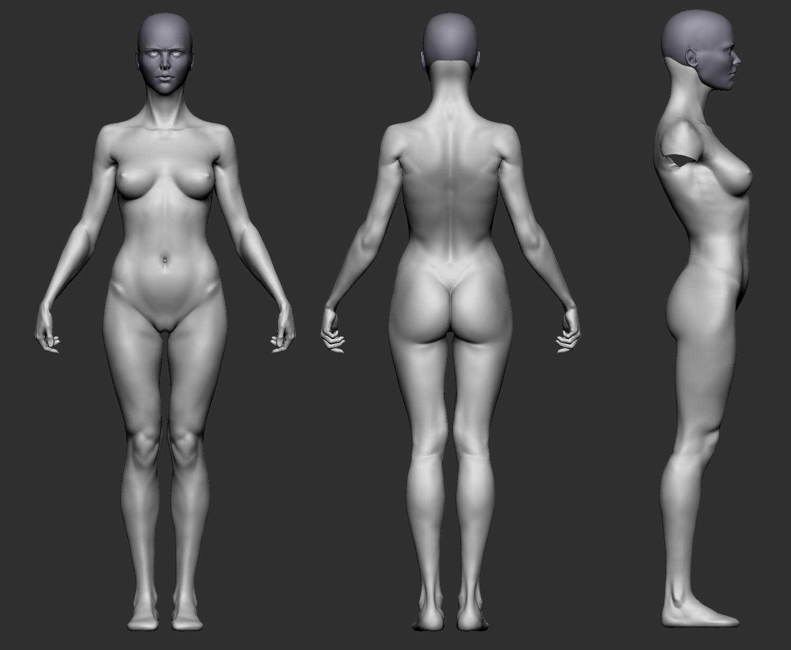
And chapeau for doing that proportional analysis! It is gold! Wish I have had this sooner since it is really helpful. Hopefully others will find this as well. The rightest image was actually the reason I decided to get more serious with 3D sculpting. I was like: “I wanna be able to do this as well!”^^

Right now my model comes in with 7.6 heads. I think I have to step back from it again for some days and compare to my 8 head model to see what I like better. I also worked on the arms and the back again. For the arms I tried to incorporate the slight rotation of the elbow when in semipronation, not easy in my opinion. And the back, yeah… it is an ongoing zone of doubt and misery. (Also tried myself at some sculpted hair, but meh… it looks more like a mop placed on the head so I better practice some more before posting:)


Yeah, when I saw this stylized blonde girl I simply fell in love. She is so accurate and delicate. Though in my case the first model forced me to start learning 3D wasn’t a cute girl but rather a monster. It was a creature called the Darkness and was made by Steve Jubinville (too sad this guy disappeared from forums and there is no news from him).

The model looks good. Some problems here and there but overall really nice. The forearm needs more adjustments though. The twisting during pronation is prominent mostly distally. Proximally not so many changes in terms of volume. In your case it appears that common mass of ridge muscles (Brachioradialis and Extensor Carpi Radialis Longus) steal some space where wrist flexors should be. And since we are here, I will suggest to practice more the forearm and especially the side of extensors. After the back shoulder region this is probably the most complex and confusing part of the body. Right now it appears vague and smooth while even in this relaxed pose you can find a lot of interesting shapes: ulnar furrow, the bulge for Extensor Digitorum Communis, the slight prominence of Anconeus and dimple for Lateral epicondyle.

PS I don’t know if you are doing this while working but I will say it anyways (I’m judging by all images in your thread). Try making renders with different lighting - this can drastically change the appearance of your model. Default Light position is good for seeing model overall but it tends to flatten your shapes and kills the drama and shadows. It is especially good when your model is still symmetrical - nicely positioned lighting will hide this greatly. Also try using different matcaps. They will help refreshing your eyes. Keep in mind though that some of them might be deceiving, especially those with cavity shading.

I think for me the game Spore got me into 3D sculpting although there´s a huge timegap between where I left the game and the first time I opened a modeling software. Also my study is very close to computer games and graphics, however it only covers the mathematical stuff so I enjoy exploring the artistic side to it!
Usually while sculpting I switch between standard mat and one from zbro. I have been using the standard a lot lately, so maybe I should start to switch more often again.
I think I am going to spend some days practicing the arm based on your adviced. Also it will give me the time I need to step back from the model. Maybe I get some hair done as well and conect the head to the body to wrap things up;) I already have a model far exceeding the expectations I had before posting and that is because of your awesome advice and the time you spent to critique my work! Can´t say it enough -thx mate!

I took my sweet time to step back a bit from this project and compared different proportions to find my personal golden middle. It is really weird but it seems my view from “real” life to 3D space becomes quite distorted. Maybe it´s a beginners thing however after spending some time working with new proportions I see the old model in a different light.
Thanks to Vir Norin I learned a few new things, such as the proportions should change relative to the person´s true height and that the size of the head compared to the body is the main indicator for the entire body size. Before that I was like: “the person should be taller? just scale the mesh a little bit^^”

Anyway this leads me to my probably last tweak on this model. Sure there´s still much to improve like the arms (they are quite the nightmare for me) and I am not happy with the knee area at all but I think there is no end to that anyway. I want to move on to my next project sculpting the male body and continue to build on the things I have learned here.
For fun I tried to zsphere pose the model though I have to say I don´t know a thing about posing, except that the arms shouldn´t be parallel xD

My thanks go again to Vir Norin whose critique and support is outstanding! Thx a lot mate! :slight_smile:


female_body_milestonesculpt_angles3.jpg

<iframe src=“https://sketchfab.com/models/1afa3fa46b6843a79b724e9835bf9bf2/embed” allowfullscreen="" mozallowfullscreen=“true” webkitallowfullscreen=“true” onmousewheel="" width=“640” frameborder=“0” height=“480”></iframe>

[Female Template](https://sketchfab.com/models/1afa3fa46b6843a79b724e9835bf9bf2?utm_medium=embed&utm_source=website&utm_campain=share-popup)
by [zaxel](https://sketchfab.com/zaxel?utm_medium=embed&utm_source=website&utm_campain=share-popup)
on [Sketchfab](https://sketchfab.com?utm_medium=embed&utm_source=website&utm_campain=share-popup)