Ok. This one was failure. It doesn’t look to bad, but I was trying to achieve a specific anaglyph depth effect and it fell short . I was trying to make the cube look like it was entirely above the surface of the plane (your monitor) and everything else was sinking into the plane. If you run your mouse through the image elements while still wearing your 3D glasses you will see what is above and below the surface of the invisible plane.
Now, I’m on a little confused about why the background is coming up around the edges, but I’m pretty sure I can sort that out. The part that really confuses me is the cube. The far corners of the cube appear to be a little blurry and sinking into the plane and I don’t understand that at all.
I got’a think harder now. Dang…
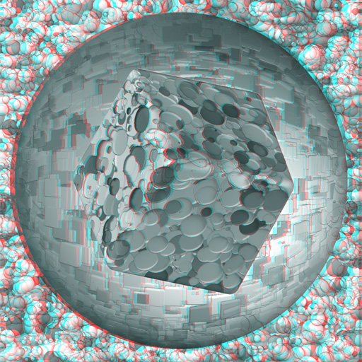
I figured out why that cube looks a little funky. I know how to solve the problem but it is truning out to be much more tricky that I at first thought.
Attachments
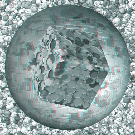


 im relatively new here. tried this out (couldnt get that callipygian program to work).


 small_orange_diamond