Goodness gracious, I think I’m just about done…
I hope you like it! I’m pretty pleased myself. Any feedback would be much appreciated.
[ ]
]
Goodness gracious, I think I’m just about done…
I hope you like it! I’m pretty pleased myself. Any feedback would be much appreciated.
[]
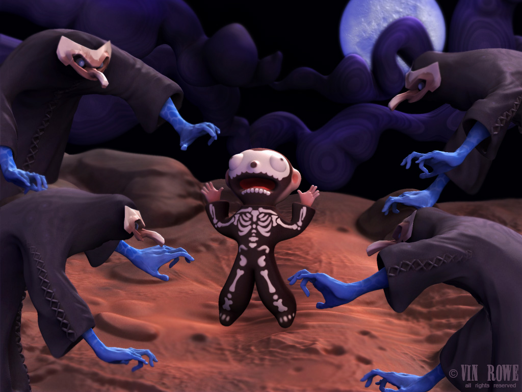
The Hands - every Hand is the same of the other monster… no various…
little boy needs shadows to ground him in the scene. Lighting needs some work to make it looks like moonlight… seeems there is too much white ambient in the scene
you’ve got a good style for your charachters, i agree that they need shadows and mabye some atmosphere, to amp it up a little, otherwise its looking great.
Hanco - the hands were a time-saving thing for me, I was hoping no one would notice… but instead I see that they were noticeable enough to prompt your very first post.  Maybe if I find some time I can add some variation.
Thanks threetails! Guess it’s back to work for me! (I’m kind of happy about that really, don’t really want to be done)
Hey vincenzo, you put this together very quickly,  I really like the background clouds and the monsters.
  I would work more on the boy though he is doesnt have any definition right now and is kind of a formless lump.
For better or worse (I think better), I made a pretty serious overhaul. I redid the kid, changed the lighting (shadow from the kid still not quite there enough probably), dressed the set a little more with some mineralage. Whatcha think?
I still have a few things to improve upon…
[[attach=74315]retry_newKid.jpg[/attach]]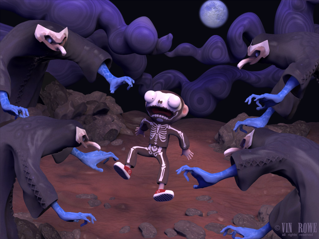
better!
I really like the changes.
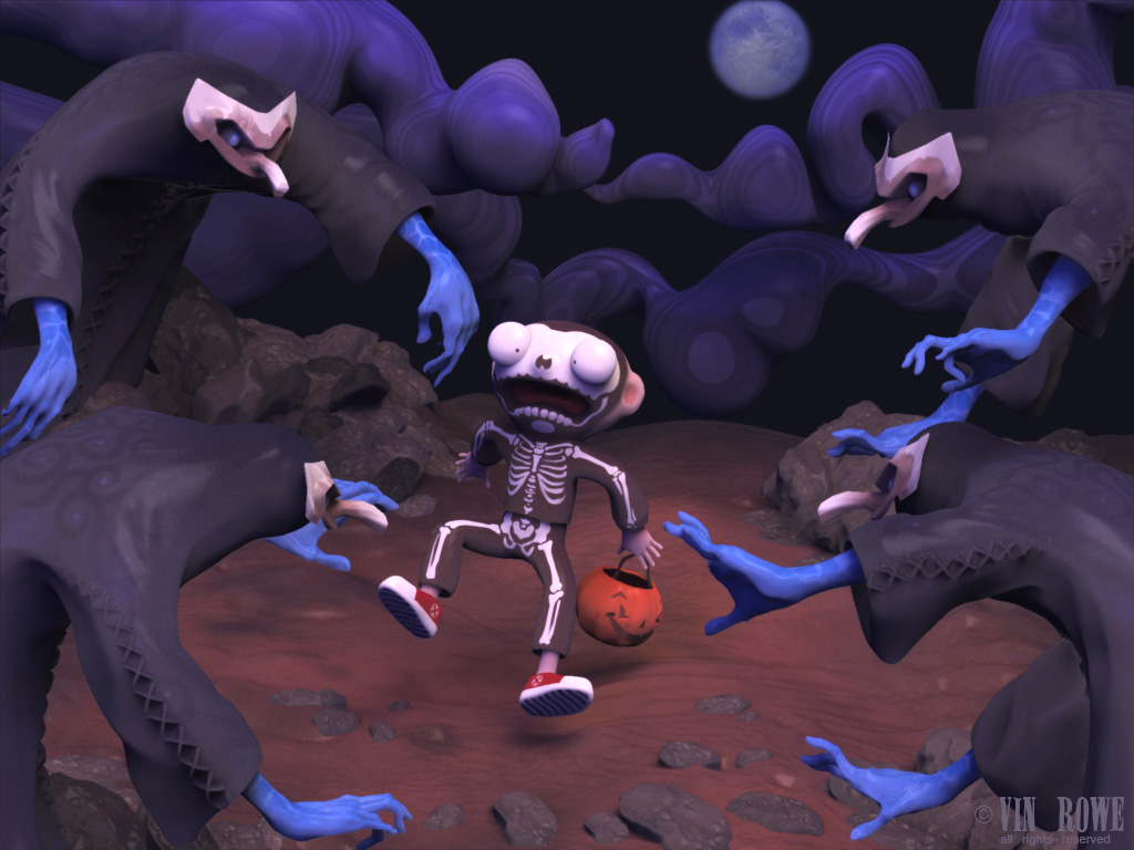
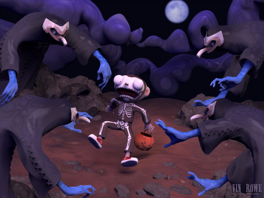
Thanks for the encouragement! I made a couple more changes, and I’m starting to think again that this is just about done… I did a bunch of different hands for the scary guys and a trick or treaty pumpkin for the the kid (also got his shadow a little more defined):
[ ]
]
The latest version is very good Vincenzo!
I like very much the Skeleton dress for the little guy and you did well to changes the hands of the Spooks… very good!
I didn’t see the cool spiral draw on the back of the spooks… very nice!

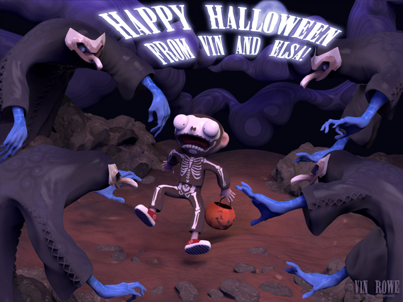
Thanks piz, and thanks to everyone who gave me feedback! It really helped me to make it better. I went into this to make my annual Halloween card, so here it is (I’ll take out the text for my final submission). Happy Halloween to ye!:
[ ]
]
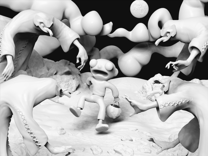
And (just because I like this kind of rendering) here’s the scene with I think Pixolator’s White Dino Shader. Makes it easier to see the modeling or lack thereof in some cases:
[ ]
]
Very Cool Vincenzo and… also very interesting technique for debug scene… I will use it! 
I like very much the composition and the expression of the child!.
This came out awesome! Great character designs and composistion.
Very Nice! The improvements you made helped tremendously
WOW! This is a great entry! Well done!
Thanks very much, gang! And great job to everybody who entered stuff! Working on this has been an excellent learning experience, and here’s the really really final final version of my entry:
[ ]
]
I should probably mention how this scene was rendered and all that, now that I think about it… The creation of all the pieces and the rendering itself were both 100% ZBrush. I used the same material for most of it, which was a modification of a great clay shader that Kris Costa made… Oh look at that, you can download it from his site. (Thanks Kris!):
http://www.antropus.com/freebies/ZBrush_clayshaders+lights.zip
Basically I tweaked that shader a little bit and had different lights (plus the glow material for the moon).
Very cool.
Good composition with a nice main character.
The face and body expression of the kid is very good.
Nice gesture of all characters.
The clay-shader looks very cool.
Good work.
Btw.:
I thinks you should keep the ‘Happy halloween’-text in the final picture.
I enhances the message and overall impression a lot and fits perfect in the composition.