ZBrushCentral

Patrick Wards Work Dump (nudity)

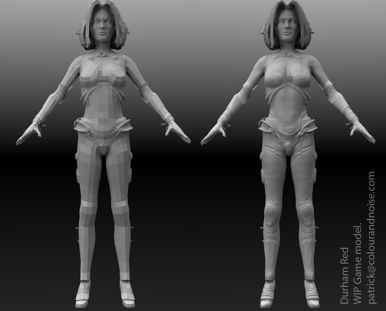
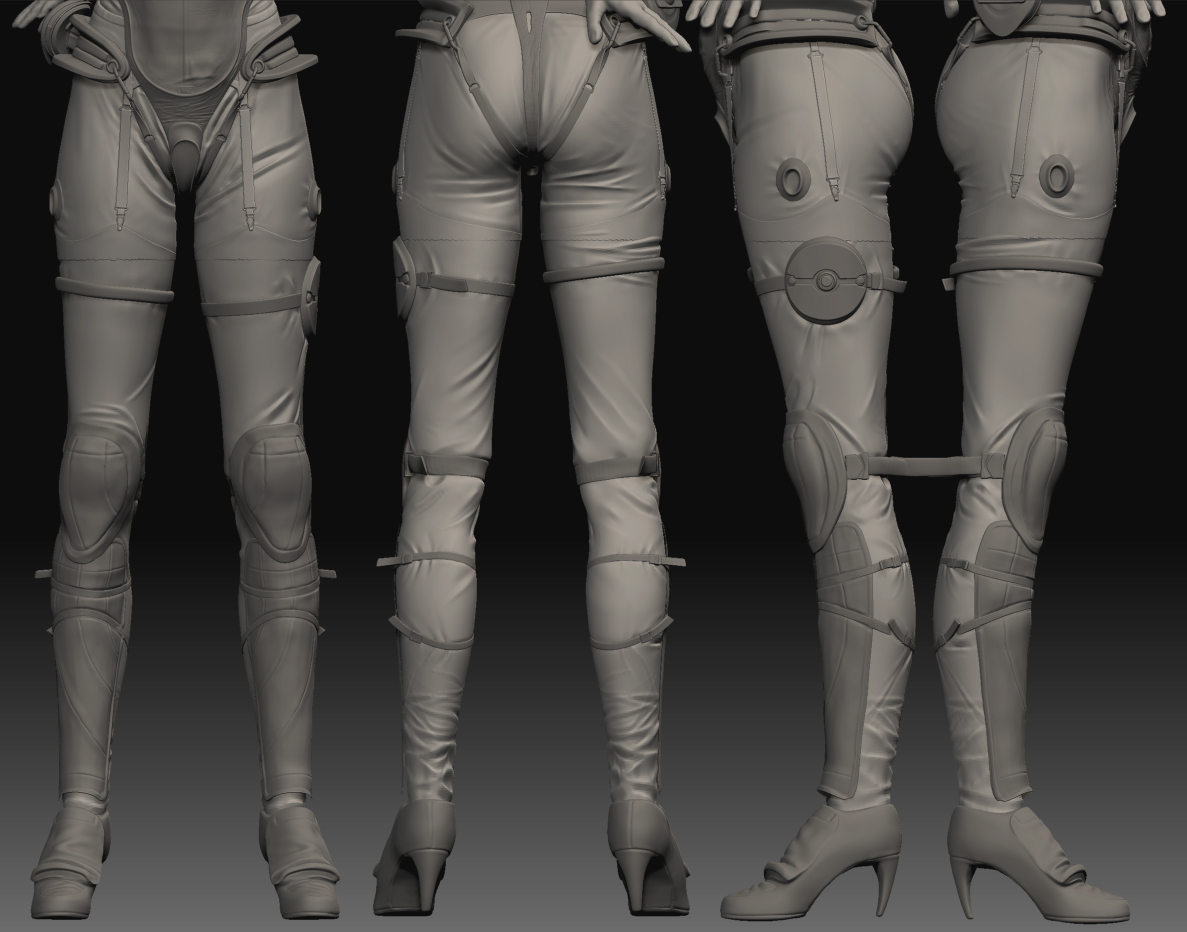
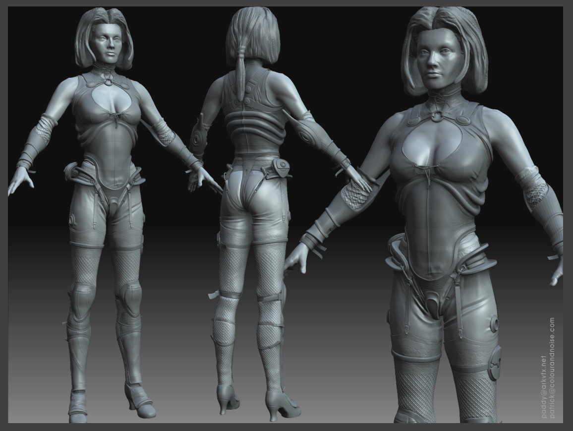
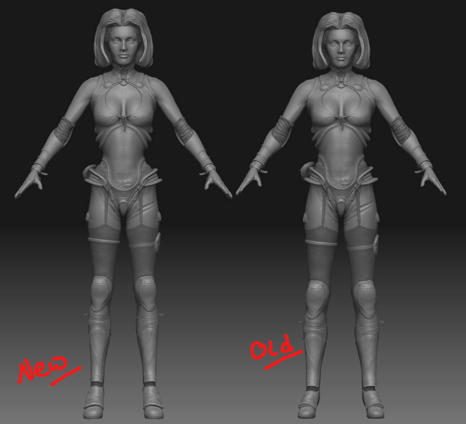
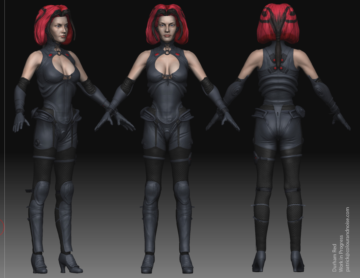
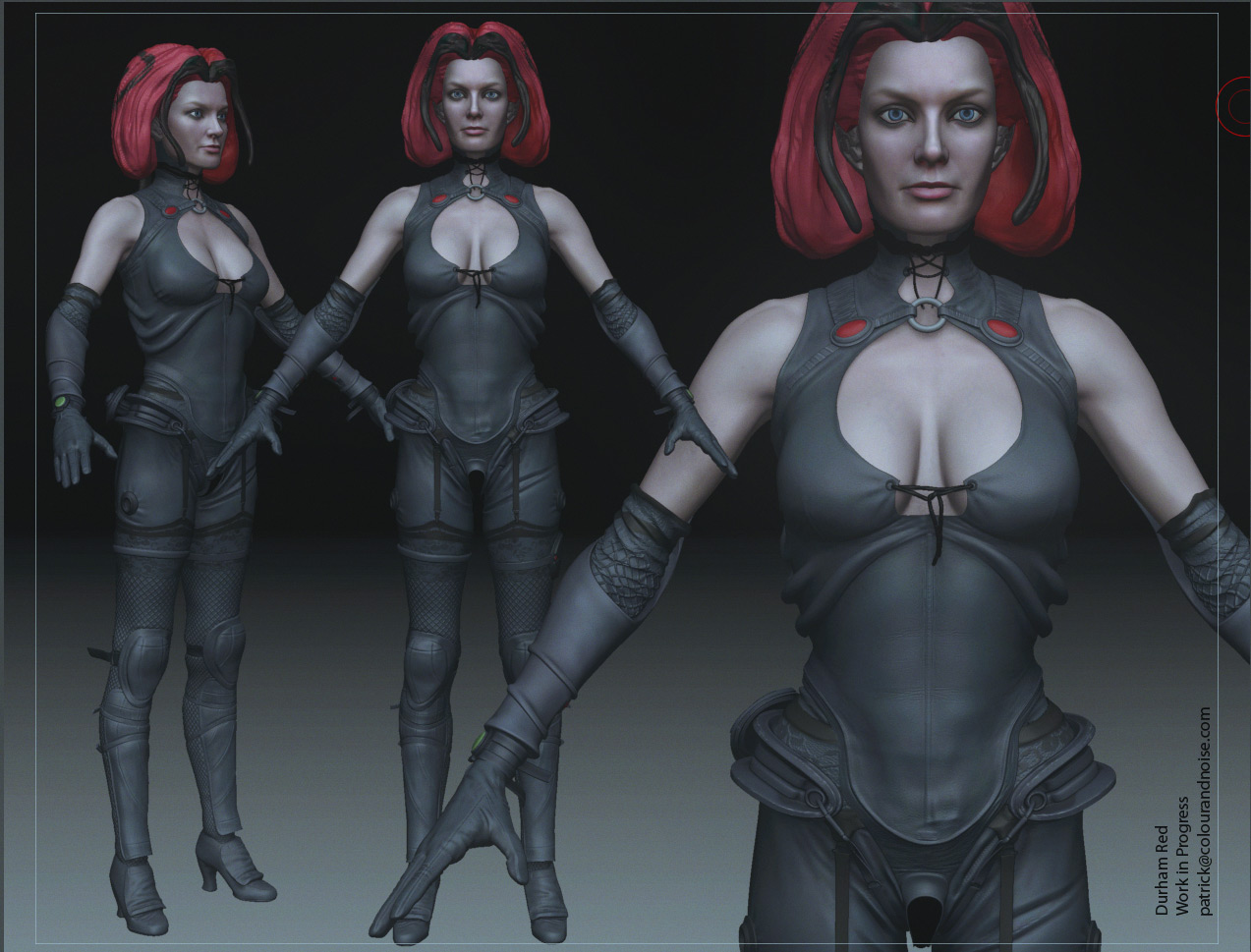
I just revisited the wrinkles after work. Not much difference but I’ve taken out some things that were bugging me, and tweaked things here and there. Again I’ve removed the stockings. The buttock area is looking too uneven so I think that’ll be the next thing to change. Still open to as much criticism as you can throw at me.

[PWard_DurhamRed_leg_wrinkle_query_v002.jpg]

Good work on leg’s small details! Keep going

So, am I the only one that thinks the heels are pointed a little too much toward the toe. I don’t wear ladies heels, but the physics behind it would seem to be, if the point doesn’t hit the ground first when walking or running, then it snaps off. The other possibility, if it doesn’t snap, it just causes the person to slip into a split. Again, I’m just stabbing in the dark here.

Have a blessed day,
-kmkenpo

eof3d - thanks.

kmkenpo - very valid point. Thanks. I’d not even thought about that. I think they should be lower and stockier. More like these.

http://www.liverpoolmuseums.org.uk/online/exhibitions/shoes/tinne/norvic_glace_kid_shoes.aspx

Or if not that low then at least thicker and better positioned.

Here are a few ideas for the shoe / boot concept… again… ONLY ideas.

Have a blessed day,
-kmkenpo

Attachments

ideas.jpg

Thanks very much.

Just a small update. The stockings are on although they’re now hiding the leather trousers. I’ve started on the face but theres a way to go yet. She’s still missing a few bits here and there and I really dislike the shoes but, well this is where she’s at now.I’d still really appreciate some advice on getting her into a game engine. The plan is to polypaint her, then to retopo her in 3DCoat, UV her in something and then use xNormal to get the maps out. I’m not sure how I’d deal with the transparency of the stockings. Its been suggested that Maya is better for baking maps out but I’m not sure it’ll take the poly count of the hi res …

PWard_DurhamRed_stockings_v002.jpg

Those shoes are a great deal better… as odd as that sounds. Really impressive work.

Have a blessed day,
-kmkenpo

Thank you!

nice work…very unique design with all the straps and such! I think the hair could use some love but i’m guessing you havent gotten to that yet:D Can’t wait to see this baked down and textured!

No the hair’s standin. I assumed it’d be a mixture of mesh and alpha’d polys in the game model so I just didn’t bother doing anything more than a rough volume. And if I can figure out the best way to bake her down then I’ll post something up but at the moment I haven’t quite got a handle on it. Thanks.

Well, ever since I started I’ve had issues with her proportions. Durham Red is a mutant vampire and in the comics she’s portrayed as unnaturally tall and thin. I tried this but then settled on more realistic proportions.
But I just thought I’d try stretching her a bit and see how she turned out. Its subtle but I think it makes a difference. Her head is bigger, arms and legs longer, waist tighter, hips larger, top of her chest slightly broader and her upper thighs slightly larger. And I fixed the size of her shows as they were always a bit on the small side.
Maybe her bust needs to be higher or maybe her waist is a little too long now …
Does anyone have an opinion?

[PWard_DurhamRed_proportions.jpg]002_durham.jpg

Thanks.

Attachments

PWard_DurhamRed_game_mesh.jpg

Quick colour blockin before I start texturing her.

[

](javascript:zb_insimg(‘214247’,‘PWard_DurhamRed_colourblockin_v001.jpg’,1,0))

Update.
[PWard_DurhamRed_CGFeedback_textured_01.jpg[/ATT]%3C/font%3E%3C/a%3E"]

](http://%3Cfont%20color=%22#9A9A9A%22%3E[ATT=214672)

just a tip: you really shouldn’t post only renders in orthographic view. hard to judge the shape this way and it simply looks bad. turn perspective on and also keep it that way for the most of your modeling process.
you are putting quite an effort into this and it looks pretty good, but these renders don’t do your work justice.
that being said - even taking the flattening appearance of the orthographic view into account her shoulders are still too wide apart from the torso.

Hey a crit! Thanks Julian. I’d all but given up on ZC.

The image above does have perspective on it and I do model with it on. The image above that and many of the others don’t, I agree.

Thanks for the comment about the shoulders. I was over compensating for her shoulders being pulled back in the ref. Maybe they should be moved in a touch. Cheers.

awesome modeling :+1: 
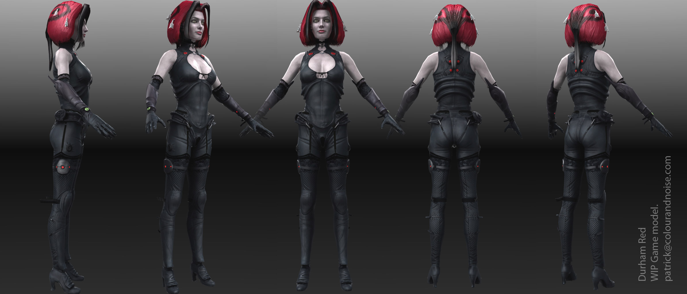
impressive. giving her darker eyebrows would do wonders and aslo add more color to the face like some red at the cheeks. i would make her a little more “round” in the face to make her younger looking. personally i like “sharp” noses also. nice detail work .]

Cheers mate. Yes you’re bang on about the eyebrows. They got forgotten about. But I’m not sure about her redder cheeks. I’ll have a go and see how she looks. It might actually emphasise her paleness.

And as for her age … nooo … I like her older. I’m not sure how old she’s supposed to look in the comics but she’s no spring chicken. A few artists made her look young but that just didn’t gel with me. She came across as more mature and weary with the world/universe.

thanks again.

Ok this is about done. This is the final game model. Not as good as I want but better than I expected and its more than served its purpose so I’ll leave it there. Next process to learn is Marmoset or the UDK. I’ve been told the UV’s are laid out wrong for UDK which I really wish I’d known earlier.

Poly count is too high at 8k tris, 2048x2048 col, spec, glow, transparency and normal, but I’ve not made an effort to really optimise it.

thumbnail.jpg
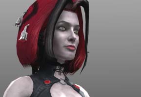
](http://%3Cfont%20color=%22#9A9A9A%22%3E[ATT=216112)

Attachments

PWard_DurhamRed_game_second_pass.jpg

PWard_DurhamRed_game_poly_normal.jpg

great works in here for sure! nice shapes for the Villikon Chronicles hanging pieces!:cool: :cool: