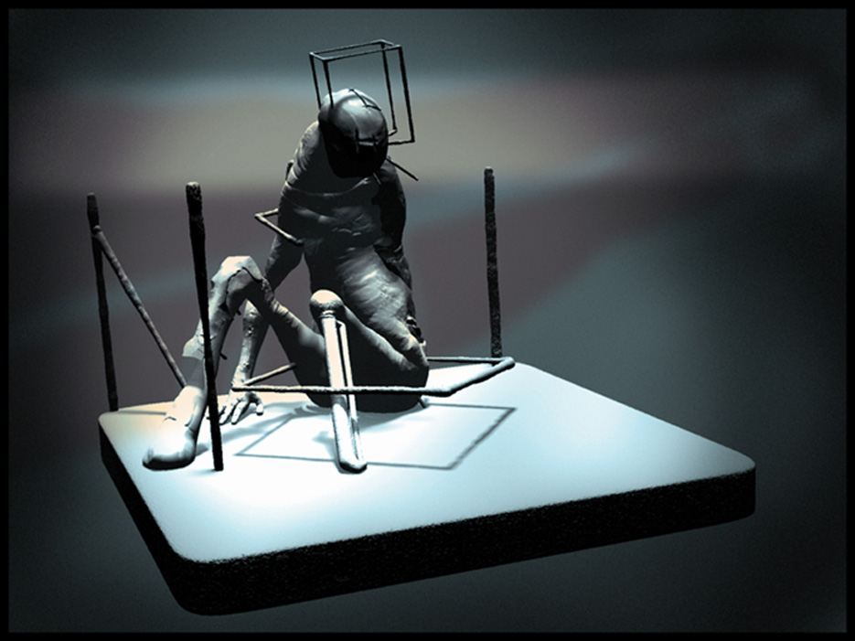
Hello, not a zsphere sketch but didnt want to clutter the forum with another thread…
Trying to get the hang of sculpting. C+C most welcome.
Hello, not a zsphere sketch but didnt want to clutter the forum with another thread…
Trying to get the hang of sculpting. C+C most welcome.
Honestly I’d give this top row. We don’t often see this end of the art spectrum. I think the overall composition is great. Seems so isolated.
Not to detract from your work but, respectfully, I have absolutely no idea how to critique abstract art. Once you get me outside of the realm of absolute correct or incorrect - or believable and unbelievable - I’m at a complete loss. I will say that I think there is something very pure about abstract art, in that it isn’t necessarily confined to the restrictions of realism. I still don’t “get it” though, and I feel like I need to “get it” in order for it to mean anything to me and to be able to identify with it.
pigumon: Thanks man, very glad you like it.
dustinbrown: I understand what you’re saying, I’m sure there are actual criteria for critically assessing this kind of thing, but thats not really my field either. I just end up going with a gut feeling of if I like it or not. Thank you for the response though.
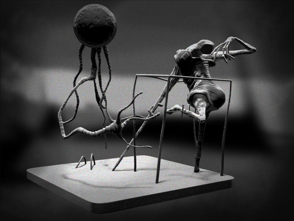
I was very curious to see how this piece would be receivedon ZBC, particularly because I am approaching Zbrush from a very different angle to most of what I see on this forum. It has taken me a long time to find a way into sculpting that feels comfortable for me. Guess I’m more taken with textures, shadowplay and the feel of a piece as a whole.
Still playing around to be honest but with each week that passes I feel I’m making progress… there is so much magic locked away in zbrush.
thanks again.
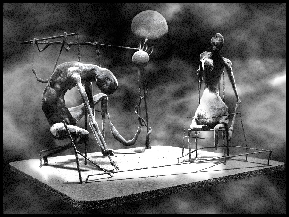
Just finished this, think I’m pretty happy with it.
Can anybody give me some advice on how to set the FOG and DEPTH CUE? Spent ages messing around with the sliders but just couldn’t get the hang of it. Would really appreciate some help, or directions to a tutorial.
I agree. Top row from me too.
…i like that last render, Grot…it looks strange and gnarly, sort of Beksinski-like
and what is it that hinders your fog settings…its not that difficult i think…you can drag from depht 1 to your scene to start your fog, and drag depht 2 for the point where the fog ends…or just drag the sliders to see a alive update on your screen, same goes for depht of field …depht of field can be seen only in render, but perhaps its changed now in the new release !
Fog has the bonus that you can use not only a color but also an image if you use that with noise you can get some interesting banding effects, just keep experimenting !
jantim
Thanks you michalis 
I had no idea you could use a teture for the fog! Just played around a bit and it looks like it has loads of potential.
Also, I guess I was just being noob, after seeing it written down the sliders for fog and depth of field made a lot more sense, thanks for the advice Jantim, really helped me.
Cool ZII stuff! I really like the two latest pieces. Love the mood/style/texture/composition. You somehow managed to make those “things” and the world they exist in very believeable. Looking forward to seeing more  .
.
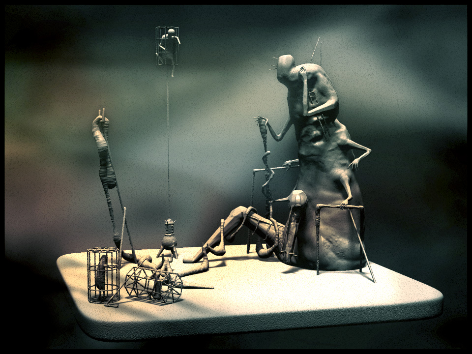
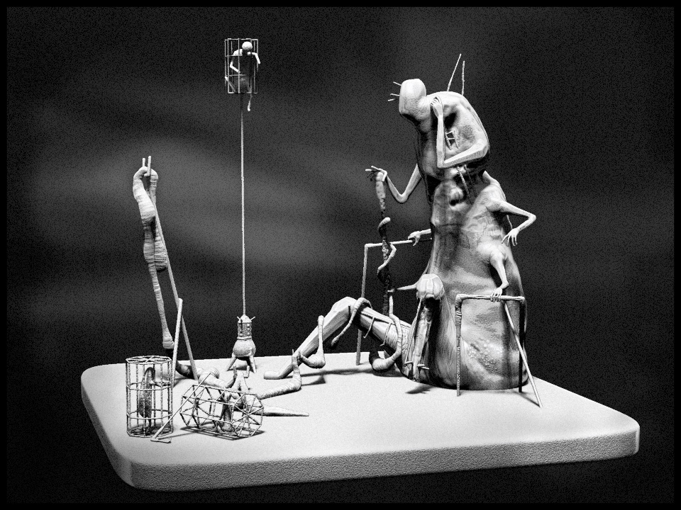
Here is a new one. Took me longer than I wanted it to, busy week I guess. Still not 100% happy with the composition. Still playing around with render techniques, and having fun.
Thanks for the comment Etcher, appreciate the feedback and support.
Anyway, here it is. As always C+C welcome…
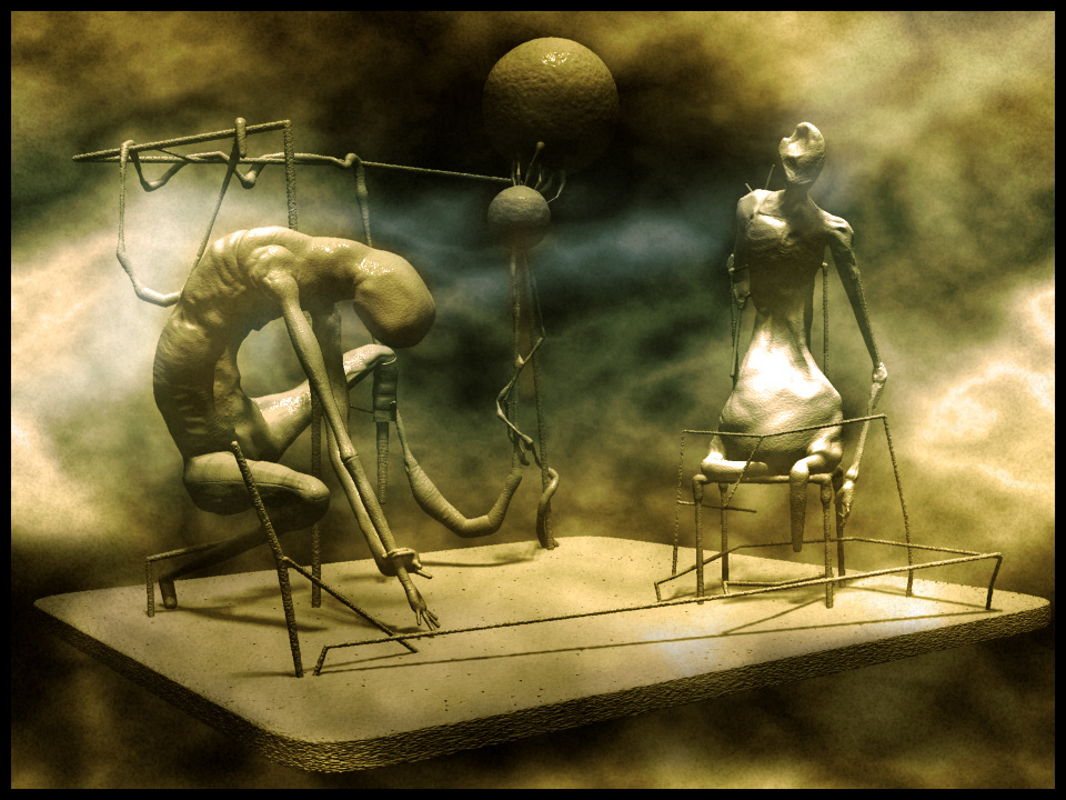
Mate…this is very good. The atmosphere in black and white (imho) is the best. Love it al the way…for me this is worth 5*****
Yeah, another nice one! I like the “grit/grain” of the black and white one, the second one feels a bit to clean/saturated. Maybe you could try to bring a bit of the colours into the b&w image. Not sure about the floating ground plane; takes away a bit of “the suspension of disbelief”, like revealing the backside of a movieset. Anyways, great stuff! More, please .
… i must say that i like the first black and white image best, the material in the render brings out the forms stronger then in the second one…is the material matcap based ?..perhaps a fog with no alpha and/or image is better because the objects are strong on themselve .
jantim
Thanks again for the comments.
Jantim: the material in the B&W is one of the new shaded sketch ones, can’t remember which. I think they are matcaps but lighting and shadows seem to work pretty well with them unlike some other matcaps I have played with.
Etcher: I see what you are saying and I’m in two minds about the floating ground plane…
On one hand I like how they mess with the suspension of disbelief, a little reminder that what you are looking at dosn’t actually exist… and on the other hand I feel they need something more, maybe a full environment… But at the moment its not bugging me too much so I shall just see what develops as I continue having fun.
Here’s another. Title: “he pokes holes in plastic bags”
(looking at them again, I think the contrast in the B&W image is a bit high. Might have another tinker when I have time)
thanks again.
This is great!
Love the style you have.
thanks man
Very nice and unique piece…it gives some sort of Grim feel
these soft forms and armatures look great…and i think you should use a bigger ground-plane that fades in a background fog, you could even use your own ground-plane and place that on the one that stretches into the foggy background .
jantim
Awesome! I think I’m a fan! Maybe a detail, but I love the shades of the fog/clouds on the left corner of the ground plane in the color pic.
Beautiful work.
BTW have you tried “toycamera analogcolor” for PP?. Its a freeware easy to use. (try zuiko lens style)