Update:
Here’s a quick textured test render so far, sort of a color study so it’s very WIP:
[ ]
]
Update:
Here’s a quick textured test render so far, sort of a color study so it’s very WIP:
[]
Nice work.
One or two things That bug me: the legs look very short and I’m not crazy about the boots (what I can see of them). The shape looks a bit to symmetrical and the stitching on the top of them seems a bit too generic and feels out of place with the rest of the model.
~M~
looking over your base mesh, if you retopo’d
the skirt-schpeal with even sized polys (and
maybe increased the density a little bit) you
could probably sort out some of the distortion
that you see in the pattern - still looks KA! 
Nice keep it up  Maybe legs aren’t showing that much also behind the robes
  just nitpicking
hey hope I’m not overstepping with audience participation here 
just wanted to illustrate that some part/material variance
in tonal value/hue would help the viewer to read the overall
design faster - it’s even more visible when the design is shown
at a smaller scale. This is just a quick mock up to show the
idea generally, you can take the same principal and get
very detailed with it, showing differentiation even down
to a sub-part level. The further you take it, the stronger
the overall design will be (just helping the viewer digest
all the wonderful details :D)
(even if it was just a tone variance) it would help a great
deal in the read.
I also agree with Super Glitcher
Thanks to all of you mindrot and Super Glitcher, and Devi!
Legs may look short I think due to perspective bias I think coz they look fine to me in ortho but what do I know, you may be right it won’t hurt to make 'em longer
But I agree about the boots definitely gotta give them more love. I think I must have rushed them in sculpt because as I tried working on them it kept crashing Zbrush and in the end I sai ‘screw this’ or something and just wanted to get a render out lol! But there are no shortcuts to perfection so yea i must fix them.
And SuperGlitcher! Wow! Thank you so much for that advise, I appreciate so much, also I’m very glad that you’re interested.
What I had is a first draft but like you suggested it’s sort of monotonous color wise making it harder to read. I didn’t want it to be too contrasty anyhow but I sure will apply what you said thanks!
Will update soon hopefully
Awesome job man, I remember seeing this a while back, and its looking great…keep up the great work.
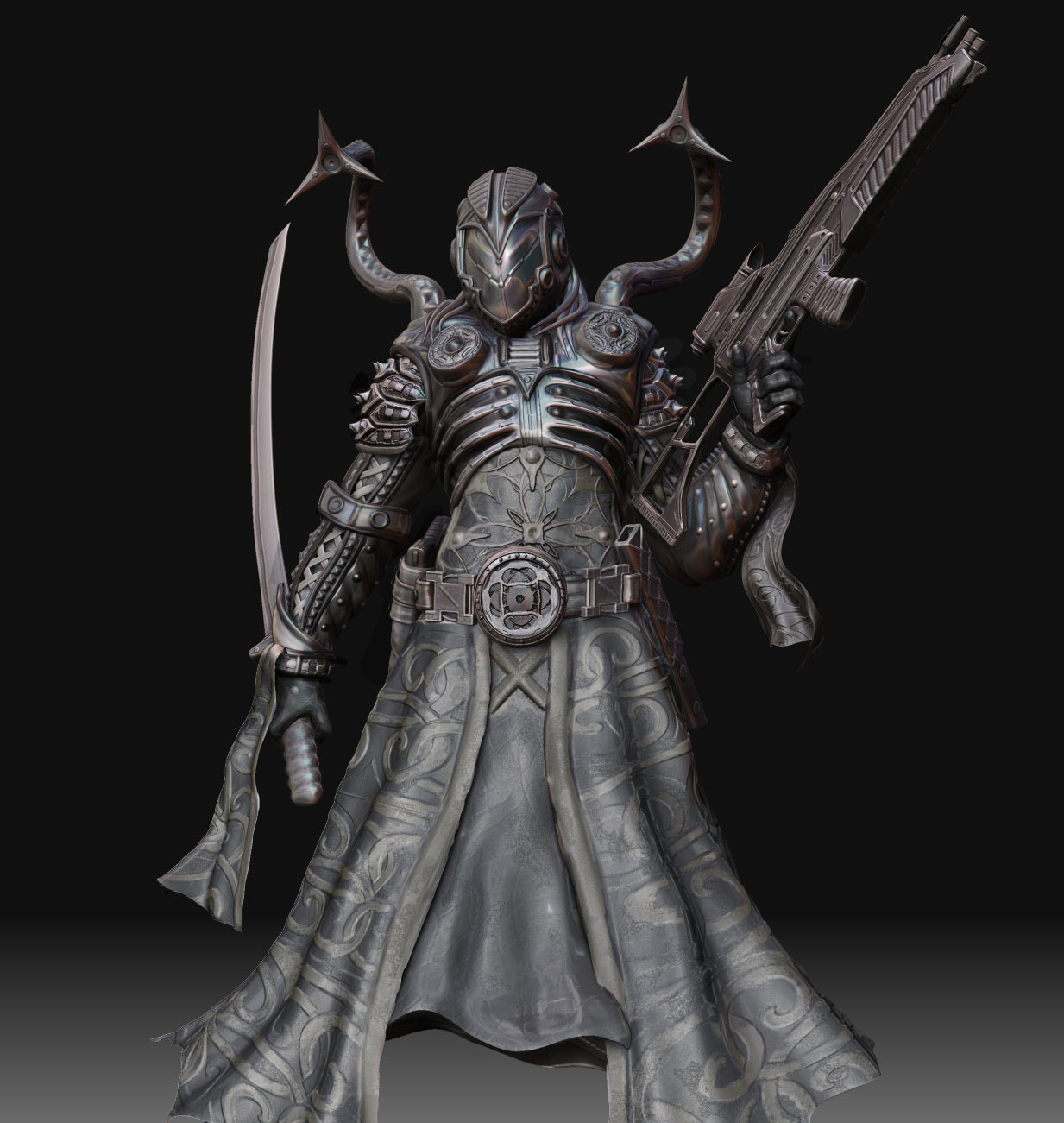
Hi all:
Update: This is second draft of the color/render study of this character.
It’s very ast to do these nice renders in Zbrush and photoshop with simply just blendmodes / opacity / masking / color overlay / post effects etc using many matcap snapshots from Zbrush for a certain angle. Great way to do studies With my current Maya MR skills they usually look better than what I achieve in Maya and are so quick to make, (3-5 hours approx of fun intuitive work)
great work!! love the texture!
Alex Oliver
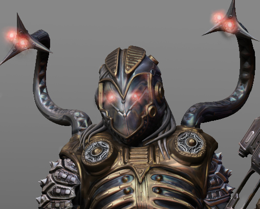
hey nice work, nice texturing, one crit, the rifle doesn’t seem to fit the character design at all, its almost like they’re from different universes.
What a strong work. I like the mix of new and old styling.
Very cool and super clean 
Hey!! Lookin’ awesome! Great work
with the color, love how it’s coming along…
great work ! keep it up…
very nice work, nice texturing.
Thank you all for the nice responses!
And about the rifle spaceboy, do you suggest I replace or redesign it completely or is it just the shading and texture etc that makes it look like it doesn’t match?
Anyhow thanks again for C&Cs
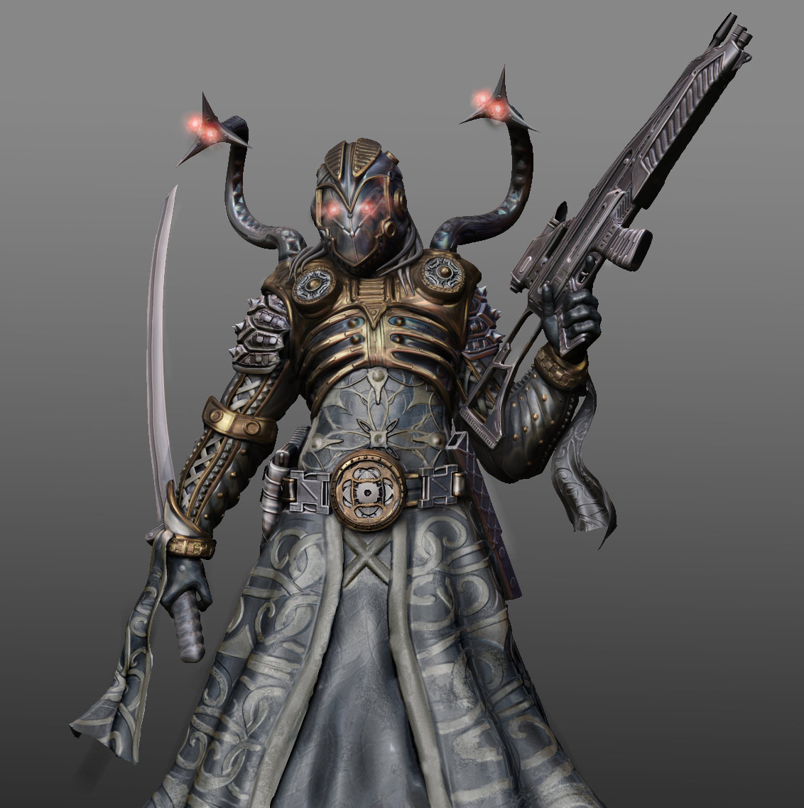
Just began rendering a bit further using that still and here is progress so far, only simple background right now with gradient light:
[ ]
]
It’s really hard to tell what type of material you’re going for on his kilt/skirt, I mean, I would imagine a type of cloth, but appears to be more metallic. Also, I don’t know if this is a straight render, it seems like you did some post work around the same area, which is giving it that painted/faded look, but it’s once again not contributing to differentiate the materials, I think if you push them a little more and build that contrast it’ll look pretty good. Cool design though.
Yeah I agree - that’s a great observation Prospect - I think the gradient background doesn’t help… (like you mentioned) It’s hiding all of that sharp, awesome detail that you have in the model… Great work.
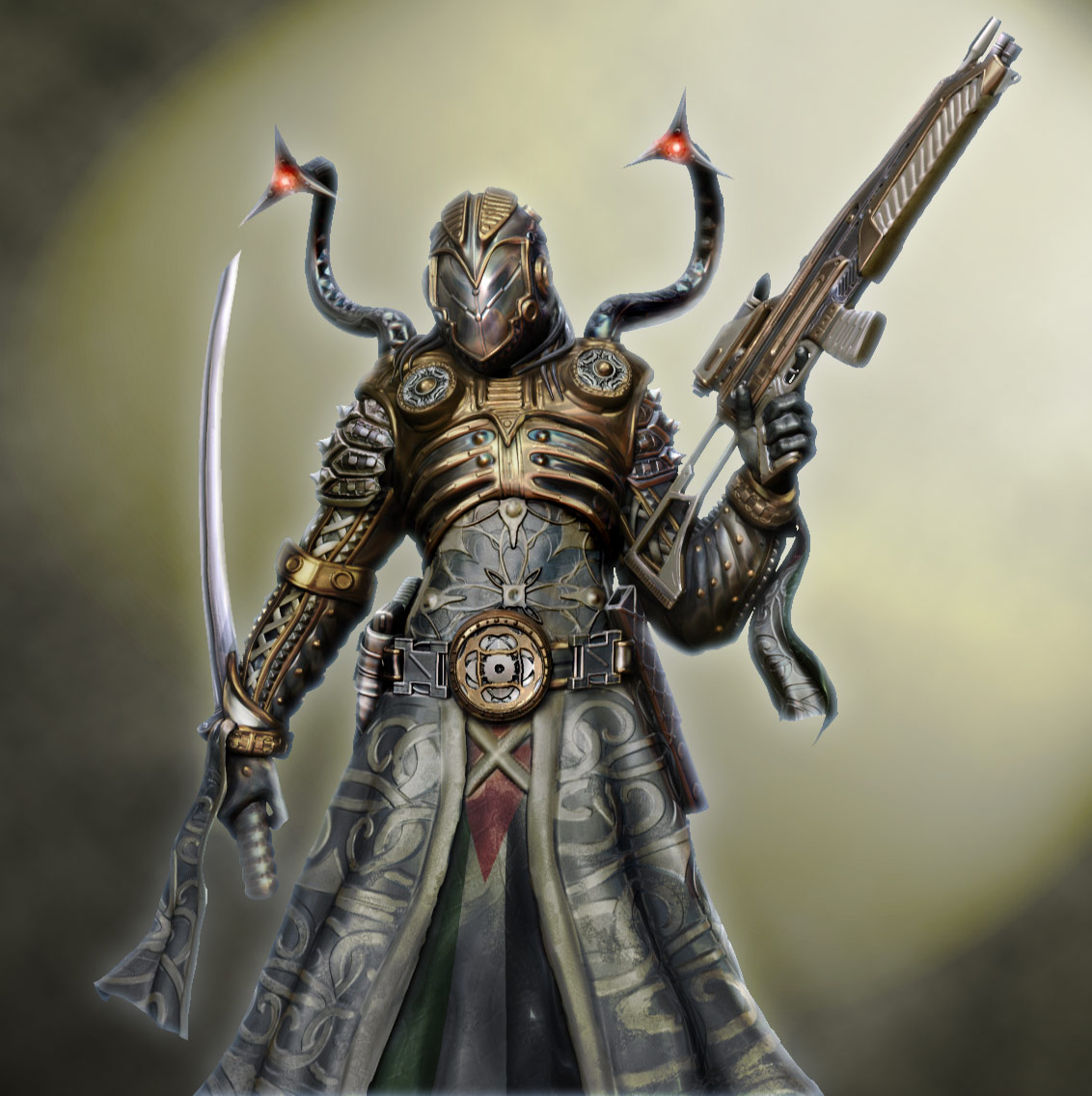
Hi and thanks Sixxpixels and and Prospect for your observations! I would never have observed that after working too closely for too long with it, things go by unnnoticed if you know what I mean.
So what you’re saying is I need to differentiate cloth material and up the contrast generally? Sure thing I will also add cloth texture to the kilt! Thanks again
Oh and you got it right Prospect in the end I decided to make this a Zbrush render with many matcaps / masks / color overlay and photoshop post-work! It’s very fast and my computer is too slow currently to tackle in ful scope larger Maya MR renders. Not to mention this way it take 1 day, and the MR render way can take weeks lol.