Awesome. Very creative. Just please colour the eyes so I can use it as a wallpaper 
I like it! Just the sort of sick taste I would like to offer my viewers first thing in the morning. Hope to see a fully textured version so please keep updating your post. Are you going to drop it?
-Shea
That is a crazy good 3d model. Great concept, and reminds me of a video by the band Tool.
Thanks a lot everybody!
@Bas Mazur:
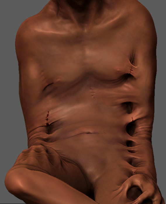
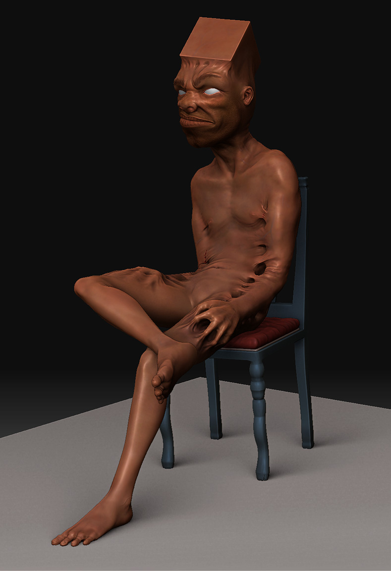
It’s just that I want to show how unable he actually is to move, think, hear, etc. so I went away a bit more from the common geometry in some parts.
@Ls3D:
What do you mean with “drop it”? (My English skills have some limitations, you know  )
)
I tried putting some cracks in it but I’m not quite confident whether I should leave, change or undo them, because to me they partly look a bit out of place. So what do you think about it?
[ ]
]
I think the cracks make it look like a statue, when actually he seems quite organic. So I’d say remove them
I think the cracks feel like geometry errors. What an interesting model though. Feels like something you would find in a creepy dream.
I like the cracks… the model makes you think about the way you feel bound and try to break away from standards that you’ve set for your self… There is a high visual impact in your model. Good Job
very creative peace of work. Looking forward to seeing this one complete.
@Ls3D:What do you mean with “drop it”?
Are you going to drop it to the canvas to do an illustration in 2.5 D, or back to your Host 3D application? I would do both if it were my baby, so perhaps that is the answer. Sorry for my vague question.
I was also wondering how your normal/displacement map pipeline would go with all those bridges. Your sculpt would be very cool with just a simple body squirm and the head struggling about.
-Shea
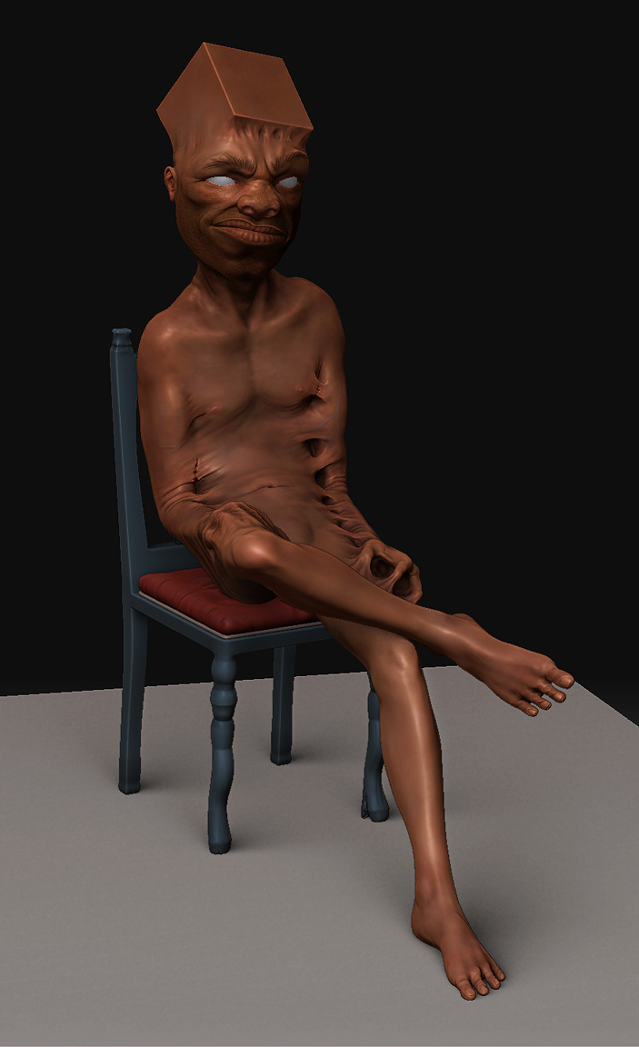
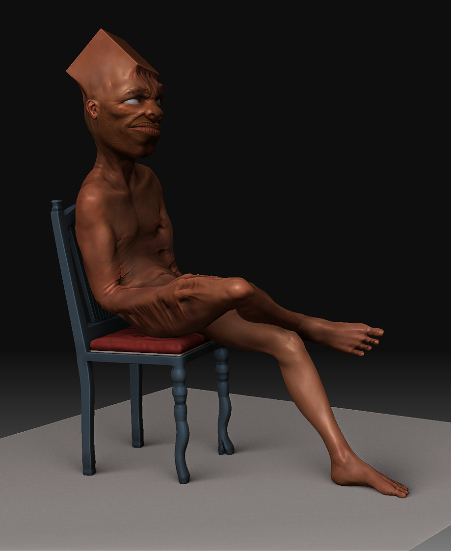
After some messing around with XSI and Mentalray (amazing but pretty heavy for newcomers…just as to be exepted) the last days, I went back to ZBrush and worked especially on the legs, feet and the chair.
Concerning the cracks I decided to get rid of some since it appeared a bit overloaded to me, but now I’m pretty happy with what I got there.
@Ls3D:
Ah, so you really meant that… Well, I’ll most likely just export the full geometry to XSI for the sake of the details and then do the usual postwork in Photoshop.
[ ]
]
Attachments
nice idear, really good, like it , wish i had thought about it hehe,
aldo there are some areas that trouble me, such as the ears, they are too small, and the attachment to the head, (top) doesnt look so natural, same with the nose holes… lower part of the nose.
His toes look like if they have knuckles, the thick part from the foot, that would look beter if you would make his toes flow naturallly from his feet.
shoulders… they are to small, you see the shoulder muscle go over to the upper arm… your muscle is very thin there, it makes the upperarm look weird or to big. and the muscle is kind of shapr, look like a disk.
the cube , dont know could be bigger, its a big thing in your model… in the theme of the thought behind it… but the cube is fairly small… makes it look a little strange, think the image overal would be better if you’d give the cube a bigger role.
but thats more taste, good allround non the less., keep it up
1… 2… 3… 4… yep! 4 toes, he has… um… a giant cube for a head and well skin sretched like that… so I guess 4 toes is not wierd in relation, LOL!
This is comming along nicely and I look forward to seeing it complete, pluss some of the corrections ivo d mentioned.
Well done! :D
Thanks a lot for the detailed crits ivo d, some of those points already were on my list, some are now but things like the small ears and the 4 toes will remain.
That’s simply because of their abilty to deliver the meaning of the image, since that guy is neither meant to hear everything that’s around him, nor is he to be able to walk or even stand properly.
At the very beginning the cube actually was a tad bigger but the problem with that was that it threw the character completely out of proportions. To me, the propotions are OK now, but exaggerating it more just looks too weird.
So thanks again, I always appreciate good crits,
frigi