hey André, good start here man, nice to see you around!
I’m diggin the pose, awesome man! the hands are really strong too!
Looking forward to see it finished!
Happy 2010 my friend!
Cheers
hey André, good start here man, nice to see you around!
I’m diggin the pose, awesome man! the hands are really strong too!
Looking forward to see it finished!
Happy 2010 my friend!
Cheers
nice works! 
i just love your blanka , the pose is great too !!

Man, awesome work on Blanka. The posed model looks killer.
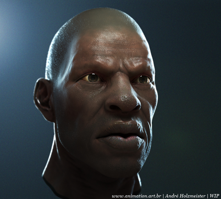
This guy is a BOPE soldier, like the one in the page 1, i am trying to produce an indie game about the subject, BOPE is a special forces from Rio de Janeiro Police Department, you could probably find some stuff on the new bout the subject as there was a small urban war a couple months and international media gave it a bit os care.
it is a low poly project, but i found it suited for my SSS2 vray tests wich i was trying to study for a while now… found some time last couple days to give it a try, very nice shader indeed, not completely satisfied with the result, the tip of the nose and upper lips looks too plastic for me… and as it is a lowpoly focused model, the bumps are a bit larger than it should (it is better for the bake, otherwise you could loose too much info, resolution based or simple stuff that is list in the bake), like the tip of the nose pores.
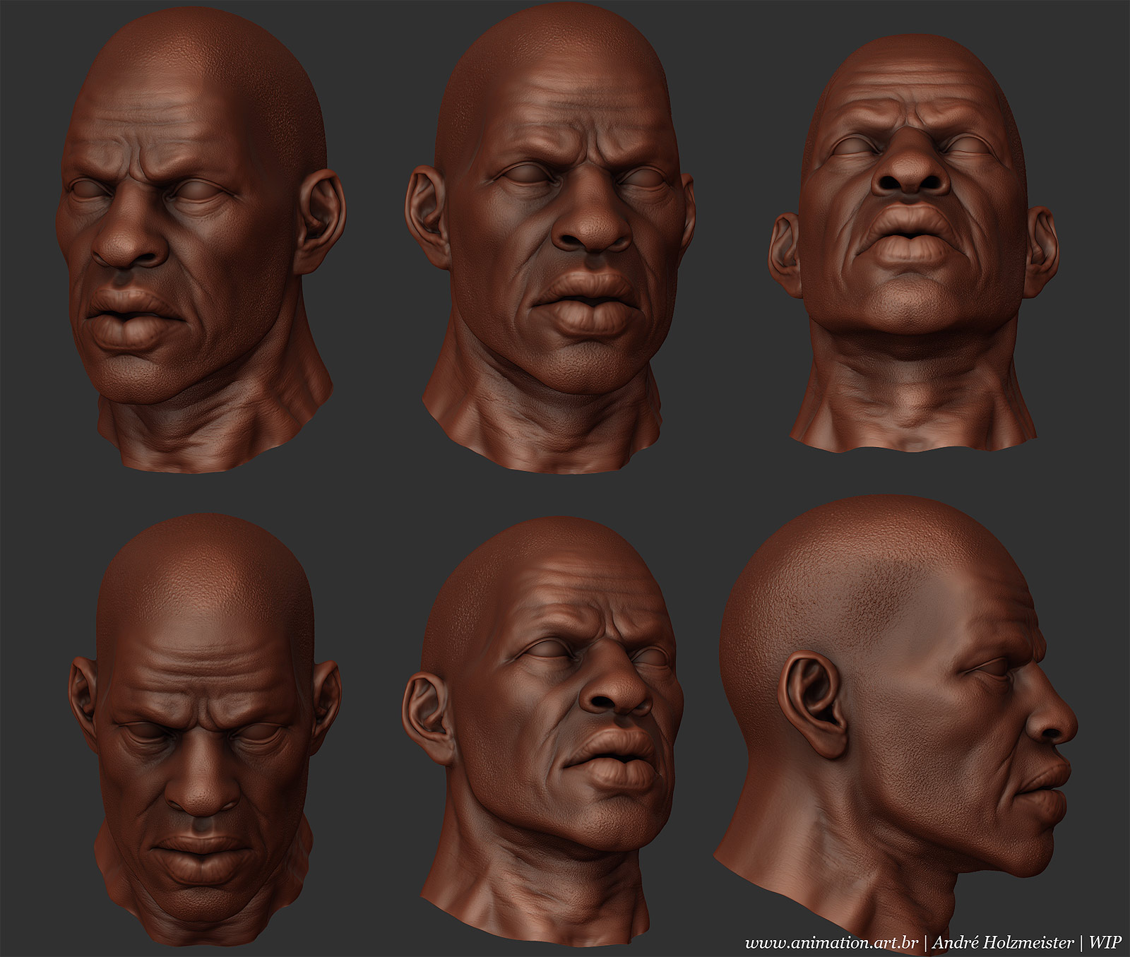
I really like the face, great detailing
Thanks Santis!
Here is a Marmoset rendering of the lowpoly soldier wich i will reuse the body and adapt to the black guy proportions.
Here is a tribute to the Famous Jump in The Fire EP from Metallica, original artwork from Les Edwards
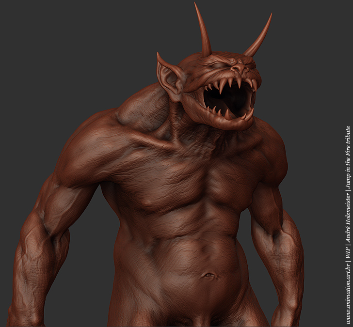
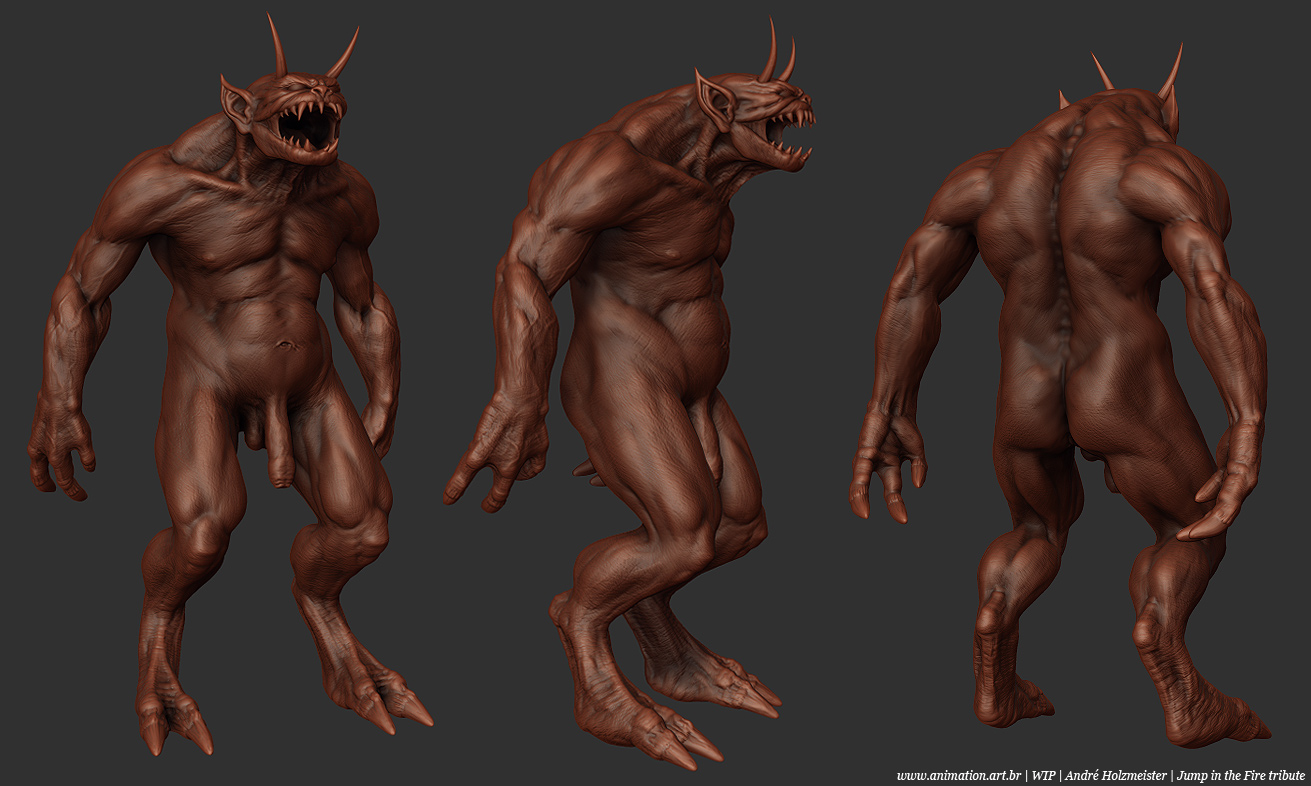
you shud re use that creature’s body for the black guy cos the pen1s is already the right proportion 
LoL 
When I first showed this model to a friend at work (female friend), it was pen1sless, she told me it is annoying that we care so much about anatomy but few guys go and model the pen1s… and most important, how would a demon get any respect without a dick? I laughed a lot, but she is completely right, and religion have satanized sex for ages, so a demon deserves to have this attributee right? After that I think this is a critic I will make everytime I see a devil without it. Anyway, I decided to make it huge to contrast with the always little pen1s found in angels statues from the Renaissance historical period, sugesting a contrast between good and evil.
Anyway it is annoying indeed, but i find it important to the piece anyway, and i think it is better to have than to let it out.
Thats an interesting theory ‘evil = huge pen!s’ . I dont tend to sculpt the genitalia because it just gets blured out or not shown because it then classed as explict.
Nice works.
Funny how people are avoiding the word ‘*****’ too… it’s just a *****, honestly! half of us have one, most of the other half enjoy them
Great sculpts! and yes, i like the idea of equating demon with potent male appendage, it’s intimidating to most men’s self-image
Question is, is he a grow-er or a show-er
‘they’ auto-removed the word ‘*****’ from my mail? … now I see why everyone was writing p3n!s…prudes!
Well, nice c0ck, then!
Doug is still wip, gonna give him a nice render soon

[attach=247565]doug_angles.jpg[/attach]
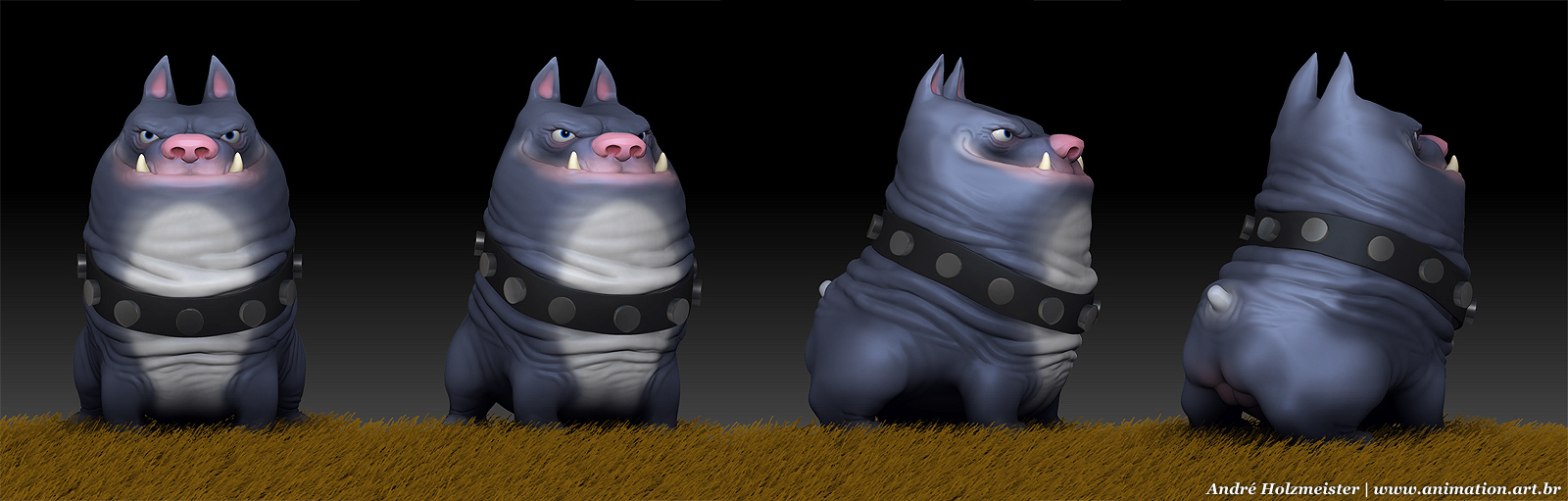
Nice. Little stumpy.
Hey man! Love the Blanka, espacially the pose. The dog looks awesome aswell, great job! Continue
Doug = fun 
He’s so pudgy, i love it!
Hi, longtime without posting news. Here is a tribute to Blizzard! I am working at my sparetime. about 15 hours until now.
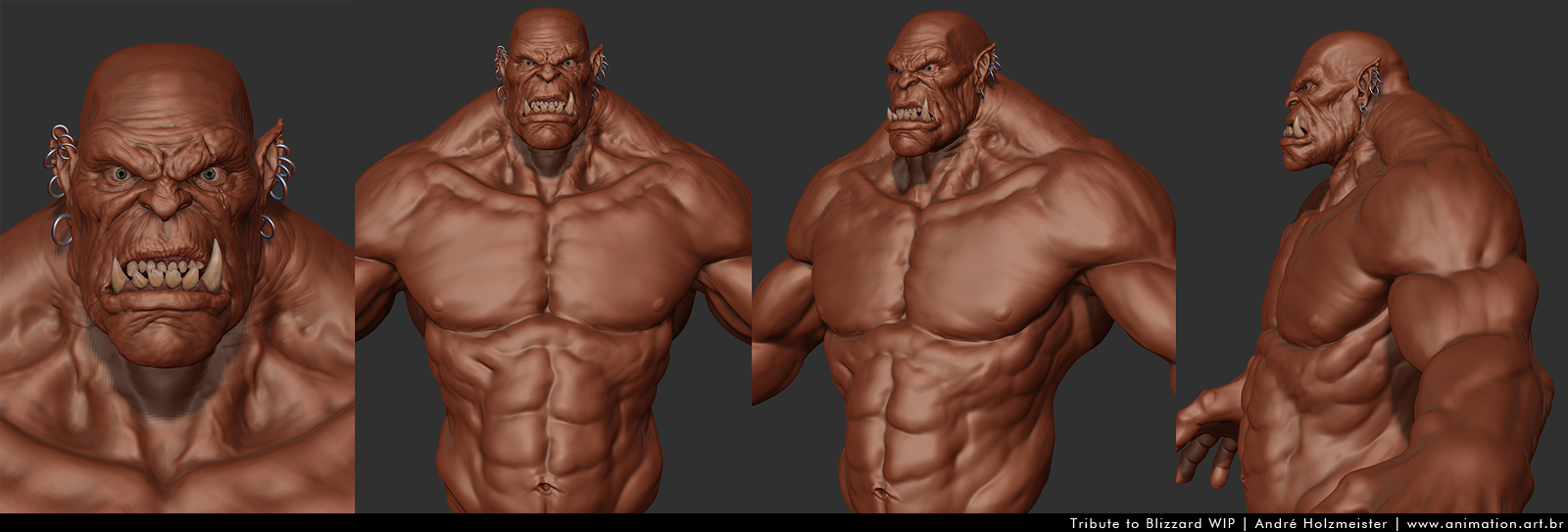

Awesome stuff, I really like the orc anatomy and proportions.

